
Recomendados
Recomendados
Mais conteúdo relacionado
Destaque
Semelhante a Biol h u1
Semelhante a Biol h u1 (20)
Mais de mcnewbold
Mais de mcnewbold (20)
Último
Último (20)
Biol h u1
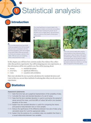
- 1. 1 Statistical analysis Introduction This mixed oak forest is a mature stage in the development of plant communities surrounding bodies of water. Studying the growth rate of the trees such as maple, beech, oak and hickory gives us evidence of the health of these plant communities. This is an Africanized honey bee (AHB). AHBs have spread to the USA from Brazil. They are now in competition with the local bee population, which are European This is the common bean plant used by honey bees (EHBs). EHBs were brought many students in their classrooms. Bean to America by European colonists in the plants grow in about 30 days under banks 1600s. AHBs are now out-competing of artificial lights. Seeds are easy to obtain. EHBs in areas the former invade. Germinated seeds can be placed in paper cups with sterilized soil. Many factors can In this chapter, you will learn how scientists analyse the evidence they collect be tested to determine whether or not they when they perform experiments. You will be designing your own experiments, so affect the growth of the bean plants. this information will be very useful to you. You will be learning about: • means; • standard deviation; • error bars; • significant difference; • t-test; • causation and correlation. Have your calculator by you to practise calculations for standard deviation and t-test so that you can use these methods of analysing data when you do your own experiments. 1.1 Statistics Assessment statements 1.1.1 State that error bars are a graphical representation of the variability of data. 1.1.2 Calculate the mean and standard deviation of a set of values. 1.1.3 State that the term standard deviation is used to summarize the spread of values around the mean, and that 68% of values fall within one standard deviation of the mean. 1.1.4 Explain how the standard deviation is useful for comparing the means and spread of data between two or more samples. 1.1.5 Deduce the significance of the difference between two sets of data using calculated values for t and the appropriate tables. 1.1.6 Explain that the existence of a correlation does not establish that there is a causal relationship between two variables. 1 01-Biol_01_001_011.indd 1 27/11/07 09:38:01
- 2. 1 Statistical analysis Reasons for using statistics Biology examines the world in which we live. Plants and animals, bacteria and Statistics can be used to describe conditions which exist in countries viruses all interact with one another and the environment. In order to examine the around the world. The data relationships of living things to their environments and each other, biologists use the can heighten our awareness scientific method when designing experiments. The first step in the scientific method of global issues. To learn about is to make observations. In science, observations result in the collection of measurable United Nations poverty facts and consumption statistics, visit data. For example: What is the height of bean plants growing in sunlight compared to heinemann.co.uk/hotlinks, insert the height of bean plants growing in the shade? Do their heights differ? Do different the express code 4242P and click species of bean plants have varying responses to sunlight and shade? After we have on Weblinks 1.1a and 1.1b. observed, we then decide which of these questions to answer. Assume we want to answer the question, ‘Will the bean plant, Phaseolus vulgaris, grow taller in sunlight or the shade?’ We must design an experiment which can try to answer this question. How many bean plants should we use in order to answer our question? Obviously, we cannot measure every bean plant that exists. We cannot even realistically set up thousands and thousands of bean plants and take the time to measure their height. Time, money, and people available to do the science are all factors which determine how many bean plants will be in the experiment. We must use samples of bean plants which represent the population of all bean plants. If we are growing the bean plants, we must plant enough seeds to get a representative sample. Statistics is a branch of mathematics which allows us to sample small portions The World Health Organization from habitats, communities, or biological populations, and draw conclusions (WHO) website has statistical information on infectious diseases. about the larger population. Statistics mathematically measures the differences and Over the next year, the system aims relationships between sets of data. Using statistics, we can take a small population to provide a single point of access of bean plants grown in sunlight and compare it to a small population of bean to data, reports and documents on: plants grown in the shade. We can then mathematically determine the differences • major diseases of poverty including malaria, HIV/AIDS, between the heights of these bean plants. Depending on the sample size that we tuberculosis; choose, we can draw conclusions with a certain level of confidence. Based on a • diseases on their way towards statistical test, we may be able to be 95% certain that bean plants grown in sunlight eradication and elimination will be taller than bean plants grown in the shade. We may even be able to say that such as guinea worm, leprosy, lymphatic filariasis; we are 99% certain, but nothing is 100% certain in science. • epidemic-prone and emerging infections such as meningitis, cholera, yellow fever and anti- Mean, range, standard deviation and error bars infective drug resistance. Statistics analyses data using the following terms: • mean; • range; • standard deviation; • error bars. For more information and access to the WHO website, visit heinemann. Mean co.uk/hotlinks, insert the express The mean is an average of data points. For example, suppose the height of bean code 4242P and click on Weblink plants grown in sunlight is measured in centimetres at 10 days after planting. 1.2. The heights are 10, 11, 12, 9, 8 and 7 centimetres. The sum of the heights is 57 centimetres. Divide 57 by 6 to find the mean (average). The mean is 9.5 centimetres. The mean is the central tendency of the data. For more statistics on the AIDS epidemic, visit heinemann.co.uk/ Range hotlinks, insert the express code 4242P and click on Weblink 1.3. The range is the measure of the spread of data. It is the difference between the largest and the smallest observed values. In our example, the range is 12 – 7 = 5. The range for this data set is 5 centimetres. If one data point were unusually large or unusually small, this very large or small data point would have a great effect on the range. Such very large or very small data points are called outliers. In our sample there is no outlier. 2 01-Biol_01_001_011.indd 2 27/11/07 09:38:01
- 3. Standard deviation The standard deviation (SD) is a measure of how the individual observations of a data set are dispersed or spread out around the mean. Standard deviation is determined by a mathematical formula which is programmed into your calculator. You can calculate the standard deviation of a data set by using the SD function of a graphic display or scientific calculator. Error bars Error bars are a graphical representation of the variability of data. Error bars can be used to show either the range of data or the standard deviation on a graph. Notice the error bars representing standard deviation on the histogram in Figure 1.1 and the line graph in Figure 1.2. The value of the standard deviation above the mean is shown extending above the top of each bar of the histogram and the same standard deviation below the mean is shown extending below the top of each bar of the histogram. Since each bar represents the mean of the data, the standard deviation for each type of tree will be different, but the value extending above and below one bar will be the same. The same is true for the line graph. Since each point on the graph represents the mean data for each day, the bars extending above and below the data point are the standard deviations above and below the mean. Figure 1.1 Rate of tree growth on the 16 Oak–Hickory Dune 2004–05. Values are represented as mean 1SD from 25 trees per species. 12 growth in metres 8 4 0 beech maple hickory oak Figure 1.2 Mean population density 300 (1SD) of two species of Paramecium P. aurelia grown in solution. 250 individuals in a litre number of 200 150 P. caudatum 100 50 0 0 1 2 3 4 5 6 7 8 9 10 11 days 3 01-Biol_01_001_011.indd 3 27/11/07 09:38:02
- 4. 1 Statistical analysis Standard deviation We use standard deviation to summarize the spread of values around the mean and to compare the means and spread of data between two or more samples. Summarizing the spread of values around the mean In a normal distribution, about 68% of all values lie within 1 standard deviation of the mean. This rises to about 95% for 2 standard deviations from the mean. To help understand this difficult concept, let’s look back to the bean plants growing in sunlight and shade. First, the bean plants in the sunlight: suppose our sample is 100 bean plants. Of that 100 plants, you might guess that a few will be very short (maybe the soil they are in is slightly sandier). A few may be much taller than the rest (possibly the soil they are in holds more water). However, all we can measure is the height of all the bean plants growing in the sunlight. If we then plot a graph of the heights, the graph is likely to be similar to a bell curve (see Figure 1.3). In this graph, the number of bean plants is plotted on the y axis and the heights ranging from short to medium to tall are plotted on the x axis. Many data sets do not have a distribution which is this perfect. Sometimes, the bell-shape is very flat. This indicates that the data is spread out widely from the mean. In some cases, the bell-shape is very tall and narrow. This shows the data is very close to the mean and not spread out. y Figure 1.3 This graph shows a bell curve. 0 x The standard deviation tells us how tightly the data points are clustered around the mean. When the data points are clustered together, the standard deviation is small; when they are spread apart, the standard deviation is large. Calculating the standard deviation of a data set is easily done on your calculator. Look at Figure 1.4. This graph of normal distribution may help you understand what standard deviation really means. The dotted area represents one standard deviation in either direction from the mean. About 68% of the data in this graph is located in the dotted area. Thus, we say that for normally distributed data, 68% of all values lie within 1 standard deviation from the mean. Two standard deviations from the mean (the dotted and the cross-hatched areas) contain about 95% of the data. If this bell curve were flatter, the standard deviation would have to be larger to account for the 68% or 95% of the data set. Now you can see why standard deviation tells you how widespread your data points are from the mean of the data set. How is this useful? For one thing, it tells you how many extremes are in the data. If there are many extremes, the standard deviation will be large; with few extremes the standard deviation will be small. 4 01-Biol_01_001_011.indd 4 27/11/07 09:38:03
- 5. mean Figure 1.4 This graph shows a normal distribution. Key y � 1 standard deviation from For directions on how to calculate the mean standard deviation with a TI-86 calculator, visit: heinemann.co.uk/ � 2 standard hotlinks, insert the express code deviations from the mean 4242P and click on Weblink 1.4a. If you have a TI-83 calculator, visit: heinemann.co.uk/hotlinks, insert 0 x 68% the express code 4242P and click on Weblink 1.4b. 95% Comparing the means and spread of data between two or more samples Remember that in statistics we make inferences about a whole population based on just a sample of the population. Let’s continue using our example of bean plants growing in the sunlight and shade to determine how standard deviation is useful for comparing the means and the spread of data between these two samples. Here are the raw data sets for bean plants grown in sunlight and in shade. Height of bean plants in the Height of bean plants in the sunlight in centimetres 0.1 cm shade in centimetres 0.1 cm 124 131 120 60 153 160 98 212 123 117 142 65 156 155 128 160 139 145 117 95 Total 1300 Total 1300 First, we determine the mean for each sample. Since each sample contains 10 plants, we can divide the total by 10 in each case. The resulting mean is 130.0 centimetres for each condition. Of course, that is not the end of the analysis. Can you see there are large differences between the two sets of data? The height of the bean plants in the shade is much more variable than that of the bean plants in the sunlight. The means of each data set are the same, but the variation is not the same. This suggests that other factors may be influencing growth in addition to sunlight and shade. How can we mathematically quantify the variation that we have observed? Fortunately, your calculator has a function that will do this for you. All you have to do is input the raw data. For practice, find the standard deviation of each raw data set above before you read on. The standard deviation of the bean plants growing in sunlight is 17.68 centimetres while the standard deviation of the bean plants growing in the shade is 47.02 centimetres. Looking at the means alone, it appears that there is no difference between the two sets of bean plants. However, the high standard deviation of the 5 01-Biol_01_001_011.indd 5 27/11/07 09:38:03
- 6. 1 Statistical analysis bean plants grown in the shade indicates a very wide spread of data around the To use an online calculator to do the t-test go to: heinemann. mean. The wide variation in this data set makes us question the experimental co.uk/hotlinks, insert the express design. Is it possible that the plants in the shade are also growing in several code 4242P and click on Weblink different types of soil? What is causing this wide variation in data? This is why it is 1.5a or 1.5b. important to calculate the standard deviation in addition to the mean of a data set. If we looked at only the means, we would not recognize the variability of data seen in the shade-grown bean plants. Significant difference between two data sets using the t-test In order to determine whether or not the difference between two sets of data is a significant (real) difference, the t-test is commonly used. The t-test compares two sets of data, for example heights of bean plants grown in the sunlight and heights of bean plants grown in the shade. Look at the bottom of the table of t values (opposite), and you will see the probability (p) that chance alone could make a difference. If p = 0.50, we see the difference is due to chance 50% of the time. This is not a significant difference in statistics. However, if you reach p = 0.05, the probability that the difference is due to chance is only 5%. That means that there is a 95% chance that the difference is due (in our bean example) to one set of the bean plants being in the sunlight. A 95% chance is a significant difference in statistics. Statisticians are never completely certain but they like to be at least 95% certain of their findings before drawing conclusions. When comparing two groups of data, we use the mean, standard deviation and sample size to calculate the value of t. When given a calculated value of t, you can use a table of t values. First, look in the left-hand column headed ‘Degrees of freedom’, then across to the given t value. The degrees of freedom are the sum of sample sizes of each of the two groups minus 2. If the degree of freedom is 9, and if the given value of t is 2.60, the table indicates that the t value is just greater than 2.26. Looking down at the bottom of the table, you will see that the probability that chance alone could produce the result is only 5% (0.05). This means that there is a 95% chance that the difference is significant. Worked example 1.1 Compare two groups of barnacles living on a rocky shore. Measure the width of their shells to see if a significant size difference is found depending on how close they live to the water. One group lives between 0 and 10 metres from the water level. The second group lives between 10 and 20 metres above the water level. Measurement was taken of the width of the shells in millimetres. 15 shells were measured from each group. The mean of the group closer to the water indicates that living closer to the water causes the barnacles to have a larger shell. If the value of t is 2.25, is that a significant difference? Solution The degree of freedom is 28 (15 + 15 – 2 = 28). 2.25 is just above 2.05. Referring to the bottom of this column in the table, p = 0.05 so the probability that chance alone could produce that result is only 5%. The confidence level is 95%. We are 95% confident that the difference between the barnacles is significant. Barnacles living nearer the water have a significantly larger shell than those living 10 metres or more away from the water. 6 01-Biol_01_001_011.indd 6 27/11/07 09:38:03
- 7. Table of t values Degrees of freedom t values 1 1.00 3.08 6.31 12.71 63.66 636.62 2 0.82 1.89 2.92 4.30 9.93 31.60 3 0.77 1.64 2.35 3.18 5.84 12.92 4 0.74 1.53 2.13 2.78 4.60 8.61 5 0.73 1.48 2.02 2.57 4.03 6.87 6 0.72 1.44 1.94 2.45 3.71 5.96 7 0.71 1.42 1.90 2.37 3.50 5.41 8 0.71 1.40 1.86 2.31 3.367 5.04 9 0.70 1.38 1.83 2.26 3.25 4.78 10 0.70 1.37 1.81 2.23 3.17 4.590 11 0.70 1.36 1.80 2.20 3.11 4.44 12 0.70 1.36 1.78 2.18 3.06 4.32 13 0.69 1.35 1.77 2.16 3.01 4.22 14 0.69 1.35 1.76 2.15 2.98 4.14 15 0.69 1.34 1.75 2.13 2.95 4.07 16 0.69 1.34 1.75 2.12 2.92 4.02 17 0.69 1.33 1.74 2.11 2.90 3.97 18 0.69 1.33 1.73 2.10 2.88 3.92 19 0.69 1.33 1.73 2.09 2.86 3.88 20 0.69 1.33 1.73 2.09 2.85 3.85 21 0.69 1.32 1.72 2.08 2.83 3.82 22 0.69 1.32 1.72 2.07 2.82 3.79 24 0.69 1.32 1.71 2.06 2.80 3.75 26 0.68 1.32 1.71 2.06 2.78 3.71 28 0.68 1.31 1.70 2.05 2.76 3.67 30 0.68 1.31 1.70 2.04 2.75 3.65 35 0.68 1.31 1.69 2.03 2.72 3.59 40 0.68 1.30 1.68 2.02 2.70 3.55 45 0.68 1.30 1.68 2.01 2.70 3.52 50 0.68 1.30 1.68 2.01 2.68 3.50 60 0.68 1.30 1.67 2.00 2.66 3.46 70 0.68 1.29 1.67 1.99 2.65 3.44 80 0.68 1.29 1.66 1.99 2.64 3.42 90 0.68 1.29 1.66 1.99 2.63 3.40 100 0.68 1.29 1.66 1.99 2.63 3.39 Probability (p) that 0.50 0.20 0.10 0.05 0.01 0.001 chance alone could (50%) (20%) (10%) (5%) (1%) (0.1%) produce the difference 7 01-Biol_01_001_011.indd 7 27/11/07 09:38:04
- 8. 1 Statistical analysis Correlation does not mean causation We make observations all the time about the living world around us. We might notice, for example, that our bean plants wilt when the soil is dry. This is a simple observation. We might do an experiment to see if watering the bean plants prevents wilting. Observing that wilting occurs when the soil is dry is a simple correlation, but the experiment gives us evidence that the lack of water is the cause of the wilting. Experiments provide a test which shows cause. Observations without an experiment can only show a correlation. Africanized honey bees The story of Africanized honey bees (AHBs) invading the USA includes an interesting correlation. In 1990, a honey bee swarm was found outside a small town in southern Texas. They were identified as AHBs. These bees were brought from Africa to Brazil in the 1950s, in the hope of breeding a bee adapted to the South American tropical climate. But by 1990, they had spread to the southern US. Scientists predicted that AHBs would invade all the southern states of the US, but this hasn’t happened. Look at Figure 1.5: the bees have remained in the southwest states (area shaded in yellow) and have not travelled to the south-eastern states. The edge of the areas shaded in yellow coincides with the point at which there is an annual rainfall of 137.5 cm (55 inches) spread evenly throughout the year. This level of year-round wetness seems to be a barrier to the movement of the bees and they do not move into such areas. Figure 1.5 AHBs have not moved beyond the areas shaded yellow in the last 10 years. So, states in the south east (Louisiana, Florida, Alabama and Mississippi) seem unlikely to be bothered by AHBs if the 137.5 cm (55 inches) of rain correlation holds true. This is an example of a mathematical correlation and is not evidence of a cause. In order to find out if this is a cause, scientists must design experiments to explain mechanisms which may be the cause of the observed correlation. Cormorants When using a mathematical correlation test, the value of r signifies the correlation. The value of r can vary from +1 (completely positive correlation) to 0 (no correlation) to –1 (completely negative correlation). For an example, we can measure in millimetres the size of breeding cormorant birds to see if there is a correlation between the sizes of males and females which breed together. 8 01-Biol_01_001_011.indd 8 27/11/07 09:38:04
- 9. Pair numbers Size of female cormorants Size of male cormorants 1 17.1 16.5 2 18.5 17.4 3 19.7 17.3 4 16.2 16.8 5 21.3 19.5 6 19.6 18.3 r = 0.88 The r value of 0.88 shows a positive correlation between the sizes of the two sexes: large females mate with large males. However, correlation is not cause. To find the cause of this observed correlation requires experimental evidence. There may be a high correlation but only carefully designed experiments can separate causation from correlation. Just because event X is regularly followed by event Y, it does not necessarily follow that X Use of tobacco by adolescents is causes Y. Biologists are often faced with the difficult challenge of determining whether or not a major public health problem in events that appear related are causally associated. For example, there may be an association all six WHO regions. Worldwide, between large numbers of telephone poles in a particular geographic area and the number of more countries need to develop, people in that area who have cancer, but that does not mean that the telephone poles cause implement, and evaluate tobacco- cancer. Carefully designed experiments are needed to separate causation from correlation. control programmes to address The tobacco companies used to say that there was a statistical correlation between smoking the use of all types of tobacco and lung cancer, but they insisted that there was no causal connection. In other words, they products, especially among girls. said X did not follow Y in this case. In fact, they said that people who thought that smoking caused cancer were committing a fallacy of post ergo proper hoc (one thing follows another). However, we now have lots of other evidence that smoking does cause lung cancer. You can find many interesting statistics if you visit heinemann. So, try assessing the following statements as to whether you think they represent a correlation co.uk/hotlinks, insert the express or if there is a causal connection between the two things in each case. code 4242P and click on Weblink 1.6. 1 Cars with low mileage per gallon/litre of fuel cause global warming. 2 Drinking red wine protects against heart disease. 3 Tanning beds can cause skin cancer. 4 UV rays increase the risk of cataracts. 5 Vitamin C cures the common cold. It can be difficult to imagine what it was like when people did not have some of the knowledge that we take for granted today. In the mid-19th century, people had a different paradigm of what caused disease; they thought there were many causes of disease but they did not know about germs (microorganisms). The modern concept that germs can cause disease, was introduced by Louis Pasteur. Further evidence of the germ theory was demonstrated by Robert Koch. To find information on Pasteur and Koch, and discover answers to the questions below, visit heinemann.co.uk/hotlinks, insert the express code 4242P and click on Weblink 1.7. 1 What was the paradigm of disease for people in the mid-19th century? What did they think caused disease? Were they looking at causation or correlation? 2 How did Louis Pasteur’s work change this paradigm? 3 Explain how Robert Koch’s work gave evidence which was required to show that a bacterium plays a causal role in a certain disease. Exercises 1 Define an error bar. 2 Define standard deviation. 3 Explain the use of standard deviation when comparing the means of two sets of data. 4 If you are given a calculated value for t, what can be deduced from a t-table? 5 Give a specific example of a correlation. 6 Explain the relationship between cause and correlation. 9 01-Biol_01_001_011.indd 9 27/11/07 09:38:05
- 10. 1 Statistical analysis Practice questions As this chapter covers new syllabus material, there are no past examination papers available. Hence, there is no markscheme for these questions. 1 What is standard deviation used for? A To determine that 68% of the values are accurate. B To deduce the significant difference between two sets of data. C To show the existence of cause. D To summarize the spread of values around the means. 2 What is an error bar? A A graphical representation of the variability of data. B A graphical representation of the correlation of data. C A calculated mean. D A histogram. 3 What is the t-test used for? A Comparing the spread of data between two samples. B Deducing the significant difference between two sets of data. C Explaining the existence of cause and correlation. D Calculating the mean and the standard deviation of a set of values. 4 What is the relationship between cause and correlation? A A correlation does not establish a causal relationship. B A correlation requires a scientific experiment, while cause does not. C A correlation requires collection of data, cause does not. D A causal relationship does not establish correlation. 5 An experiment using 0.5 grams of fresh garlic and crushed garlic root, leaf and bulb from garlic cloves sprouted for 2 days was performed. This garlic was used in a bioassay on lettuce seedlings to see if growth of the lettuce seedlings was inhibited compared to a control. Data recorded was seedling length in millimetres. Crushed Crushed Crushed Control Fresh garlic sprouted root sprouted leaf sprouted bulb (no treatment) 4 4 3 3 20 5 5 4 4 19 6 5 5 5 17 4 5 5 4 20 3 4 5 5 21 4 3 6 4 22 3 3 4 5 19 5 5 5 4 17 4 4 4 4 16 3 3 3 5 20 (a) Find the mean and standard deviation of each of these data sets. (b) Discuss the variability of the garlic data. (c) Compare the means of each group of data. (d) (i) If the calculated t for fresh garlic compared to the control is t = 13.9, is the difference between the two groups a significant difference? (ii) What is the probability that the difference between the groups is due to chance? 10 01-Biol_01_001_011.indd 10 27/11/07 09:38:05
- 11. (e) (i) If the calculated t for the sprouted bulb compared to the fresh garlic is t = 0.33, is the difference significant? (ii) What is the probability that the difference between the two groups is due to chance? 6 An experiment using fertilizer on bean plants was performed. Germinated seeds were planted in sterile soil to which different amounts of a commercial fertilizer were added. Height of the plants was measured in centimetres 25 days after planting. Data recorded was bean plant height in centimetres (0.5 cm). Group A Group B Group C Group D No fertilizer 0.001% fertilizer 0.01% fertilizer 0.1% fertilizer 10 8 7 12 7 8 10 13 8 7 8 15 7 10 10 10 8 10 8 10 10 7 9 15 9 8 9 10 8 8 8 10 7 9 6 14 9 9 7 10 (a) Find the mean and standard deviation of each set of data. (b) Discuss the variability of the bean plant data. (c) Compare the means of each group of data. (d) (i) If the calculated t for Group B compared to the the control is t = 0.60, is the difference between the two groups a significant difference? (ii) What is the probability that the difference between the two groups is due to chance? (e) (i) If the calculated t for Group D compared to the the control is t = 2.90, is the difference between the two groups significant? (ii) What is the probability that the difference is due to chance? 11 01-Biol_01_001_011.indd 11 27/11/07 09:38:05