CSS3 for web designer - How to design a visually appealing website
•Transferir como KEY, PDF•
1 gostou•1,496 visualizações

How to design a visually appealing website using CSS3.

Recomendados
Mais conteúdo relacionado
Mais procurados
Semelhante a CSS3 for web designer - How to design a visually appealing website
Semelhante a CSS3 for web designer - How to design a visually appealing website (20)
Mais de Mario Hernandez
Mais de Mario Hernandez (12)
Último
Último (20)
CSS3 for web designer - How to design a visually appealing website
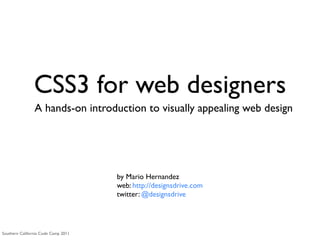
- 1. CSS3 for web designers A hands-on introduction to visually appealing web design by Mario Hernandez web: http://designsdrive.com twitter: @designsdrive Southern California Code Camp 2011
- 2. Agenda • Intro to 960 Grid System • Elements of great design • Supported CSS3 properties • Hands-on web design • Additional resources
- 4. What is a grid system? A series of columns working as guides to streamline web development workflow by providing commonly used dimensions, based on a fixed width of 960 pixels. Source: Wikipedia
- 5. Why use a grid system? • Saves time • Saves money • Reduces frustration
- 6. How do grid systems work? • Grid systems are built using columns • Columns are grid system’s smallest unit of measurement • The two most popular version of a grid system are 12 and 16 columns Example based on 960.gs (12 columns)
- 7. Column width • Page regions (header, sidebar, content, etc.,) are defined by column width • As in: “The header is eight columns wide” Example based on 960.gs (12 columns)
- 8. Gutters (margins) • Margins are used to create gutters between columns • These margins provide gutters between page regions Example based on 960.gs (12 columns)
- 9. Floating <div> elements • The wrapping <div> class: grid_12 elements are assigned a column width using a class: grid_4 class: grid_4 class: CSS class grid_4 • Because these classes class: grid_8 also float the elements, they simply fall into class: grid_6 class: grid_6 place on the page
- 10. What is 960.gs? • 960.gs — also known as the 960 Grid System — was created by Nathan Smith in order to “streamline web development workflow” • It’s both a prototyping and development framework • Download it from http://960.gs Source: 960.gs
- 11. What’s in it? • You can download it from http://960.gs • GPL and MIT licensed • The 960.gs download includes: • Printable sketch sheets for doodling • Design templates for all most applications: Photoshop, Illustrator, Inkscape, OmniGraffle, etc. Source: 960.gs
- 12. 12 column version Source: 960.gs
- 13. Grid system CSS classes • grid_x (where X indicates the number of columns an element is given) • alpha & omega: Fix floats on nested regions • prefix & suffix: Allow empty spaces before or after a region grid_4 grid_4 • pull & push: Rearrange push_6 pull_6 regions independently of the order they appear on the markup Source: 960.gs
- 14. Grid system CSS classes • grid_x (where X indicates the number of columns an element is given) • alpha & omega: Fix floats on nested regions • prefix & suffix: Allow empty spaces before or after a region grid_4 • pull & push: Rearrange push_6 pull_6 regions independently of the order they appear on the markup Source: 960.gs
- 15. Grid system CSS classes • grid_x (where X indicates the number of columns an element is given) • alpha & omega: Fix floats on nested regions • prefix & suffix: Allow empty spaces before or after a region grid_4 grid_4 • pull & push: Rearrange pull_6 push_6 regions independently of the order they appear on the markup Source: 960.gs
- 16. Design with CSS3
- 17. Great design • A well designed product gives the impression that it works well Source: Apple.com
- 18. Great design • Better designed websites appear easier to use • Generally people associate great design with something that works well Source: http://mailchimp.com Source: MailChimp.com
- 19. Elements of great web design
- 20. COLOR
- 21. Texture
- 22. white space
- 23. Typography
- 24. CSS3 • Use CSS3 to target the experience layer • Focus on the properties that are widely supported • Do not sacrifice functionality for looks Critical Non-critical Branding Interaction Usability Visual rewards Accessibility Feedback Layout Movement Source: CSS3 for web designers book by Ethan Marcotte
- 25. CSS3 Supported Properties Property Supported In border-radius 3+ 3+ 1+ 10.5+ 9+ text-shadow 1.1+ 2+ 3.1+ 9.2+ box-shadow 3+ 3+ 3.5+ 10.5+ 9+ opacity 1.2+ 1+ 1.5+ 9+ 9+ RGBA 3.2+ 3+ 3+ 10+ 9+
- 27. Let’s do this!
- 28. Resources • 960 Grid System: http://960.gs • CSS3 Resources: http://www.css3files.com By Dan Cederholm By Dan Cederholm By Ethan Marcotte
- 29. Contact me • Web: http://designsdrive.com • Email: designsdrive@gmail.com • Twitter: @designsdrive
Notas do Editor
- I have been designing website for about 10 years. For the past 6-7 years I have been doing it as a full time web developer for the federal government. During all this time, I have also been running my own independent freelance business and that&#x2019;s where I get to be a little more creative.\n
- \n
- \n
- This definition is specifically for the type of grid system we&#x2019;ll be discussing today. As you will see, there are other grid systems for different functions.\n
- You no longer need to spend time hacking IE.\nNot every project lends itself to a grid system. So if you are having difficulties with a grid system I would suggest you take a closer look at your project&#x2019;s requirements and ask yourself whether the grid system is the right tool for this particular project.\n\nA GRID SYSTEM IS NOT A SILVER BULLET.\n
- There is a 24 column but it&#x2019;s not widely used as the 12 or 16 columns version. There is also a fluid version which is gaining a lot of traction especially when it comes to responsive web design which allows for the grid to be resized automatically based on the size screen it&#x2019;s being looked at.\n
- You no longer measure your regions in pixels. You use columns as the measurements unit\n
- You don&#x2019;t have to do the math yourself. All the calculations have already been made for you so you can focus on design.\n
- All elements float to the left by default. If you know a little about floating elements you&#x2019;ll know that floating elements to the left automatically aligns everything horizontally.\n
- \n
- \n
- In the 16 column version each column is 40px wide. Everything else remains the same\n
- \n
- \n
- \n
- The premise of this session is not to teach you all there is to know about great web design, first of all because I don&#x2019;t know everything there is to know about great web design. The idea is to introduce you to principles and techniques that will help you become a better designer. \n
- Example of this are apple products. The other side of the coin is also true. Personally when I visit a poorly designed website, I become skeptical or suspicious whether it works well or I make a pre-assumption that this website may not work well. Better yet, I question the company&#x2019;s reputation or trust if I am about to do business with them.\n
- Example of this are apple products. The other side of the coin is also true. Personally when I visit a poorly designed website, I become skeptical or suspicious whether it works well or I make a pre-assumption that this website may not work well. Better yet, I question the company&#x2019;s reputation or trust if I am about to do business with them.\n
- Using helvetica font. Talk about the helvetica documentary.\n
- \n
- \n
- \n
- Using helvetica font. Talk about the helvetica documentary.\n
- Before we get into it. I would recommend you get a hold of the following 3 books. Start with HandCrafted CSS then to get a good foundation on CSS in general. Then move on to CSS3 for web designers and finally, Responsive web design. You will become a better designer after you have gone through these books.\n
- Talk about the fact that css3 is a series of modules that run independently from each other. This is a good thing. This means you can implement only those properties that are widely supported.\n
- \n
- \n
- \n
- \n
- \n
- \n
- \n
- \n