SlideShare uma empresa Scribd logo
1 de 7
Front Cover Analysis.
Target Audience:
Gender: Male
Age: 20-35
Social Class: Middle to Upper
Class
Interests: Music,
Music Festivals,
Gigs,
Friends
The masthead of Q magazine is the first thing that the audience will see.
Following conventions of magazines, Q has the masthead in the top left
corner. This means it can be seen and will also be the first thing a person
will look at. The masthead is a bright red colour, which will be seen as a
more ‘aggressive’ colour that can suggest anger and rebellion. This shows
it’s trying to attracts a stereotypically male audience. The connotation to
rebellion can be linked to the genre of the magazine as it mostly writes
about indie and rock music which is what these types of songs are about. It
also fits in with the general colour scheme of red, grey and black.
The name itself doesn’t give away much about the magazine; suggesting
that its audience already has knowledge of what they are buying; due to
either buying it before or knowing about it through other people because it
is a successful magazine. This will target the audience of middle to upper
class people as they expect the things they buy to be the best and if a
magazine can be so well known without the name directly telling them
anything that means it’s good.
The main image is a close-up shot of Liam Gallagher; who is looking directly at
the camera, giving a direct mode of address to communicate with the
audience. This is done to make the reader feel like he is looking directly at
them and holds the readers attention, creating a feeling of privacy and
intimacy. The points of interests using the rule of three are right on his eyes,
reinforcing the idea that he is looking directly at the reader. This enforces the
feeling of privacy which is anchored by the main coverline ‘”It’s been boring
without me, hasn’t it?”’ This is posed as a question rather than a statement
because they want the reader to be interested in the answer or answer it
themselves. This coverline is directed at the target audience of people over 20
because it suggests that they have previous knowledge of Liam Gallagher and
what he did. People over that age will clearly know the answer to the question
if they're interested in the music Q magazine talks about. The phrase makes
them feel included in the niche market that the phrase includes. This once
again anchors itself back to the pose which is serious and mature which shows
that audience is older because they are more likely to gravitate towards a main
image of someone their own age because they can relate to that more than
someone younger.
The tagline for the magazine is ‘The worlds greatest music magazine’
this will also attract wealthier people because its suggests that its
above other magazines and its something that rich people will feel
good spending their money on; because its better than others when
they spend their money on Q and not other music magazines.
The other coverlines featured are ones such as ‘King of Leon
RETURNS!’. This stands out because of the explanation mark and
because of the colour scheme of red contrasting against the plan
background. The cover lines which are more important are in red to
match the masthead and they will attract more attention due to
their bright colour. The rest of the coverlines stick to the same
layout, font and colours. This makes the reader feel more familiar
with the magazine and are more likely to buy it if its something they
already know. The regular readers will also know exactly what to
expect from each colour. They all stand out against the duller
background. The bands which are talked about are all indie and rock
bands, this enforces the genre of the magazine. Most of the bands
which are discussed also feature primarily males so this will attract
a male audience because its something they can identify with and
see themselves and what they enjoy represented in a good light.
The genre of indie and rock is also male dominated in both artist
and consumer; this means that targeting the magazine to that
audience will give them a wider market when trying to sell the
magazine.
Following codes and conventions, the barcode is in a place where
most people wont look. It takes up white space which would
otherwise be empty, this makes the magazine look fuller.
The place where the barcode would usually is taken by a white puff
which is contrasted with the black shirt making it stand out.
Front Cover Analysis.
The use of the coverline ‘LIAM THEN. NOW.
TOMORROW…’ gives the audience an idea
of what the magazine will feature without
giving too much away so the reader will still
buy the magazine. It gives away enough
information about what will be discussed
and the fact it doesn’t it say a lot makes the
reader intrigued about what will be written
about. As it states that it’s a world exclusive
before it shows that no other magazine will
have the same information that’s why it’s a
secret and being kept especially for this
magazine. It will once again attract an
audience because its something seen as
exclusive and somewhere that they can’t
find it out anywhere else so they're more
willing to spend money on it.
Contents Page Analysis.
There are two fonts used on the contents pages. One font is used for the titles and
another is used for the extra information. The contents page sticks to the colour
scheme of red and black that is on the cover. The use of these two fonts keeps the page
looking consistent and clean. The font for the extra information is smaller and not bold;
this is something the audience would expect because its not as important so it doesn’t
stand out as much.
The main image on the page uses a direct mode of address as does one of the
secondary images. This attracts the audiences attention to the photos as they feel
more private and this may be used as a way to convince the reader to read the article
featuring the people in the photos. It is a full body shot
The extra information in ‘features’ also uses a direct mode of address such as ‘you
might think…’ to make the magazine feel more tailored towards the reader and more
personal rather than just using more general pronouns so they feel like the magazine is
specifically for them and not just anyone.
The title for the contents page is bold and the largest writing on the page, next to the
masthead for Q. This clearly indicated what the page is. It is also in black on a white
background which gives it a contrast. The sub-heading gives a short overview of the
main features of the magazine as its called the ‘highlights’ showing that its seen as the
best things from this months magazine and is trying to convince the reader to read
those articles.
The date is right on top of the title, it’s in
red with the contrast of the black and
plain background to fit the colour
scheme. The photos on the page anchor themselves to the articles by having the page
numbers in a box on the corner of the. The captions in the boxes in the pictures
aren’t directly linked to the articles but more to the photo in a catchy caption. This
presents the magazine in a less serious way than other magazines might, this may
attract their target audience of males because they are stereotypically more
immature and would appreciate this kind of humour.
The logo is in the right corner to keep
the brand identity clear. This is also
kept with the colour scheme of red,
black and white. This is even with the
main photo of the person wearing
red and black. The only thing that
doesn’t match is the blue background
and once again it is a masculine
colour to attract that target audience.
Contents Page Analysis.
The contents pages are split into three column. With the main image always talking
up 2/3 of the page. The colour scheme changed onto blue and green which are still
seen as stereotypically seen as male colours. The colour changes with the title of the
sub section it talks about. This splits off the page in a way that makes it easy to read
and comprehendible in an easy way.
The page numbers are in red next to black writing which makes them stand out in
contrast. This means that this is the first thing the reader will look at may just go
straight there because they know these will be in main things in the magazine. The
titles are names of the artists being written about in bold writing. This means that if
you know the artist the reader might just go straight there because it’s the boldest
thing and doesn’t need the extra information underneath.
Double Page Spread Analysis.
Each page is split into two columns with the articles.
This creates a clean look for the magazine which is
easy to read and it sticks to this layout throughout
the whole spread. The columns are clearly split with a
line which makes it even easier to read so there's no
way to get it confused.
The font for the main article is easy to read and
follows conventions because it’s how the audience
would expect the article to look. This means that the
reader doesn’t have to struggle so they are more
likely to read the article because its something that
they are familiar with.
The same fonts are used for the date at the top but
bolder and bigger. The captions in red boxes on the
corner of the photos featured on the double page
spread to attract the readers attention as everything
else is mostly black and white. This contrast with
everything else and means that the readers eyes are
attracted to it.
The drop cap is used to separate the paragraphs. It isn’t used right at the
start of the article which is unusual as most magazines do it to indicate
the start of the article but Q uses it when it changed topic.
There is one main image on each page. Both images use direct mode of
address. This can be used to keep the audiences attention and makes
them feel involved in the article rather than just feeling like they're
reading something but like they're a part of the article itself; almost as if
it’s a conversation rather than an interview. The pose in the first picture is
casual which enforce the idea that this is a conversation and can attract
the older male audience because it makes them feel even with the person
being interviewed rather then the celebrity being superior to them as
they most likely wouldn’t like to be seen as they're being talked down to,
so that may make them more compelled to carry on reading.
The article uses a lot of informal language which is
anchored by the causal poses in the image. There is a
lot of slang and swearing used which shows that the
magazine is targeted towards older people because it
uses language which would be inappropriate for
younger audiences. That language may also show
that its targeted towards males because they're seen
as more ‘crude’ and would feel better about that
language being used. Swearing also has connotations
to being informal and comfortable which cab be
linked to it being a conversation and making people
feel more involved.
Double Page Spread Analysis.
There is no white space on the double page spread. This means
that the whole page is filled with different things and where
the article isn’t writer there are quotes or secondary images.
This keeps the magazine original and easy to read but not
boring to look at and will keep the audience interested.
The branding of the magazine is kept through the colour
scheme being kept on the double page spread. These colours
are associated with the magazine and even though the
magazine logo is only tiny in the corner someone who reads
Q magazine will still be able to tell what magazine this is
because of the colour scheme.
The whole double page spread gives an impression of a
casual conversation. This can attract the audience of older
male audiences because it seems comfortable and not
patronising toward them.
How are these connected?
All of these link together by the colour scheme of red,
black and white. This connects everything together and
makes all the pages in the magazine recognizable to Q
magazine.
The fonts in these are all the same. This once again
keeps the magazine on brand and recognisable and
keeps the audience engaged as its easily read.
The magazine keeps the celebrities it writes about mostly
in the same genre; this means that if a person likes a
genre of music they will most likely enjoy most of the
things being written about or discover new things that
they will like.
The masthead for Q magazine is in all of these. This keep the
magazine on brand and makes sure that the reader always
remembers what they're reading and makes it difficult to
forget s that they are more likely to buy another issue of the
magazine if they enjoyed the first one they read.

Mais conteúdo relacionado

Mais de magda rak

Doc codes and conventions
Doc codes and conventionsDoc codes and conventions
Doc codes and conventionsmagda rak
 
Codes and conventions evaluation
Codes and conventions evaluationCodes and conventions evaluation
Codes and conventions evaluationmagda rak
 
Alchohol doc idea pp
Alchohol doc idea ppAlchohol doc idea pp
Alchohol doc idea ppmagda rak
 
Alchohol doc idea pp
Alchohol doc idea ppAlchohol doc idea pp
Alchohol doc idea ppmagda rak
 
Radio script
Radio scriptRadio script
Radio scriptmagda rak
 
Radio history
Radio historyRadio history
Radio historymagda rak
 
Dps construction
Dps constructionDps construction
Dps constructionmagda rak
 
Generation Gap article final
Generation Gap article finalGeneration Gap article final
Generation Gap article finalmagda rak
 
Expert questions
Expert questionsExpert questions
Expert questionsmagda rak
 
Socially smoking
Socially smokingSocially smoking
Socially smokingmagda rak
 
Narrative therory.
Narrative therory.Narrative therory.
Narrative therory.magda rak
 
Codes and conventions [gg
Codes and conventions [ggCodes and conventions [gg
Codes and conventions [ggmagda rak
 
Vox pops questions
Vox pops questionsVox pops questions
Vox pops questionsmagda rak
 
Codes and Conventions Radio
Codes and Conventions RadioCodes and Conventions Radio
Codes and Conventions Radiomagda rak
 

Mais de magda rak (20)

Doc codes and conventions
Doc codes and conventionsDoc codes and conventions
Doc codes and conventions
 
Codes and conventions evaluation
Codes and conventions evaluationCodes and conventions evaluation
Codes and conventions evaluation
 
Alchohol doc idea pp
Alchohol doc idea ppAlchohol doc idea pp
Alchohol doc idea pp
 
Alchohol doc idea pp
Alchohol doc idea ppAlchohol doc idea pp
Alchohol doc idea pp
 
Radio script
Radio scriptRadio script
Radio script
 
Final dos
Final dosFinal dos
Final dos
 
Radio history
Radio historyRadio history
Radio history
 
Dps construction
Dps constructionDps construction
Dps construction
 
Generation Gap article final
Generation Gap article finalGeneration Gap article final
Generation Gap article final
 
Expert questions
Expert questionsExpert questions
Expert questions
 
Socially smoking
Socially smokingSocially smoking
Socially smoking
 
Narrative therory.
Narrative therory.Narrative therory.
Narrative therory.
 
Codes and conventions [gg
Codes and conventions [ggCodes and conventions [gg
Codes and conventions [gg
 
Mediation
MediationMediation
Mediation
 
Mediation
MediationMediation
Mediation
 
Script
ScriptScript
Script
 
Vox pops questions
Vox pops questionsVox pops questions
Vox pops questions
 
Codes and Conventions Radio
Codes and Conventions RadioCodes and Conventions Radio
Codes and Conventions Radio
 
Vox Pop
Vox PopVox Pop
Vox Pop
 
storyboard2
storyboard2storyboard2
storyboard2
 

Último

Team Lead Succeed – Helping you and your team achieve high-performance teamwo...
Team Lead Succeed – Helping you and your team achieve high-performance teamwo...Team Lead Succeed – Helping you and your team achieve high-performance teamwo...
Team Lead Succeed – Helping you and your team achieve high-performance teamwo...Association for Project Management
 
Active Learning Strategies (in short ALS).pdf
Active Learning Strategies (in short ALS).pdfActive Learning Strategies (in short ALS).pdf
Active Learning Strategies (in short ALS).pdfPatidar M
 
Unraveling Hypertext_ Analyzing Postmodern Elements in Literature.pptx
Unraveling Hypertext_ Analyzing  Postmodern Elements in  Literature.pptxUnraveling Hypertext_ Analyzing  Postmodern Elements in  Literature.pptx
Unraveling Hypertext_ Analyzing Postmodern Elements in Literature.pptxDhatriParmar
 
Oppenheimer Film Discussion for Philosophy and Film
Oppenheimer Film Discussion for Philosophy and FilmOppenheimer Film Discussion for Philosophy and Film
Oppenheimer Film Discussion for Philosophy and FilmStan Meyer
 
4.16.24 Poverty and Precarity--Desmond.pptx
4.16.24 Poverty and Precarity--Desmond.pptx4.16.24 Poverty and Precarity--Desmond.pptx
4.16.24 Poverty and Precarity--Desmond.pptxmary850239
 
BIOCHEMISTRY-CARBOHYDRATE METABOLISM CHAPTER 2.pptx
BIOCHEMISTRY-CARBOHYDRATE METABOLISM CHAPTER 2.pptxBIOCHEMISTRY-CARBOHYDRATE METABOLISM CHAPTER 2.pptx
BIOCHEMISTRY-CARBOHYDRATE METABOLISM CHAPTER 2.pptxSayali Powar
 
Q-Factor General Quiz-7th April 2024, Quiz Club NITW
Q-Factor General Quiz-7th April 2024, Quiz Club NITWQ-Factor General Quiz-7th April 2024, Quiz Club NITW
Q-Factor General Quiz-7th April 2024, Quiz Club NITWQuiz Club NITW
 
Transaction Management in Database Management System
Transaction Management in Database Management SystemTransaction Management in Database Management System
Transaction Management in Database Management SystemChristalin Nelson
 
4.11.24 Poverty and Inequality in America.pptx
4.11.24 Poverty and Inequality in America.pptx4.11.24 Poverty and Inequality in America.pptx
4.11.24 Poverty and Inequality in America.pptxmary850239
 
Narcotic and Non Narcotic Analgesic..pdf
Narcotic and Non Narcotic Analgesic..pdfNarcotic and Non Narcotic Analgesic..pdf
Narcotic and Non Narcotic Analgesic..pdfPrerana Jadhav
 
DIFFERENT BASKETRY IN THE PHILIPPINES PPT.pptx
DIFFERENT BASKETRY IN THE PHILIPPINES PPT.pptxDIFFERENT BASKETRY IN THE PHILIPPINES PPT.pptx
DIFFERENT BASKETRY IN THE PHILIPPINES PPT.pptxMichelleTuguinay1
 
Scientific Writing :Research Discourse
Scientific  Writing :Research  DiscourseScientific  Writing :Research  Discourse
Scientific Writing :Research DiscourseAnita GoswamiGiri
 
Textual Evidence in Reading and Writing of SHS
Textual Evidence in Reading and Writing of SHSTextual Evidence in Reading and Writing of SHS
Textual Evidence in Reading and Writing of SHSMae Pangan
 
Multi Domain Alias In the Odoo 17 ERP Module
Multi Domain Alias In the Odoo 17 ERP ModuleMulti Domain Alias In the Odoo 17 ERP Module
Multi Domain Alias In the Odoo 17 ERP ModuleCeline George
 
ROLES IN A STAGE PRODUCTION in arts.pptx
ROLES IN A STAGE PRODUCTION in arts.pptxROLES IN A STAGE PRODUCTION in arts.pptx
ROLES IN A STAGE PRODUCTION in arts.pptxVanesaIglesias10
 
Using Grammatical Signals Suitable to Patterns of Idea Development
Using Grammatical Signals Suitable to Patterns of Idea DevelopmentUsing Grammatical Signals Suitable to Patterns of Idea Development
Using Grammatical Signals Suitable to Patterns of Idea Developmentchesterberbo7
 
Q-Factor HISPOL Quiz-6th April 2024, Quiz Club NITW
Q-Factor HISPOL Quiz-6th April 2024, Quiz Club NITWQ-Factor HISPOL Quiz-6th April 2024, Quiz Club NITW
Q-Factor HISPOL Quiz-6th April 2024, Quiz Club NITWQuiz Club NITW
 
Grade 9 Quarter 4 Dll Grade 9 Quarter 4 DLL.pdf
Grade 9 Quarter 4 Dll Grade 9 Quarter 4 DLL.pdfGrade 9 Quarter 4 Dll Grade 9 Quarter 4 DLL.pdf
Grade 9 Quarter 4 Dll Grade 9 Quarter 4 DLL.pdfJemuel Francisco
 

Último (20)

Team Lead Succeed – Helping you and your team achieve high-performance teamwo...
Team Lead Succeed – Helping you and your team achieve high-performance teamwo...Team Lead Succeed – Helping you and your team achieve high-performance teamwo...
Team Lead Succeed – Helping you and your team achieve high-performance teamwo...
 
Active Learning Strategies (in short ALS).pdf
Active Learning Strategies (in short ALS).pdfActive Learning Strategies (in short ALS).pdf
Active Learning Strategies (in short ALS).pdf
 
Unraveling Hypertext_ Analyzing Postmodern Elements in Literature.pptx
Unraveling Hypertext_ Analyzing  Postmodern Elements in  Literature.pptxUnraveling Hypertext_ Analyzing  Postmodern Elements in  Literature.pptx
Unraveling Hypertext_ Analyzing Postmodern Elements in Literature.pptx
 
Oppenheimer Film Discussion for Philosophy and Film
Oppenheimer Film Discussion for Philosophy and FilmOppenheimer Film Discussion for Philosophy and Film
Oppenheimer Film Discussion for Philosophy and Film
 
4.16.24 Poverty and Precarity--Desmond.pptx
4.16.24 Poverty and Precarity--Desmond.pptx4.16.24 Poverty and Precarity--Desmond.pptx
4.16.24 Poverty and Precarity--Desmond.pptx
 
BIOCHEMISTRY-CARBOHYDRATE METABOLISM CHAPTER 2.pptx
BIOCHEMISTRY-CARBOHYDRATE METABOLISM CHAPTER 2.pptxBIOCHEMISTRY-CARBOHYDRATE METABOLISM CHAPTER 2.pptx
BIOCHEMISTRY-CARBOHYDRATE METABOLISM CHAPTER 2.pptx
 
Q-Factor General Quiz-7th April 2024, Quiz Club NITW
Q-Factor General Quiz-7th April 2024, Quiz Club NITWQ-Factor General Quiz-7th April 2024, Quiz Club NITW
Q-Factor General Quiz-7th April 2024, Quiz Club NITW
 
Transaction Management in Database Management System
Transaction Management in Database Management SystemTransaction Management in Database Management System
Transaction Management in Database Management System
 
Paradigm shift in nursing research by RS MEHTA
Paradigm shift in nursing research by RS MEHTAParadigm shift in nursing research by RS MEHTA
Paradigm shift in nursing research by RS MEHTA
 
4.11.24 Poverty and Inequality in America.pptx
4.11.24 Poverty and Inequality in America.pptx4.11.24 Poverty and Inequality in America.pptx
4.11.24 Poverty and Inequality in America.pptx
 
Narcotic and Non Narcotic Analgesic..pdf
Narcotic and Non Narcotic Analgesic..pdfNarcotic and Non Narcotic Analgesic..pdf
Narcotic and Non Narcotic Analgesic..pdf
 
DIFFERENT BASKETRY IN THE PHILIPPINES PPT.pptx
DIFFERENT BASKETRY IN THE PHILIPPINES PPT.pptxDIFFERENT BASKETRY IN THE PHILIPPINES PPT.pptx
DIFFERENT BASKETRY IN THE PHILIPPINES PPT.pptx
 
Scientific Writing :Research Discourse
Scientific  Writing :Research  DiscourseScientific  Writing :Research  Discourse
Scientific Writing :Research Discourse
 
Textual Evidence in Reading and Writing of SHS
Textual Evidence in Reading and Writing of SHSTextual Evidence in Reading and Writing of SHS
Textual Evidence in Reading and Writing of SHS
 
Multi Domain Alias In the Odoo 17 ERP Module
Multi Domain Alias In the Odoo 17 ERP ModuleMulti Domain Alias In the Odoo 17 ERP Module
Multi Domain Alias In the Odoo 17 ERP Module
 
prashanth updated resume 2024 for Teaching Profession
prashanth updated resume 2024 for Teaching Professionprashanth updated resume 2024 for Teaching Profession
prashanth updated resume 2024 for Teaching Profession
 
ROLES IN A STAGE PRODUCTION in arts.pptx
ROLES IN A STAGE PRODUCTION in arts.pptxROLES IN A STAGE PRODUCTION in arts.pptx
ROLES IN A STAGE PRODUCTION in arts.pptx
 
Using Grammatical Signals Suitable to Patterns of Idea Development
Using Grammatical Signals Suitable to Patterns of Idea DevelopmentUsing Grammatical Signals Suitable to Patterns of Idea Development
Using Grammatical Signals Suitable to Patterns of Idea Development
 
Q-Factor HISPOL Quiz-6th April 2024, Quiz Club NITW
Q-Factor HISPOL Quiz-6th April 2024, Quiz Club NITWQ-Factor HISPOL Quiz-6th April 2024, Quiz Club NITW
Q-Factor HISPOL Quiz-6th April 2024, Quiz Club NITW
 
Grade 9 Quarter 4 Dll Grade 9 Quarter 4 DLL.pdf
Grade 9 Quarter 4 Dll Grade 9 Quarter 4 DLL.pdfGrade 9 Quarter 4 Dll Grade 9 Quarter 4 DLL.pdf
Grade 9 Quarter 4 Dll Grade 9 Quarter 4 DLL.pdf
 

Q analysis

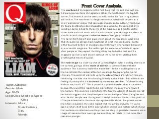
  • 1. Front Cover Analysis. Target Audience: Gender: Male Age: 20-35 Social Class: Middle to Upper Class Interests: Music, Music Festivals, Gigs, Friends The masthead of Q magazine is the first thing that the audience will see. Following conventions of magazines, Q has the masthead in the top left corner. This means it can be seen and will also be the first thing a person will look at. The masthead is a bright red colour, which will be seen as a more ‘aggressive’ colour that can suggest anger and rebellion. This shows it’s trying to attracts a stereotypically male audience. The connotation to rebellion can be linked to the genre of the magazine as it mostly writes about indie and rock music which is what these types of songs are about. It also fits in with the general colour scheme of red, grey and black. The name itself doesn’t give away much about the magazine; suggesting that its audience already has knowledge of what they are buying; due to either buying it before or knowing about it through other people because it is a successful magazine. This will target the audience of middle to upper class people as they expect the things they buy to be the best and if a magazine can be so well known without the name directly telling them anything that means it’s good. The main image is a close-up shot of Liam Gallagher; who is looking directly at the camera, giving a direct mode of address to communicate with the audience. This is done to make the reader feel like he is looking directly at them and holds the readers attention, creating a feeling of privacy and intimacy. The points of interests using the rule of three are right on his eyes, reinforcing the idea that he is looking directly at the reader. This enforces the feeling of privacy which is anchored by the main coverline ‘”It’s been boring without me, hasn’t it?”’ This is posed as a question rather than a statement because they want the reader to be interested in the answer or answer it themselves. This coverline is directed at the target audience of people over 20 because it suggests that they have previous knowledge of Liam Gallagher and what he did. People over that age will clearly know the answer to the question if they're interested in the music Q magazine talks about. The phrase makes them feel included in the niche market that the phrase includes. This once again anchors itself back to the pose which is serious and mature which shows that audience is older because they are more likely to gravitate towards a main image of someone their own age because they can relate to that more than someone younger.
  • 2. The tagline for the magazine is ‘The worlds greatest music magazine’ this will also attract wealthier people because its suggests that its above other magazines and its something that rich people will feel good spending their money on; because its better than others when they spend their money on Q and not other music magazines. The other coverlines featured are ones such as ‘King of Leon RETURNS!’. This stands out because of the explanation mark and because of the colour scheme of red contrasting against the plan background. The cover lines which are more important are in red to match the masthead and they will attract more attention due to their bright colour. The rest of the coverlines stick to the same layout, font and colours. This makes the reader feel more familiar with the magazine and are more likely to buy it if its something they already know. The regular readers will also know exactly what to expect from each colour. They all stand out against the duller background. The bands which are talked about are all indie and rock bands, this enforces the genre of the magazine. Most of the bands which are discussed also feature primarily males so this will attract a male audience because its something they can identify with and see themselves and what they enjoy represented in a good light. The genre of indie and rock is also male dominated in both artist and consumer; this means that targeting the magazine to that audience will give them a wider market when trying to sell the magazine. Following codes and conventions, the barcode is in a place where most people wont look. It takes up white space which would otherwise be empty, this makes the magazine look fuller. The place where the barcode would usually is taken by a white puff which is contrasted with the black shirt making it stand out. Front Cover Analysis. The use of the coverline ‘LIAM THEN. NOW. TOMORROW…’ gives the audience an idea of what the magazine will feature without giving too much away so the reader will still buy the magazine. It gives away enough information about what will be discussed and the fact it doesn’t it say a lot makes the reader intrigued about what will be written about. As it states that it’s a world exclusive before it shows that no other magazine will have the same information that’s why it’s a secret and being kept especially for this magazine. It will once again attract an audience because its something seen as exclusive and somewhere that they can’t find it out anywhere else so they're more willing to spend money on it.
  • 3. Contents Page Analysis. There are two fonts used on the contents pages. One font is used for the titles and another is used for the extra information. The contents page sticks to the colour scheme of red and black that is on the cover. The use of these two fonts keeps the page looking consistent and clean. The font for the extra information is smaller and not bold; this is something the audience would expect because its not as important so it doesn’t stand out as much. The main image on the page uses a direct mode of address as does one of the secondary images. This attracts the audiences attention to the photos as they feel more private and this may be used as a way to convince the reader to read the article featuring the people in the photos. It is a full body shot The extra information in ‘features’ also uses a direct mode of address such as ‘you might think…’ to make the magazine feel more tailored towards the reader and more personal rather than just using more general pronouns so they feel like the magazine is specifically for them and not just anyone. The title for the contents page is bold and the largest writing on the page, next to the masthead for Q. This clearly indicated what the page is. It is also in black on a white background which gives it a contrast. The sub-heading gives a short overview of the main features of the magazine as its called the ‘highlights’ showing that its seen as the best things from this months magazine and is trying to convince the reader to read those articles. The date is right on top of the title, it’s in red with the contrast of the black and plain background to fit the colour scheme. The photos on the page anchor themselves to the articles by having the page numbers in a box on the corner of the. The captions in the boxes in the pictures aren’t directly linked to the articles but more to the photo in a catchy caption. This presents the magazine in a less serious way than other magazines might, this may attract their target audience of males because they are stereotypically more immature and would appreciate this kind of humour. The logo is in the right corner to keep the brand identity clear. This is also kept with the colour scheme of red, black and white. This is even with the main photo of the person wearing red and black. The only thing that doesn’t match is the blue background and once again it is a masculine colour to attract that target audience.
  • 4. Contents Page Analysis. The contents pages are split into three column. With the main image always talking up 2/3 of the page. The colour scheme changed onto blue and green which are still seen as stereotypically seen as male colours. The colour changes with the title of the sub section it talks about. This splits off the page in a way that makes it easy to read and comprehendible in an easy way. The page numbers are in red next to black writing which makes them stand out in contrast. This means that this is the first thing the reader will look at may just go straight there because they know these will be in main things in the magazine. The titles are names of the artists being written about in bold writing. This means that if you know the artist the reader might just go straight there because it’s the boldest thing and doesn’t need the extra information underneath.
  • 5. Double Page Spread Analysis. Each page is split into two columns with the articles. This creates a clean look for the magazine which is easy to read and it sticks to this layout throughout the whole spread. The columns are clearly split with a line which makes it even easier to read so there's no way to get it confused. The font for the main article is easy to read and follows conventions because it’s how the audience would expect the article to look. This means that the reader doesn’t have to struggle so they are more likely to read the article because its something that they are familiar with. The same fonts are used for the date at the top but bolder and bigger. The captions in red boxes on the corner of the photos featured on the double page spread to attract the readers attention as everything else is mostly black and white. This contrast with everything else and means that the readers eyes are attracted to it. The drop cap is used to separate the paragraphs. It isn’t used right at the start of the article which is unusual as most magazines do it to indicate the start of the article but Q uses it when it changed topic. There is one main image on each page. Both images use direct mode of address. This can be used to keep the audiences attention and makes them feel involved in the article rather than just feeling like they're reading something but like they're a part of the article itself; almost as if it’s a conversation rather than an interview. The pose in the first picture is casual which enforce the idea that this is a conversation and can attract the older male audience because it makes them feel even with the person being interviewed rather then the celebrity being superior to them as they most likely wouldn’t like to be seen as they're being talked down to, so that may make them more compelled to carry on reading. The article uses a lot of informal language which is anchored by the causal poses in the image. There is a lot of slang and swearing used which shows that the magazine is targeted towards older people because it uses language which would be inappropriate for younger audiences. That language may also show that its targeted towards males because they're seen as more ‘crude’ and would feel better about that language being used. Swearing also has connotations to being informal and comfortable which cab be linked to it being a conversation and making people feel more involved.
  • 6. Double Page Spread Analysis. There is no white space on the double page spread. This means that the whole page is filled with different things and where the article isn’t writer there are quotes or secondary images. This keeps the magazine original and easy to read but not boring to look at and will keep the audience interested. The branding of the magazine is kept through the colour scheme being kept on the double page spread. These colours are associated with the magazine and even though the magazine logo is only tiny in the corner someone who reads Q magazine will still be able to tell what magazine this is because of the colour scheme. The whole double page spread gives an impression of a casual conversation. This can attract the audience of older male audiences because it seems comfortable and not patronising toward them.
  • 7. How are these connected? All of these link together by the colour scheme of red, black and white. This connects everything together and makes all the pages in the magazine recognizable to Q magazine. The fonts in these are all the same. This once again keeps the magazine on brand and recognisable and keeps the audience engaged as its easily read. The magazine keeps the celebrities it writes about mostly in the same genre; this means that if a person likes a genre of music they will most likely enjoy most of the things being written about or discover new things that they will like. The masthead for Q magazine is in all of these. This keep the magazine on brand and makes sure that the reader always remembers what they're reading and makes it difficult to forget s that they are more likely to buy another issue of the magazine if they enjoyed the first one they read.