
Recomendados
Mais conteúdo relacionado
Último
Último (20)
Destaque
Destaque (20)
Interview questions
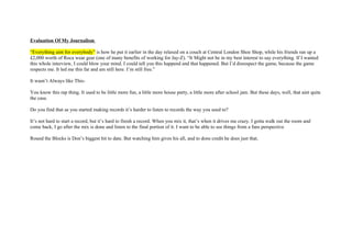
- 1. Evaluation Of My Journalism “Everything aint for everybody” is how he put it earlier in the day relaxed on a couch at Central London Shoe Shop, while his friends ran up a £2,000 worth of Roca wear gear (one of many benefits of working for Jay-Z). “It Might not be in my best interest to say everything. If I wanted this whole interview, I could blow your mind. I could tell you this happend and that happened. But I’d disrespect the game, because the game respects me. It led me this far and am still here. I’m still free.” It wasn’t Always like This- You know this rap thing. It used to be little more fun, a little more house party, a little more after school jam. But these days, well, that aint quite the case. Do you find that as you started making records it’s harder to listen to records the way you used to? It’s not hard to start a record, but it’s hard to finish a record. When you mix it, that’s when it drives me crazy. I gotta walk out the room and come back, I go after the mix is done and listen to the final portion of it. I want to be able to see things from a fans perspective Round the Blocks is Don’s biggest hit to date. But watching him gives his all, and to dons credit he does just that.
- 2. My use of technology In Photoshop, you can use the Paint Tools to draw freehand and to create your own images and graphics. Photoshop’s paint tools consist of the Pencil tool, the Paintbrush, the Airbrush, and the Paint Bucket. I used these tools to edit the photographs I took, removing any unwanted part of the photo, so the image consisted of exactly what I wanted. The ‘magic wand tool’. I used this tool in order to add text to the page. If I needed to edit the text inserted, I used these options to do so. These allowed me to change the font style, with a choice of various font families, and also change the size, make it bold, italic, or underlined. I used the paint tool to make my front page and double spread more colourful and eye catching the Paintbrush also draws, but rather than having a sharp edge, the edge is softer and slightly transparent: A gradient is a fill consisting of two or more colours blending together. Here is a simple example of a gradient, beginning with white and ending with black:
- 3. Audience theory When designing my production, I will need to ensure that my idea is specifically targeting my target audience. In this case Hip-Hop and R&B listeners, even though there are a number of other theories, which relate to constructing an audience. In term, of Burton’s theory between socially grouped audiences and media grouped audiences, my age group will be between the ages of 13 above. As my target audience is amongst this age group. The most common listeners would be the 13-30 age groups. They would usually be undergoing education in college or university or being employed in a part-time job or Full-time. In terms of media grouped audience, which focuses on their relationship with the media, my target audience would share an interest in fashion, the latest Music and other real life situations, which the media highlights. Burton’s classification of socially grouped audiences, and identify further subjective which identify more specific regions, which offer motives appropriate to my audience. For example, my target audience would have personal interest in, Music, celebrities, real life and other issues which would appeal to my target audience, and this idea would persuade readers to buy my magazines as it would personally appeal to their aspirations. The ethnic grouping of my audience will play a role in my choice of images and messages. The genre of music I am focusing on (Hip-Hop and R&B) mainly targets the black urban community. Richard Dyer suggests that people will respond to a message if it offers them a positive outlook for the inadequacies of their own lives. In my case, my magazine will provide energy for those who feel exhaustion, by providing bold headings, with colour schemes that give of a sense of energy. It will also a sense of community for those who feel isolated, as I plan to produce a real life story for my double page spread, which can help the reader feel involved and can also, in some cases, relate to it through their own experiences. For example, if my real life story was to be based around Tragedy, there would be clear motives I could offer based on this theory such as clarity on facts and a community device as people who can relate to the story, might feel as if they are not alone. Abraham Maslow suggests in his theory, that everyone has 8 basic needs; therefore if I target these needs I will have a greater chance of fulfilling my target audience’s requirements. In my case, the top two needs in Maslow’s hierarchy apply to my magazine, as humans feel as if they need to have self-esteem, confidence and a sense of achievement. It also relates to self- actualisation, as I will insure that my magazine includes that strategy which enables the reader to accept facts and creativity. This can support the theory of hoe men supply their wages
- 4. Colour Schemes: for my magazine I am hoping to use a range of two to three different colours to: After reaching other magazines and what colours they use, I narrowed my list of colours down to 6 different colours. White: is the colour that represents purity, neutrality, sterility and youth. The reason why I chose white is because White is a neutral colour that will continue to be the preferred backdrop on websites and the “colour” behind the colour. This suits the audience I am targeting cause it is associated with Light, reverence, purity, truth, peace, innocence, cleanliness, simplicity. Black: It has an ominous characteristic, symbolizing death. • It has an air of intelligence (graduation robes), marked with rebellion (the bad guy), shrouded in mystery (space). • Black’s evil symbolism complements the good in the world. Whatever the social, economic, political environment, I Chose Black because; it will always be a popular colour in all industries including the music industry which would target my audience. Red is the color of celebration and good luck (China), purity and integrity (India). I chose Red Because It is so bold and audacious; it usually dilutes the colours around it. That’s why it’s used to accent and highlight objects of importance.
- 5. Plan For the magazine I am hoping to use the following ideas to help me design my magazine. Title Ideas: for my magazine cover I am hoping to choose one out of the following names: • G.M.: this stands for gifted musicians. Abbreviations are common these days with magazines. This makes people feel superior cause they may no what it means • Seeing Sounds: I don’t think this would work in my title but I think it will work well as a slogan. • Mr Exclusive: this name possesses certain qualities that give the tale verisimilitude. This is a name that would be remembered as a good magazine, it could associate with music legends. • Shake: is a rhythmic movement, this could target an audience that is into dance and up-tempo music Ideas that have been discarded: • Unix • Ridely • Unique • Ballers
- 6. • All or Nothing I after looking at all possible title names; I have decided to choose Mr Exclusive. Because I feel it is easy to pronounce, it’s also a common word used, this could also appeal to my target audience for example, and their favourite artists can be considered legends in their main genre. Evaluation of a Contents Page Key conventions of the magazine After producing two radial analyses of existing magazine covers similar to my own production, I found key conventions which could be seen in both magazine covers. Firstly, the colour schemes which were generally used were colours such as Red, Blue and Black. These colours are stereotypically seen to be “masculine” colours as they are generally associated with being favoured amongst the male generation, The connotations of the colours black and red are generally associated with passionate, strong, something which will provide energy and confidence to the audience. The fonts used were generally bold to grab the reader’s attention and formatted on top of the covers to ensure that the model was the key object which grabbed main attention. The uses of different fonts were also used in both magazine covers to make the fonts look different from one another and almost make them look unique in their own way. From this observation, I will ensure that my cover will have different types of font to make the cover look as eye-catching as possible.
- 7. The fonts used were generally bold to grab the reader’s Front Cover Evaluation attention and formatted on top of the covers to ensure that the model was the key object which grabbed main attention Firstly, the colour schemes which were generally used were colours such as Red and Black. These colours This is a catchy album are stereotypically seen to be name that also “masculine” colours as they are supports are audience generally associated with being theories which are favoured amongst the male males around the ages of 15-20. That makes generation. the magazine seem more official and realistic The connotations of the colours black This is a column for our and red are generally associated with latest artists and I used the connotations of the colours passionate, strong, something which black and red are generally will provide energy and confidence to associated with passionate, the audience. This is essential for how strong, something which to grasp our reader’s attention by will provide energy and confidence to the audience. making an effective quote that is aimed towards are audience.
- 8. Contents Page Evaluation Abraham Maslow suggests in his theory, that everyone has 8 basic needs; therefore if I target these needs I will have a greater chance of fulfilling my target audience’s requirements. In my case, the top two needs in Maslow’s hierarchy apply to my magazine, as humans feel as if they need to have self-esteem, confidence and a sense of achievement. It also relates to self- actualisation, as I will insure that my magazine includes that Burton’s classification of socially grouped strategy which enables the reader to audiences, and identify further subjective which accept facts and creativity. identify more specific regions, which offer motives appropriate to my audience. For example, my target audience would have This main column on my contents personal interest in, Music, celebrities, real life page is the featured artist I used that and other issues which would appeal to my relate towards my audience theory. target audience, and this idea would persuade Richard Dyer suggests that people will readers to buy my magazines as it would respond to a message if it offers them personally appeal to their aspirations. The a positive outlook for the inadequacies ethnic grouping of my audience will play a role in of their own lives. In my case, my my choice of images and messages. The genre of magazine will provide energy for those music I am focusing on (Hip-Hop and R&B) mainly who feel exhaustion, by providing bold targets the black urban community. headings, with colour schemes that give of a sense of energy.
- 9. I constructed this image to support my audience theory For example, my target audience would have personal interest in, Music, celebrities, real life and Double Page Evaluation other issues which would appeal to my target audience, and this idea would persuade readers to buy my magazines as it would personally appeal to Richard Dyer suggests that people their aspirations. The will respond to a message if it offers ethnic grouping of my them a positive outlook for the audience will play a role in inadequacies of their own lives. In my choice of images and my case, my magazine will provide messages. The genre of energy for those who feel music I am focusing on exhaustion, by providing bold (Hip-Hop and R&B) mainly headings, with colour schemes that targets the give of a sense of energy. It will also a sense of community for those who feel isolated, as I plan to produce a real life story for my double page spread, which can help the reader The fonts used were feel involved and can also, in some generally bold to grab the cases, relate to it through their own reader’s attention and experiences. For example, if my real formatted on bottom of the life story was to be based around covers to ensure that the Tragedy, there would be clear model was the key object motives I could offer based on this which grabbed main theory such as clarity on facts and a attention. community device as people who can relate to the story, might feel as if they are not alone.