SlideShare uma empresa Scribd logo
1 de 10
Baixar para ler offline
From Teaching Geography, Second Edition, by Phil Gersmehl. Copyright 2008 by The Guilford Press.
Permission to photocopy is granted to purchasers of this book for personal use only (see copyright
page for details).

182
Teacher ’s Guide for Transparencies 1A and 1B

Transparency 1A is a bad example (and 1B is a good example) of a choropleth (CORE-oh-pleth)
map.
    The choropleth map “language” is used to show information that is collected and reported
for political units, such as countries, states, counties, or election districts. Examples of such
information include census data, crime rates, and percentages of people who voted for a partic-
ular candidate.
    Reporting information by political areas does not tell us about the internal arrangement of
things in an area. To avoid confusion, therefore, cartographers have adopted three conventions
about how to make choropleth maps:
 1. Use choropleth maps only for ratio data (numbers you get when you divide two counts,
    such as the amount of production and number of people, in order to get a ratio such as
    production per person). That is what Transparency 1B does right. Map 1A uses
    choropleth symbols to show counts. This can be misleading, because two small states
    might actually have greater total production than a large state, but their lighter color
    implies otherwise. It would better to use scaled symbols (e.g., circles of different sizes) to
    show counts, because readers can visually compare the size of a graduated symbol with the
    size of a state to get a more accurate picture.
 2. Choose category boundaries carefully. Map 1A has numbers to show actual production in
    the top three states. How different would the map seem if the darkest category had only
    states with more than 10 billion dollars of farm products? This question raises an impor-
    tant point: a map maker has plenty of chances to make choices that are not technically
    “wrong” but still alter the impression that a map conveys. That realization is a useful
    learner outcome.
 3. Arrange colors in a logical sequence. The conventional rule is to represent low values with
    light colors and higher values with progressively darker colors.
Activity: Have students find choropleth maps in magazines and newspapers. Did the authors of
the maps follow these three basic rules? You may be surprised how often they don’t. If you find
a particularly good (bad!) example, cover the legend and ask students which areas have the
highest values. Discussion should lead to two conclusions:
    A map with poor category choices and/or a nonintuitive color sequence may accurately
      portray each individual area, BUT
    The reader has to work harder to see the overall pattern.
Since the clear depiction of spatial patterns is a major goal in making maps, students should
wonder whether someone who chooses awkward categories or a bad color sequence is just
ignorant or is deliberately trying to mislead.
Activity: Give students a table of numbers for an area with about 20 sub-areas, and have them
make choropleth maps with different numbers of categories and boundaries between them.
    For a how-to manual with interesting data, get Thematic Maps: Visualizing Patterns, by Carol
Gersmehl, prepared for the Tennessee Geographic Alliance summer institutes and used in
many other states. I freely admit that I “borrowed” many ideas from this teacher-tested manual.
I also realize that the one-page discussion here is sketchy, but remember, this page has just two
of 85 example transparencies; keep reading!


                                                                                              183
From Teaching Geography, Second Edition, by Phil Gersmehl. Copyright 2008 by The Guilford Press.
Permission to photocopy is granted to purchasers of this book for personal use only (see copyright
page for details).

184
Teacher ’s Guide for Transparency 1C

This map is a greatly simplified 1:24,000 topographic map. Topographic maps like this are
available for most parts of the United States; go to www.topozone.com or write to the Map Distri-
bution Center, U.S. Geological Survey, Federal Center, Denver, CO 80225, for a (free!) index
map of your state, which you can use to select maps for purchase.
Activity: Put a topographic map of your local area on a bulletin board. This kind of map can
show familiar details in a new light, which can prompt lively discussion of subjects being cov-
ered in class and questions that students generate on their own.
   A key to successful use of topographic maps is to know the advantages and limitations of
each scale. For example, a map with a scale of 1:24,000 (the fraction means that an inch on the
map is 24,000 inches or 2,000 feet in the real world) has a wealth of fine detail but cannot show
more than a few dozen square miles at a time. If you have a lot of display space, tile several of
these maps together to show a larger area. A subject the size of Atlanta, Georgia, and its sub-
urbs, for instance, would make an impressive wall display. A map of Georgia at that scale, how-
ever, would need a gymnasium floor.
   The answer to this dilemma is to find other maps at different scales. The U.S. Geological
Survey also makes available maps at scales of 1:100,000; 1:250,000; and whole-state maps at
appropriate (smaller!) scales.


                     Teacher ’s Guide for Transparency 1D

At a scale of 1:250,000, a topographic map is useful for planning how to get from one place to
another. Maps at this scale show major roads, rivers, terrain features, and forest regions. As you
can see on this transparency, however, a 1:250,000 map cannot show individual buildings or
details such as the rapids in the river. In other words, someone looking at a map of Harpers
Ferry at a scale of 1:250,000 will miss precisely what seemed most strategically important at a
scale of 1:24,000, namely the presence of shallow water that makes the river easy to cross (see
the CD unit on Transitions).
    This raises very important point: much of what we “know” about the world depends on the
scale at which we view it. It is therefore wise to examine places at several scales.
Activity: Have students gather as many different maps as they can find for a specific area. Look
at maps in newspapers, county and city offices, Chambers of Commerce, travel brochures (e.g.,
in rest stops and plazas on Interstate Highways), and road maps.
    Then, post the maps (or copies of them) in scale order, with the most detailed maps at one
end and maps that cover an entire state or country on the other. Ask students to examine the
maps and tabulate what kinds of information appear at each scale. The flip side of that coin is a
good test question: “What scale map should you ask for if you want to find out about the pat-
tern of houses in Roseville? the distance from Moscow to Berlin? and so on?”
Extra: The DeLorme Company (www.delorme.com) has compiled books of topographic maps for
each state. Those books are great resources for class use, field trips, or personal travel!


                                                                                              185
From Teaching Geography, Second Edition, by Phil Gersmehl. Copyright 2008 by The Guilford Press.
Permission to photocopy is granted to purchasers of this book for personal use only (see copyright
page for details).

186
Teacher ’s Guide for Transparency 1E

Iron and steel mills were big business, particularly in the late 1800s. Like textiles in the early
1800s, autos in the mid-1900s, and computers in the late 1900s, these factories employed mil-
lions of workers. Moreover, they required the purchase of many other kinds of products, and
they provided “raw” materials for many other goods and services. As a result, during its peak
each of these industries had a great inf luence on patterns of wealth and population.
    If you want to understand the world economy of the late 1800s, therefore, you have to look
at where iron and steel were made.
    This map shows part of Europe. It is deliberately drawn with very faint lines for national
borders, because in fact these borders changed several times. Moreover, many of the interna-
tional tensions that led to wars in the 20th century involved control of key transportation
routes and the raw materials for iron and steel mills.
Activity: Show the transparency and ask which lettered places would be good locations for steel
mills. The names are not important for this activity, but in order from A to I, the places are a
mountain village in Norway; Birmingham, England; Paris, France; Essen-Dusseldorf in the Ruhr
Valley of Germany; Verona, Italy; the western end of the Carpathian Mountains; the port city
of Gdansk, Poland; Budapest, Hungary; Istanbul; Aleppo, Syria; the Donetsk area of Ukraine;
Banghazi, Libya; and Madrid, Spain.
    Of those, D was and is the largest steel center; it is located close to major coal deposits and
is directly downstream from the largest iron ore mines in Europe. Places B and K are also
important. To make this Activity more analytical, read on.


                      Teacher ’s Guide for Transparency 1F

The recipe for steel is simple: mix coal, iron ore, and limestone. Cook well, making sure you
don’t burn yourself! Then cool the steel and ship it to the customers. Unfortunately, the raw
materials and buyers are usually in different places. As a result, people building a steel mill
must pick a compromise location (see the CD unit on Changing Technology).
    This transparency graphically shows that a blast furnace needs more coal than ore, and
therefore it usually makes sense to put it close to coal mines. Moreover, since it is cheaper to
transport heavy material in boats than by other means, it usually makes sense to put mills on
major rivers or in ports. (Think of the locations of famous steel mill areas in the United States:
Pittsburgh, Cleveland, Detroit, Gary, Chicago, and Baltimore are all on navigable water, and
they all are much closer to sources of coal than to major deposits of iron ore, which are in
northern Michigan, Minnesota, and Brazil.)
Activity: Use this diagram to aid a discussion of Transparency 1E. Then, if desired, have stu-
dents try to draw a similar diagram showing the inputs and outputs of another industry.
   Caution: Steel production is a “heavy” industry; the raw materials and final product weigh a
   great deal and are expensive to transport. As a result, people try to locate factories between
   the sources of raw materials and the market. Some industries have raw materials and prod-
   ucts that are light and easy to transport. Those factories can be located almost anywhere.
Activity: Have students try to classify specified industries as heavy or light; for example, oil
refining (H), computer assembly (L), copper smelting (H), diamond cutting (L), grain milling
(H), and sewing shirts or backpacks (sort of in between). Heavy industries are usually located
close to raw materials. Most industries in the light and in-between categories tend to be located
closer to other inputs, such as skilled labor, capital, clean water, and so on.


                                                                                               187
From Teaching Geography, Second Edition, by Phil Gersmehl. Copyright 2008 by The Guilford Press.
Permission to photocopy is granted to purchasers of this book for personal use only (see copyright
page for details).

188
Teacher ’s Guide for Transparency 1G

A key to finding a good location for production in a heavy industry is to minimize the cost of
transporting raw materials. Assigning “penalties” to potential sites is a way to make analysis of
this factor more rigorous than simply “eyeballing” a map.
Activity: Use the map in Transparency 1E, but with the following calculations:
  1. Estimate the distance from a source of coal or iron ore to your factory site.
  2. Note whether the route goes over land or by boat.
  3. Calculate the transportation penalty.
If this seems too easy for your students, you can add complexity in several ways. Add penalties
for crossing mountains or national borders. Add penalties for areas with severe air and water
pollution, such as the Ruhr or middle Elbe. Have them do research on mining and add penal-
ties for using low quality coal or iron ore.


                      Teacher ’s Guide for Transparency 1H

With Transparency 1F, this diagram helps introduce some really knotty policy questions:
   What should people do when changing technology has made their town a less desirable
     location for a particular kind of industry? (See the CD unit on Changing Technology).
   What should people do when doing “what they always have done” is no longer competitive
     in the international economy?
Phrasing a question in a particular way tends to restrict the range of options that might be con-
sidered. This is important for students to learn, because the two questions above really address
different aspects of the same issue. Emphasize that a decreasing ability to compete may not be
anyone’s “fault.” The human tendency is to seek a scapegoat – to blame factory owners, labor
unions, recent immigrants, or government policy for something that may be nothing more
(and nothing less!) than a geographic consequence of a change in technology.
    It may be useful to put the question into a larger perspective: a change in technology has
made steel production more efficient and steel less expensive. Consumers in all parts of a coun-
try have gained, but producers in a few areas have been hurt. A humane society should take this
geographic fact into account in designing welfare and migration policies.
Activity: Assign roles (e.g., mayor, labor leader, minister, storekeeper, etc.) for students to play
in simulating a town that loses its major employer.
    Transparencies 1E–1H can help a teacher show why an old steel mill may not be able to
compete with new electric furnaces in a location well suited to that technology. Or, if desired,
modify the simulation above to fit some other economic activity, such as a textile mill, a meat-
packing plant, a drive-in theater, or a small video store threatened by a new superstore. Have
students discuss the threatened business’s options: moving away, retraining for other work, and
so on. Have them prepare maps to illustrate the options. The key question is: Can the proposed
new activity work in the current environment? This is the big question of economic geography;
it can take years to learn how to answer it well. Four transparencies aren’t enough, but we have
learned enough to say that a society is in trouble if its citizens graduate from school and still see
no need to think about the locational consequences of technological change!


                                                                                                189
From Teaching Geography, Second Edition, by Phil Gersmehl. Copyright 2008 by The Guilford Press.
Permission to photocopy is granted to purchasers of this book for personal use only (see copyright
page for details).

190
Teacher ’s Guide for Transparency 1I

The basic idea of “per” data is simple: a quantity is divided by the number of individuals who
“share” it.
    It must be admitted, however, that the real-world use of per data can be confusing, espe-
cially if we are not sure what is being divided by what. This raises a difficult question: how can
students accurately understand a newspaper or television story if they cannot figure out how
the tables or maps of per data were made? It helps, then, for teachers to use per data fre-
quently, so that students gradually improve their ability to interpret the results.
Activity: Project this Transparency and have students fill in the blanks by dividing the total land
area number by the population number. Since both numbers are expressed in millions, the mil-
lions “cancel out” and the result is the number of acres per person. Work through some of the
examples that have already been calculated – the answers for the blanks are 4.5 for Mexico, 1.0
for Germany, and 0.7 for Japan.
    Once students get the idea, you can extend the discussion. For example, is the number of
acres per person the most useful per number, or would something else be more meaningful? It
might be noted that people cannot grow food in deserts or high mountains. Before doing the
calculation, therefore, it might be useful to know the proportion of the land that could be used
to grow food. To make a link to Transparency 1J, write the following numbers next to the coun-
try names: 13, 63, 5, 19, 14, 35, 13. These numbers indicate the percentage of land area that
can be used for crops (right, that’s another per number!). Multiplying Argentina’s 684 million
acres of land by 13 percent (13/100) gives a result of 89 million acres of cropland. The answers
to this calculation are in the first column of Transparency 1J.


                      Teacher ’s Guide for Transparency 1J

Repeat the recipe for “per” data: “take the quantity you want to measure and divide it by a num-
ber that can make the data meaningful.” Agricultural land, for example, is meaningful in terms
of how many people must be fed. A relevant per measure, therefore, is the number of acres per
person (the number of acres of cropland divided by the number of people).
Activity: Project this Transparency and have students calculate the number of cropland acres
per person (0.64 for Mexico, 0.37 for Germany, less than 0.1 for Japan; underscore that the
amount of cropland per person in Japan is less than 1/20th as much as in the United States).
    These numbers, as Postscript 1-1 says, are one reason Americans are not as concerned as
people in other countries about “values” issues in geography. Compared with those of other
industrial countries, residents of the United States have always had plenty of cropland for food
and plenty of “empty” land for new buildings, roads, parks, waste disposal, and other uses. As
population increases, however, land issues become more important, which is one reason for
the present upsurge of interest in geography in America.
    It is important to keep in mind that all land is not equally productive. This observation
leads to another kind of “per”data: yield per acre. The average yield of wheat per acre of cold
Canadian soil is much less than the corn yield in Iowa, and both are low compared with yields
in tropical Bangladesh or southern China, where farmers can get several crops of rice each
year. Almanacs or encyclopedias (or www.cia.gov) can provide data for calculating ratios such as
food production per person.


                                                                                               191

Mais conteúdo relacionado

Semelhante a Transparencies ch01-pp182-191

Transparencies ch02-pp192-201
Transparencies ch02-pp192-201Transparencies ch02-pp192-201
Transparencies ch02-pp192-201lschmidt1170
 
Transparencies ch10-pp300-303
Transparencies ch10-pp300-303Transparencies ch10-pp300-303
Transparencies ch10-pp300-303lschmidt1170
 
Geographical Sources Governmental Publications/ Documents Continuing Resour...
Geographical Sources  Governmental Publications/ Documents  Continuing Resour...Geographical Sources  Governmental Publications/ Documents  Continuing Resour...
Geographical Sources Governmental Publications/ Documents Continuing Resour...Janecatalla
 
Transparencies ch04-pp220-245
Transparencies ch04-pp220-245Transparencies ch04-pp220-245
Transparencies ch04-pp220-245lschmidt1170
 
Continuing Our Look At Primary And Secondary Data
Continuing Our Look At Primary And Secondary DataContinuing Our Look At Primary And Secondary Data
Continuing Our Look At Primary And Secondary Dataguest9fa52
 
Transparencies ch08-pp284-293
Transparencies ch08-pp284-293Transparencies ch08-pp284-293
Transparencies ch08-pp284-293lschmidt1170
 
Exploring our geographic world by tessie calimag bb.
Exploring our geographic world by tessie calimag bb.Exploring our geographic world by tessie calimag bb.
Exploring our geographic world by tessie calimag bb.Tessie Calimag
 
Exploring our geographic world by tessie calimag bb.
Exploring our geographic world by tessie calimag bb.Exploring our geographic world by tessie calimag bb.
Exploring our geographic world by tessie calimag bb.Tessie Calimag
 
Transparencies ch07-pp274-283
Transparencies ch07-pp274-283Transparencies ch07-pp274-283
Transparencies ch07-pp274-283lschmidt1170
 
Staff Luncheon Geosources
Staff Luncheon GeosourcesStaff Luncheon Geosources
Staff Luncheon Geosourcesroycekitts
 
Statistical techniques in geographical analysis
Statistical techniques in geographical analysisStatistical techniques in geographical analysis
Statistical techniques in geographical analysisakida mbugi
 
Geographical Sources
Geographical SourcesGeographical Sources
Geographical SourcesJohan Koren
 
GEOGRAPHIC SKILLS: CHOROPLETH MAPS
GEOGRAPHIC SKILLS: CHOROPLETH MAPSGEOGRAPHIC SKILLS: CHOROPLETH MAPS
GEOGRAPHIC SKILLS: CHOROPLETH MAPSGeorge Dumitrache
 
Chapter 1: True Maps, False Impressions
Chapter 1: True Maps, False ImpressionsChapter 1: True Maps, False Impressions
Chapter 1: True Maps, False Impressionsjstubblefield
 
Transparencies intro-pp180-181
Transparencies intro-pp180-181Transparencies intro-pp180-181
Transparencies intro-pp180-181lschmidt1170
 

Semelhante a Transparencies ch01-pp182-191 (20)

Transparencies ch02-pp192-201
Transparencies ch02-pp192-201Transparencies ch02-pp192-201
Transparencies ch02-pp192-201
 
Transparencies ch10-pp300-303
Transparencies ch10-pp300-303Transparencies ch10-pp300-303
Transparencies ch10-pp300-303
 
Geographical Sources Governmental Publications/ Documents Continuing Resour...
Geographical Sources  Governmental Publications/ Documents  Continuing Resour...Geographical Sources  Governmental Publications/ Documents  Continuing Resour...
Geographical Sources Governmental Publications/ Documents Continuing Resour...
 
Transparencies ch04-pp220-245
Transparencies ch04-pp220-245Transparencies ch04-pp220-245
Transparencies ch04-pp220-245
 
Cataloging maps
Cataloging mapsCataloging maps
Cataloging maps
 
Continuing Our Look At Primary And Secondary Data
Continuing Our Look At Primary And Secondary DataContinuing Our Look At Primary And Secondary Data
Continuing Our Look At Primary And Secondary Data
 
Transparencies ch08-pp284-293
Transparencies ch08-pp284-293Transparencies ch08-pp284-293
Transparencies ch08-pp284-293
 
Exploring our geographic world by tessie calimag bb.
Exploring our geographic world by tessie calimag bb.Exploring our geographic world by tessie calimag bb.
Exploring our geographic world by tessie calimag bb.
 
Exploring our geographic world by tessie calimag bb.
Exploring our geographic world by tessie calimag bb.Exploring our geographic world by tessie calimag bb.
Exploring our geographic world by tessie calimag bb.
 
Map reading
Map readingMap reading
Map reading
 
Transparencies ch07-pp274-283
Transparencies ch07-pp274-283Transparencies ch07-pp274-283
Transparencies ch07-pp274-283
 
Staff Luncheon Geosources
Staff Luncheon GeosourcesStaff Luncheon Geosources
Staff Luncheon Geosources
 
Statistical techniques in geographical analysis
Statistical techniques in geographical analysisStatistical techniques in geographical analysis
Statistical techniques in geographical analysis
 
Geographical Sources
Geographical SourcesGeographical Sources
Geographical Sources
 
Unit I - Introduction to Maps.pptx
Unit I - Introduction to Maps.pptxUnit I - Introduction to Maps.pptx
Unit I - Introduction to Maps.pptx
 
Introduction to Maps
Introduction to MapsIntroduction to Maps
Introduction to Maps
 
GEOGRAPHIC SKILLS: CHOROPLETH MAPS
GEOGRAPHIC SKILLS: CHOROPLETH MAPSGEOGRAPHIC SKILLS: CHOROPLETH MAPS
GEOGRAPHIC SKILLS: CHOROPLETH MAPS
 
Chapter 1: True Maps, False Impressions
Chapter 1: True Maps, False ImpressionsChapter 1: True Maps, False Impressions
Chapter 1: True Maps, False Impressions
 
Transparencies intro-pp180-181
Transparencies intro-pp180-181Transparencies intro-pp180-181
Transparencies intro-pp180-181
 
Viz class forphysicists
Viz class forphysicistsViz class forphysicists
Viz class forphysicists
 

Mais de lschmidt1170

How did the magna carta influence the united states bill of rights
How did the magna carta influence the united states bill of rightsHow did the magna carta influence the united states bill of rights
How did the magna carta influence the united states bill of rightslschmidt1170
 
Sustainable development goals
Sustainable development goalsSustainable development goals
Sustainable development goalslschmidt1170
 
Magna cartas lessons for the me
Magna cartas lessons for the meMagna cartas lessons for the me
Magna cartas lessons for the melschmidt1170
 
What is the magna carta and why there is a google doodle telegraph
What is the magna carta and why there is a google doodle    telegraphWhat is the magna carta and why there is a google doodle    telegraph
What is the magna carta and why there is a google doodle telegraphlschmidt1170
 
Universal declaration of human rights
Universal declaration of human rightsUniversal declaration of human rights
Universal declaration of human rightslschmidt1170
 
Magna carta and the law of nature
Magna carta and the law of natureMagna carta and the law of nature
Magna carta and the law of naturelschmidt1170
 
King john the most evil monarch in britain's history telegraph
King john  the most evil monarch in britain's history   telegraphKing john  the most evil monarch in britain's history   telegraph
King john the most evil monarch in britain's history telegraphlschmidt1170
 
How did the magna carta influence the united states bill of rights
How did the magna carta influence the united states bill of rightsHow did the magna carta influence the united states bill of rights
How did the magna carta influence the united states bill of rightslschmidt1170
 
Constitution billofrightsfacts
Constitution billofrightsfactsConstitution billofrightsfacts
Constitution billofrightsfactslschmidt1170
 
Feudal strength! henry ii and the struggle for royal control in
Feudal strength!  henry ii and the struggle for royal control inFeudal strength!  henry ii and the struggle for royal control in
Feudal strength! henry ii and the struggle for royal control inlschmidt1170
 
A magna carta for the earth oecd observer
A magna carta for the earth    oecd observerA magna carta for the earth    oecd observer
A magna carta for the earth oecd observerlschmidt1170
 
Denis haley catherine douglas geneaology 1793 to 1989
Denis haley catherine douglas geneaology 1793 to 1989Denis haley catherine douglas geneaology 1793 to 1989
Denis haley catherine douglas geneaology 1793 to 1989lschmidt1170
 
Na map 1 with terms
Na map 1 with termsNa map 1 with terms
Na map 1 with termslschmidt1170
 
Introfall 2016 14week
Introfall 2016 14weekIntrofall 2016 14week
Introfall 2016 14weeklschmidt1170
 
Fall 2016 syllabus geog 110 71
Fall 2016 syllabus geog 110 71Fall 2016 syllabus geog 110 71
Fall 2016 syllabus geog 110 71lschmidt1170
 
Intro fall 2016 geog lab
Intro fall 2016 geog labIntro fall 2016 geog lab
Intro fall 2016 geog lablschmidt1170
 
Fall 2016 intro wed
Fall 2016 intro wedFall 2016 intro wed
Fall 2016 intro wedlschmidt1170
 
Fall 2016 intro mon
Fall 2016 intro monFall 2016 intro mon
Fall 2016 intro monlschmidt1170
 

Mais de lschmidt1170 (20)

How did the magna carta influence the united states bill of rights
How did the magna carta influence the united states bill of rightsHow did the magna carta influence the united states bill of rights
How did the magna carta influence the united states bill of rights
 
Sustainable development goals
Sustainable development goalsSustainable development goals
Sustainable development goals
 
Magna cartas lessons for the me
Magna cartas lessons for the meMagna cartas lessons for the me
Magna cartas lessons for the me
 
What is the magna carta and why there is a google doodle telegraph
What is the magna carta and why there is a google doodle    telegraphWhat is the magna carta and why there is a google doodle    telegraph
What is the magna carta and why there is a google doodle telegraph
 
Universal declaration of human rights
Universal declaration of human rightsUniversal declaration of human rights
Universal declaration of human rights
 
Magna carta and the law of nature
Magna carta and the law of natureMagna carta and the law of nature
Magna carta and the law of nature
 
King john the most evil monarch in britain's history telegraph
King john  the most evil monarch in britain's history   telegraphKing john  the most evil monarch in britain's history   telegraph
King john the most evil monarch in britain's history telegraph
 
How did the magna carta influence the united states bill of rights
How did the magna carta influence the united states bill of rightsHow did the magna carta influence the united states bill of rights
How did the magna carta influence the united states bill of rights
 
Constitution billofrightsfacts
Constitution billofrightsfactsConstitution billofrightsfacts
Constitution billofrightsfacts
 
Feudal strength! henry ii and the struggle for royal control in
Feudal strength!  henry ii and the struggle for royal control inFeudal strength!  henry ii and the struggle for royal control in
Feudal strength! henry ii and the struggle for royal control in
 
Constitution
ConstitutionConstitution
Constitution
 
Bill of rights
Bill of rightsBill of rights
Bill of rights
 
A magna carta for the earth oecd observer
A magna carta for the earth    oecd observerA magna carta for the earth    oecd observer
A magna carta for the earth oecd observer
 
Denis haley catherine douglas geneaology 1793 to 1989
Denis haley catherine douglas geneaology 1793 to 1989Denis haley catherine douglas geneaology 1793 to 1989
Denis haley catherine douglas geneaology 1793 to 1989
 
Na map 1 with terms
Na map 1 with termsNa map 1 with terms
Na map 1 with terms
 
Introfall 2016 14week
Introfall 2016 14weekIntrofall 2016 14week
Introfall 2016 14week
 
Fall 2016 syllabus geog 110 71
Fall 2016 syllabus geog 110 71Fall 2016 syllabus geog 110 71
Fall 2016 syllabus geog 110 71
 
Intro fall 2016 geog lab
Intro fall 2016 geog labIntro fall 2016 geog lab
Intro fall 2016 geog lab
 
Fall 2016 intro wed
Fall 2016 intro wedFall 2016 intro wed
Fall 2016 intro wed
 
Fall 2016 intro mon
Fall 2016 intro monFall 2016 intro mon
Fall 2016 intro mon
 

Último

ECOLUXE pre-ESPYS Ultimate Sports Lounge 2024
ECOLUXE pre-ESPYS Ultimate Sports Lounge 2024ECOLUXE pre-ESPYS Ultimate Sports Lounge 2024
ECOLUXE pre-ESPYS Ultimate Sports Lounge 2024Durkin Entertainment LLC
 
NO1 Certified Black magic specialist,Expert in Pakistan Amil Baba kala ilam E...
NO1 Certified Black magic specialist,Expert in Pakistan Amil Baba kala ilam E...NO1 Certified Black magic specialist,Expert in Pakistan Amil Baba kala ilam E...
NO1 Certified Black magic specialist,Expert in Pakistan Amil Baba kala ilam E...Amil Baba Dawood bangali
 
办理滑铁卢大学毕业证成绩单|购买加拿大文凭证书
办理滑铁卢大学毕业证成绩单|购买加拿大文凭证书办理滑铁卢大学毕业证成绩单|购买加拿大文凭证书
办理滑铁卢大学毕业证成绩单|购买加拿大文凭证书zdzoqco
 
What Life Would Be Like From A Different Perspective (saltyvixenstories.com)
What Life Would Be Like From A Different Perspective (saltyvixenstories.com)What Life Would Be Like From A Different Perspective (saltyvixenstories.com)
What Life Would Be Like From A Different Perspective (saltyvixenstories.com)Salty Vixen Stories & More
 
Zoom In Game for ice breaking in a training
Zoom In Game for ice breaking in a trainingZoom In Game for ice breaking in a training
Zoom In Game for ice breaking in a trainingRafik ABDI
 
Taken Pilot Episode Story pitch Document
Taken Pilot Episode Story pitch DocumentTaken Pilot Episode Story pitch Document
Taken Pilot Episode Story pitch Documentf4ssvxpz62
 
Flying Avocado Cat Cryptocurrency Created, Coded, Generated and Named by Grok...
Flying Avocado Cat Cryptocurrency Created, Coded, Generated and Named by Grok...Flying Avocado Cat Cryptocurrency Created, Coded, Generated and Named by Grok...
Flying Avocado Cat Cryptocurrency Created, Coded, Generated and Named by Grok...TeslaStakeHolder
 
A Spotlight on Darla Leigh Pittman Rodgers: Aaron Rodgers' Mother
A Spotlight on Darla Leigh Pittman Rodgers: Aaron Rodgers' MotherA Spotlight on Darla Leigh Pittman Rodgers: Aaron Rodgers' Mother
A Spotlight on Darla Leigh Pittman Rodgers: Aaron Rodgers' Motherget joys
 
Fight Scene Storyboard (Action/Adventure Animation)
Fight Scene Storyboard (Action/Adventure Animation)Fight Scene Storyboard (Action/Adventure Animation)
Fight Scene Storyboard (Action/Adventure Animation)finlaygoodall2
 
Statement Of Intent - - Copy.documentfile
Statement Of Intent - - Copy.documentfileStatement Of Intent - - Copy.documentfile
Statement Of Intent - - Copy.documentfilef4ssvxpz62
 
Uk-NO1 Amil In Karachi Best Amil In Karachi Bangali Baba In Karachi Aamil In ...
Uk-NO1 Amil In Karachi Best Amil In Karachi Bangali Baba In Karachi Aamil In ...Uk-NO1 Amil In Karachi Best Amil In Karachi Bangali Baba In Karachi Aamil In ...
Uk-NO1 Amil In Karachi Best Amil In Karachi Bangali Baba In Karachi Aamil In ...Amil baba
 
Aesthetic Design Inspiration by Slidesgo.pptx
Aesthetic Design Inspiration by Slidesgo.pptxAesthetic Design Inspiration by Slidesgo.pptx
Aesthetic Design Inspiration by Slidesgo.pptxsayemalkadripial4
 
NO1 Certified kala ilam Expert In Peshwar Kala Jadu Specialist In Peshwar Kal...
NO1 Certified kala ilam Expert In Peshwar Kala Jadu Specialist In Peshwar Kal...NO1 Certified kala ilam Expert In Peshwar Kala Jadu Specialist In Peshwar Kal...
NO1 Certified kala ilam Expert In Peshwar Kala Jadu Specialist In Peshwar Kal...Amil Baba Dawood bangali
 
THE MEDIC, A STORY for entertainment.docx
THE MEDIC, A STORY for entertainment.docxTHE MEDIC, A STORY for entertainment.docx
THE MEDIC, A STORY for entertainment.docxazuremorn
 
Biswanath Byam Samiti Open Quiz 2022 by Qui9 Grand Finale
Biswanath Byam Samiti Open Quiz 2022 by Qui9 Grand FinaleBiswanath Byam Samiti Open Quiz 2022 by Qui9 Grand Finale
Biswanath Byam Samiti Open Quiz 2022 by Qui9 Grand FinaleQui9 (Ultimate Quizzing)
 
Princess Jahan's Tuition Classes, a story for entertainment
Princess Jahan's Tuition Classes, a story for entertainmentPrincess Jahan's Tuition Classes, a story for entertainment
Princess Jahan's Tuition Classes, a story for entertainmentazuremorn
 

Último (20)

ECOLUXE pre-ESPYS Ultimate Sports Lounge 2024
ECOLUXE pre-ESPYS Ultimate Sports Lounge 2024ECOLUXE pre-ESPYS Ultimate Sports Lounge 2024
ECOLUXE pre-ESPYS Ultimate Sports Lounge 2024
 
NO1 Certified Black magic specialist,Expert in Pakistan Amil Baba kala ilam E...
NO1 Certified Black magic specialist,Expert in Pakistan Amil Baba kala ilam E...NO1 Certified Black magic specialist,Expert in Pakistan Amil Baba kala ilam E...
NO1 Certified Black magic specialist,Expert in Pakistan Amil Baba kala ilam E...
 
办理滑铁卢大学毕业证成绩单|购买加拿大文凭证书
办理滑铁卢大学毕业证成绩单|购买加拿大文凭证书办理滑铁卢大学毕业证成绩单|购买加拿大文凭证书
办理滑铁卢大学毕业证成绩单|购买加拿大文凭证书
 
What Life Would Be Like From A Different Perspective (saltyvixenstories.com)
What Life Would Be Like From A Different Perspective (saltyvixenstories.com)What Life Would Be Like From A Different Perspective (saltyvixenstories.com)
What Life Would Be Like From A Different Perspective (saltyvixenstories.com)
 
S10_E02_How to Pimp Social Media 101.pptx
S10_E02_How to Pimp Social Media 101.pptxS10_E02_How to Pimp Social Media 101.pptx
S10_E02_How to Pimp Social Media 101.pptx
 
Zoom In Game for ice breaking in a training
Zoom In Game for ice breaking in a trainingZoom In Game for ice breaking in a training
Zoom In Game for ice breaking in a training
 
Taken Pilot Episode Story pitch Document
Taken Pilot Episode Story pitch DocumentTaken Pilot Episode Story pitch Document
Taken Pilot Episode Story pitch Document
 
S10_E06-Sincerely,The Friday Club- Prelims Farewell Quiz.pptx
S10_E06-Sincerely,The Friday Club- Prelims Farewell Quiz.pptxS10_E06-Sincerely,The Friday Club- Prelims Farewell Quiz.pptx
S10_E06-Sincerely,The Friday Club- Prelims Farewell Quiz.pptx
 
Flying Avocado Cat Cryptocurrency Created, Coded, Generated and Named by Grok...
Flying Avocado Cat Cryptocurrency Created, Coded, Generated and Named by Grok...Flying Avocado Cat Cryptocurrency Created, Coded, Generated and Named by Grok...
Flying Avocado Cat Cryptocurrency Created, Coded, Generated and Named by Grok...
 
Sincerely, The Friday Club - Farewell Quiz-Finals.pptx
Sincerely, The Friday Club - Farewell Quiz-Finals.pptxSincerely, The Friday Club - Farewell Quiz-Finals.pptx
Sincerely, The Friday Club - Farewell Quiz-Finals.pptx
 
A Spotlight on Darla Leigh Pittman Rodgers: Aaron Rodgers' Mother
A Spotlight on Darla Leigh Pittman Rodgers: Aaron Rodgers' MotherA Spotlight on Darla Leigh Pittman Rodgers: Aaron Rodgers' Mother
A Spotlight on Darla Leigh Pittman Rodgers: Aaron Rodgers' Mother
 
Fight Scene Storyboard (Action/Adventure Animation)
Fight Scene Storyboard (Action/Adventure Animation)Fight Scene Storyboard (Action/Adventure Animation)
Fight Scene Storyboard (Action/Adventure Animation)
 
Statement Of Intent - - Copy.documentfile
Statement Of Intent - - Copy.documentfileStatement Of Intent - - Copy.documentfile
Statement Of Intent - - Copy.documentfile
 
Moveable Feast_Travel-Lifestyle-Culture Quiz.pptx
Moveable Feast_Travel-Lifestyle-Culture Quiz.pptxMoveable Feast_Travel-Lifestyle-Culture Quiz.pptx
Moveable Feast_Travel-Lifestyle-Culture Quiz.pptx
 
Uk-NO1 Amil In Karachi Best Amil In Karachi Bangali Baba In Karachi Aamil In ...
Uk-NO1 Amil In Karachi Best Amil In Karachi Bangali Baba In Karachi Aamil In ...Uk-NO1 Amil In Karachi Best Amil In Karachi Bangali Baba In Karachi Aamil In ...
Uk-NO1 Amil In Karachi Best Amil In Karachi Bangali Baba In Karachi Aamil In ...
 
Aesthetic Design Inspiration by Slidesgo.pptx
Aesthetic Design Inspiration by Slidesgo.pptxAesthetic Design Inspiration by Slidesgo.pptx
Aesthetic Design Inspiration by Slidesgo.pptx
 
NO1 Certified kala ilam Expert In Peshwar Kala Jadu Specialist In Peshwar Kal...
NO1 Certified kala ilam Expert In Peshwar Kala Jadu Specialist In Peshwar Kal...NO1 Certified kala ilam Expert In Peshwar Kala Jadu Specialist In Peshwar Kal...
NO1 Certified kala ilam Expert In Peshwar Kala Jadu Specialist In Peshwar Kal...
 
THE MEDIC, A STORY for entertainment.docx
THE MEDIC, A STORY for entertainment.docxTHE MEDIC, A STORY for entertainment.docx
THE MEDIC, A STORY for entertainment.docx
 
Biswanath Byam Samiti Open Quiz 2022 by Qui9 Grand Finale
Biswanath Byam Samiti Open Quiz 2022 by Qui9 Grand FinaleBiswanath Byam Samiti Open Quiz 2022 by Qui9 Grand Finale
Biswanath Byam Samiti Open Quiz 2022 by Qui9 Grand Finale
 
Princess Jahan's Tuition Classes, a story for entertainment
Princess Jahan's Tuition Classes, a story for entertainmentPrincess Jahan's Tuition Classes, a story for entertainment
Princess Jahan's Tuition Classes, a story for entertainment
 

Transparencies ch01-pp182-191

  • 1. From Teaching Geography, Second Edition, by Phil Gersmehl. Copyright 2008 by The Guilford Press. Permission to photocopy is granted to purchasers of this book for personal use only (see copyright page for details). 182
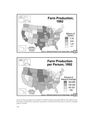
  • 2. Teacher ’s Guide for Transparencies 1A and 1B Transparency 1A is a bad example (and 1B is a good example) of a choropleth (CORE-oh-pleth) map. The choropleth map “language” is used to show information that is collected and reported for political units, such as countries, states, counties, or election districts. Examples of such information include census data, crime rates, and percentages of people who voted for a partic- ular candidate. Reporting information by political areas does not tell us about the internal arrangement of things in an area. To avoid confusion, therefore, cartographers have adopted three conventions about how to make choropleth maps: 1. Use choropleth maps only for ratio data (numbers you get when you divide two counts, such as the amount of production and number of people, in order to get a ratio such as production per person). That is what Transparency 1B does right. Map 1A uses choropleth symbols to show counts. This can be misleading, because two small states might actually have greater total production than a large state, but their lighter color implies otherwise. It would better to use scaled symbols (e.g., circles of different sizes) to show counts, because readers can visually compare the size of a graduated symbol with the size of a state to get a more accurate picture. 2. Choose category boundaries carefully. Map 1A has numbers to show actual production in the top three states. How different would the map seem if the darkest category had only states with more than 10 billion dollars of farm products? This question raises an impor- tant point: a map maker has plenty of chances to make choices that are not technically “wrong” but still alter the impression that a map conveys. That realization is a useful learner outcome. 3. Arrange colors in a logical sequence. The conventional rule is to represent low values with light colors and higher values with progressively darker colors. Activity: Have students find choropleth maps in magazines and newspapers. Did the authors of the maps follow these three basic rules? You may be surprised how often they don’t. If you find a particularly good (bad!) example, cover the legend and ask students which areas have the highest values. Discussion should lead to two conclusions: A map with poor category choices and/or a nonintuitive color sequence may accurately portray each individual area, BUT The reader has to work harder to see the overall pattern. Since the clear depiction of spatial patterns is a major goal in making maps, students should wonder whether someone who chooses awkward categories or a bad color sequence is just ignorant or is deliberately trying to mislead. Activity: Give students a table of numbers for an area with about 20 sub-areas, and have them make choropleth maps with different numbers of categories and boundaries between them. For a how-to manual with interesting data, get Thematic Maps: Visualizing Patterns, by Carol Gersmehl, prepared for the Tennessee Geographic Alliance summer institutes and used in many other states. I freely admit that I “borrowed” many ideas from this teacher-tested manual. I also realize that the one-page discussion here is sketchy, but remember, this page has just two of 85 example transparencies; keep reading! 183
  • 3. From Teaching Geography, Second Edition, by Phil Gersmehl. Copyright 2008 by The Guilford Press. Permission to photocopy is granted to purchasers of this book for personal use only (see copyright page for details). 184
  • 4. Teacher ’s Guide for Transparency 1C This map is a greatly simplified 1:24,000 topographic map. Topographic maps like this are available for most parts of the United States; go to www.topozone.com or write to the Map Distri- bution Center, U.S. Geological Survey, Federal Center, Denver, CO 80225, for a (free!) index map of your state, which you can use to select maps for purchase. Activity: Put a topographic map of your local area on a bulletin board. This kind of map can show familiar details in a new light, which can prompt lively discussion of subjects being cov- ered in class and questions that students generate on their own. A key to successful use of topographic maps is to know the advantages and limitations of each scale. For example, a map with a scale of 1:24,000 (the fraction means that an inch on the map is 24,000 inches or 2,000 feet in the real world) has a wealth of fine detail but cannot show more than a few dozen square miles at a time. If you have a lot of display space, tile several of these maps together to show a larger area. A subject the size of Atlanta, Georgia, and its sub- urbs, for instance, would make an impressive wall display. A map of Georgia at that scale, how- ever, would need a gymnasium floor. The answer to this dilemma is to find other maps at different scales. The U.S. Geological Survey also makes available maps at scales of 1:100,000; 1:250,000; and whole-state maps at appropriate (smaller!) scales. Teacher ’s Guide for Transparency 1D At a scale of 1:250,000, a topographic map is useful for planning how to get from one place to another. Maps at this scale show major roads, rivers, terrain features, and forest regions. As you can see on this transparency, however, a 1:250,000 map cannot show individual buildings or details such as the rapids in the river. In other words, someone looking at a map of Harpers Ferry at a scale of 1:250,000 will miss precisely what seemed most strategically important at a scale of 1:24,000, namely the presence of shallow water that makes the river easy to cross (see the CD unit on Transitions). This raises very important point: much of what we “know” about the world depends on the scale at which we view it. It is therefore wise to examine places at several scales. Activity: Have students gather as many different maps as they can find for a specific area. Look at maps in newspapers, county and city offices, Chambers of Commerce, travel brochures (e.g., in rest stops and plazas on Interstate Highways), and road maps. Then, post the maps (or copies of them) in scale order, with the most detailed maps at one end and maps that cover an entire state or country on the other. Ask students to examine the maps and tabulate what kinds of information appear at each scale. The flip side of that coin is a good test question: “What scale map should you ask for if you want to find out about the pat- tern of houses in Roseville? the distance from Moscow to Berlin? and so on?” Extra: The DeLorme Company (www.delorme.com) has compiled books of topographic maps for each state. Those books are great resources for class use, field trips, or personal travel! 185
  • 5. From Teaching Geography, Second Edition, by Phil Gersmehl. Copyright 2008 by The Guilford Press. Permission to photocopy is granted to purchasers of this book for personal use only (see copyright page for details). 186
  • 6. Teacher ’s Guide for Transparency 1E Iron and steel mills were big business, particularly in the late 1800s. Like textiles in the early 1800s, autos in the mid-1900s, and computers in the late 1900s, these factories employed mil- lions of workers. Moreover, they required the purchase of many other kinds of products, and they provided “raw” materials for many other goods and services. As a result, during its peak each of these industries had a great inf luence on patterns of wealth and population. If you want to understand the world economy of the late 1800s, therefore, you have to look at where iron and steel were made. This map shows part of Europe. It is deliberately drawn with very faint lines for national borders, because in fact these borders changed several times. Moreover, many of the interna- tional tensions that led to wars in the 20th century involved control of key transportation routes and the raw materials for iron and steel mills. Activity: Show the transparency and ask which lettered places would be good locations for steel mills. The names are not important for this activity, but in order from A to I, the places are a mountain village in Norway; Birmingham, England; Paris, France; Essen-Dusseldorf in the Ruhr Valley of Germany; Verona, Italy; the western end of the Carpathian Mountains; the port city of Gdansk, Poland; Budapest, Hungary; Istanbul; Aleppo, Syria; the Donetsk area of Ukraine; Banghazi, Libya; and Madrid, Spain. Of those, D was and is the largest steel center; it is located close to major coal deposits and is directly downstream from the largest iron ore mines in Europe. Places B and K are also important. To make this Activity more analytical, read on. Teacher ’s Guide for Transparency 1F The recipe for steel is simple: mix coal, iron ore, and limestone. Cook well, making sure you don’t burn yourself! Then cool the steel and ship it to the customers. Unfortunately, the raw materials and buyers are usually in different places. As a result, people building a steel mill must pick a compromise location (see the CD unit on Changing Technology). This transparency graphically shows that a blast furnace needs more coal than ore, and therefore it usually makes sense to put it close to coal mines. Moreover, since it is cheaper to transport heavy material in boats than by other means, it usually makes sense to put mills on major rivers or in ports. (Think of the locations of famous steel mill areas in the United States: Pittsburgh, Cleveland, Detroit, Gary, Chicago, and Baltimore are all on navigable water, and they all are much closer to sources of coal than to major deposits of iron ore, which are in northern Michigan, Minnesota, and Brazil.) Activity: Use this diagram to aid a discussion of Transparency 1E. Then, if desired, have stu- dents try to draw a similar diagram showing the inputs and outputs of another industry. Caution: Steel production is a “heavy” industry; the raw materials and final product weigh a great deal and are expensive to transport. As a result, people try to locate factories between the sources of raw materials and the market. Some industries have raw materials and prod- ucts that are light and easy to transport. Those factories can be located almost anywhere. Activity: Have students try to classify specified industries as heavy or light; for example, oil refining (H), computer assembly (L), copper smelting (H), diamond cutting (L), grain milling (H), and sewing shirts or backpacks (sort of in between). Heavy industries are usually located close to raw materials. Most industries in the light and in-between categories tend to be located closer to other inputs, such as skilled labor, capital, clean water, and so on. 187
  • 7. From Teaching Geography, Second Edition, by Phil Gersmehl. Copyright 2008 by The Guilford Press. Permission to photocopy is granted to purchasers of this book for personal use only (see copyright page for details). 188
  • 8. Teacher ’s Guide for Transparency 1G A key to finding a good location for production in a heavy industry is to minimize the cost of transporting raw materials. Assigning “penalties” to potential sites is a way to make analysis of this factor more rigorous than simply “eyeballing” a map. Activity: Use the map in Transparency 1E, but with the following calculations: 1. Estimate the distance from a source of coal or iron ore to your factory site. 2. Note whether the route goes over land or by boat. 3. Calculate the transportation penalty. If this seems too easy for your students, you can add complexity in several ways. Add penalties for crossing mountains or national borders. Add penalties for areas with severe air and water pollution, such as the Ruhr or middle Elbe. Have them do research on mining and add penal- ties for using low quality coal or iron ore. Teacher ’s Guide for Transparency 1H With Transparency 1F, this diagram helps introduce some really knotty policy questions: What should people do when changing technology has made their town a less desirable location for a particular kind of industry? (See the CD unit on Changing Technology). What should people do when doing “what they always have done” is no longer competitive in the international economy? Phrasing a question in a particular way tends to restrict the range of options that might be con- sidered. This is important for students to learn, because the two questions above really address different aspects of the same issue. Emphasize that a decreasing ability to compete may not be anyone’s “fault.” The human tendency is to seek a scapegoat – to blame factory owners, labor unions, recent immigrants, or government policy for something that may be nothing more (and nothing less!) than a geographic consequence of a change in technology. It may be useful to put the question into a larger perspective: a change in technology has made steel production more efficient and steel less expensive. Consumers in all parts of a coun- try have gained, but producers in a few areas have been hurt. A humane society should take this geographic fact into account in designing welfare and migration policies. Activity: Assign roles (e.g., mayor, labor leader, minister, storekeeper, etc.) for students to play in simulating a town that loses its major employer. Transparencies 1E–1H can help a teacher show why an old steel mill may not be able to compete with new electric furnaces in a location well suited to that technology. Or, if desired, modify the simulation above to fit some other economic activity, such as a textile mill, a meat- packing plant, a drive-in theater, or a small video store threatened by a new superstore. Have students discuss the threatened business’s options: moving away, retraining for other work, and so on. Have them prepare maps to illustrate the options. The key question is: Can the proposed new activity work in the current environment? This is the big question of economic geography; it can take years to learn how to answer it well. Four transparencies aren’t enough, but we have learned enough to say that a society is in trouble if its citizens graduate from school and still see no need to think about the locational consequences of technological change! 189
  • 9. From Teaching Geography, Second Edition, by Phil Gersmehl. Copyright 2008 by The Guilford Press. Permission to photocopy is granted to purchasers of this book for personal use only (see copyright page for details). 190
  • 10. Teacher ’s Guide for Transparency 1I The basic idea of “per” data is simple: a quantity is divided by the number of individuals who “share” it. It must be admitted, however, that the real-world use of per data can be confusing, espe- cially if we are not sure what is being divided by what. This raises a difficult question: how can students accurately understand a newspaper or television story if they cannot figure out how the tables or maps of per data were made? It helps, then, for teachers to use per data fre- quently, so that students gradually improve their ability to interpret the results. Activity: Project this Transparency and have students fill in the blanks by dividing the total land area number by the population number. Since both numbers are expressed in millions, the mil- lions “cancel out” and the result is the number of acres per person. Work through some of the examples that have already been calculated – the answers for the blanks are 4.5 for Mexico, 1.0 for Germany, and 0.7 for Japan. Once students get the idea, you can extend the discussion. For example, is the number of acres per person the most useful per number, or would something else be more meaningful? It might be noted that people cannot grow food in deserts or high mountains. Before doing the calculation, therefore, it might be useful to know the proportion of the land that could be used to grow food. To make a link to Transparency 1J, write the following numbers next to the coun- try names: 13, 63, 5, 19, 14, 35, 13. These numbers indicate the percentage of land area that can be used for crops (right, that’s another per number!). Multiplying Argentina’s 684 million acres of land by 13 percent (13/100) gives a result of 89 million acres of cropland. The answers to this calculation are in the first column of Transparency 1J. Teacher ’s Guide for Transparency 1J Repeat the recipe for “per” data: “take the quantity you want to measure and divide it by a num- ber that can make the data meaningful.” Agricultural land, for example, is meaningful in terms of how many people must be fed. A relevant per measure, therefore, is the number of acres per person (the number of acres of cropland divided by the number of people). Activity: Project this Transparency and have students calculate the number of cropland acres per person (0.64 for Mexico, 0.37 for Germany, less than 0.1 for Japan; underscore that the amount of cropland per person in Japan is less than 1/20th as much as in the United States). These numbers, as Postscript 1-1 says, are one reason Americans are not as concerned as people in other countries about “values” issues in geography. Compared with those of other industrial countries, residents of the United States have always had plenty of cropland for food and plenty of “empty” land for new buildings, roads, parks, waste disposal, and other uses. As population increases, however, land issues become more important, which is one reason for the present upsurge of interest in geography in America. It is important to keep in mind that all land is not equally productive. This observation leads to another kind of “per”data: yield per acre. The average yield of wheat per acre of cold Canadian soil is much less than the corn yield in Iowa, and both are low compared with yields in tropical Bangladesh or southern China, where farmers can get several crops of rice each year. Almanacs or encyclopedias (or www.cia.gov) can provide data for calculating ratios such as food production per person. 191