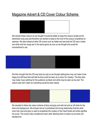
1. Magazine Advert & CD Cover Colour Scheme
We choose these colours as we thought it would be better to keep the colours simple as the
advertised song was sad therefore we wanted to keep to the mod of the song to empathise its
sadness. We also looked at other CD covers such as Adele and saw that her CD was in black
and white and her songs are in the same genre as ours so we thought this would be
conventional to use.
We then thought that the CD may look too sad so we thought adding blue may not make it look
happy but still have that sad feel as blue could be seen as a colour for mystery. The blue also
may make it eye catching for the audience as black and white may be seen as too dull. The
colours also don’t clash so everything would be seen clearly.
We decided to follow the colour scheme of blue and grey and add red and an off white for the
texts and background. We choose red as it symbolises the loving relationship that the artist
once had, blue and grey is used to empathies the mystery of her heart break and white signifies
her purity. The colours also complement each other allowing them to stand out as texts and
background.