

Recomendados
Mais conteúdo relacionado
Semelhante a Program Description
Semelhante a Program Description (20)
Último
Último (20)
Program Description
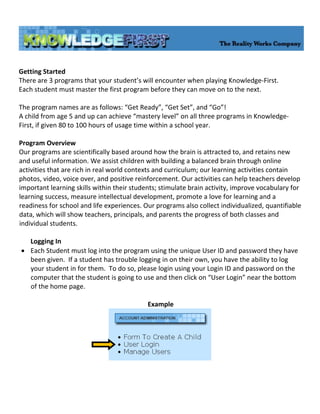
- 1. Getting Started There are 3 programs that your student’s will encounter when playing Knowledge‐First. Each student must master the first program before they can move on to the next. The program names are as follows: “Get Ready”, “Get Set”, and “Go”! A child from age 5 and up can achieve “mastery level” on all three programs in Knowledge‐ First, if given 80 to 100 hours of usage time within a school year. Program Overview Our programs are scientifically based around how the brain is attracted to, and retains new and useful information. We assist children with building a balanced brain through online activities that are rich in real world contexts and curriculum; our learning activities contain photos, video, voice over, and positive reinforcement. Our activities can help teachers develop important learning skills within their students; stimulate brain activity, improve vocabulary for learning success, measure intellectual development, promote a love for learning and a readiness for school and life experiences. Our programs also collect individualized, quantifiable data, which will show teachers, principals, and parents the progress of both classes and individual students. Logging In • Each Student must log into the program using the unique User ID and password they have been given. If a student has trouble logging in on their own, you have the ability to log your student in for them. To do so, please login using your Login ID and password on the computer that the student is going to use and then click on “User Login” near the bottom of the home page. Example
- 2. • This will take you to your students’ login page. Click “login” under the student’s name that is waiting to play. The child’s map will appear allowing them to start playing the program right where they left off. Example Activity Map • The “Get Ready” activity map has 21 squares which link to the different learning activities in the program. Your student’s and the school bus token will start on the first square. They must complete each activity before their bus will move on to the next square. As a student progresses through “Get Ready” you will notice that each of the previous squares have changed color to reflect the mastery level of that activity. • While on the map, a student can roll over each of the squares to see the name of that activity. Example
- 3. • On the top of the map is a top bar with the student’s name, time on the program, their score, and an exit tab. The “time” represents the student’s total number of hours and minutes on the program. The “score” is based on a total number of points received for the 567questions in “Get Ready”. The majority of the questions answered correctly are worth 5 points but some questions are worth 10 or 15 points. The maximum possible points a student can receive on “Get Ready” is 3,120. The “exit” tab will take the student back to the login page where if need be they will re‐enter their User ID and Password to log back into their map. Example Logging Off • When it’s time for your student’s to log off of Knowledge‐First, please remember that if they are in the middle of playing an activity, they must click on the green circle with the house at the bottom of their screen. Clicking on the blue circle with the arrow will skip the introduction to the activity. Please make sure each student listens to the introduction enough times to assure that they understand how to play that activity. Clicking on the red circle with the X will take the child back to the login screen. Example Reviewing Student Data • To view student performance data please login under your User ID and Password, click on "Student Performance Charts" near the bottom of your screen. • All of the quantifiable data is recorded in real time and viewable at any time. This means that once a student has played activities and then logs off of the program, you can then log in to view their progress immediately. Example
- 4. Classroom Report • There are 21 activities within “Get Ready”. Near the top of the chart you will see a key that will explain that if you click on any of the numbers 1‐21 it will bring up the name of that activity as well as the skills that the activity covers. Example
- 5. • This chart will show you the mastery level that a student has achieved on each activity. At the top of the chart, you will find a color key that will explain the mastery level that a student may reach. Example • The numbers within a student’s colored squares represent how many times they’ve completed that activity. Once as student reaches a green square they will not have to play that activity again. The first line of the colored squares represents their first round of play through the 21 activities. The second line below the student’s name represents their continued progress through the 21 activities. (If a student does not have a second line that means they have not finished their first round of play) On the progress line, the first faded square represents what activity that child is currently on. The following faded squares are showing you that they have not played those activities for a second time. Example
- 6. Reviewing Individual Student Data • Click on a student’s name while in the Student Performance Data, it will bring up their individual Student Report Card. This document is printable and often used by teachers during parent /teacher conferences. Example Student Report Card • The left hand column on the report shows the 30 goals in one or more of the 21 “Get Ready” learning activities. You can see progress on each of these goals by looking at the percentages and the small colored circles to the right of the goals. The number inside of the circle indicates the number of times that student practiced/revisited that goal. • The top chart in the right hand column shows Class Ranking. Class Ranking shows the students class ranking by hour vs. class progress at X hours • The Middle chart shows State Standards. The percentage shown represents progress on activities mastered to date in math and language standards. • The third chart in the right hand column shows Accuracy and Processing Speed. This represents a student’s speed (processing speed) in answering questions against his/her accuracy (number of questions selected correctly) at each proceeding hour on the program
- 8. • Go back to the classroom report by clicking on the Left arrow at the top of your screen on your tool bar, or the classroom report tab on the top of the page. Click on “Front” link underneath the student’s name. This will bring up the front of your student’s Intellectual Growth Certificate. Example Intellectual Growth Certificate/Chart‐front • This chart shows progress in intellectual growth. There are 1,000 questions in “Get Ready” that deal with growth in eight cognitive categories. The current intellectual status is measured by the percentage of the mastered activities within those eight cognitive categories. • This Certificate is given to every student once they have achieved 100% mastery on each program. Example
- 9. • There are two sides to the Intellectual Growth Certificate. To see the back of the chart, go back to the classroom report by clicking on the Left arrow at the top of your screen on your tool bar, or by clicking the Classroom repot tab at the top of the chart. Click on “Back” underneath the student’s name. This will bring up the back of your student’s Intellectual Growth Chart. Example Intellectual Growth Certificate/Chart‐back • This chart shows detailed progress in intellectual growth. There are 11 Cognitive categories that the child must deal with in the 21 “Get Ready” activities. The first blue line (light blue) on the chart shows the percentage they received on each particular category their first time through the program. • The second blue line (dark blue) on the chart shows the percentage they received on each particular category at each additional attempt at the program, (2nd – 6th attempt) Example