
Recomendados
Mais conteúdo relacionado
Mais procurados
Mais procurados (20)
Destaque
Destaque (20)
Semelhante a Bastille Cross-Media Case Study
Semelhante a Bastille Cross-Media Case Study (20)
Mais de leannacatherina
Mais de leannacatherina (20)
Último
Último (20)
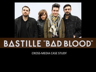
Bastille Cross-Media Case Study
- 2. BACKGROUND – early days Bastille debuted in June 2010, with their 7"/45 rpm single, featuring the two tracks, "Flaws" and "Icarus". Released through London-based independent record label, 'Young & Lost Club', this was followed by the release of the EP Laura Palmer later in 2011. After debuting further tracks online through sites such as YouTube and MySpace, the band received a great amount of media attention and fans. The group subsequently secured a few support slots, and later performed at major UK festivals including Glastonbury, the Isle of Wight and Blissfields. .
- 3. BACKGROUND – hitting the big time In December 2011, record label EMI Music announced that they had offered Bastille a record contract with Virgin Records. Their debut single, "Overjoyed" was released in April 2012. Their second single, "Bad Blood" – which shares the same title as the band's first studio album, followed in August 2012, and received moderate success in the United Kingdom, charting at number ninety. The third track to be taken from Bad Blood, titled, "Flaws", became the group's first to enter the charts inside the Top 40, debuting at number twenty-one. In February 2013, ahead of the release of their debut album, the band's fourth single, Pompeii was released to huge demand, charting at number two in the UK, and giving Bastille their first number-one single in Scotland. Their first studio album, titled Bad Blood, was released in March 2013, and debuted atop the UK Albums Chart
- 4. WEBSITE
- 5. Social media links reflect band’s younger target audience and organic roots. Main image – looks random – taken from latest music video. No images of band’s faces – suggests an attitude of shying away from limelight and/or band’s faces not being central to their image. Layout is basic, clean and simple. Homepage dominated by main image promoting latest single. Muted, grey tones of colour scheme reflect Britishness & (musical) integrity. It’s about the music, not the styling. Latest music video starts playing immediately when you enter website. Typography = simple, sans serif, capitals – co-ordinates with ‘logo’. Tabs along top edge – don’t detract from main image.
- 6. Other pages are very social media and new/live music-focused, with a simple, functional design and mode of address, creating a sense that the Band are also music fans first and foremost and that love of music is something they share with their fans. Also reflecting target audience of young, media-savvy people and genuine music fans. No clear male/female targeting. Branding/design is strong and consistent throughout site, as is presence of images from latest video. Record co. influence evident especially in ‘Store’ section – merchandising but otherwise efforts have been made to make the band appear ‘organic’ and with musical integrity.
- 8. ALBUM ARTWORK There are no images of the band on the front cover, suggesting that the band’s ‘brand’ is not dependent on, or even linked to, their physical appearance. Also follows conventions of rock artwork – image is ambiguous, ‘arty’ and juxtaposed with red text and name of album has dark, sinister connotations. Collage of black & white images of the band in un-posed situations allow fans to feel as though they are looking ‘behind the scenes’. This panel is within the booklet – like a reward for buying the album.
- 9. ALBUM PROMOTION Web-based and print promotion of the album and associated tour is consistent with the front cover of the album, cementing the image being created and further enhancing audience’s knowledge & understanding of the Bastille ‘brand’. Tour poster also advertises album release date – cross-media promotion.
- 10. MUSIC VIDEO – Pompeii The video – the first taken from the album – shows lead singer Dan Smith in a post- apocolyptic city, running from an apparent contagion which leads to strange, black eyes. Directed by Jesse John Jenkins, released 2013.
- 11. There are lots of wide- angle, long and very long shots throughout the video, giving it an epic, cinematic feel and connoting the enormity of the city and the insignificance of Smith’s existence within it. The setting – a vast American city & its outskirts, leading finally to a mountain top, also add to the epic feel. Close-ups of Smith are relatively few – unusual for an early video. The rest of the band are not in the video.
- 12. The lighting and colour palette are muted and natural throughout, with much of the video shot at night and the rest at dusk and dawn. This adds to the cinematic feel and suggests artistic integrity and commitment to the video concept. This is further suggested by the relatively minor performance element, which although lip-synced direct to camera still maintains the context of the narrative and is subtle enough not to detract from the verismilitude of the ‘film’.
- 13. The narrative follows Todorov – the Equilibrium is Disrupted by the appearance of the black-eyed people, Smith runs from them in an attempt to Resolve and the final shot (which mirrors one from the start) shows that he has been infected – Resolution.
- 14. Goodwin Analysis Close-ups of the lead singer throughout. The cinematic style and zombie-apocolypse narrative element are Intertextual references. Notion of looking – Smith looking out of a window and in a rear-view mirror. Music & visuals – connected through pace of edits, cutting on the beat and increase in pace/frantic running & camera movement as song reaches crescendo. Lyrics & visuals – ‘if you close your eyes’ – links to black eyes; ‘walls tumbling down in the city…’ – links to city setting; video’s narrative enhances song’s meaning.
- 15. Cross-media - Conclusion The somewhat dark, sinister tone of the video is consistent with the band’s website and album cover. Colour palette and visual style are muted and naturalistic throughout, with little in the way of images of the band and no use of studio shots or ‘live’ staging of performances. The image or ‘brand’ created throughout these various promotional elements is of artistic and creative integrity, a desire not to be pigeon-holed (it is difficult to find Genre characteristics across the branding) but a definite sense of quality through high production values. We could suggest that the band’s reticence about being ‘famous’ is somewhat at odds with their mainstream label’s desire to make them a big-money brand with mass appeal.