
Recomendados
Mais conteúdo relacionado
Mais procurados
Mais procurados (17)
Destaque
Semelhante a Kerrang evaluation analysis one
Semelhante a Kerrang evaluation analysis one (20)
Último
Último (20)
Kerrang evaluation analysis one
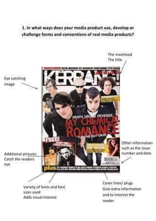
- 1. 1. In what ways does your media product use, develop or challenge forms and conventions of real media products? The masthead The title Eye catching image Other information such as the issue Additional pictures number and date Catch the readers eye Cover lines/ plugs Variety of fonts and font Give extra information sizes used and to interest the Adds visual interest reader
- 2. The masthead in more detail 1. The masthead should stand out, in this case white on black 2. Should read from left to right and stretch across the whole page width 3. Reflect the magazine’s genre and style, in this case bold capitalised rough looking letters for a rock genre 4. Can go over or under the photograph
- 3. Cover lines in more detail 1. Use of hyperbole/ exaggeration - ‘Ultimate’ and ‘Angriest’ 2. ‘Plus’ and ‘Free’ makes it seem like they have more to offer and that it is good value 3. The posters are a special feature that will make the reader want to buy it more
- 4. Main image in more detail 1. The photo fills most of the page 2. It is of a famous band that will catch the fans attention 3. The styling of the band fits with the genre and style of the magazine
- 5. Colours and fonts in more detail 1. Use of a colour scheme to make it look professional and tie everything together, in this case black, white, red and yellow 2. The colours should reflect your audience 3. A variety of fonts and font sizes will add interest to the front cover 4. The masthead should stand out against the other colours and fonts on the page