Responsive Web Design for SharePoint 2013
•Transferir como PPTX, PDF•
8 gostaram•15,026 visualizações

Responsive Web Design for SharePoint 2013 2003 called and they want their crappy web design back. In the last ten years, so much has changed in the design community that organizations are still asking for designs that are outdated both from a design perspective as well as from a best practices perspective. This session is focused on showing you the benefits of designing for multiple devices, resolutions and needs. We’ll look at the latest design trends, some of the latest and best SharePoint 2013 implementations and what steps you can take to bring your corporate intranet to 2013.

Recomendados
Recomendados
Mais conteúdo relacionado
Mais de Kanwal Khipple
Mais de Kanwal Khipple (20)
Último
Último (20)
Responsive Web Design for SharePoint 2013
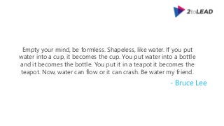
- 1. Empty your mind, be formless. Shapeless, like water. If you put water into a cup, it becomes the cup. You put water into a bottle and it becomes the bottle. You put it in a teapot it becomes the teapot. Now, water can flow or it can crash. Be water my friend. - Bruce Lee
- 2. Not here to talk about Design
- 3. 2toLead Responsive Web Design for SharePoint 2013 Because one size does not fit all!
- 4. Kanwal Khipple • Co-Founder, 2toLead • kanwal@2toLead.com • 416-888-7777 • @kkhipple – personal twitter account • @SharePointBuzz – 10k followers receive latest SharePoint related tweets • LinkedIn – Let’s do business together! Connect with me professionally • Facebook – connect with me personally
- 6. Agenda • History lesson • Top Responsive SharePoint Sites • New WCM features in SP2013 • CORE Ingredients • Steps to convert your existing intranet • Resources
- 7. 2toLead History Lesson Look back to move forward
- 8. Remember When? Launch your Browser to view a site and get this
- 9. Above the Fold • Load a site and you have to scroll • Important information should be easily accessible
- 10. Above the Fold
- 13. Separate Mobile Site • Two websites, one for your desktop and one specifically for mobile • Customers get automatically redirected to the best site for their device
- 16. Responsive Web Design Adapting a website’s layout across multiple devices
- 17. Adaptive Design • Intelligent design • Progressively improves site based on screen size, device, orientation and platform features
- 18. Why even bother? It’s about adoption = conversion! Unfriendly = more likely to leave 61% Friendly = more likely to buy 67%
- 20. 2toLead Responsive in SharePoint Is it possible?
- 23. 2toLead New WCM Features in SharePoint 2013 Embracing web design community
- 24. Composed Looks • Allows you to configure image, colors, site layout and fonts • No longer work with Microsoft Office Themes
- 25. Image Renditions Create different image versions based on your needs
- 26. Managed Navigation Navigation can now be driven by the Managed Metadata term
- 27. Device Channels
- 28. WCM Highlights • Leverage the power of search by using Content Search Web Part • Create your own BestBuy.com using Catalogs • Content Editors can copy from Microsoft Word and paste into SharePoint (cleaner markup) • Configure friendly URL for terms • Search Engine site map
- 29. 2toLead CORE Ingredients Recipe for #SPRWD
- 30. Fluid Grid
- 31. Fluid Grid 700 % 988 = 0.7085 70.85% of the total width h1 { width: 70.85%; /* 700px / 988px = 0.7085 */ }
- 32. Media Queries
- 33. Media Queries CSS 2.1 <link rel="stylesheet" type="text/css" href="core.css“ media="screen" /> <link rel="stylesheet" type="text/css" href="print.css" media="print" /> CSS 3.0 <link rel="stylesheet" type="text/css“ media="screen and (max-device-width: 480px)“ href=“custom.css" /> Media Type Query containing media feature to inspect
- 34. Flexible Media
- 35. Flexible Media img, embed, object, video { max-width: 100%; } {
- 36. Flexible Media
- 37. Responsive Web Design • Flexible Media • Media Queries • Fluid Grid
- 38. 2toLead Convert Fixed to Responsive Be Like Water
- 39. Prepare Design for a Framework 1. Upload Framework TIP: Good frameworks – Twitter Bootstrap – Skeleton – Zurb Foundation 2. Add Framework to your master page 3. Leverage Grid Based CSS Framework
- 40. Make it Responsive 1. Define your Viewport <meta name="viewport" content="width=device-width, initial-scale=1.0" /> 2. Modify CSS for media queries 3. Convert from Fixed to Fluid
- 41. Things to Consider • Cleaning up the padding, margin and container spacing issues • SharePoint styles for ribbon and other controls will need to be tested
- 42. Older Browsers • Be Progressive Across All Browsers • HTML5Shiv • Browser Upgrade Notification • Consider leveraging Device Channels
- 44. Responsive Bootstrap Template • Ethan Marcotte’s book on demonstrates how you can deliver a quality experience to your users no matter how large (or small) their display. • http://responsivesharepoint.codeplex.com – Master page that has Twitter Bootstrap integrated
- 45. Book Author Pro SharePoint 2013 Branding and Responsive Web Development • A complete guide to planning, designing, and developing modern, responsive websites and applications using SharePoint 2013 and open standards like HTML5, CSS3 and JavaScript • 450 Pages • User Level: Intermediate to Advanced Available on Amazon
- 46. 2toLead Thank You! with Great Power comes Responsibility
- 48. Kanwal Khipple • Co-Founder, 2toLead • kanwal@2toLead.com • 416-888-7777 • @kkhipple – personal twitter account • @SharePointBuzz – 10k followers receive latest SharePoint related tweets • LinkedIn – Let’s do business together! Connect with me professionally • Facebook – connect with me personally
Notas do Editor
- Responsive Web Design for SharePoint 2013 2003 called and they want their crappy web design back. In the last ten years, so much has changed in the design community that organizations are still asking for designs that are outdated both from a design perspective as well as from a best practices perspective. This session is focused on showing you the benefits of designing for multiple devices, resolutions and needs. We’ll look at the latest design trends, some of the latest and best SharePoint 2013 implementations and what steps you can take to bring your corporate intranet to 2013.
- User Experience Is At the Core of Everything We Do User Experience – The key to high user adoption and ROI Award winning SharePoint Development Multiple awards for both Internet and Intranet Sites Developed Full Lifecycle SharePoint Support In addition to 3 SharePoint MVP’s on staff, we offer comprehensive SharePoint Skills for all SharePoint project requirements. 250+ SharePoint Project to-date Microsoft SharePoint TAP Program Member (SharePoint Wave 15)
- View port
- The concept, Graceful Degradation, was introduced as best practice for providing the best experience to users with the latest modern browser. For those that didn't have a modern browser, web designers would not provide equivalents. Visitors with the latest modern browser felt like first class citizens and interacted with the site as web designers intended. For those that did not have the latest web browser, they were at least given a web site that degraded gracefully to a lower level of functionality.
- Progressive Enhancement, on the other hand, begins with the basic version of the site to ensure that it works on all browsers and then web designers can add enhancements specifically for modern browsers. Progressive Enhancement focuses on content first rather than functionality. This emphasis on content is much more important over Graceful Degradation as content is truly the only reason any one of us browse and/or build web sites in the first place. As a comparison, Graceful Degradation prioritized presentation and functionality before content and Progressive Enhancement prioritized content to the top of a web designers’ priority list.
- Conventional approachCreating separate mobile sites and ensuring that they worked on a multitude of devices was popular for a while. However, as the sheer number of smart devices grew this approach simply became uneconomical. Web designers now had to consider the user experience for each variation of mobile device, browser, operating system and display resolution, and how to best take advantage of each combination. Further complicating matters, web design had to be completely reimagined for the keyboard and touch interface.
- Coined by Ethan Marcotte in May 2010, is a technique for adapting a website’s layout across multiple devices.Responsive Web Design is all about building a web site that is resolution and device independent. It is an evolution of web design, rather than a revolution. Why? Primarily because the foundation of Responsive Web Design stems from two existing web design approaches: graceful degradation and progressive enhancement. The term, Responsive Web Design, was coined by Ethan Marcotte in the popular article on “A List Apart” [http://www.alistapart.com/articles/responsive-web-design/] as an approach which popularized the use of flexible grid layouts, flexible images and media queries into one unified methodology.
- An example is you might have a side bar navigation on the desktop size version of the site, and then when viewed on a smartphone the menu becomes a select list to save space in the interface. Another example is you might offer functionally on mobile device not available on a desktop. Say you had a restaurant website - When it's viewed on a mobile device that's location aware with GPS, a panel appears saying "Get directions to our restaurant from your location". Desktops don't know their location so it doesn't appear to them."Adaptive web sites are those that adapt their design, structure and content to best meet the needs of their users over time. This is usually achieved by reviewing statistical information about user behaviour (e.g., through analytics data) and enhancing the design and content in key areas to best meet users expectations. Responsive design is where a web site will respond to the capabilities of a user's technological capabilities to best meet the user's needs. That is to say, it will adapt to the screen size/resolution of the user's device, ability to use javascript, responsiveness to HTML5 and CSS3 technologies, etc. to ensure that the user experience is the best it can be....."
- Friendly? A mobile friendly site makes me more likely to buy a product or use a service.Unfriendly If I don’t see what I’m looking for right away on a mobile site, I’ll quickly move on to another site.Mobile-friendly sites turn users into customersNot having a mobile-friendly site helps your competitors Non-mobile friendly sites can hurt a company’s reputation
- Coined by Ethan Marcotte in May 2010, is a technique for adapting a website’s layout across multiple devices.Responsive Web Design is all about building a web site that is resolution and device independent. It is an evolution of web design, rather than a revolution. Why? Primarily because the foundation of Responsive Web Design stems from two existing web design approaches: graceful degradation and progressive enhancement. The term, Responsive Web Design, was coined by Ethan Marcotte in the popular article on “A List Apart” [http://www.alistapart.com/articles/responsive-web-design/] as an approach which popularized the use of flexible grid layouts, flexible images and media queries into one unified methodology.
- http://www.topsharepoint.com/responsive-sharepoint-websites
- Themes v3.0
- Configure device channels to show different master pages per device channelEven different display templates based on the same design per device channel
- The problem with fixed grids is that designs are typically based on pixels.They are not based off of the device resolutionLeverage CSS Frameworks like bootstrap
- So here we have a picture of the Title. We want to give wrap that around a the Header 1 tag. However we don’t want to restrict it based on a pixel widthWe want it to relatively grow / shrink based on the full sizeMore info - http://alistapart.com/article/fluidgrids
- In plain English, we’re asking the device if its horizontal resolution (max-device-width) is equal to or less than 480px. If the test passes—in other words, if we’re viewing our work on a small-screen device like the iPhone—then the device will load custom.css. Otherwise, the link is ignored altogether.Reference http://alistapart.com/article/responsive-web-design
- Flexible images are also sized in relative units (up to 100%), so as to prevent them from displaying outside their containing element.
- Flexible images are also sized in relative units (up to 100%), so as to prevent them from displaying outside their containing element.
- Flexible images are also sized in relative units (up to 100%), so as to prevent them from displaying outside their containing element.
- Get familiar with Design Manager
- Define your Viewport <meta name="viewport" content="width=device-width, initial-scale=1.0" />Modify CSS for media queriesConvert from Fixed to Fluid- Convert each div container to take advantage of the css framework
- HTML5Shiv - it enables styling for HTML5 elements by non-HTML5 browsers such as IE 8 and older. Why is this a problem for HTML5 elements? Browsers typically won’t apply styling to elements that they don’t recognize.
- Responsive SharePoint - Download: Bootstrap for SharePoint …responsivesharepoint.codeplex.com/re