SlideShare uma empresa Scribd logo
1 de 11
The aims for SASH are to prevent
homelessness.
The purpose of SASH is to stop
homelessness and guarantee young people
a place to stay in an emergency; this is
called a Nightstop, where hosts will take
you in for a night and look after you.
SASH run supported group projects for
young people that need a long time place
to stay until they gain the skills needed and
a job to live independently.
They also offer help to solve the problems
that they are being faced with by
volunteers and local organisations coming
in to help you get back on the rails to a
happy life.
They can also help you gain a good education, and employment if you have already left
school.
Colour schemes:
The colours on this poster are minimalistic in the way that they have only used three
colours, red, white and black.
The colour red is normally associated with danger, which will tell the audience that these
people are in danger everyday from being homeless. The colour red is also a very intense
colour because of the way that it is usually associated with danger and warning. Also
because of the way that red is associated with warnings and danger; it makes you think that
you need to react quick because that’s what you’d do in a real life danger situation, so it will
make the audience feel as if they need to help support SASH quickly.
Using the colour red on the poster also makes the rest of the poster that isn’t red stand out.
The colour white is a strange colour to use, or so it seems; from doing research I’ve found
out that the colour white is supposed to mean safety and perfection, but there isn’t
anything safe and perfect about being homeless, but if I didn’t know this I would think that
it was a good colour to use because it makes the text easier for the audience to read which
is what people will want.
I think that using the colour black in this poster is really good because the colour is all dark
and gloomy and it makes you feel quite down, which is how homeless people will feel.
Using black helps make the writing stand out from the rest of the poster as well because
most of the poster is white and red, whereas the information that is in black stands out
more because of the way that your eye is being drawn to it because of how dark it is.
Text:
The text on this poster is easy really simple and this makes it easier for the audience to read
rather than fancy writing.
This poster only has a little bit of writing on it which is good because it cuts out all the
useless information that people don’t need, it tells you only the important things, so it gets
straight to the point.
SASH has been written in clear bold writing so that the first thing you see is the name of the
company and this might give incite in to what the poster is going to be about before reading
it. This is interesting because you would have thought they would have wanted the first
thing for people to notice to be what the poster is about rather than the company that the
poster is for.
By using the colour black as part of the text it balances it out so that there isn’t too much of
one colour.
Images:
The images used on this poster is just the SASH logo, the logo is made up of the word SASH
written in bold bright writing in a red colour, this makes it stand out from everything else on
the page, but it’s also the same red, which keeps it looking professional.
There is also lines coming out from the name of the company coming from the top left
covering half of the word SASH, the lines coming out from the company name make it look
like a sunshine. Which will give people the idea that the company is happy and nice, which
will give the audience a good interpretation of them.
The aim for Simon on The Streets is again to try and stop people from being homeless and
change their lives.
Simon on The Streets is a street based company that supports the homeless and works on
giving raw emotional and practical support for those that need it. They offer individual help
for those at risk of being homeless and those that are and help with behaviour programmes,
mental health issues, and addictions.
Colour Schemes:
The contrast of this poster is really dulled down and dark, this makes the image quite
upsetting for the audience to look at because it’s giving them a feel of what there life is like.
The dark colours look really depressing as well because of the tone of them, this is the same
kind of feel that they are going for by using the colours that they have on the image, they
are all quite dark as well which makes them all blend in to one, which is what their life may
be like, the same thing everyday with the same routines.
The dark clothes that the man seems to be wearing in the photograph are really dark and
this will give people the idea that they don’t want to stand out and that they don’t want to
be noticed by people.
The blue that he is wearing is really dark, this is showing seriousness, this is showing that he
is serious about being back in a stable home, blue is also a strong and solid colour, this is
showing that you have to be a strong willed person to cope with living on the streets.
Text:
On this poster the information given doesn’t help a homeless person at all in any way
because they won’t have the internet, so instead they could have used a 0800 number so
that they could at least ring from a public phone.
The text that has been used on the poster is really big and quite bold so that it stands out,
they have done this by using a high contrast to catch people’s eye, especially with the way
that the background is really dark and the text is white; which will make it easier for the
audience to read.
The texture of the text looks quite rough and messy; this is hinting that this is what people
on the street will be like, because they won’t be able to look after themselves because if
they are homeless they are probably not going to have a job either.
Images:
The image in this poster is the main image as it’s the background picture, which means it’s
covering the full thing.
The image in this has been edited so that it is quite a dark contrast, which makes the image
look quite depressing because there isn’t any lightness in it everything is just dark.
At first when looking at the poster I didn’t really understand what the zip was being used for
but after taking some time to think about it I realised that the zip is a pun on the large text
in the poster ‘NO ROUGH SLEEPER SHOULD BE STUCK ON THE STREETS’, this is showing
people rather than telling them that he is stuck on the streets from the way that the zip is
attaching him to the floor and he’s trying to get himself unstuck from homelessness.
The man in the image also fits in with what the subject is about they have actually made an effort to
make him look homeless, rather than just having someone with longish hair and a bit of stubble,
they have make him with really long greasy hair, a beard and tired eyes.
In the image the man also looks like he is fighting for his life from the way that his hand is placed on
the floor looking like he’s trying really hard to push himself back up, he looks as if he is physically and
emotionally tired.
The YMCA Homeless company work to create a trusting and faithful environment to help people
discover that all these charities are there to help people not judge them.
They work to making each person feel special by providing shelter for the people in need and give
them hope in being able to live back at home or find a forever home.
They will also help by focusing on the past and present to sort out working on things that they want;
they will also assess the current behaviour of individuals.
Colour Schemes:
This poster is made up of three different colours, blue, black, red and white.
The colour red is normally associated with danger, which is showing people that living on the street
with no protection or company is dangerous. By using a triangle as well this is normally represented
with danger, as it’s normally known as a warning triangle. So this is again showing that being
homeless is dangerous.
It’s also used to show determination, rage and anger, by using this colour when the public see It, it
should encourage them to try and help and it’s also how the homeless people will be feeling.
The colour blue I find is a weird colour to use for this because blue is normally seen as a calming
colour and thought of as stability, and you would have thought that being homeless wasn’t a calming
thing or at all stable because something could happen at any second, I think that it would have been
better if they where to use a dark blue because it seems more of a serious colour rather than a light
blue for some reason, maybe because light blue seems more playful.
White is a good colour to use on this because it breaks up all the colours and because of the way
that it’s the first thing that you notice because of how bright it is compared to the darkness of the
rest of the poster, which is a good idea because it is going to get the message across straight away, it
brings out text from the black of the background.
The black background is a good colour because the black makes everything else stand out, especially
the white. It also emphasis the seriousness of homelessness because of how dark it is so its giving
people the idea that homelessness is a dark and scary things.
Text:
The text on this poster is really formal, it’s telling you that the reason for why they are homeless
doesn’t matter and that what it’s doing to them and making them go through does.
By having it in bold as well it’s also getting the message across to people quickly, especially because
of the way that it’s really bold and stands out from everything else on the page with how bright it is.
Again in the logo of the poster they have used a font which looks really rough because of the way
that it’s all jagged which will remind people of homelessness.
IMAGES:
In this poster there is only one image so there really isn’t anything to say about it, but in the logo
there is a triangle that has been put in-between the words to separate them and to show that
homelessness is a warning, they have also made it red to emphasise this.
The Salvation Army is one of the biggest
company services for homeless people, they
think that everyone is valuable and that
nobody should me segregated because of the
past life that they have had.
The Salvation Army helps people by looking
at their whole life and the problems that they
are being faced with.
When people come to them homeless they
will be asked if they would be ok with staying
in a hostel and start assessing what situation
they are in, once they know what’s going on
in the persons life they will help them as best
as they can and as fast as they can so they
can go back in to the world and carry out a
normal lifestyle, they will also help them to
get some work when they are back on track
and then once this happens they will help
them to rent a cheap but nice house.
Colour Schemes:
The tone of this poster is quite dark and gloomy, everything has been dulled down to look darker,
and so by having the photo on a dark contrast and this will give the reader an idea of what their life
is like.
Most of the colours in this image are grey; from doing research this colour is represented with
detachment, which is clearly what has happened to the girl in the photo, she has been detached
from all of her family and been detached from her home. The colour grey to me is also quite
depressing as well because it’s not really a ‘happy’ colour to look at, for example like yellow or
orange, it’s just dull and boring so it makes you bored and sad looking at it, it will also depress
peoples energy as well, it hints loneliness and isolation, though some people might not see it like
this.
Text:
The poster doesn’t have much text in it but the text that is in it is really powerful from the way that
it’s been wrote and how simple it’s been put, ‘Poverty shouldn’t be a life sentence’ its basically
trying to get people to think that their life is like a prison and that there’s no way of getting out of
homelessness through poverty, which is sad to think of because nobody’s life should be made to feel
like prison just because of something that they can’t help, because of the way that they have put it
so simple it’s getting the message across straight away as well and getting to the point without loads
of useless information, which will make people realise how important the situation is.
The text that has been used is quite formal as well because it’s not a fancy text it’s just nice and
simple for people to read, this is showing professionalism and that they are a serious company
wanting to help and change people’s life.
Images:
The image on this photo is really strong and powerful because it’s showing a small girl in a open
space, this is representing the world, that when your alone your alone and there’s no body there
besides you in the big world.
The way that the girl is sat is quite strong, she is sat with her arm on the side resting her head, this is
making her look as if she is tired from sleepless nights or just fed up of the life that she’s living, by
putting this photo as the main image it should make people want to help because nobody should
have to live a homeless life.
On the walls and on the ground there is also a tally, this is what people do in jail to tell the number
of days that they have been there, and this is what the girl has done to show how many days she has
been homeless, by doing this it’s also referring back to sentence at the top of the page ‘Poverty
shouldn’t be a life sentence’ it’s again showing that there life is like they are in jail doing a life
sentence.
In the image it looks quite cold as well, you can tell this from if you look out of the bridge the
weather isn’t all warm and sunny it’s all quite dark and looking as if it’s about to rain, there’s also no
leaves on the trees and everything has turned brown as well so this is also telling you that it’s
autumn/winter. The girl in the image is also wearing a thick long coat and warm clothes so this also
gives it away as well.
With it being winter/autumn in the photo the girl is likely to fall ill as well because she will constantly
be cold, this will mean that she will be ill for longer compared to people that have a home, all
because she won’t have a doctor and no money to get medicine to make herself better. This is done
to guilt trip people in to donating money and helping the homeless.
Comparing and Contrasting.
While doing research in to existing product’s I thought that all the posters for homelessness would
be the same but they aren’t, some are simple, some are complicated, some are busy, quiet, and
some have hidden messages within them.
All the posters that I have done some annotations to have all different things in them, for example,
the first poster is quite simple and quiet, there isn’t really much too this poster because there isn’t
any images, it’s all just text and some colours in the background to break everything up a bit, I think
that they could have created a miles better poster if they where to add some pictures because after
a while it gets boring to look at and this kind of poster won’t get anyone’s attention.
The first poster is for stopping young people from being homeless, this poster doesn’t have much
too it as there isn’t much text in the poster and there isn’t any images in the poster either, this wont
have the same effect as the other posters because it won’t catch their attention like the other ones
will, just simply because there isn’t much too it, its all about blocks of colours with a couple
sentences of text that won’t really make the audience feel anything of feel like they need to help the
young homeless.
The second poster which is for the Simon on The Streets company has a story behind it, it’s also
getting a message across to the public the text on this poster saying ‘No rough sleeper should be
stuck on her streets’ is telling a message about why there is a zip on the edge of the mans face and
attached to the floor, the zip is also half open so this is telling the public that he is stuck in poverty
and this is getting the message across to people hat he needs there help, this is why I find that
poster interesting because it’s eye catching but it’s making people think for themselves rather than
being told what’s happening. The text to picture ratio is also equal because the main picture which is
a background picture is the most noticeable thing, but then you get a sentence in a massive bold
block so hat it stands out, so the text to picture ratio is equal because they are balancing each other
out.
The third poster doesn’t have any images in, so this isn’t really interesting either it’s pretty much like
the first poster for SASH. This poster is very minimalistic because it’s only made up of 4 colours but
they are all just darker or lighter versions of each other.
The text on his poster stands out a lot because of how bold and bright it is against the background,
but still I don’t think that anyone would be interested in this poster for long.
A fault that I have found with the poster is that there isn’t a public phone number for the homeless
people to ring off there’s only a name of a company, and some people that are homeless might not
know where that is, another thing is that they can’t even search where it is or how to get help
through looking on the internet because obviously if they’re homeless they won’t have access to the
internet.
The fourth poster is quite touching from the Salvation Army because it’s telling you a story and the
girl in the image is young, the image also has tally’s all over it, this is relating to the text in the poster
that say’s ‘Poverty shouldn’t be a life sentence’, this is telling people hat the girl has lost her home to
poverty and is now homeless.
The two posters that are telling people a story are the Simon on The Street’s poster and The
Salvation Army poster, the way that the text and images have been linked together are telling
people what’s going on, it makes you think about the hidden message in the picture.
The text in both of these posters also get’s straight to the point so that it will keep the audience’s
attention rather than loads of text that the audience will get bored off reading and stop after a
while.
I think that the best one out of these two is the Simon on The Streets poster, this is because of the
way that you can really see how tired and fed up the man looks in his eyes almost as if he’s about
the cry, whereas the Salvation Army photograph doesn’t really show anything about how the girl is
feeling, it’s showing the days that she’s been homeless on a tally but that’s not telling the reader
how desperate she is to get off the street, another thing showing this on the Simon on The Streets
poster is the text towards the top of the poster.
The YMCA Homeless and SASH posters are the same because there isn’t much too them and there
isn’t really any text in the posters, it’s telling you what the situation is about but there’s no text in
there that makes you feel guilty and want to do something to help the homeless, although it does
get straight to the point. This is something that I think they could improve on because compared to
the other two I don’t think that they will get as many homeless people coming in for help.
I think that the best photo out of these two is the YMCA Homeless poster, this is just simply because
it looks more professional than the other photograph, because of the colours that have been used
and the way that the text has been placed and also because of the type of font that has been used,
its miles more bolder than the other poster so it’s more likely to catch peoples attention than the
other which has small and thin writing.
Research in to existing charities

Mais conteúdo relacionado

Mais procurados

Analysis of digipak 1
Analysis of digipak 1Analysis of digipak 1
Analysis of digipak 1mollieafh
 
Analysis of digipak 1
Analysis of digipak 1Analysis of digipak 1
Analysis of digipak 1mollieafh
 
Black and white edit
Black and white edit Black and white edit
Black and white edit eilisbell
 
Katy Perry Poster Analysis
Katy Perry Poster AnalysisKaty Perry Poster Analysis
Katy Perry Poster Analysischarsimcox96
 
Making cd cover explanation2
Making cd cover   explanation2Making cd cover   explanation2
Making cd cover explanation2chloeallenby
 
Music Magazine Analysis
Music Magazine AnalysisMusic Magazine Analysis
Music Magazine AnalysisCloee Lang
 
Final ideas, rosie&milli
Final ideas, rosie&milliFinal ideas, rosie&milli
Final ideas, rosie&millirockinmole
 
Task 3 Homeless Charity Analysis
Task 3 Homeless Charity AnalysisTask 3 Homeless Charity Analysis
Task 3 Homeless Charity AnalysisHatieBruton
 
Designing Outside 8.5x11
Designing Outside 8.5x11Designing Outside 8.5x11
Designing Outside 8.5x11Paul Brown
 
Initial research
Initial researchInitial research
Initial researchLeah Ellis
 
Evaluation Questions - #1
Evaluation Questions - #1Evaluation Questions - #1
Evaluation Questions - #1melixzah
 
Review project
Review projectReview project
Review projectbenny7F
 
Defending My Design
Defending My DesignDefending My Design
Defending My Designlilimcgeegee
 
Brainstorming slogans rosie anderson
Brainstorming slogans rosie andersonBrainstorming slogans rosie anderson
Brainstorming slogans rosie andersonrockinmole
 
Brainstorming slogans milli lamptey
Brainstorming slogans milli lampteyBrainstorming slogans milli lamptey
Brainstorming slogans milli lampteyrockinmole
 

Mais procurados (19)

Analysis of digipak 1
Analysis of digipak 1Analysis of digipak 1
Analysis of digipak 1
 
Analysis of digipak 1
Analysis of digipak 1Analysis of digipak 1
Analysis of digipak 1
 
Black and white edit
Black and white edit Black and white edit
Black and white edit
 
Katy Perry Poster Analysis
Katy Perry Poster AnalysisKaty Perry Poster Analysis
Katy Perry Poster Analysis
 
Making cd cover explanation2
Making cd cover   explanation2Making cd cover   explanation2
Making cd cover explanation2
 
Music Magazine Analysis
Music Magazine AnalysisMusic Magazine Analysis
Music Magazine Analysis
 
Final ideas, rosie&milli
Final ideas, rosie&milliFinal ideas, rosie&milli
Final ideas, rosie&milli
 
Task 3 Homeless Charity Analysis
Task 3 Homeless Charity AnalysisTask 3 Homeless Charity Analysis
Task 3 Homeless Charity Analysis
 
Magazine research
Magazine researchMagazine research
Magazine research
 
Designing Outside 8.5x11
Designing Outside 8.5x11Designing Outside 8.5x11
Designing Outside 8.5x11
 
Initial research
Initial researchInitial research
Initial research
 
Essay
EssayEssay
Essay
 
Evaluation Questions - #1
Evaluation Questions - #1Evaluation Questions - #1
Evaluation Questions - #1
 
Review project
Review projectReview project
Review project
 
media evaluation
 media evaluation media evaluation
media evaluation
 
Defending My Design
Defending My DesignDefending My Design
Defending My Design
 
Brainstorming slogans rosie anderson
Brainstorming slogans rosie andersonBrainstorming slogans rosie anderson
Brainstorming slogans rosie anderson
 
Double page spread 1
Double page spread 1Double page spread 1
Double page spread 1
 
Brainstorming slogans milli lamptey
Brainstorming slogans milli lampteyBrainstorming slogans milli lamptey
Brainstorming slogans milli lamptey
 

Destaque

!през опрф спикеры1103
!през опрф спикеры1103!през опрф спикеры1103
!през опрф спикеры1103econadin
 
Florian willershausen gazprom_paper_rus___mr
Florian willershausen gazprom_paper_rus___mrFlorian willershausen gazprom_paper_rus___mr
Florian willershausen gazprom_paper_rus___mreconadin
 
беляев
беляевбеляев
беляевeconadin
 
Вопросы противодействия распространению в IP-сетях контента с признаками нару...
Вопросы противодействия распространению в IP-сетях контента с признаками нару...Вопросы противодействия распространению в IP-сетях контента с признаками нару...
Вопросы противодействия распространению в IP-сетях контента с признаками нару...Roman Khimich
 
Mock cans magazine page and banner
Mock cans magazine page and bannerMock cans magazine page and banner
Mock cans magazine page and bannerkatiesteph5
 

Destaque (8)

Presentation1
Presentation1Presentation1
Presentation1
 
!през опрф спикеры1103
!през опрф спикеры1103!през опрф спикеры1103
!през опрф спикеры1103
 
Florian willershausen gazprom_paper_rus___mr
Florian willershausen gazprom_paper_rus___mrFlorian willershausen gazprom_paper_rus___mr
Florian willershausen gazprom_paper_rus___mr
 
беляев
беляевбеляев
беляев
 
Вопросы противодействия распространению в IP-сетях контента с признаками нару...
Вопросы противодействия распространению в IP-сетях контента с признаками нару...Вопросы противодействия распространению в IP-сетях контента с признаками нару...
Вопросы противодействия распространению в IP-сетях контента с признаками нару...
 
Ozon
OzonOzon
Ozon
 
#6
#6#6
#6
 
Mock cans magazine page and banner
Mock cans magazine page and bannerMock cans magazine page and banner
Mock cans magazine page and banner
 

Semelhante a Research in to existing charities

Semelhante a Research in to existing charities (20)

Task 3 and 4 re done
Task 3 and 4 re done Task 3 and 4 re done
Task 3 and 4 re done
 
Flatplan 10
Flatplan 10Flatplan 10
Flatplan 10
 
Flatplan 11
Flatplan 11Flatplan 11
Flatplan 11
 
Sash presentation task 3&4
Sash presentation task 3&4Sash presentation task 3&4
Sash presentation task 3&4
 
Mood boards and flat plans
Mood boards and flat plansMood boards and flat plans
Mood boards and flat plans
 
Flat plans
Flat plansFlat plans
Flat plans
 
Flat plans LO3
Flat plans LO3Flat plans LO3
Flat plans LO3
 
Flat plans
Flat plansFlat plans
Flat plans
 
Task 3
Task 3Task 3
Task 3
 
Task 3
Task 3Task 3
Task 3
 
Purposes & Impacts
Purposes & ImpactsPurposes & Impacts
Purposes & Impacts
 
Homeless charities
Homeless charitiesHomeless charities
Homeless charities
 
Homeless charities
Homeless charitiesHomeless charities
Homeless charities
 
Sash presentation
Sash presentation Sash presentation
Sash presentation
 
existing ideas
existing ideasexisting ideas
existing ideas
 
Social action and community media presentation
Social action and community media presentationSocial action and community media presentation
Social action and community media presentation
 
Task 3 and 4
Task 3 and 4Task 3 and 4
Task 3 and 4
 
Final plan LO3
Final plan LO3Final plan LO3
Final plan LO3
 
Flatplans
FlatplansFlatplans
Flatplans
 
Poster genre research
Poster genre researchPoster genre research
Poster genre research
 

Mais de katiesteph5

Evaluation of existing factual writing
Evaluation of existing factual writingEvaluation of existing factual writing
Evaluation of existing factual writingkatiesteph5
 
Double page spread eval
Double page spread evalDouble page spread eval
Double page spread evalkatiesteph5
 
Should factual products contain bias
Should factual products contain biasShould factual products contain bias
Should factual products contain biaskatiesteph5
 
Evaluation of existing factual writing
Evaluation of existing factual writingEvaluation of existing factual writing
Evaluation of existing factual writingkatiesteph5
 
Planning pro forma
Planning pro formaPlanning pro forma
Planning pro formakatiesteph5
 

Mais de katiesteph5 (20)

Flat plans
Flat plansFlat plans
Flat plans
 
My layouts eval
My layouts evalMy layouts eval
My layouts eval
 
Evaluation of existing factual writing
Evaluation of existing factual writingEvaluation of existing factual writing
Evaluation of existing factual writing
 
My layouts eval
My layouts evalMy layouts eval
My layouts eval
 
Double page spread eval
Double page spread evalDouble page spread eval
Double page spread eval
 
Should factual products contain bias
Should factual products contain biasShould factual products contain bias
Should factual products contain bias
 
Evaluation of existing factual writing
Evaluation of existing factual writingEvaluation of existing factual writing
Evaluation of existing factual writing
 
Contact shet4
Contact shet4Contact shet4
Contact shet4
 
Contact shet3
Contact shet3Contact shet3
Contact shet3
 
Contact shet
Contact shetContact shet
Contact shet
 
C ontact shet2
C ontact shet2C ontact shet2
C ontact shet2
 
Contact shet4
Contact shet4Contact shet4
Contact shet4
 
Contact shet3
Contact shet3Contact shet3
Contact shet3
 
C ontact shet2
C ontact shet2C ontact shet2
C ontact shet2
 
Contact shet
Contact shetContact shet
Contact shet
 
Evaluation
EvaluationEvaluation
Evaluation
 
Evaluation
EvaluationEvaluation
Evaluation
 
Evaluation
EvaluationEvaluation
Evaluation
 
Evaluation
EvaluationEvaluation
Evaluation
 
Planning pro forma
Planning pro formaPlanning pro forma
Planning pro forma
 

Último

Call Girls In DLf Gurgaon ➥99902@11544 ( Best price)100% Genuine Escort In 24...
Call Girls In DLf Gurgaon ➥99902@11544 ( Best price)100% Genuine Escort In 24...Call Girls In DLf Gurgaon ➥99902@11544 ( Best price)100% Genuine Escort In 24...
Call Girls In DLf Gurgaon ➥99902@11544 ( Best price)100% Genuine Escort In 24...lizamodels9
 
Mondelez State of Snacking and Future Trends 2023
Mondelez State of Snacking and Future Trends 2023Mondelez State of Snacking and Future Trends 2023
Mondelez State of Snacking and Future Trends 2023Neil Kimberley
 
Mysore Call Girls 8617370543 WhatsApp Number 24x7 Best Services
Mysore Call Girls 8617370543 WhatsApp Number 24x7 Best ServicesMysore Call Girls 8617370543 WhatsApp Number 24x7 Best Services
Mysore Call Girls 8617370543 WhatsApp Number 24x7 Best ServicesDipal Arora
 
Monte Carlo simulation : Simulation using MCSM
Monte Carlo simulation : Simulation using MCSMMonte Carlo simulation : Simulation using MCSM
Monte Carlo simulation : Simulation using MCSMRavindra Nath Shukla
 
Socio-economic-Impact-of-business-consumers-suppliers-and.pptx
Socio-economic-Impact-of-business-consumers-suppliers-and.pptxSocio-economic-Impact-of-business-consumers-suppliers-and.pptx
Socio-economic-Impact-of-business-consumers-suppliers-and.pptxtrishalcan8
 
VIP Call Girl Jamshedpur Aashi 8250192130 Independent Escort Service Jamshedpur
VIP Call Girl Jamshedpur Aashi 8250192130 Independent Escort Service JamshedpurVIP Call Girl Jamshedpur Aashi 8250192130 Independent Escort Service Jamshedpur
VIP Call Girl Jamshedpur Aashi 8250192130 Independent Escort Service JamshedpurSuhani Kapoor
 
Pharma Works Profile of Karan Communications
Pharma Works Profile of Karan CommunicationsPharma Works Profile of Karan Communications
Pharma Works Profile of Karan Communicationskarancommunications
 
The CMO Survey - Highlights and Insights Report - Spring 2024
The CMO Survey - Highlights and Insights Report - Spring 2024The CMO Survey - Highlights and Insights Report - Spring 2024
The CMO Survey - Highlights and Insights Report - Spring 2024christinemoorman
 
Lucknow 💋 Escorts in Lucknow - 450+ Call Girl Cash Payment 8923113531 Neha Th...
Lucknow 💋 Escorts in Lucknow - 450+ Call Girl Cash Payment 8923113531 Neha Th...Lucknow 💋 Escorts in Lucknow - 450+ Call Girl Cash Payment 8923113531 Neha Th...
Lucknow 💋 Escorts in Lucknow - 450+ Call Girl Cash Payment 8923113531 Neha Th...anilsa9823
 
Regression analysis: Simple Linear Regression Multiple Linear Regression
Regression analysis:  Simple Linear Regression Multiple Linear RegressionRegression analysis:  Simple Linear Regression Multiple Linear Regression
Regression analysis: Simple Linear Regression Multiple Linear RegressionRavindra Nath Shukla
 
Call Girls in Gomti Nagar - 7388211116 - With room Service
Call Girls in Gomti Nagar - 7388211116  - With room ServiceCall Girls in Gomti Nagar - 7388211116  - With room Service
Call Girls in Gomti Nagar - 7388211116 - With room Servicediscovermytutordmt
 
Monthly Social Media Update April 2024 pptx.pptx
Monthly Social Media Update April 2024 pptx.pptxMonthly Social Media Update April 2024 pptx.pptx
Monthly Social Media Update April 2024 pptx.pptxAndy Lambert
 
Russian Faridabad Call Girls(Badarpur) : ☎ 8168257667, @4999
Russian Faridabad Call Girls(Badarpur) : ☎ 8168257667, @4999Russian Faridabad Call Girls(Badarpur) : ☎ 8168257667, @4999
Russian Faridabad Call Girls(Badarpur) : ☎ 8168257667, @4999Tina Ji
 
Best VIP Call Girls Noida Sector 40 Call Me: 8448380779
Best VIP Call Girls Noida Sector 40 Call Me: 8448380779Best VIP Call Girls Noida Sector 40 Call Me: 8448380779
Best VIP Call Girls Noida Sector 40 Call Me: 8448380779Delhi Call girls
 
Eni 2024 1Q Results - 24.04.24 business.
Eni 2024 1Q Results - 24.04.24 business.Eni 2024 1Q Results - 24.04.24 business.
Eni 2024 1Q Results - 24.04.24 business.Eni
 
Call Girls In Panjim North Goa 9971646499 Genuine Service
Call Girls In Panjim North Goa 9971646499 Genuine ServiceCall Girls In Panjim North Goa 9971646499 Genuine Service
Call Girls In Panjim North Goa 9971646499 Genuine Serviceritikaroy0888
 
7.pdf This presentation captures many uses and the significance of the number...
7.pdf This presentation captures many uses and the significance of the number...7.pdf This presentation captures many uses and the significance of the number...
7.pdf This presentation captures many uses and the significance of the number...Paul Menig
 
Catalogue ONG NƯỚC uPVC - HDPE DE NHAT.pdf
Catalogue ONG NƯỚC uPVC - HDPE DE NHAT.pdfCatalogue ONG NƯỚC uPVC - HDPE DE NHAT.pdf
Catalogue ONG NƯỚC uPVC - HDPE DE NHAT.pdfOrient Homes
 

Último (20)

Call Girls In DLf Gurgaon ➥99902@11544 ( Best price)100% Genuine Escort In 24...
Call Girls In DLf Gurgaon ➥99902@11544 ( Best price)100% Genuine Escort In 24...Call Girls In DLf Gurgaon ➥99902@11544 ( Best price)100% Genuine Escort In 24...
Call Girls In DLf Gurgaon ➥99902@11544 ( Best price)100% Genuine Escort In 24...
 
Mondelez State of Snacking and Future Trends 2023
Mondelez State of Snacking and Future Trends 2023Mondelez State of Snacking and Future Trends 2023
Mondelez State of Snacking and Future Trends 2023
 
Mysore Call Girls 8617370543 WhatsApp Number 24x7 Best Services
Mysore Call Girls 8617370543 WhatsApp Number 24x7 Best ServicesMysore Call Girls 8617370543 WhatsApp Number 24x7 Best Services
Mysore Call Girls 8617370543 WhatsApp Number 24x7 Best Services
 
Monte Carlo simulation : Simulation using MCSM
Monte Carlo simulation : Simulation using MCSMMonte Carlo simulation : Simulation using MCSM
Monte Carlo simulation : Simulation using MCSM
 
Socio-economic-Impact-of-business-consumers-suppliers-and.pptx
Socio-economic-Impact-of-business-consumers-suppliers-and.pptxSocio-economic-Impact-of-business-consumers-suppliers-and.pptx
Socio-economic-Impact-of-business-consumers-suppliers-and.pptx
 
VIP Call Girl Jamshedpur Aashi 8250192130 Independent Escort Service Jamshedpur
VIP Call Girl Jamshedpur Aashi 8250192130 Independent Escort Service JamshedpurVIP Call Girl Jamshedpur Aashi 8250192130 Independent Escort Service Jamshedpur
VIP Call Girl Jamshedpur Aashi 8250192130 Independent Escort Service Jamshedpur
 
Pharma Works Profile of Karan Communications
Pharma Works Profile of Karan CommunicationsPharma Works Profile of Karan Communications
Pharma Works Profile of Karan Communications
 
The CMO Survey - Highlights and Insights Report - Spring 2024
The CMO Survey - Highlights and Insights Report - Spring 2024The CMO Survey - Highlights and Insights Report - Spring 2024
The CMO Survey - Highlights and Insights Report - Spring 2024
 
Lucknow 💋 Escorts in Lucknow - 450+ Call Girl Cash Payment 8923113531 Neha Th...
Lucknow 💋 Escorts in Lucknow - 450+ Call Girl Cash Payment 8923113531 Neha Th...Lucknow 💋 Escorts in Lucknow - 450+ Call Girl Cash Payment 8923113531 Neha Th...
Lucknow 💋 Escorts in Lucknow - 450+ Call Girl Cash Payment 8923113531 Neha Th...
 
Regression analysis: Simple Linear Regression Multiple Linear Regression
Regression analysis:  Simple Linear Regression Multiple Linear RegressionRegression analysis:  Simple Linear Regression Multiple Linear Regression
Regression analysis: Simple Linear Regression Multiple Linear Regression
 
Call Girls in Gomti Nagar - 7388211116 - With room Service
Call Girls in Gomti Nagar - 7388211116  - With room ServiceCall Girls in Gomti Nagar - 7388211116  - With room Service
Call Girls in Gomti Nagar - 7388211116 - With room Service
 
Monthly Social Media Update April 2024 pptx.pptx
Monthly Social Media Update April 2024 pptx.pptxMonthly Social Media Update April 2024 pptx.pptx
Monthly Social Media Update April 2024 pptx.pptx
 
Russian Faridabad Call Girls(Badarpur) : ☎ 8168257667, @4999
Russian Faridabad Call Girls(Badarpur) : ☎ 8168257667, @4999Russian Faridabad Call Girls(Badarpur) : ☎ 8168257667, @4999
Russian Faridabad Call Girls(Badarpur) : ☎ 8168257667, @4999
 
Best VIP Call Girls Noida Sector 40 Call Me: 8448380779
Best VIP Call Girls Noida Sector 40 Call Me: 8448380779Best VIP Call Girls Noida Sector 40 Call Me: 8448380779
Best VIP Call Girls Noida Sector 40 Call Me: 8448380779
 
Best Practices for Implementing an External Recruiting Partnership
Best Practices for Implementing an External Recruiting PartnershipBest Practices for Implementing an External Recruiting Partnership
Best Practices for Implementing an External Recruiting Partnership
 
Eni 2024 1Q Results - 24.04.24 business.
Eni 2024 1Q Results - 24.04.24 business.Eni 2024 1Q Results - 24.04.24 business.
Eni 2024 1Q Results - 24.04.24 business.
 
Forklift Operations: Safety through Cartoons
Forklift Operations: Safety through CartoonsForklift Operations: Safety through Cartoons
Forklift Operations: Safety through Cartoons
 
Call Girls In Panjim North Goa 9971646499 Genuine Service
Call Girls In Panjim North Goa 9971646499 Genuine ServiceCall Girls In Panjim North Goa 9971646499 Genuine Service
Call Girls In Panjim North Goa 9971646499 Genuine Service
 
7.pdf This presentation captures many uses and the significance of the number...
7.pdf This presentation captures many uses and the significance of the number...7.pdf This presentation captures many uses and the significance of the number...
7.pdf This presentation captures many uses and the significance of the number...
 
Catalogue ONG NƯỚC uPVC - HDPE DE NHAT.pdf
Catalogue ONG NƯỚC uPVC - HDPE DE NHAT.pdfCatalogue ONG NƯỚC uPVC - HDPE DE NHAT.pdf
Catalogue ONG NƯỚC uPVC - HDPE DE NHAT.pdf
 

Research in to existing charities

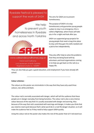
  • 1. The aims for SASH are to prevent homelessness. The purpose of SASH is to stop homelessness and guarantee young people a place to stay in an emergency; this is called a Nightstop, where hosts will take you in for a night and look after you. SASH run supported group projects for young people that need a long time place to stay until they gain the skills needed and a job to live independently. They also offer help to solve the problems that they are being faced with by volunteers and local organisations coming in to help you get back on the rails to a happy life. They can also help you gain a good education, and employment if you have already left school. Colour schemes: The colours on this poster are minimalistic in the way that they have only used three colours, red, white and black. The colour red is normally associated with danger, which will tell the audience that these people are in danger everyday from being homeless. The colour red is also a very intense colour because of the way that it is usually associated with danger and warning. Also because of the way that red is associated with warnings and danger; it makes you think that you need to react quick because that’s what you’d do in a real life danger situation, so it will make the audience feel as if they need to help support SASH quickly. Using the colour red on the poster also makes the rest of the poster that isn’t red stand out.
  • 2. The colour white is a strange colour to use, or so it seems; from doing research I’ve found out that the colour white is supposed to mean safety and perfection, but there isn’t anything safe and perfect about being homeless, but if I didn’t know this I would think that it was a good colour to use because it makes the text easier for the audience to read which is what people will want. I think that using the colour black in this poster is really good because the colour is all dark and gloomy and it makes you feel quite down, which is how homeless people will feel. Using black helps make the writing stand out from the rest of the poster as well because most of the poster is white and red, whereas the information that is in black stands out more because of the way that your eye is being drawn to it because of how dark it is. Text: The text on this poster is easy really simple and this makes it easier for the audience to read rather than fancy writing. This poster only has a little bit of writing on it which is good because it cuts out all the useless information that people don’t need, it tells you only the important things, so it gets straight to the point. SASH has been written in clear bold writing so that the first thing you see is the name of the company and this might give incite in to what the poster is going to be about before reading it. This is interesting because you would have thought they would have wanted the first thing for people to notice to be what the poster is about rather than the company that the poster is for. By using the colour black as part of the text it balances it out so that there isn’t too much of one colour. Images: The images used on this poster is just the SASH logo, the logo is made up of the word SASH written in bold bright writing in a red colour, this makes it stand out from everything else on the page, but it’s also the same red, which keeps it looking professional. There is also lines coming out from the name of the company coming from the top left covering half of the word SASH, the lines coming out from the company name make it look like a sunshine. Which will give people the idea that the company is happy and nice, which will give the audience a good interpretation of them.
  • 3. The aim for Simon on The Streets is again to try and stop people from being homeless and change their lives. Simon on The Streets is a street based company that supports the homeless and works on giving raw emotional and practical support for those that need it. They offer individual help for those at risk of being homeless and those that are and help with behaviour programmes, mental health issues, and addictions. Colour Schemes: The contrast of this poster is really dulled down and dark, this makes the image quite upsetting for the audience to look at because it’s giving them a feel of what there life is like. The dark colours look really depressing as well because of the tone of them, this is the same kind of feel that they are going for by using the colours that they have on the image, they are all quite dark as well which makes them all blend in to one, which is what their life may be like, the same thing everyday with the same routines. The dark clothes that the man seems to be wearing in the photograph are really dark and this will give people the idea that they don’t want to stand out and that they don’t want to be noticed by people. The blue that he is wearing is really dark, this is showing seriousness, this is showing that he is serious about being back in a stable home, blue is also a strong and solid colour, this is showing that you have to be a strong willed person to cope with living on the streets.
  • 4. Text: On this poster the information given doesn’t help a homeless person at all in any way because they won’t have the internet, so instead they could have used a 0800 number so that they could at least ring from a public phone. The text that has been used on the poster is really big and quite bold so that it stands out, they have done this by using a high contrast to catch people’s eye, especially with the way that the background is really dark and the text is white; which will make it easier for the audience to read. The texture of the text looks quite rough and messy; this is hinting that this is what people on the street will be like, because they won’t be able to look after themselves because if they are homeless they are probably not going to have a job either. Images: The image in this poster is the main image as it’s the background picture, which means it’s covering the full thing. The image in this has been edited so that it is quite a dark contrast, which makes the image look quite depressing because there isn’t any lightness in it everything is just dark. At first when looking at the poster I didn’t really understand what the zip was being used for but after taking some time to think about it I realised that the zip is a pun on the large text in the poster ‘NO ROUGH SLEEPER SHOULD BE STUCK ON THE STREETS’, this is showing people rather than telling them that he is stuck on the streets from the way that the zip is attaching him to the floor and he’s trying to get himself unstuck from homelessness. The man in the image also fits in with what the subject is about they have actually made an effort to make him look homeless, rather than just having someone with longish hair and a bit of stubble, they have make him with really long greasy hair, a beard and tired eyes. In the image the man also looks like he is fighting for his life from the way that his hand is placed on the floor looking like he’s trying really hard to push himself back up, he looks as if he is physically and emotionally tired.
  • 5. The YMCA Homeless company work to create a trusting and faithful environment to help people discover that all these charities are there to help people not judge them. They work to making each person feel special by providing shelter for the people in need and give them hope in being able to live back at home or find a forever home. They will also help by focusing on the past and present to sort out working on things that they want; they will also assess the current behaviour of individuals. Colour Schemes: This poster is made up of three different colours, blue, black, red and white. The colour red is normally associated with danger, which is showing people that living on the street with no protection or company is dangerous. By using a triangle as well this is normally represented with danger, as it’s normally known as a warning triangle. So this is again showing that being homeless is dangerous. It’s also used to show determination, rage and anger, by using this colour when the public see It, it
  • 6. should encourage them to try and help and it’s also how the homeless people will be feeling. The colour blue I find is a weird colour to use for this because blue is normally seen as a calming colour and thought of as stability, and you would have thought that being homeless wasn’t a calming thing or at all stable because something could happen at any second, I think that it would have been better if they where to use a dark blue because it seems more of a serious colour rather than a light blue for some reason, maybe because light blue seems more playful. White is a good colour to use on this because it breaks up all the colours and because of the way that it’s the first thing that you notice because of how bright it is compared to the darkness of the rest of the poster, which is a good idea because it is going to get the message across straight away, it brings out text from the black of the background. The black background is a good colour because the black makes everything else stand out, especially the white. It also emphasis the seriousness of homelessness because of how dark it is so its giving people the idea that homelessness is a dark and scary things. Text: The text on this poster is really formal, it’s telling you that the reason for why they are homeless doesn’t matter and that what it’s doing to them and making them go through does. By having it in bold as well it’s also getting the message across to people quickly, especially because of the way that it’s really bold and stands out from everything else on the page with how bright it is. Again in the logo of the poster they have used a font which looks really rough because of the way that it’s all jagged which will remind people of homelessness. IMAGES: In this poster there is only one image so there really isn’t anything to say about it, but in the logo there is a triangle that has been put in-between the words to separate them and to show that homelessness is a warning, they have also made it red to emphasise this.
  • 7. The Salvation Army is one of the biggest company services for homeless people, they think that everyone is valuable and that nobody should me segregated because of the past life that they have had. The Salvation Army helps people by looking at their whole life and the problems that they are being faced with. When people come to them homeless they will be asked if they would be ok with staying in a hostel and start assessing what situation they are in, once they know what’s going on in the persons life they will help them as best as they can and as fast as they can so they can go back in to the world and carry out a normal lifestyle, they will also help them to get some work when they are back on track and then once this happens they will help them to rent a cheap but nice house. Colour Schemes: The tone of this poster is quite dark and gloomy, everything has been dulled down to look darker, and so by having the photo on a dark contrast and this will give the reader an idea of what their life is like. Most of the colours in this image are grey; from doing research this colour is represented with detachment, which is clearly what has happened to the girl in the photo, she has been detached from all of her family and been detached from her home. The colour grey to me is also quite depressing as well because it’s not really a ‘happy’ colour to look at, for example like yellow or orange, it’s just dull and boring so it makes you bored and sad looking at it, it will also depress peoples energy as well, it hints loneliness and isolation, though some people might not see it like this. Text: The poster doesn’t have much text in it but the text that is in it is really powerful from the way that it’s been wrote and how simple it’s been put, ‘Poverty shouldn’t be a life sentence’ its basically trying to get people to think that their life is like a prison and that there’s no way of getting out of
  • 8. homelessness through poverty, which is sad to think of because nobody’s life should be made to feel like prison just because of something that they can’t help, because of the way that they have put it so simple it’s getting the message across straight away as well and getting to the point without loads of useless information, which will make people realise how important the situation is. The text that has been used is quite formal as well because it’s not a fancy text it’s just nice and simple for people to read, this is showing professionalism and that they are a serious company wanting to help and change people’s life. Images: The image on this photo is really strong and powerful because it’s showing a small girl in a open space, this is representing the world, that when your alone your alone and there’s no body there besides you in the big world. The way that the girl is sat is quite strong, she is sat with her arm on the side resting her head, this is making her look as if she is tired from sleepless nights or just fed up of the life that she’s living, by putting this photo as the main image it should make people want to help because nobody should have to live a homeless life. On the walls and on the ground there is also a tally, this is what people do in jail to tell the number of days that they have been there, and this is what the girl has done to show how many days she has been homeless, by doing this it’s also referring back to sentence at the top of the page ‘Poverty shouldn’t be a life sentence’ it’s again showing that there life is like they are in jail doing a life sentence. In the image it looks quite cold as well, you can tell this from if you look out of the bridge the weather isn’t all warm and sunny it’s all quite dark and looking as if it’s about to rain, there’s also no leaves on the trees and everything has turned brown as well so this is also telling you that it’s autumn/winter. The girl in the image is also wearing a thick long coat and warm clothes so this also gives it away as well. With it being winter/autumn in the photo the girl is likely to fall ill as well because she will constantly be cold, this will mean that she will be ill for longer compared to people that have a home, all because she won’t have a doctor and no money to get medicine to make herself better. This is done to guilt trip people in to donating money and helping the homeless.
  • 9. Comparing and Contrasting. While doing research in to existing product’s I thought that all the posters for homelessness would be the same but they aren’t, some are simple, some are complicated, some are busy, quiet, and some have hidden messages within them. All the posters that I have done some annotations to have all different things in them, for example, the first poster is quite simple and quiet, there isn’t really much too this poster because there isn’t any images, it’s all just text and some colours in the background to break everything up a bit, I think that they could have created a miles better poster if they where to add some pictures because after a while it gets boring to look at and this kind of poster won’t get anyone’s attention. The first poster is for stopping young people from being homeless, this poster doesn’t have much too it as there isn’t much text in the poster and there isn’t any images in the poster either, this wont have the same effect as the other posters because it won’t catch their attention like the other ones will, just simply because there isn’t much too it, its all about blocks of colours with a couple sentences of text that won’t really make the audience feel anything of feel like they need to help the young homeless. The second poster which is for the Simon on The Streets company has a story behind it, it’s also getting a message across to the public the text on this poster saying ‘No rough sleeper should be stuck on her streets’ is telling a message about why there is a zip on the edge of the mans face and attached to the floor, the zip is also half open so this is telling the public that he is stuck in poverty and this is getting the message across to people hat he needs there help, this is why I find that poster interesting because it’s eye catching but it’s making people think for themselves rather than being told what’s happening. The text to picture ratio is also equal because the main picture which is a background picture is the most noticeable thing, but then you get a sentence in a massive bold block so hat it stands out, so the text to picture ratio is equal because they are balancing each other out. The third poster doesn’t have any images in, so this isn’t really interesting either it’s pretty much like the first poster for SASH. This poster is very minimalistic because it’s only made up of 4 colours but they are all just darker or lighter versions of each other. The text on his poster stands out a lot because of how bold and bright it is against the background, but still I don’t think that anyone would be interested in this poster for long. A fault that I have found with the poster is that there isn’t a public phone number for the homeless
  • 10. people to ring off there’s only a name of a company, and some people that are homeless might not know where that is, another thing is that they can’t even search where it is or how to get help through looking on the internet because obviously if they’re homeless they won’t have access to the internet. The fourth poster is quite touching from the Salvation Army because it’s telling you a story and the girl in the image is young, the image also has tally’s all over it, this is relating to the text in the poster that say’s ‘Poverty shouldn’t be a life sentence’, this is telling people hat the girl has lost her home to poverty and is now homeless. The two posters that are telling people a story are the Simon on The Street’s poster and The Salvation Army poster, the way that the text and images have been linked together are telling people what’s going on, it makes you think about the hidden message in the picture. The text in both of these posters also get’s straight to the point so that it will keep the audience’s attention rather than loads of text that the audience will get bored off reading and stop after a while. I think that the best one out of these two is the Simon on The Streets poster, this is because of the way that you can really see how tired and fed up the man looks in his eyes almost as if he’s about the cry, whereas the Salvation Army photograph doesn’t really show anything about how the girl is feeling, it’s showing the days that she’s been homeless on a tally but that’s not telling the reader how desperate she is to get off the street, another thing showing this on the Simon on The Streets poster is the text towards the top of the poster. The YMCA Homeless and SASH posters are the same because there isn’t much too them and there isn’t really any text in the posters, it’s telling you what the situation is about but there’s no text in there that makes you feel guilty and want to do something to help the homeless, although it does get straight to the point. This is something that I think they could improve on because compared to the other two I don’t think that they will get as many homeless people coming in for help. I think that the best photo out of these two is the YMCA Homeless poster, this is just simply because it looks more professional than the other photograph, because of the colours that have been used and the way that the text has been placed and also because of the type of font that has been used, its miles more bolder than the other poster so it’s more likely to catch peoples attention than the other which has small and thin writing.