
Mais conteúdo relacionado
Mais procurados
Mais procurados (20)
Semelhante a Double page spread eval
Semelhante a Double page spread eval (20)
Mais de katiesteph5
Mais de katiesteph5 (20)
Double page spread eval
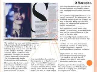
- 1. Q Magazine. This magazine has margins, you can see this because there is framework on the right hand page leaving space inbetween text. The layout of this page has been set in to specific placements, but what throws you is the fact that there is a big ‘S’ taking up most of the page, white contributes so making the magazine look quirky and slightly unorganized. This magazine is just a double page spread. The text is only on one side of the page and the imagery bleeds on to the gutter of the other side. The standard portrait orientation has been used, this is the most common style in media. The text that has been used for this magazine Is Sans-Serif, when looking at the text you can see the flicks that appear at the end of the lettering, they seem to have used this text as this article is more for a feminine audience, which this kind of font represents. Though what they are Talking about may interest men, The first paragraph may be Drop capitals have been used in Enticing to the male audience. this magazine in as they have used The baseline for the text is quite a small space with the smaller text and larger with the bigger font this makes the article look more structured and dense. larger versions of lettering at the start of new topics to attract the audiences attention. If they didn’t already know, it’s also showing that it’s the start of a new subject. Dateline has been used, this doesn’t occur much anymore in todays media, though it appeared a lot when newspapers where just black and white. Page number has been used to navigate people from page to page. The arrow on the page are also showing that there is more about the subject on the next page. Negative space has been created In this magazine because of the big Drop capital ‘S’ taking up most of the space leaving no room for text.
- 2. Marc Jacobs magazine. Margins have been used in this article to avoid putting key pieces of writing inside. It’s also created a frame around the edge of the magazine. Grids have been used in this magazine for the text and a few of the images, it looks as if the images have been put in line with the text, this makes the magazine look more organized. Columns of text have been used this is also done using the grid system, this creates a more formal look. This magazine spreads, it goes across more than one page, this isn’t something that happens often in magazines, so this is rare for this magazine. This is the only header/headline for this magazine, at first when you look at the page you don’t really notice it because of how fine it is and with all different colours being used. The images of the rabbits on this page have been cut out and placed on to the magazine copy, you can tell this because the images wouldn’t just be drawn on to normal paper, normally they would use squared drawing paper to get their dimensions right. A strap line has been used on this magazine to give more information about what the article is going to be about, this informs the reader a bit more what the article is about before they get in to reading it. The gaps in between the sentences are Around the same sizes as the little text on Slide one, this may be because they have a Lot to write about, or because they want their text to look in depth. Though this may put some readers off.