
Recomendados
Mais conteúdo relacionado
Mais procurados
Mais procurados (17)
Destaque
Destaque (20)
Semelhante a Presentation1
Semelhante a Presentation1 (20)
Mais de juliaharvey
Último
Último (20)
Presentation1
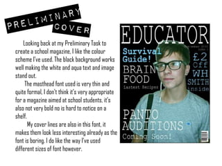
- 1. Looking back at my Preliminary Task to create a school magazine, I like the colour scheme I’ve used. The black background works well making the white and aqua text and image stand out. The masthead font used is very thin and quite formal, I don’t think it’s very appropriate for a magazine aimed at school students, it’s also not very bold no is hard to notice on a shelf. My cover lines are also in this font, it makes them look less interesting already as the font is boring. I do like the way I’ve used different sizes of font however.
- 2. Initially my contents page looks pretty empty. There are not many page numbers or features, if I’d spent longer on the contents I think I would have added a lot more. I like the consistency I’ve kept from my cover to contents, however, again the font lacks interest and looks very basic and plain. Using the cover image in the corner does add a professional element to it but it looks very basic and ‘school magazine’ like. My cutting out again looks very bad as I’ve tried to keep the shadow in the image which makes it look untidy.
- 3. Comparing my Preliminary work to my coursework I can see how my Photoshop ability has improved. In the Prelim the main image I’ve used shows that I can edit the colour/ saturation/ contrast etc, however my cutting out looks of a very poor standard, by using the whole of the image for the cover, as I have done in my coursework, makes the magazine look a lot more professional. In the coursework I have used a much more minimalistic look using barely any coverlines, the fonts for coverlines and masthead are bold and attract interest, unlike the thin, basic font used in the Preliminary task. In the contents I have included many more features and pages which look interesting and quite authentic, rather than just a few in a list in the centre of the page as I’ve done in my Prelim contents. Overall I much prefer my coursework magazine, I think I have progressed in magazine layouts and structuring coverlines and text. My cutting out on Photoshop has also improved even though I only did a small amount on my Final cover.