Using percentage widths
•Transferir como DOCX, PDF•
0 gostou•294 visualizações

A post from my blog http:/http://jbkflex.wordpress.com/ Well, in this post I will discuss another technique to auto adjust the contents of the mobile web page as per the current orientation. Though this is not as powerful as the java script method or the CSS3 Media Query way, but still it is effective. Before staring, check out the demo applicationhttp://jbk404.site50.net/html5/mobile/percentwidth/ in your web browser and try to resize it, you will notice that the contents always auto fits to the screen width size. So, similarly it will also auto fit the mobile device’s screen width when viewed in different modes. Try opening the same URL in your smartphone.

Recomendados
Recomendados
Mais conteúdo relacionado
Último
Último (20)
Destaque
Destaque (20)
Using percentage widths
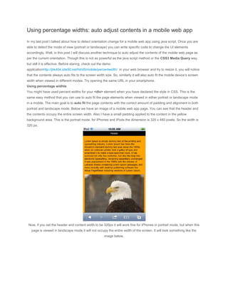
- 1. Using percentage widths: auto adjust contents in a mobile web app In my last post I talked about how to detect orientation change for a mobile web app using java script. Once you are able to detect the mode of view (portrait or landscape) you can write specific code to change the UI elements accordingly. Well, in this post I will discuss another technique to auto adjust the contents of the mobile web page as per the current orientation. Though this is not as powerful as the java script method or the CSS3 Media Query way, but still it is effective. Before staring, check out the demo applicationhttp://jbk404.site50.net/html5/mobile/percentwidth/ in your web browser and try to resize it, you will notice that the contents always auto fits to the screen width size. So, similarly it will also auto fit the mobile device’s screen width when viewed in different modes. Try opening the same URL in your smartphone. Using percentage widhts You might have used percent widths for your <div> element when you have declared the style in CSS. This is the same easy method that you can use to auto fit the page elements when viewed in either portrait or landscape mode in a mobile. The main goal is to auto fit the page contents with the correct amount of padding and alignment in both portrait and landscape mode. Below we have an image of a mobile web app page. You can see that the header and the contents occupy the entire screen width. Also I have a small padding applied to the content in the yellow background area. This is the portrait mode, for iPhones and iPods the dimension is 320 x 480 pixels. So the width is 320 px. Now, if you set the header and content width to be 320px it will work fine for iPhones in portrait mode, but when this page is viewed in landscape mode it will not occupy the entire width of the screen. It will look something like the image below,
- 2. You can see there is empty space on the right as the page’s contents did not occupy the entire screen width. The same problem will be there when you are developing a mobile web app for different screen sizes and different devices such as a an Android Phone with 480 x 800 resolution or an iPad. So, how to overcome this problem. Simply use percent widths. Declare the width of the header and the content or the footer to be 100%. And also adjust the values of the paddings in percent accordingly. Below, we have the full code of the app. Lets check it out, <!DOCTYPE html> <html> <head> <title>Percentage width test</title> <meta name="viewport" content="width=device-width; initial-scale=1.0; minimum- scale=1.0; maximum-scale=1.0;"/> <style type="text/css"> body { margin:0; padding:0; font-family:Arial; font-size:12px; } #header
- 3. { width:100%; height:20px; text-align:center; background-color:#000; color:#fff; padding-top:5px; } #footer { width:100%; height:25px; text-align:center; background-color:#008000; padding-top:5px; color:#fff; } #mainContent { width:95%; background-color:#ffa500; padding:2.5%; } </style>
- 4. <script type="text/javascript"> window.onload = function() { setTimeout(function() { window.scrollTo(0,1); }, 10); } </script> </head> <body> <div id="header">Header</div> <div id="mainContent"> <p>Lorem Ipsum is simply dummy text of the printing and typesetting industry. Lorem Ipsum has been the industry's standard dummy text ever since the 1500s, when an unknown printer took a galley of type and scrambled it to make a type specimen book. It has survived not only five centuries, but also the leap into electronic typesetting, remaining essentially unchanged. It was popularised in the 1960s with the release of Letraset sheets containing Lorem Ipsum passages, and more recently with desktop publishing software like Aldus PageMaker including versions of Lorem Ipsum.</p> <img src="images/bird.jpg" width="100%" /> </div> <div id="footer">Footer</div>
- 5. </body> </html> In the source code of the web app above, in the HTML part we have a header <div>, a footer <div> and a content area <div> which holds the Lorem Ipsum content and the image of the bird. If you see the image tag, there itself we have specified the width to be 100% <img src="images/bird.jpg" width="100%" /> This lets the image to occupy the screen width always. Also this maintains the aspect ratio of the image, since we have not specified width and height together. Note that specifying only the width or the height maintains the aspect ratio of an image in a web page. Let’s check out the CSS now. The CSS part is very simple, the style rules of thebody is self explanatory in itself for a decent CSS guy. The important part is the header, footer and mainContentstyle rules. You can see I have specified the width of header and footer to be 100%. The other style rules are pretty easy to understand, isn’t it. #header { width:100%; } #footer { width:100%; } 100% width ensures that the header and footer always occupies the screen width of the mobile device, be it the portrait or the landscape mode. That’s not only it, they will occupy the screen width even for desktop browsers if you resize them. Now, check out the mainContent style, #mainContent { width:95%; background-color:#ffa500; padding:2.5%;
- 6. } I have the width as 95%, since I have a padding for the content. The padding value occupies the space within the content area and if the width was 100%, then the padding would have added to the 100% value and as a result the content area would have been more that 100% and would have gone out of the screen area resulting in a horizontal scrollbar. So, I kept the width as 95% keeping into account the padding of 2.5%. Why 2.5%? Well, I manipulated it by trial and error, you can do the same according to your need. But keep in mind that if you specify a padding value then do not set the width to 100%. Keep it less than 100%. These are very simple techniques. You might wonder why I did not try this earlier. Well, I felt the same. The end result can be seen below in the images, both the images are of the same app in landscape mode, Here is the link to the demo: http://jbk404.site50.net/html5/mobile/percentwidth/ Try opening it in your iPhone or Android phone and change the view to landscape.