Replicating the Swipe Gesture iPhone Gallery for mobile web– HTML5 – Part 1
•Transferir como DOCX, PDF•
0 gostou•1,733 visualizações

In this tutorial we will talk about building up a Swipe Gesture photo gallery for iPhone, iPod using web technologies – HTML5, CSS3 and JavaScript. To begin with, you might have viewed pictures in your iPhone or iPod photo library and may remember how you used to swipe your finger across the screen of your device to view the next or the previous image in the gallery. The same thing we are going to replicate and make a mobile web app. Our app will run full screen on the mobile safari browser so this gives it a native look n feel.

Recomendados
Recomendados
Mais conteúdo relacionado
Último
Último (20)
Destaque
Destaque (20)
Replicating the Swipe Gesture iPhone Gallery for mobile web– HTML5 – Part 1
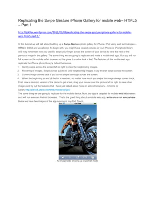
- 1. Replicating the Swipe Gesture iPhone Gallery for mobile web– HTML5 – Part 1 http://jbkflex.wordpress.com/2012/01/09/replicating-the-swipe-gesture-iphone-gallery-for-mobile- web-html5-part-1/ In this tutorial we will talk about building up a Swipe Gesture photo gallery for iPhone, iPod using web technologies – HTML5, CSS3 and JavaScript. To begin with, you might have viewed pictures in your iPhone or iPod photo library and may remember how you used to swipe your finger across the screen of your device to view the next or the previous image in the gallery. The same thing we are going to replicate and make a mobile web app. Our app will run full screen on the mobile safari browser so this gives it a native look n feel. The features of this mobile web app replicate the iPhone photo library’s default behaviors, 1. Gently swipe across the screen left or right to view the neighboring images. 2. Flickering of images. Swipe across quickly to view neighboring images. I say it harsh swipe across the screen. 3. Current Image comes back if you do not swipe it enough across the screen. 4. When the beginning or end of the list is reached, no matter how much you swipe the image always comes back. First, view a desktop version of the demo to get a feel, drag your mouse over the picture left or right to view other images and try out the features that I have just talked about (View in web-kit browsers – Chrome or Safari):http://jbk404.site50.net/html5/mobile/swipey/ The same thing we are going to replicate for the mobile device. Now, our app is targeted for mobile web kitbrowsers so it will run even on Android browsers. That’s the good thing about a mobile web app, write once run everywhere. Below we have two images of the app running in my iPod Touch, An image/slide showing up in portrait mode
- 2. Change of slides when swiping What is a Swipe gesture? When you use your finger to drag on the mobile device’s screen it is called a swipe gesture. It is equivalent of a mouse drag over a desktop browser. Remember that our app is a single touch application and not a multi touch app. Even the default iPhone photo gallery is a single touch app. That means you can use only one finger at a time to operate. Check out this video to get an idea: The basic concept to start with
- 3. I have a picture above that explains the entire process. We have images placed inside <li> elements which acts as slides and all these <li> elements are placed inside an <ul> element. The <li> elements are laid out horizontally since we are building a horizontal gallery. This can easily be done by using float:left CSS property. <div id="wrapper"> <ul id="panelContainer"> <li> <img src="img/1.jpg" width="100%" height="100%"/> </li> <li> <img src="img/2.jpg" width="100%" height="100%" /> </li> ..... </ul> </div> Now, we basically have to move the <ul> element (our slides container) left or right using CSS3 transition and transformations (Hardware accelerated CSS3 transitions, this makes the animation much smooth) based on the user’s swiping gesture interaction on the device screen. Ofcourse we have the four features that we have talked about earlier and need to keep that in mind. So our transition and movements should follow these features and we will have to code it out accordingly. We will talk about it later. Finally we have all our slides and the container inside a wrapper. The wrapper is a <div> element with overflow:hidden. The wrapper occupies the entire browser screen and acts as a masking element. This ensures that only one slide/image is seen at a time. Preparing the slides As I have already talked about, each image is placed inside a <li> element and let’s consider it to be a slide. So, we place multiple such slides inside an <ul> element which is our slide container (Refer the HTML block above). Normally, in an unordered list the <li> elements are placed vertically. To place the slides horizontally, this is how to do it, #wrapper ul { list-style:none; margin:0;
- 4. padding:0; -webkit-transition: -webkit-transform 0.3s linear; } #wrapper ul li { float:left; } We have set a float:left to our slides. And to the unordered list – the <ul> element we have set list- style:none,padding and margin to 0. One important thing to note is that for our slides to be placed horizontally we have to set enough width to the slide container (<ul>) so that there is room for all the slides and there is no slide wrapping i.e placing slides in a new line after full width is reached. I will talk about this in the java script part. First, let’s check out the full HTML and CSS needed for our app, body { margin:0; padding:10px; } #wrapper { overflow:hidden; } #wrapper ul { list-style:none;
- 5. margin:0; padding:0; -webkit-transition: -webkit-transform 0.3s linear; } #wrapper ul li { float:left; } <!DOCTYPE html> <html> <head> <title>Swipe Gesture - Gallery</title> <meta name="apple-mobile-web-app-capable" content="yes" /> <meta name="viewport" content="initial-scale=1.0; minimum-scale=1.0; maximum- scale=1.0;" /> <link href="css/styles.css" rel="Stylesheet" /> </head> <body> <div id="wrapper"> <ul id="slideContainer"> <li> <img src="img/1.jpg" width="100%" height="100%"/> </li> <li>
- 6. <img src="img/2.jpg" width="100%" height="100%" /> </li> <li> <img src="img/3.jpg" width="100%" height="100%" /> </li> <li> <img src="img/4.jpg" width="100%" height="100%" /> </li> <li> <img src="img/5.jpg" width="100%" height="100%"/> </li> <li> <img src="img/6.jpg" width="100%" height="100%"/> </li> <li> <img src="img/7.jpg" width="100%" height="100%"/> </li> </ul> </div> </body> <script type="text/javascript" src="js/scripts.js"> </script> </html>
- 7. We have a total of 7 images/slides. You can add as much images/slides as you want and the app will adjust automatically. This looks pretty simple isn’t it. Now, let’s check the java script code needed for handling all our interactions in our next part- Part2 Link to desktop version of the demo : http://jbk404.site50.net/html5/mobile/swipey/