
Recomendados
Mais conteúdo relacionado
Mais procurados
Mais procurados (19)
Semelhante a My poster analysis
Semelhante a My poster analysis (20)
Mais de johanna-asmedia
Mais de johanna-asmedia (20)
My poster analysis
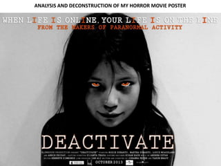
- 1. ANALYSIS AND DECONSTRUCTION OF MY HORROR MOVIE POSTER
- 2. The inspiration from my magazine came from the Insidious horror movie poster. I really like the layout of this poster and I felt that the sub genre of the insidious poster linked with the sub-genre of my horror trailer. I really liked the idea of having one of the main protagonists as the main focus of the poster but looking directly at the viewers to grab their attention. I also liked the idea of having the eyes of the character different to normal. The eyes of the character in the insidious poster look like smashed glass and i wanted to edit my eyes to an orange colour to make them look more scary for the audience to look at. Although the background of the insidious poster reveals some of the location, i didn’t feel this necessary to add to my poster because the main character is captivating enough to draw the reader’s in straight away and also it leaves a sense of mystery not having the location included.
- 3. MAIN IMAGE Above is the original After adjusting the overall general photograph I took of one of colour of my image, I then decided the protagonists of our to use the colour tool to edit the eyes of my character. I zoomed in horror trailer and I used this really far so that I could be really image as the main focus for detailed when colouring her eyes my poster. I told her to pose Using Photoshop, I decided to edit the and then I made the white part of contrast, brightness and exposure of my her eye brighter so that her eyes with an evil, creepy look photograph to give it more of a horror stand out and then coloured the staring directly at the look and to fit it to the sub-genre of our main part of the eye from black to audience, yet because of horror trailer. I decided to make the orange but leaving the pupils image a lot darker so that it seems much black. I did this because I feel that the age of the actress, it more dark and scary adding to the the eyes are an important, factor also gives the image an psychological factors of our trailer and it of my image to draw the readers innocent edge to it also adds to the colour scheme of my in and if they feel that they are furthermore drawing the poster which is black, white and orange. being stared at then they will Along with adjusting the become more freaked out and viewers in because it will brightness, contrast and exposure, I also scared thus leading them to want leave them questioning used the burn tool to emphasize the to watch the film because being what this little girl has done. dark smudges underneath her eyes to scared is a key factor as well as key make her look more tired and troubled. enjoyment of horror movies.
- 4. After editing the main image of my poster, I then moved on to adding in the title of my horror movie. I felt that the title was also a key aspect of the poster because this is what the viewers are going to need to know when they want to go and watch our film. It has to be able to stick in their heads so that when they chat about it with family or friends they can then share what it is called with them, hopefully promoting it. I placed the title of our film directly in the bottom centre of my poster in rather large, capital writing. The font is white and is placed on the black background therefore leading it to be very noticeable. Also the fact that it is directly in the centre means that it will be one of the first things that the viewers will see. After adding in the title, I thought it would be good to follow one of the main conventions of horror posters and add in the tagline and the promoting line as most posters include these. I feel that our tagline is one of the most important elements of our horror movie trailer because it really emphasizes the sub genre and is also relevant to many people’s lives thus drawing the readers in. Because one of the key aspects of our trailer is the modern day use of social media, then our tagline will scare the readers because they will feel that something bad is going to happen to them because they are expressing their lives ‘online’ through social network sites such as Facebook and Twitter. I decided to place this at the top of the poster in the centre because this is one of the first places the viewers will look at when looking at this poster because the majority of people tend to read from top to bottom.
- 5. The next thing I added to my poster was the billing block. The vast majority of film posters have these on them so that the viewers can know extra details of actors, producers etc if they really want to. It’s always there for them to look at if they want to. However, I have placed this directly at the bottom of the poster underneath the title but in very small font. The reason that the font is so small is because it is not something that the viewers will necessarily remember and it won’t necessarily draw them into want to watch the film. However it is important to have it there just in case they do want to know. Afterwards, I inserted the release date of the film. This is slightly larger than the billing block just because it’s more something that the viewers will want to know rather than wanting to know the editors or casting directors of the film etc. It is also placed at the bottom of the poster because I don’t feel that it is of most importance. In addition, I then added in the logos of the film companies and distribution companies at the bottom of the billing block. I also placed these at the bottom of my poster because I feel the level of importance isn’t as great as other aspects of my poster, yet it needs to be included to inform the viewers of the companies behind the film.
- 6. Finally, after adding all the text and most important features of my horror movie poster, I then eventually decided that the text didn’t seem to stand out enough. So in the end I decided to edit my text and add an outline and an outer glow to the text. I feel that this really made it stand out of the page and add emphasis to the poster and lead the viewers to want to read the text even more. I could really see the difference it made and I also noticed that every other poster edits the text and adds effects to it to make it stand out more as we can see in the insidious poster where I got my inspiration from. Also, the I’s in the tagline have been made a different colour from the rest of the tagline bringing it to stand out even more. And also so that the viewers can feel included because they will feel like it relates to them personally because of the vast use of the word ‘I’.
- 7. Colour scheme The colour scheme of my poster is black, white and bright orange. The reason I chose this colour scheme is because not only do I want my poster to stand out but I feel that these colours represent the horror theme. The black contrasts with the white, and the bright orange just adds in a bit of colour to make the poster much more interesting and intriguing for the viewers to look at. The main image is black and white, adding an eerie effect but also bringing in elements of the past, which is one of the main focuses of our horror movie. The promotion line ‘From the makers of Paranormal Activity’ is mainly in bright orange to contrast it from the rest of the poster, because this is an important thing for the viewers to know so that they know that the people who made ‘Deactivate’ have previously made successful horror movies before leading them to want to watch it more. Comparing it to real media products My poster has many connotations of previous real media products such as what is included. For example, the title, tagline, billing block, release date etc. These are all things that are on the majority, included in most posters. Also, the image is very creepy and scary much like the images in many other posters. This is to promote the horror genre and to draw the viewers in to want to watch the film because of it’s terror and suspense. Much like many other posters, the image is always focussed on the horror sub-genre of the film so that the viewers know what to expect. My poster however goes against the stereotypical features of many posters such as the insidious poster because of the fact that the location isn’t revealed. In many posters, the product reveals a glimpse of the location in the film, however in my poster the focus is just on the character and the location is a secret and is not of most importance to draw the viewer in to the film. I feel that my poster is simple yet effective and doesn’t reveal too much of the film leaving ambiguity in the viewers head (one of the connotations of psychological horror sub- genre)