
Recommended
More Related Content
What's hot
What's hot (18)
Viewers also liked
Similar to Double Page Spread Analysis
Similar to Double Page Spread Analysis (20)
More from johanna-asmedia
More from johanna-asmedia (20)
Double Page Spread Analysis
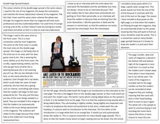
- 1. Double Page Spread Analysis I chose to do an interview with the artist about her I included a drop quote which is in new band The Rockabees and the worldwide tour they large, capital, bold, orange font. This The colour scheme of my double page spread is the same colours are doing. I chose to do an interview because I feel quote stands out from the rest of the I used for the rest of my magazine; this keeps the consistency that readers like to hear about how artists/bands are article because it contrasts with the and matches the house style/colour scheme of my magazine. The getting on from them personally, so an interview will rest of the text on the page. The reason fact that I have used the same colour scheme the whole way draw the readers in because they are hearing from the I have included a drop quote on the through my magazine means that my magazine will look more artist themselves. I did the questions in bold and the right page is so that when the readers professional and less cluttered/jumbled. I’ve used hints of orange answers in normal text, so that the audience can easily are flicking through the magazine, they to bring a bit of life, so that it doesn’t look too boring but mostly separate the interviewer from the interviewee. are automatically drawn to this quote, used black and white so that it is clear to read and understand. meaning that they will want to find out The image I used is the same artist as more, therefore read the article. This is the front cover. This is a main a convention used on many double convention used by most magazines. page spreads because it is known to The artist on the front cover is usually draw the reader’s in and catch their the main story on the double page attention. spread. The image is a full body shot of the artist sat on an amp, with her bass The page number, date and guitar next to her. She is wearing the name of magazine is placed in same clothes as on the front cover, the the bottom left and bottom scruffy, ripped looking clothes, but this right of the magazine in very time we get more of what she is small font. It is small so that wearing because she is not covering the readers aren’t drawn away any of it up. We can see attitude in her from what is most important face, as she stares directly at the but it can still be seen. The audience. Even though she is sat down, name of the magazine is which could make her seem of lower included next to the page authority, the fact that she is giving number so that the readers such an intense, controlling look means can be reminded of what On the left page, directly underneath the image is an introduction to the interview on the that the readers will begin to feel over magazine they are reading, next page. The title is the biggest font on this double page spread, so that it will stand out powered by her. The amp and the bass meaning that the name will and catch the reader’s eye. The band’s name which is being talked about on this spread is are two of the main things needed in a stick in their head leading in bold. It is the boldest font on the page. This is so that the audience know exactly who is band. They are included in this image so them to want to buy it again. being talked about. The sub-heading is slightly smaller, being slightly less important and that the readers can automatically The whole aim is for people to in Italics to emphasize the shock and excitement to the story. Underneath the sub- relate to the music being represented want to continue buying it and heading is 3 columns with an introduction to the interview. The first letter of the in this magazine. The audience will including the name there introduction is in large white font on an orange box. It stands out and automatically relate to this image because they relate means that there is more draws the reader in. This is a typical convention on many double page spreads. This is fully to the indie/rock music being chance to reach this aim. done so that the readers know where to begin reading and can be drawn into the article. represented here.