
Recomendados
Mais conteúdo relacionado
Mais procurados
Mais procurados (18)
Destaque
Destaque (18)
Semelhante a Red, black and white colour scheme catches eyes on emo music magazine spread
Semelhante a Red, black and white colour scheme catches eyes on emo music magazine spread (20)
Mais de johanna-asmedia
Mais de johanna-asmedia (20)
Último
Último (20)
Red, black and white colour scheme catches eyes on emo music magazine spread
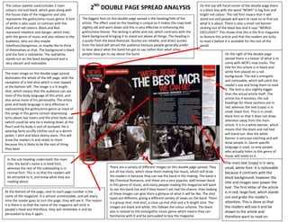
- 1. The colour palette used includes 2 main colours red and black, which goes along with 2ND DOUBLE PAGE SPREAD ANALYSIS On the top left hand corner of the double page there is a black box with the word “NEWS” in big font and the house style of the magazine and also bright red colour. The red font means that it will represents the gothic/emo music genre. A hint The biggest font on this double page spread is the heading/title of the stand out and people will want to read on to find out of white is also used, to contrast with the article. The effect used on the heading is unique as it makes the copy look what it is about. There is also a small red banner black and red colours. Black and Red slightly old and worn down and this is very effective in enhancing the sticking out of the black box and it says “WORLD represent rebellion and danger, which links gothic/emo theme. The writing is white and red, which contrasts with the EXCLUSIVE!” This shows that this is the first magazine with the genre of music and also relates to the black background bringing it to stand out above all things. The heading is to feature this article and that the readers are lucky audience, who are also maybe a quote from the band featured. Quotes are reliable, and direct quotes to read it before it is available for the rest of the rebellious/dangerous, or maybe like to think from the band will attract the audience because people generally prefer world. of themselves as that. The background is black to hear about what the band has got to say rather than what other and the font is red/white. The red/white people have got to say about the band. On the right of the double page stands out on the black background and is spread there is a teaser of what is to very vibrant and noticeable. come with MCR’s new tracks. The title for this article is in black and The main image on this double page spread white font placed on a red dominates the whole of the left page, with the background. The red is energetic exception of a mid-shot which is over lapped and noticeable, which will catch the at the bottom left. The image is a ¾ length reader’s eye and bring them to read shot, which means that the audience can see it. The font is also slightly bigger most of the body language of this artist, and than the actual article itself. The also sense more of his personality. The artists article has 4 sections; the sub pose and body language is very effective in headings for these sections are in representing the gothic/emo genre as most of red, whereas the text (copy) is in the songs in this genre contain depressing small, black font. This is in small, lyrics about lost lovers and the artist looks sad black font so that it does not draw (which could be why he is looking down at the attention away from the main floor) and his body is sort of slumped. He is article. It is in a white banner, which wearing fairly scruffy clothes such as a denim means that the black and red text jacket, t shirt and black skinny jeans. This will will stand out. Also the white draw the readers in and relate to them banner is very eye-catching and will because this is likely to be the sort of thing draw people in. Genre specific they wear. language is used, so only people who actually listen to this genre of music will relate to it. In the sub-heading underneath the main title, the band’s name is in bold font, The main text (copy) is in very, whereas the rest of the subheading is in There are a variety of different images on this double page spread. They small, white font. It is noticeable normal font. This is so that the readers will are all live shots, which show them making live music, which will draw because it contrasts with the be attracted to it, and know what they are the readers in because they can see the band in the making. The band is black background; however the reading about. My Chemical Romance, and these are a very popular, well-known band title and images over power the in this genre of music, and many people reading this magazine will want to see this band live and if they haven’t yet had the chance, then looking text. The first letter of the article At the bottom of the page, next to each page number is the is in red, large font, which stands at these images can give them a glimpse of what it will be like. The shot name of the magazine. It is almost unnoticeable, and yet every out and grabs the reader’s types are different, giving a different variety of views on the band. There time the reader goes to turn the page, they will see it. The reason attention. This is done so that is a group shot, mid-shot, a close up mid shot and a ¾ length shot. The it is there is so that the name of the magazine will stick in images are black and white, this follows the colour scheme. The black the readers will see it and be people’s head and therefore, they will remember it and be also is related to the emo/gothic music genre which means they can drawn to the article and persuaded to buy it again. familiarize with it and be persuaded to buy the magazine. therefore want to read on.