Call Girls in Delhi, Escort Service Available 24x7 in Delhi 959961-/-3876
1st double page spread done
1. Johanna Fryer
DOUBLE PAGE SPREAD ANALYSIS
The title is white, bold and is in capital letters. The first thing
that the readers will see is ‘NOEL GALLAGHER’ and this is
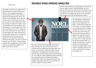
The image is a mid shot and is placed on the what the editors want the reader to see first because he is the
left hand side of the article. Readers will be main feature of the article. The fact that it is the only writing
drawn in to the image because people in white and is much bigger than the rest of the copy means
naturally read from left to right, therefore it that it stands out the most and will draw the reader in.
will be the first thing that they will see. The
image is of Noel Gallagher, who is obviously
The sub-heading is in black, which
the main focus of this article as we can see
contrasts with the title, which is in
from the title. His head is tilted down and his
white. The sub-heading says ‘The
eyes staring up, this gives the readers a sense
CHIEF’. It seems that the whole aim
of intimidation and a sense that Noel is over
of this article is to represent Noel as
powering them. The facial expressions of Noel
an over powering person and higher
are evil looking and it’s as if he is saying ‘you
authority than the rest of us. So the
don’t want to mess with me’ and his eyes are
use of the word chief conveys the
staring straight at the reader to draw them in
authority of him because chiefs are
and make them feel part of it. He is wearing a
superior and respected. The word
brown leather jacket and is fairly scruffy
‘CHIEF’ is in capital letters whereas
looking; this also represents the power he
the word ‘The’ is in lower case italics.
shows over the readers. This relates to the title
The fact that the word ‘CHIEF’ is in
because it says ‘The CHIEF’. Chiefs are higher
capitals illustrates that it is important
authority than everybody else and this is what
and that it is overpowering and
comes across about Noel Gallagher. He is The colour scheme of this double page spread is blue,
relates to the image. Because ‘the’ is
higher authority and rules you. white and black. The colours are fairly calm, which
in italics it emphasises that he is the
contrasts with the intimidating, controlling image. These
only one and that there is nobody
colours are very natural and give the reader a sense of
else as high as him.
sophistication. The background is blue which contrasts
with the white and black writing to make the writing stand
out. The image has a white shadowing around it; this helps
the image contrast with the background creating a
dramatic effect. Also it goes along with the idea of Noel
Gallagher being higher authority, as it seems that this is
what the magazine is trying to achieve.