
Recomendados
Mais conteúdo relacionado
Mais procurados
Mais procurados (16)
Semelhante a Analyse music magazine
Semelhante a Analyse music magazine (20)
Analyse music magazine
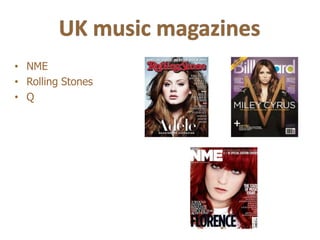
- 1. • NME • Rolling Stones • Q
- 2. • Editor: Mike Williams • Company: IPC. Media (Time Inc.) • Other Publications by IPC. Media: Teen Now, Uncut, Wallpaper, Woman&Home, TV times, Look etc.
- 3. Masthead: “NME” the headline is written in san serif as Main Image: The main image is a Layout: Pink is the main colour, main font. Very simple short and solid masthead. It is medium close up of Rihanna. She uses which represents love, self written in pink which is associated with the stereotype of a direct address by looking straight into confidence and acceptance. The teenage girls. It is very straight forward and informal the camera. She does not smile or give pink colour makes it more aimed because of the shortness. any facial expressions, but looks very for girls or women, because it is a calm. The fact that she is not giving girly colour. It is not filled with any facial expressions makes the lots of captures, pictures and text. attitude of the magazine very calm. She It looks tidy. But because of the is dressed up a lot and not showing strong use of pink it still doesn’t much skin, which may represent the look that calm even though it is image of Rihanna as decent, proper not much of text and pictures. It and pure. This makes the magazine is very lucid because of the small look more proper as well, and aimed for amount of text. It looks cheap girls in any age, but mostly teenagers because of the small amount of and young adults. text, pictures, adds and captures. Main Heading: “Rihanna” with big Sub Heading: “The state of pink letters written in san serif at the music today” is written in san middle of the picture of Rihanna. serif font and underneath the sub Very feminine text. The pink colour heading there are some artists represents self confidence, which is represented as the state of music something that it looks like Rihannas today. It is written in pink, and got. It is a quote from her that matches the other headlines and matches the colour of the main texts. Only the names are heading. It makes you want to read mentioned so it makes you more of what’s behind it. It also curious and you want buy it. represents the person that she is and you get an impression of how she is as a person. Buzz: Draws your attention to it pretty quickly. “Introducing the new NME 4 of 10 special edition covers.” Makes it more special because it is special edition cover, which makes Barcode: In order for the consumer to purchase the you want to buy it even more. media product. Tells you about the price and date.
- 4. Layout: Red is the main colour. Red Date: Date of the day. Main Heading: “This Week” is the represents danger and temper, main heading and written in san serif which kind of fits into this page. It is font with big black letters. It is very very strong coloured and looks a bit framed compared to the rest of the “rockish” and punky. It may text. Tells the audience about this represent what music and bands the week’s contents within music. magazine is representing this week. It is very structured and tidy. It is easy to read what the contents is Sub headings: Written in black about and which page to find the boxes in san serif font, which is the topics. same as the main heading. Tells the audience about the different topics Images: There are two main and what’s underneath. Very tidy images put together placed in the and framed. A very good overview middle of the page. The images is of what the topics are and well of two guys singing, one of them is structured because of the black holding a guitar. This tells us that boxes. the main article will probably be Cover lines: Tells you about the about them because they seem main articles in the magazine important, and because the and what they are about, and picture is placed in the middle and which page you can find them covers about a quarter of the page, on. Well structured and tidy. and it is the first thing you see when you look at the page. Plug: makes you curious and want to read more about it. Adds: Commercial set on the bottom of the page which doesn’t really make it that important, but you still see it.
- 5. Main image: The main image is Main heading: The main heading is small a medium close up of Lady The big “L” is set at the middle of the page and covers and written in black serif font. “Lady” is Gaga. The picture covers about some of the article as well. It is very framed and red. written in small letters and “gaga” is written half of the page. She is standing Red represents love, danger and passion, which in capital letters. This may represent how with no clothes and hands probably represents what kind of a person Lady Gaga is. big her last name has become and how covering her breasts, there are The big “L” is probably a symbol of how big and famous famous it is. It is set on the right side of the also jewellery covering her her name is, and how dominant it is. page and is not very framed. breasts. She gives a direct address by looking straight into the camera. This makes the picture sexually represented because she is naked, touching herself and she also has her mouth open which kind of makes her more available in this context. Her hair is also a bit messy and tousled, which also is a typical stereotype of sex and “sexy.” The fact that she is naked may represent her feelings and personality. She is not afraid to show her body and looks confident. Layout: Very tidy and solid layout. The main colours are white, sepia, red and black. There are not a lot of colours which makes the layout very calm and relaxing, this may also represent the kind of person Lady Gaga is.
- 6. • Editor: Jann Wenner, Will Dana • Publisher: Jann Wenner • Company: Wenner Media LLC • Other Publications by Wenner Media LLC: Men’s Journal, Weekly us
- 7. Masthead: The headline is written in serif font, which Layout: Not too colourful, uses looks more formal. Uses grey/beige as main colour. Main Image: The main image is a colours that matches each other. This represents friendliness and safety. This aims for medium shot of Zac Efron, a teenage Uses grey, pink, orange and both genders, but because of the colour it looks more sensation. Half-dressed in a t-shirt, and beige. Because of the white for men than women. The headline kind of fades touching himself. At the same time he background the colours matches behind all the other text, and is not as coloured looks kind of innocent because he is well together. Pink mostly compared to the rest of the layout. The colour and laughing and smiling and not looking represents that is a women text makes the attitude in the headline very calm and straight into the camera, and not giving magazine, but here it has been relaxing. any sexual look. The main colour is white used other colours as well so it though, which represents purity, can represent both genders. The goodness and innocence. The fact that he main colour here is white, which is holding is shirt up, showing his chest represents and abs, and touching himself makes it a goodness, innocence, purity. This sexually represented picture. The majority makes a good attitude. Because of the audience of this magazine would of that it looks like a magazine for probably be mostly girls/women because teenagers and young adults. of the sexual representation of Zac Efron. Because it is not filled with lots of The fact that he is showing his abs and captions, pictures and text it looks holding his shirt up will increase the like a middle-priced magazine. amount of magazines bought. Main Heading: “The New Sub Heading: “Punk Rock Fight American Heart Throb, Zac Club,” written in san serif. The colour Efron,” is the main of this text matches the masthead and heading, written in San Serif. The is smaller, but also darker and main heading is written in stronger coloured than the main pink, and his name in orange. heading, which draws your attention Orange represents to it. power, sincerity and enthusiasm while pink represents love, self confidence and calmness. The Plug: “John Edwards, The real headline is bigger than the other liberal with big ideas.” In a black texts and has a stronger colour box with orange and white text in which frames the headline. Since San Serif. Draws your attention to the main colour of the headline is it quickly because it is right by the pink which is a girly colour, and it masthead and compared to the says “The New American Heart rest of the layout this box stands Throb,” it is more aimed for girls. Barcode: In order for the consumer to purchase out because it is stronger coloured. the media product. Tells you about the price and By the “With Big Ideas” text you date. get curious and want to read more.
- 8. Main Heading: “Contents” is the main heading. It is written in Sub Headings: Very well serif, in white in a red box. This structured. Written in red and serif frames the main heading very font. The sub headings separate the well. It represents what the different topics and makes it very contents in the magazine will be. structure and solid, and it also Very solid and tidy main heading. makes it easy to find the topics and It tells the audience what he stuff that you are looking for. contents are and which page you can find it. Cover lines: Written in black and serif, and is framed more than the other texts. Tells you about what Layout: Well structured and is on the different pages and what organized. Pictures placed on you can read about on the page the lift side and contents and number that is set on the left side cover lines placed on the right of the cover lines. Well structured side, these covers about the and tidy. same amount of the page. Red and white are the main Lines: Separate the different colours. sub headings and topics. Images: Three different images placed on the left side of the content page. The two pictures on the top are different Webpage, Page number and from the last one because the date: Placed in the corners of pictures on the top are of music the page and tells you about artists, and the last one is of he webpage, page number and “Apocalypsie in the Gulf.” The date. last picture is not very connected to the two pictures on the top. The pictures tells the audience what is on the page that is numbered in the corners, and who the main article will be about.
- 9. Main Image: The main image is a close up of the Main Heading: “The Tells the audience who and famous singer Adele. It covers about half of the double Triumph of Adele” is written what Adele is and makes you spread page which makes her very imporant. She looks in serif. The words are want to read the article. very pale because the use of lights and colour in her face. written in different sizes She looks very serious and thoughtful, but also very calm where her name dominates. and relaxed. By the look of her face and use of colours It also tells the audience she looks like a decent and proper woman. You also get what the article is about. an impression that it is a serious and proper article of The main heading covers Adele. about a quarter of the page, which makes it important and dominating. Layout: The main colour is grey, white and black. These are colours that you associate with sadness, darkness and death. This may represent the image of the article and Adele, and what she is like, and what she is experiencing. Very tidy and solid layout, mostly because of the colours. Looks expensive and exclusive because of the use of black, white and grey colours. It also makes Adele look like a proper and decent person. Introduction: Tells you about who Adele is, and what success she has achieved. Also tells the audience what the article will contain.
- 10. • Editor: Danyel Smith • Company: Prometheus Global Media • Other Publications by Prometheus Global Media: Adweek, Backstage, The Hollywood Reporter.
- 11. Layout: The colours are very solid and Masthead: Uses white as main Plug: This draws attention to you calm. Mostly grey, white and black. It colour, which contains that it is a quickly because it is right by the looks a bit expensive because of the magazine for both genders. The masthead and it is also very strong elegant layout colours. The background letters with holes in are filled with coloured. colours makes it easy to see the colours, such as red, yellow, blue headlines. and lime green. The colours makes the magazine a bit more childish. Buzz Word: “Exclusive” draws The letters are rounded, which your attention to it. It tells us makes it relaxing and soft. about special offers and makes you want to buy the magazine. It is also very strong coloured Main Image: The main picture is a compared to the rest of the layout close up of Drake. He uses a direct and background. address by looking straight into the camera. He has a very serious look and he is not smiling. He looks very Sub Heading: The “A Little decent. He does not show any facial Pitchy” text catches your attention expressions. This makes the image very well because of the catchy and attitude of the magazine very colours, they used yellow which calm. The colours of Drake and the was very framed compared to the background is very relaxed. background colours, it brings the focus to the sub heading. It makes you want to read what’s underneath the sub heading. This is also representing what will be in the magazine, and makes you want to buy it. Main Heading: One big word, “Drake” written in San Serif, and the little sub heading underneath represents who Drake is and what the article inside the magazine will tell about him. And that the main article will be about Drake and Barcode: In order for the consumer why he is the new face of Hip to purchase the media product. Tells Hop. you about the price and date.
- 12. Main Heading: “Contents” is written black san serif. I is the Layout: Very colourful and main heading, and tells the tidy layout. Well structured and audience what the contents in it is easy to read what the the magazine are and what content is about and what is in page they can find it. it. On the right side there is a list of costumers of number 1 albums, singles and this week Images: There are three on. Blz which keeps you images with a number in the updated. The colours are very left corner of each picture. This basic and not too strong tells us what page the different coloured. artists are represented on. It does not say anything about them, which makes you curious and want to look at the Sub Headings: Written in pages. Further down there is a black serif. Well structured picture of two guys, which the and tidy, and a good overview main article is probably of what the different topics about, because the picture is are and what’s underneath placed in the middle of the and what the content is. It is page and is the biggest as also numbered and lined well. It is the first thing you which makes it even more see when you look at the tidy. It has the same font as page. In the right corner you the main heading. It see what page you can find represents the different topics the article. that contains in the magazine. Webpage, Date and Page number: Placed in the left Cover Lines: Tells you bottom of the corner. Tells about important and main you about webpage, date and articles in the magazine, page number. because they are more framed than the other headings. Written in blue san serif.
- 13. Main Heading: “Girl, you’ll be a woman soon,” is placed in Main Image: The main image is a long shot of the teenage pop sensation the middle of the page which makes it the main focus of the Miley Cyrus. She is using a direct address by looking straight into the page, as well as the image of Miley Cyrus. It is written san camera, she looks very serious but at the same time very calm. The way serif and is very simple. In The word “girl” is coloured in Miley is posing is matching the main heading very well. It shows how she is pink, which is the stereotype of teenage girlish. Pink also still a girl by the way she looks and is posing, but still how she is growing by represents self confidence and acceptance, which fits fell into the shoes, style of her clothes and the look at her face. The image is spread the text and image. The “You’ll be a woman soon” part is over both of the pages and it is a very tidy and calm image, which may placed on the right side of the pictures which very well represent her personality or the image of who she is. The pose she has is represents how she is growing because it is written in also very calm and relaxing, which makes the double page very relaxed and black, and “Girl” is written in pink and is placed at the left you get an impression that she is a relaxed and calm person. side. The text in the right corner is surrounded in a white box with thin, white lines. Layout: A very simple The text is representing and solid layout. Not how Miley is transforming many colours, and the from a tween idol to a pop colours matches the star. And the little text picture. Black and pink underneath matches the are the main colours. “Girl” part from the main The layout is a bit cold heading. because of the picture and colours sat Information of who Miley together. Not a lot of is and how she became text and very calm and famous. Written in white relaxing layout. san serif, and not framed at all. The text kind of fades behind the rest of the layout and seems less important.