SlideShare a Scribd company logo
1 of 1
The main image of is of Katy Perry, this
picture is quite revealing as it shows
off most of her figure but is cautiously
done. This shot of Katy Perry could also
imply that she is seen a sex icon or
she’s seen as attractive to the public.
There are no sub- images which has it’s
advantages and disadvantages. The main
advantage is that we can spot what the
main story is going to be about in the
magazine as all the attention is focused
on her. On the other hand as there are no
sub images to let readers know what is
also in the magazine people may not buy
the magazine as they also may not be
bothered to read the....
The genre of this magazine seems to be varied
as Katy Perry is considered a pop star but T-
Pain is a rapper and a singer
Katy Perry is covering the
masthead connoting that this
is a well known magazine so
even though she’s covering the
magazine people will still know
what this magazine is. The
masthead is also very basic
with bold capital black letters
but it stands out well against
the plain white background so
the simple format is effective.
The language used is very
colloquial and explicit which
clearly shows that this
magazine is for older readers
compared to the younger girl
readers for the pop magazines
The magazine uses the colour
scheme of black, white and pink. The
background being white and the sell
lines being black and pink. The fonts
used are clear and also simple which
matches the style of the magazine.
The fonts used also stay the same
apart from the headline, this is
effective as there isn’t any confusion
to reading the sell/ head lines
however there isn’t much variety
either so everything looks the same
The photography used for this magazine
stands out well as Katy Perry’s body
isn't facing the camera however she
faces the camera. This shot also
subverts front cover stereotypes as the
shot used isn’t a close up but a full body
shot. This makes the magazine stand
out well against the other magazines
but we also focus on Katy’s body as this
is what is essentially emphasised on the
front cover
Small things also help the magazine front
cover stand out more such as here Katy Perry’s
hair is jet black and blends into the masthead
making it stand out more. Katy Perry also
wears a bright red and a bright blue bracelet
which contrasts against the colour scheme but
draws us eyes to Katy Perry further
emphasising on her figure

More Related Content

Viewers also liked

Flower portfolio
Flower portfolioFlower portfolio
Flower portfolioallenaba
 
Reference Letter
Reference LetterReference Letter
Reference LetterKelly Bill
 
2016FinalPresentationExpMeetingYouthworkTilburgJune
2016FinalPresentationExpMeetingYouthworkTilburgJune2016FinalPresentationExpMeetingYouthworkTilburgJune
2016FinalPresentationExpMeetingYouthworkTilburgJunePink Hilverdink, Msw
 
Int mkt africa
Int mkt africaInt mkt africa
Int mkt africadaraji1234
 
Raimondo Villano: presentation of his new website
Raimondo Villano: presentation of his new websiteRaimondo Villano: presentation of his new website
Raimondo Villano: presentation of his new websiteRaimondo Villano
 
Devconf 17 metrics collection using open-source tools is easy
Devconf 17 metrics collection using open-source tools is easyDevconf 17 metrics collection using open-source tools is easy
Devconf 17 metrics collection using open-source tools is easyYaniv Bronhaim
 
Circular Economy Challenges and Opportunities for Phosphorus Recycling - Inte...
Circular Economy Challenges and Opportunities for Phosphorus Recycling - Inte...Circular Economy Challenges and Opportunities for Phosphorus Recycling - Inte...
Circular Economy Challenges and Opportunities for Phosphorus Recycling - Inte...European Sustainable Phosphorus Platform
 
Fossasia 16 Integrating oVirt, Foreman and Katello to empower your data-center
Fossasia 16 Integrating oVirt, Foreman and Katello to empower your data-centerFossasia 16 Integrating oVirt, Foreman and Katello to empower your data-center
Fossasia 16 Integrating oVirt, Foreman and Katello to empower your data-centerYaniv Bronhaim
 
- R. VILLANO - R O M A N C E 2016-DE part 2
- R. VILLANO - R O M A N C E  2016-DE part 2- R. VILLANO - R O M A N C E  2016-DE part 2
- R. VILLANO - R O M A N C E 2016-DE part 2Raimondo Villano
 

Viewers also liked (11)

Flower portfolio
Flower portfolioFlower portfolio
Flower portfolio
 
Reference Letter
Reference LetterReference Letter
Reference Letter
 
2016FinalPresentationExpMeetingYouthworkTilburgJune
2016FinalPresentationExpMeetingYouthworkTilburgJune2016FinalPresentationExpMeetingYouthworkTilburgJune
2016FinalPresentationExpMeetingYouthworkTilburgJune
 
Int mkt africa
Int mkt africaInt mkt africa
Int mkt africa
 
Raimondo Villano: presentation of his new website
Raimondo Villano: presentation of his new websiteRaimondo Villano: presentation of his new website
Raimondo Villano: presentation of his new website
 
Devconf 17 metrics collection using open-source tools is easy
Devconf 17 metrics collection using open-source tools is easyDevconf 17 metrics collection using open-source tools is easy
Devconf 17 metrics collection using open-source tools is easy
 
Circular Economy Challenges and Opportunities for Phosphorus Recycling - Inte...
Circular Economy Challenges and Opportunities for Phosphorus Recycling - Inte...Circular Economy Challenges and Opportunities for Phosphorus Recycling - Inte...
Circular Economy Challenges and Opportunities for Phosphorus Recycling - Inte...
 
Personality Development
Personality DevelopmentPersonality Development
Personality Development
 
Bio Fertilizer
Bio FertilizerBio Fertilizer
Bio Fertilizer
 
Fossasia 16 Integrating oVirt, Foreman and Katello to empower your data-center
Fossasia 16 Integrating oVirt, Foreman and Katello to empower your data-centerFossasia 16 Integrating oVirt, Foreman and Katello to empower your data-center
Fossasia 16 Integrating oVirt, Foreman and Katello to empower your data-center
 
- R. VILLANO - R O M A N C E 2016-DE part 2
- R. VILLANO - R O M A N C E  2016-DE part 2- R. VILLANO - R O M A N C E  2016-DE part 2
- R. VILLANO - R O M A N C E 2016-DE part 2
 

More from jayceegriffith97 (8)

Poster analysis
Poster analysisPoster analysis
Poster analysis
 
Contents page analysis
Contents page analysisContents page analysis
Contents page analysis
 
Final drafts
Final draftsFinal drafts
Final drafts
 
Question 6
Question 6Question 6
Question 6
 
1st front cover analysis
1st front cover analysis1st front cover analysis
1st front cover analysis
 
1st front cover analysis
1st front cover analysis1st front cover analysis
1st front cover analysis
 
Katy perry
Katy perryKaty perry
Katy perry
 
Mood board
Mood boardMood board
Mood board
 

4th front cover analysis

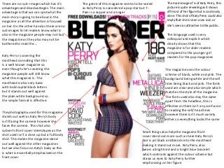
  • 1. The main image of is of Katy Perry, this picture is quite revealing as it shows off most of her figure but is cautiously done. This shot of Katy Perry could also imply that she is seen a sex icon or she’s seen as attractive to the public. There are no sub- images which has it’s advantages and disadvantages. The main advantage is that we can spot what the main story is going to be about in the magazine as all the attention is focused on her. On the other hand as there are no sub images to let readers know what is also in the magazine people may not buy the magazine as they also may not be bothered to read the.... The genre of this magazine seems to be varied as Katy Perry is considered a pop star but T- Pain is a rapper and a singer Katy Perry is covering the masthead connoting that this is a well known magazine so even though she’s covering the magazine people will still know what this magazine is. The masthead is also very basic with bold capital black letters but it stands out well against the plain white background so the simple format is effective. The language used is very colloquial and explicit which clearly shows that this magazine is for older readers compared to the younger girl readers for the pop magazines The magazine uses the colour scheme of black, white and pink. The background being white and the sell lines being black and pink. The fonts used are clear and also simple which matches the style of the magazine. The fonts used also stay the same apart from the headline, this is effective as there isn’t any confusion to reading the sell/ head lines however there isn’t much variety either so everything looks the same The photography used for this magazine stands out well as Katy Perry’s body isn't facing the camera however she faces the camera. This shot also subverts front cover stereotypes as the shot used isn’t a close up but a full body shot. This makes the magazine stand out well against the other magazines but we also focus on Katy’s body as this is what is essentially emphasised on the front cover Small things also help the magazine front cover stand out more such as here Katy Perry’s hair is jet black and blends into the masthead making it stand out more. Katy Perry also wears a bright red and a bright blue bracelet which contrasts against the colour scheme but draws us eyes to Katy Perry further emphasising on her figure