
Recomendados
Mais conteúdo relacionado
Mais procurados
Mais procurados (20)
Destaque
Semelhante a Leaflet design project
Semelhante a Leaflet design project (20)
Mais de iteclearners
Mais de iteclearners (20)
Último
Último (20)
Leaflet design project
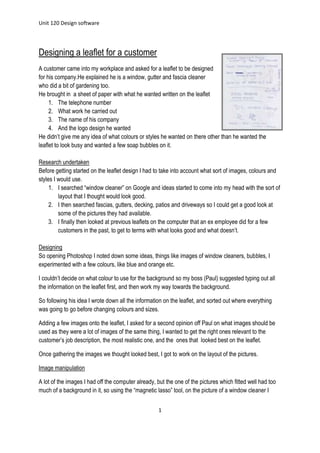
- 1. Unit 120 Design software 1 Designing a leaflet for a customer A customer came into my workplace and asked for a leaflet to be designed for his company.He explained he is a window, gutter and fascia cleaner who did a bit of gardening too. He brought in a sheet of paper with what he wanted written on the leaflet 1. The telephone number 2. What work he carried out 3. The name of his company 4. And the logo design he wanted He didn’t give me any idea of what colours or styles he wanted on there other than he wanted the leaflet to look busy and wanted a few soap bubbles on it. Research undertaken Before getting started on the leaflet design I had to take into account what sort of images, colours and styles I would use. 1. I searched “window cleaner” on Google and ideas started to come into my head with the sort of layout that I thought would look good. 2. I then searched fascias, gutters, decking, patios and driveways so I could get a good look at some of the pictures they had available. 3. I finally then looked at previous leaflets on the computer that an ex employee did for a few customers in the past, to get to terms with what looks good and what doesn’t. Designing So opening Photoshop I noted down some ideas, things like images of window cleaners, bubbles, I experimented with a few colours, like blue and orange etc. I couldn’t decide on what colour to use for the background so my boss (Paul) suggested typing out all the information on the leaflet first, and then work my way towards the background. So following his idea I wrote down all the information on the leaflet, and sorted out where everything was going to go before changing colours and sizes. Adding a few images onto the leaflet, I asked for a second opinion off Paul on what images should be used as they were a lot of images of the same thing, I wanted to get the right ones relevant to the customer’s job description, the most realistic one, and the ones that looked best on the leaflet. Once gathering the images we thought looked best, I got to work on the layout of the pictures. Image manipulation A lot of the images I had off the computer already, but the one of the pictures which fitted well had too much of a background in it, so using the “magnetic lasso” tool, on the picture of a window cleaner I
- 2. Unit 120 Design software 2 went round the shape of the figure, cut and pasted it and got rid of the background, so I could use the figure on its own without having to deal with the background. The other images involved things like a decking, patio, guttering, which I wanted to keep as they were so you could see what the picture were of. But once I had put all the pictures in a layout on the background (which had been left white till the end), they didn’t look very tidy because they had sharp edges and they weren’t blending into each other as I would have liked. So adding a vector mask to a layer with one of the pictures on, I used the paint brush tool and went round the edges, and did this to all the layers which had the pictures, which removed the sharpness and made it look smoother so the images could lie on top of each other and fit together better on the flyer itself. After doing this to the edges of all the pictures I was able to make them as big and small as I want and lay them in a place which would look good, whether it was on top of each other, crossing etc. When I finally found the right places for all the pictures (which took a few attempts), I went back to the font, because of all the activity going on in the background the writing on the leaflet had to stand out, because it’s important for the viewers to be able to not only see but understand what it says. My initial thought was a bright colour, I immediately thought of yellow, so I went with yellow to see what it would look like. Because of the busy background the writing would not work just yellow so I experimented with different shadings and outlines, and it turned out that more outline stands out more on the leaflet against all the pictures. I have tried a number of colours but the yellow seems to stand out more against the pictures so for the benefit of the customer, viewers and the leaflet I decided to proceed with the yellow, because it had the best outcome. Not wanting too much yellow on the leaflet, I decided to keep the job description in the same colour, but change the colour of the telephone numbers and the name of the business. But because of the busy image background shadows will make the numbers stand out that bit more. An outline is helpful, because it makes the numbers stand out a lot better against the pictures and separates it
- 3. Unit 120 Design software 3 from the background, being careful of what colours will be used as not all colours will have the same effect. I thought because we have already used yellow (which was a colour that stood out), after looking at all of the colour options, my favourite one and the one that I thought stood out best was the blue and black. The font was a lot easier because I wanted it to be a rounded font but still simple and plain, so finding a font was not a problem because it gives the leaflet a little variety in terms of font. In the end I chose the top font which is called “copper black” I thought this was the most effective. Designing the logo The customer who came in did not have a logo, and because he also wants a van sign written I had to come up with a logo idea which would look good not only on the leaflet but on a van also. He drew a brief picture to show us what he was aiming to have, which looked a bit like this. But left it to us to come up with a nice simple logo he could start using for his business. So I had a mess around with trying to get the layout of the text right and as it was in the diagram I was given, before looking through the fonts we had available on the computer. It was simple enough because I used the cut tool, which allowed me to cut out bits of the letters so they could slot in the right place. On our work computer we have lots of fonts available for us to use, I checked out the fonts available on word because they offer simple yet effective fonts which are what we are looking for. I can see that the simpler the text is the more it will look better in the layout that I have to work with. And the more complex the font the harder it will be to understand and see against the busy background. Going with the simple technique out of the designs I came up with, I went on to further investigation on other simple fonts which looked similar and finally decided on the “Bell MT” font. After a few alterations in Photoshop this is the final logo design. It’s bold simple, effective and stands out being a different colour to all the text on the leaflet. It works well against the background because
- 4. Unit 120 Design software 4 the background around the logo is a blue colour so it doesn’t clash. This was done by typing out the letters used, cutting out the “c” and placing it on top of the “d” and the erasing a bit of the “c” to make it look like it was going behind and coming back out on top. The font I used was “bell MT”, it did look a little different on Word than it did on Photoshop, but I thought it looked better in Photoshop. Proofing I gave the customer a ring and asked him to come and proof the design. When he came in a few days later I showed him the design, and he was very pleased with the outcome, he stated that it was “wonderful”. He didn’t want to change anything on it; all he had asked me to do was add “solar panel cleaning” to the list of jobs on there. I did this in front of the customer, by clicking on the text box and adding another line. Obviously had to size the whole text box down a bit to make it fit, but he was happy with what it looked like and paid the deposit, so I saved my artwork “for web & devices”, set the standard to “maximum” and saved it on to the desktop ready to be sent off. I had a few problems while sending the artwork to our printers, firstly they phoned and explained that there was low resolution and could we fix it. I then emailed the next day asking what the problem was and they replied that the whole leaflet had a very low resolution including the text. (Email ofscreen shots) So I went on Photoshop and changed the resolution to a higher number, and resent the new artwork back over as an attachment in an email. I still had problems because they then emailed me back explaining that the text was fine now, it was just the pictures, they stated that I should exchange the pictures for bigger ones, or leave them and proceed with the printing, and the only problem was that the printing quality will be very poor.
- 5. Unit 120 Design software 5 Having a problem with the images, resulted in having to change the whole design of the background meaning, the customer would have to look at the final design and proof it again before sending it off. Going ahead with changing the pictures, when getting to the final design, I decided to ask a good friend of the company, who did our website, because he knows a lot of things about resolution etc. He replied to my email quite fast and told me overall it was good for resolution, so ahead I went to sending it off again to the printers I had to contact the customer to come in and proof the design and he seemed to like it, I had to explain to him what the problem was and he was very understanding and wanted to keep it like that and told me to send it off. So all in all the customer, printers and myself were very happy with the outcome despite the problems we had, I was able to overcome this and sort it out. Once the leaflet is sorted out we ask the printers via email (with the attached leaflet file) for 5000 single sided copies, at 130gsm gloss they will then be dispatched and posted,delivery varies on time of order, but will usually take 5+ days. Designing stage (Draft one)
- 6. Unit 120 Design software 6 The customer asked if he could have a picture of a window cleaner on it, so I did exactly that. By getting an image of a window cleaner and another image that went on there to show that by adding a vector mask to the images it will get rid of the sharp edges, using the paintbrush tool so other images on there can overlap each other and look smoother as if it was to be one whole image. Once I had done all this to the images on the leaflet I finally had a background, a busy one which is what the customer asked for. It was quite easy to do this because you only have to go around the edges of the pictures that are going to be touching and as you can see it works quite well because there are no white spaces on the page. To know where to put the next bit of text I had to put the logo on their first to see where I was going to put it. “Window, cleaning and fascias”. This font is “Arial rounded” I had to use my instinct with this one and not keep them in the same colour, putting cleaning and fascias on an angle using the transform tool (Ctrl+T), I thought added effect to the whole leaflet and looked a lot better. With the word window being black it didn’t stand out as well as I had hoped so putting a white edge around made it stand out more, and I decided to put “cleaning+fascias” in the same colour as the numbers so there is a colour theme going on the leaflet. The numbers “copper black” stood out exactly as I had planned them to, adding a black outline using the “stroke” tool by double clicking on the layer. Tasha advised me to put a “T” and an “M” in front of the numbers as it will look more professional and the audience will know then what number is what.The font used in the job description is just “Arial rounded
- 7. Unit 120 Design software 7 also”, I used this because the job description is one of the most important things to see on the leaflet I wanted it to look as plain but bold as I could get it before it becomes too much. Finally the only thing left on the leaflet I had to do which the customer asked for, was to put some bubbles on there, I found a free image on the internet of a bubble and copied it into Photoshop, I used the “magnetic lasso” tool and drew around it and then copied it onto the leaflet, duplicated the layer and spread out all the bubbles where I thought they would look best, resizing each one so they would all look different sizes and would give it more effect on the leaflet. The pictures I used for the leaflet design were copyright free images I was able to have on the creative commons website. The copyright law gives the creators' rights to control the ways in which their material may be used. In many cases, the creator will also have the right to be identified as the author and to object to distortions of his work. Copyright is an automatic right and arises whenever an individual or company creates a work. In short, work that expresses an idea may be protected, but not the idea behind it. Only the owner or their exclusive licensee can bring proceedings in the courts. The leaflet was saved as a photoshop document and saved in our work files. When sending it off to the printers they asked us to send it as a JPEG, because of the image resolution quality was better in a JPEG file format. Images can also be saved as PNG, PDF and GIFF formats. So saving it as a JPEG as well we kept both of the files for future references.
- 8. Unit 120 Design software 8
- 9. Unit 120 Design software 9 Process Stage one Stage two Stage three Stage four Customer requirements The customer arrives with information. Information is transferred from customer notes to computer using scanner. Upload information from scanner and save appropriately. Using information planning begins. Setup Opening the design software I will be using and setting dimensions to leaflet requirements. Changing resolution of the document to fit the needs of the printers. Making sure I save it to appropriate file name and location. Start designing. Logo design Open customers' information to follow on with designing. Drawing a rough guide to what the customer would like on an appropriate software program. Editing logo to fit and stand out as a company name on the leaflet. Save as appropriate file and name as it will be used later on. Background (pictures) Open browser and find a site wich provides free images. Find related images to job description and save in computer files for use on the design software. Open images in software and set them out in a clean layout so they can been seen. Edit the images to fit on the leaflet and colour fix, without no sharp edges that will be noticed. Failing to find copyright free images will result in having to take them myself with work camera. Contents Type contents out using customer information given and choose a clear font. Set out contents in a layout that fits and looks smart. Edit contents in terms of colours and effect to make it stand out against background. Find a perfect size to have the contents that will stand out on the leaflet. Telephone number Type out number given by customer and find a bold font. Set the number in an appropriate place on leaflet that will stand out. Edit the numbers so they are bold and easy for the audience to read. Resize the number so it look sbig enough to see and looks good on the leaflet
- 10. Unit 120 Design software 10 itself. Finalizing Using customers information double checking that your design meets the requirements. If not then add the additional information (pictures etc.) Edit and size them if needed. Bring customer in to proof your design. If for some reason the customer does not like the design then get the customer to go over the design with you on the computer and make any changes to the leaflet that they like and make sure they finalise the design before sending it off. Sending Save the file in separate file location under the appropriate file name and format that is needed for the printers. Opening email attach the leaflet design to a new email and not down any requirements e.g. quality, size etc. Send the email and wait for response by phone. Wait for phonecall response, and pay for items over the phone. Sometimes problems can occur when sending off leaflet, so the response off the printers will let you know, any problems may result in re designing, editing or even starting over. If this is the case then the design process will have to be done again and proofing with the customer will be necessary also.