SlideShare uma empresa Scribd logo
1 de 2
How effective is the combination of your main product and ancillary texts? By
  Sharon Uyinmwen

  The two ancillary texts I created were the Film review and poster. Before creating these I knew
  that in order for them to compliment my film well they had to work in unity with one another
  in order to put the film out there in the best way possible. I had to keep in mind the target
  audience I wanted to appeal to, and keep a consistent housing style between the posters, film and
  review. In addition I had to take into consideration the representations of my characters, and
  create the posters in a way that it would show the representations rather than contradict them.
  The film, poster and review working hand in hand are important as the poster
  creates audience engagement and gets the audience asking questions. Once the
  audience have become engaged they start looking to sources such as film reviews
  to start to reveal the answers to some of their questions and depending on the
  reception from the review, will then lead to them gaining the experience for
  themselves by watching this film. So I kept these points in mind when I created
  my ancillary texts.
With the creation of my poster I carried out research on films of the same
genre and how their posters were presented. I noticed a consistency of
composition simplicity from poster to poster, and how even though the
ideas were very simple they still got the general idea of what the film was
trying to convey without giving the whole plot away. I also looked at
colours and font styles and noticed reoccurring, red, yellow, and black and
white. These are colours which matched with the world of our film. I also
noticed a focus on key characters and how incorporating this could
attract a certain target audience. So, when I created my poster I made
sure that Frank and Charlie, the two main protagonists were main focus
of my film posters, by doing this target audience engage with my
characters if they feel they relate to them in some way. I used bold
colours like black, white and red as these are the main colours used in my
film. In order to develop audience engagement I made my taglines vague
whilst relating them back to the film. One example of this is ‘When the
blind lead the blind they are bound to bump in to some trouble’. The use if
the words ‘bound to bump into some trouble’ will get the audience
wondering what kind of trouble the twosome will eventually be involved
with and at the same time it didn’t give the plot away.

  Also, the use of the words ‘The blind lead the blind’ not only does it hint to a scene
  from the film but also adds as a representation to the characters as it highlights how stupid they are
  and throughout the whole film this stupidity becomes apparent. The poster is a marketing
  technique that appeals to a fan base not only through paper based techniques such as billboards and
  posters but also virally over the internet and through word of mouth. So with this in mind my
  poster had to have a unique selling point that audiences would remember to want to share with
  others. This is particularly seen with my poster number 3. My tagline was based a familiar saying
  which I then adapted to the world of my film. ‘ Cookies 20p, Donation to the blind
  50p an ounce of intelligence...Priceless. The use of this tagline is not only
  familiar to audiences, but, it also gets the audience asking questions. This will eventually lead to
  them wanting to know more about the film. The genre of the film was another element that
  needed to be shown through the poster. I made the comedy and light heartedness of my film shine
  through by using funny pictures with natural bright lighting in all my posters. The image in poster
  3 was taken inside the hotel as the pair was bursting through the doors. This was a good image to
  use as it showed the characters facial expressions clearly which created a solid representation that
audiences could pick up. During the creation of the poster I tried my best to keep the lighting
natural and bright so audiences would become aware it is not a horror based or dark and gloomy
film. Poster number 1 & 2 incorporates the prop of the car which is the main plot point in the film.
In order to not give too much away, I adjusted the layout so the car would not be the main focus in
the frame. I eventually lowered the car in the frame. I used the certificate symbol (12) in poster 2
to reach out my main target audience so when the audience look at the poster they can have more
of an idea of whether or not it will appeal to them.
               The film review is created to highlight the positives or negatives of a film in order for
audiences to decide if a film is worth watching or not, it also talks about previous films the director
and cast members have been a part of in order to spark interest in readers. Positive reviews entice
people to want to go and watch the film which inevitably increases the revenue for the
institution, and they tend to be written by neutral sources so the reader knows they are
getting an honest opinion rather than a bias opinion. This is what I found out whilst
analysing and researching various different film reviews and magazines. I preferred the
style of Total magazine the most, as I felt our film could fit well in a review like Total. It also
takes time to venture into different genres of film and publishes reviews of independent
low budget films similar to ours. My film review that I created is aimed to encourage people to
watch our film. I highlighted the genre numerous times when I said ‘If you like comedies and
actions films, you will love Switch as it has the perfect balance of the two’, this will also speak out
to a wider target audience as people who like action comedies will feel that the film will appeal to
them. Also because the initial age group is 12 and above the film review can speak out to the older
side of the audience as they are more likely to read film reviews. The writing style of the review is
a written in persuasive language to help sell the film in the best way possible, and briefly talks
about the synopsis of the film, it then goes into certain filming techniques used. Those who know
about the production of films will understand these aspects and will be intrigued by the thought of
the film using them. I have used an image that highlights the comedy aspect of the film, a picture
of Frank as he blew the flour in Big Pete’s face. The caption I added ‘Frank in the mist of one of his
bright ideas, literally’ also highlights humour and puts forward a representation of Franks
character. The light heartedness of the film is shown throughout the poster and the review and
works as a package with the film.
To conclude my film, review and posters all highlight key features of the film to work as ‘’Total’’
package.

Mais conteúdo relacionado

Mais procurados

Evaluation Question 1
Evaluation Question 1Evaluation Question 1
Evaluation Question 1meganfinchx
 
Evaluation Question 3
Evaluation Question 3Evaluation Question 3
Evaluation Question 3j160007
 
How effective is the combination of your main
How effective is the combination of your mainHow effective is the combination of your main
How effective is the combination of your maina07achaudhry
 
Media Evaluation
Media EvaluationMedia Evaluation
Media Evaluationlhill03
 
Evaluation Question 2
Evaluation Question 2Evaluation Question 2
Evaluation Question 2shaniamedia
 
Critical evaluation[1]
Critical evaluation[1]Critical evaluation[1]
Critical evaluation[1]guestf10853f
 
Question 1
Question 1 Question 1
Question 1 naf112
 
Evaluation Question 2
Evaluation Question 2Evaluation Question 2
Evaluation Question 2mags249
 
Evaluation Question 2
Evaluation Question 2Evaluation Question 2
Evaluation Question 2mags249
 

Mais procurados (17)

Evaluation Question 1
Evaluation Question 1Evaluation Question 1
Evaluation Question 1
 
Question 2
Question 2Question 2
Question 2
 
Question 5 evaluation
Question 5 evaluationQuestion 5 evaluation
Question 5 evaluation
 
Evaluation Question 3
Evaluation Question 3Evaluation Question 3
Evaluation Question 3
 
How effective is the combination of your main
How effective is the combination of your mainHow effective is the combination of your main
How effective is the combination of your main
 
Question 5 evaluation
Question 5 evaluationQuestion 5 evaluation
Question 5 evaluation
 
Media Evaluation
Media EvaluationMedia Evaluation
Media Evaluation
 
Evaluation question 2
Evaluation question 2Evaluation question 2
Evaluation question 2
 
Evaluation Question 2
Evaluation Question 2Evaluation Question 2
Evaluation Question 2
 
Evaluation Question 2 - Synergy
Evaluation Question 2 - Synergy Evaluation Question 2 - Synergy
Evaluation Question 2 - Synergy
 
Critical evaluation[1]
Critical evaluation[1]Critical evaluation[1]
Critical evaluation[1]
 
Evaluation
EvaluationEvaluation
Evaluation
 
Media a2 evaluation
Media a2 evaluationMedia a2 evaluation
Media a2 evaluation
 
Question 1
Question 1 Question 1
Question 1
 
Question 2
Question 2 Question 2
Question 2
 
Evaluation Question 2
Evaluation Question 2Evaluation Question 2
Evaluation Question 2
 
Evaluation Question 2
Evaluation Question 2Evaluation Question 2
Evaluation Question 2
 

Semelhante a Question 2

Semelhante a Question 2 (20)

Media Studies Evaltuation
Media Studies EvaltuationMedia Studies Evaltuation
Media Studies Evaltuation
 
Media Evaluation
Media EvaluationMedia Evaluation
Media Evaluation
 
Media evaluation
Media evaluationMedia evaluation
Media evaluation
 
Media Evaluation.
Media Evaluation.Media Evaluation.
Media Evaluation.
 
Media Evaluation.
Media Evaluation.Media Evaluation.
Media Evaluation.
 
Question Two
Question TwoQuestion Two
Question Two
 
Media Evaluation
Media EvaluationMedia Evaluation
Media Evaluation
 
Media Evaluation.
Media Evaluation.Media Evaluation.
Media Evaluation.
 
Evaluation Question 2
Evaluation Question 2 Evaluation Question 2
Evaluation Question 2
 
FACES
FACESFACES
FACES
 
Presentation
PresentationPresentation
Presentation
 
Question 2
Question 2Question 2
Question 2
 
Evaluation
EvaluationEvaluation
Evaluation
 
Mind rewind presentation
Mind rewind presentationMind rewind presentation
Mind rewind presentation
 
Evaluation
EvaluationEvaluation
Evaluation
 
Evaluation Question 2
Evaluation Question 2 Evaluation Question 2
Evaluation Question 2
 
Q2
Q2Q2
Q2
 
Evaluation 2011
Evaluation 2011Evaluation 2011
Evaluation 2011
 
Evaluation - Media
Evaluation - MediaEvaluation - Media
Evaluation - Media
 
Evaluation
EvaluationEvaluation
Evaluation
 

Mais de hththththt

Mais de hththththt (9)

Question 2
Question 2 Question 2
Question 2
 
Question 2
Question 2Question 2
Question 2
 
Question 2
Question 2Question 2
Question 2
 
Question 2
Question 2Question 2
Question 2
 
Question 3
Question 3Question 3
Question 3
 
Question 4
Question 4Question 4
Question 4
 
Question 4
Question 4Question 4
Question 4
 
Question 4
Question 4Question 4
Question 4
 
Question 1
Question 1 Question 1
Question 1
 

Question 2

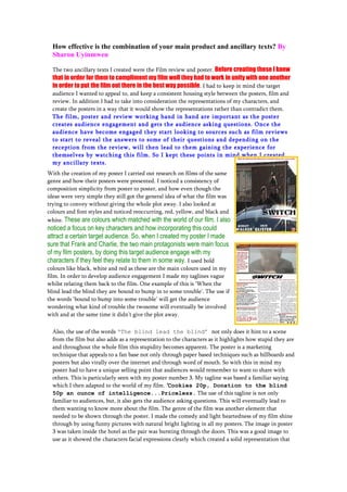
  • 1. How effective is the combination of your main product and ancillary texts? By Sharon Uyinmwen The two ancillary texts I created were the Film review and poster. Before creating these I knew that in order for them to compliment my film well they had to work in unity with one another in order to put the film out there in the best way possible. I had to keep in mind the target audience I wanted to appeal to, and keep a consistent housing style between the posters, film and review. In addition I had to take into consideration the representations of my characters, and create the posters in a way that it would show the representations rather than contradict them. The film, poster and review working hand in hand are important as the poster creates audience engagement and gets the audience asking questions. Once the audience have become engaged they start looking to sources such as film reviews to start to reveal the answers to some of their questions and depending on the reception from the review, will then lead to them gaining the experience for themselves by watching this film. So I kept these points in mind when I created my ancillary texts. With the creation of my poster I carried out research on films of the same genre and how their posters were presented. I noticed a consistency of composition simplicity from poster to poster, and how even though the ideas were very simple they still got the general idea of what the film was trying to convey without giving the whole plot away. I also looked at colours and font styles and noticed reoccurring, red, yellow, and black and white. These are colours which matched with the world of our film. I also noticed a focus on key characters and how incorporating this could attract a certain target audience. So, when I created my poster I made sure that Frank and Charlie, the two main protagonists were main focus of my film posters, by doing this target audience engage with my characters if they feel they relate to them in some way. I used bold colours like black, white and red as these are the main colours used in my film. In order to develop audience engagement I made my taglines vague whilst relating them back to the film. One example of this is ‘When the blind lead the blind they are bound to bump in to some trouble’. The use if the words ‘bound to bump into some trouble’ will get the audience wondering what kind of trouble the twosome will eventually be involved with and at the same time it didn’t give the plot away. Also, the use of the words ‘The blind lead the blind’ not only does it hint to a scene from the film but also adds as a representation to the characters as it highlights how stupid they are and throughout the whole film this stupidity becomes apparent. The poster is a marketing technique that appeals to a fan base not only through paper based techniques such as billboards and posters but also virally over the internet and through word of mouth. So with this in mind my poster had to have a unique selling point that audiences would remember to want to share with others. This is particularly seen with my poster number 3. My tagline was based a familiar saying which I then adapted to the world of my film. ‘ Cookies 20p, Donation to the blind 50p an ounce of intelligence...Priceless. The use of this tagline is not only familiar to audiences, but, it also gets the audience asking questions. This will eventually lead to them wanting to know more about the film. The genre of the film was another element that needed to be shown through the poster. I made the comedy and light heartedness of my film shine through by using funny pictures with natural bright lighting in all my posters. The image in poster 3 was taken inside the hotel as the pair was bursting through the doors. This was a good image to use as it showed the characters facial expressions clearly which created a solid representation that
  • 2. audiences could pick up. During the creation of the poster I tried my best to keep the lighting natural and bright so audiences would become aware it is not a horror based or dark and gloomy film. Poster number 1 & 2 incorporates the prop of the car which is the main plot point in the film. In order to not give too much away, I adjusted the layout so the car would not be the main focus in the frame. I eventually lowered the car in the frame. I used the certificate symbol (12) in poster 2 to reach out my main target audience so when the audience look at the poster they can have more of an idea of whether or not it will appeal to them. The film review is created to highlight the positives or negatives of a film in order for audiences to decide if a film is worth watching or not, it also talks about previous films the director and cast members have been a part of in order to spark interest in readers. Positive reviews entice people to want to go and watch the film which inevitably increases the revenue for the institution, and they tend to be written by neutral sources so the reader knows they are getting an honest opinion rather than a bias opinion. This is what I found out whilst analysing and researching various different film reviews and magazines. I preferred the style of Total magazine the most, as I felt our film could fit well in a review like Total. It also takes time to venture into different genres of film and publishes reviews of independent low budget films similar to ours. My film review that I created is aimed to encourage people to watch our film. I highlighted the genre numerous times when I said ‘If you like comedies and actions films, you will love Switch as it has the perfect balance of the two’, this will also speak out to a wider target audience as people who like action comedies will feel that the film will appeal to them. Also because the initial age group is 12 and above the film review can speak out to the older side of the audience as they are more likely to read film reviews. The writing style of the review is a written in persuasive language to help sell the film in the best way possible, and briefly talks about the synopsis of the film, it then goes into certain filming techniques used. Those who know about the production of films will understand these aspects and will be intrigued by the thought of the film using them. I have used an image that highlights the comedy aspect of the film, a picture of Frank as he blew the flour in Big Pete’s face. The caption I added ‘Frank in the mist of one of his bright ideas, literally’ also highlights humour and puts forward a representation of Franks character. The light heartedness of the film is shown throughout the poster and the review and works as a package with the film. To conclude my film, review and posters all highlight key features of the film to work as ‘’Total’’ package.