3. CSS Sprites - History
The origin of the term "sprites" comes from old school
computer graphics and the video game industry. The idea
was that the computer could fetch a graphic into
memory, and then only display parts of that image at a
time, which was faster than having to continually fetch new
images. The sprite was the big combined graphic. CSS
Sprites is pretty much the exact same theory: get the image
once, shift it around and only display parts of it, saves the
overhead of having to fetch multiple images.
http://css-tricks.com/css-sprites
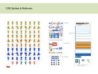
4. CSS Sprites - History
In 2004, Dave Shea suggested a simple CSS-based
approach to CSS sprites based on the practice
established by those legendary video games. In this
case, multiple images used throughout a website
would be combined into the so-called “master
image.” To display a single image from the master
image, one would use the background-position
property in CSS, defining the exact position of the
image to be displayed. Any hover, active or focus
effects would be implemented using the simple
definition of the background-position property for the
displayed element.
http://coding.smashingmagazine.com/2009/04/27/the-mystery-of-
css-sprites-techniques-tools-and-tutorials/
5. When the page is loaded, it would not load single
images one by one (nor hover-state images per
request), but would rather load the whole master image
at once. It may not sound like a significant
improvement, but it actually was: the main
disadvantage of the onMouse effects is that JavaScript-
based hover effects require two HTTP requests for
each image, which takes time and creates that
unpleasant “flickering” of images. Because the master
image is loaded with the whole page only once with
CSS sprites, no additional HTTP requests are needed
for hover, active or focus effects (because the image is
already loaded), and no “flickering” effect occurs.
http://coding.smashingmagazine.com/2009/04/27/the-mystery-of-css-
sprites-techniques-tools-and-tutorials/
6. Using the background-position property
The background-position property defines the initial position of a background-image.
#star{ #star{
background-image: url(‘star.gif’); background-image: url(‘star.gif’);
background-position: 0 0; background-position: 20px 20px;
} }
7. Using the background-position property
background-position: [horizontal position] [vertical position];
20px
20px
#star{ #star{
background-image: url(‘star.gif’); background-image: url(‘star.gif’);
background-position: 0 0; background-position: 20px 20px;
} }
8. Using the background-position property
The background-position property accepts one or two length values, percentages, or keywords.
Specify the horizontal position using one of the following keywords: left, center, or right.
To set the vertical position, the following values are used: top, center, and bottom.
background-position: left top; /* same as 0% 0% */
background-position: left center; /* same as 0% 50% */
background-position: left bottom; /* same as 0% 100% */
background-position: right top; /* same as 100% 0% */
background-position: right center; /* same as 100% 50% */
background-position: right bottom; /* same as 100% 100% */
background-position: center top; /* same as 50% 0% */
background-position: center center; /* same as 50% 50% */
background-position: center bottom; /* same as 50% 100% */
9. Using the background-position property
background-position: [horizontal position] [vertical position];
#star{ #star{
background-image: url(‘star.gif’); background-image: url(‘star.gif’);
background-position: left top; background-position: right bottom;
} }
