
Recomendados
Mais conteúdo relacionado
Mais procurados
Mais procurados (18)
Destaque
Semelhante a Friday 13th poster
Semelhante a Friday 13th poster (20)
Mais de hifsahussain
Mais de hifsahussain (20)
Último
Último (20)
Friday 13th poster
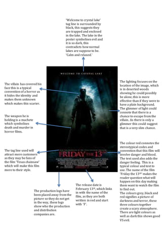
- 1. The colour red connotes the stereotypical codes and convention that this film will involve danger and blood. The text used also adds the danger feeling. This is a typical colour and text to use. The name of the film ‘Friday the 13th’ makes the reader question what will happen on this day making them want to watch the film to find out. The colours grey, black and red signifies a picture of darkness and terror, these three colours together create a scary atmosphere. There are light colours as well as dark this shows good VS evil. The lighting focuses on the location of the image, which is in deserted woods showing he could possibly be alone, this is more effective than if they were to have a plain background. The glimmer of light could connote that there is a chance to escape from the villain. As there is only a glimmer this could suggest that is a very slim chance. ‘Welcome to crystal lake’ tag line is surrounded by black, this suggests they are trapped and enclosed in the lake. The lake in the poster symbolises evil and it is so dark, this contradicts how normal lakes are suppose to be. ‘Calm and relaxed.’ The villain has covered his face this is a typical convention of a horror as it hides the identity and makes them unknown which makes this scarier. The release date is February 13th, which links in with the name of the film, as they are both written in red and start with ‘F’. The tag line used will attract more customers as they may be fans of the film ‘Texas chainsaw’ which will make this film more to their style. The weapon he is holding is a machete which symbolises death and murder in horror films. The production logs have been placed away from the picture so they do not get in the way, these logs show who the production and distribution companies are.