6 ways to refine iPhone and iPad Apps
•
8 gostaram•606 visualizações

The document discusses 6 ways to create a better user experience for iPhone and iPad apps. It discusses 1) being welcoming to users through getting started information, interface annotations, and optional demos; 2) knowing individual users through personalization; 3) letting the app's content be the primary focus; 4) making selections fast and error-free with defaults, lists, suggestions and stored history; 5) providing feedback through animations, transitions and alerts; and 6) minimizing problems through explanations, maintaining the current state, autosaving and keeping users informed. Examples are provided for each tip.

Recomendados
Recomendados
Mais conteúdo relacionado
Mais procurados
Mais procurados (20)
Semelhante a 6 ways to refine iPhone and iPad Apps
Semelhante a 6 ways to refine iPhone and iPad Apps (20)
Mais de Ginsburg Design
Mais de Ginsburg Design (6)
Último
Último (20)
6 ways to refine iPhone and iPad Apps
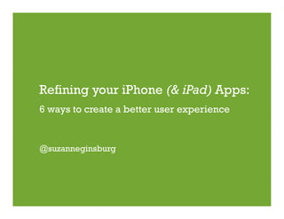
- 1. Refining your iPhone (& iPad) Apps: 6 ways to create a better user experience @suzanneginsburg
- 2. My Background • Started in web design 14 years ago; mobile design 2 years ago. • Have iPhone/iPad UX blog at www.iphoneuxreviews.com • iPhone design book published August 20, 2010! 2
- 3. ways to create a better iPhone app user experience. http://www.flickr.com/sarkphoto/ 3
- 5. #1: Be Welcoming This is not welcoming: Accuweather 5
- 6. #1: Be Welcoming There are many things you can do to welcome your users. We’ll review three on the slides that follow: • Display getting started information • Annotate the user interface • Provide an optional demo 6
- 7. #1: Be Welcoming Getting started information is particularly important for the following kinds of apps: • Apps with little or no precedence • Apps that require certain configurations (e.g., sound turned on) • Apps that require registration (e.g., Twitter clients) 7
- 8. #1: Be Welcoming Some getting started examples: TweetDeck nook Yelp scope (Monocle) 8
- 9. #1: Be Welcoming Another way to be welcoming is to annotate the user interface. • Most effective when most of the app functionality is concentrated on one screen. • Should go away once the user has interacted with the UI; alternative form of Help should still be available. • Best when not overdone (more than 5 annotations could be overwhelming.) 9
- 10. #1: Be Welcoming Some annotation examples: Postman Pulse 10
- 11. Annotation example on the iPad for Stick It. Treatment of “Help” one in center less ideal, but others are effective. Ocarina 11
- 12. #1: Be Welcoming Some apps may want to consider providing an optional demo. • Effective when the app space isn’t well defined or the user interface is unique. • Make sure users can skip the demo & be sure to allocate additional time for localization as needed. 12
- 13. #1: Be Welcoming Some demo examples: Convertbot 123 Color (iPad app) 13
- 15. #2: Know Thy User The iPhone presents a unique opportunity to create personalized experiences, yet many apps barely scratch the surface. Some ways to personalize the UX: • User’s Name or ID • Settings • Favorites & User Behavior 15
- 16. #2: Know Thy User Some name/ID personalization examples: Flickr foursquare 16
- 17. #2: Know Thy User User settings are another way to personalize the UX. Choose these wisely since too many can overwhelm users. Some common ones include: • Default font size, especially for news & Twitter apps • Sounds • Measurement (e.g., miles vs. kilometers) • Default apps (e.g., Twitter client) • Content (e.g., news sections on NY Times) 17
- 18. #2: Know Thy User Some content personalization examples: New York Times allows tab customization. USA Today lets users choose default news sections. 18
- 19. #2: Know Thy User Favorites and User Behavior are also effective ways to personalize the UX. • Favorites require users to actively save items to view later. • User Behavior based personalization is passive, saving this information behind the scenes. This can be very powerful but also raises privacy issues so it’s important to be as transparent as possible. 19
- 20. #2: Know Thy User Here are favorites and user behavior examples: Yelp syncs iPhone & website favorites. iConcertCal uses your iTunes music to recommend concerts. 20
- 21. Let the content shine. http://www.flickr.com/mag3737 21
- 22. #3: Let the content shine “The idea is that the content is the interface, the information is the interface—not the administrative debris.” Edward Tufte, Professor Emeritus of Political Science, Statistics, and Computer Science at Yale University. 22
- 23. #3: Let the content shine Some examples: New York Times with controls. With controls hidden. 23
- 24. #3: Let the content shine Pulse with nav hidden. Pulse with nav shown. 24
- 25. Controls are not hidden on the NY Times iPad app but they’ve still made an effort to let the content shine. The muted custom controls can be easily accessed yet don’t compete with the content. 25
- 26. USA Today also created custom controls that compliment the content. 26
- 27. Contrast the previous two with this design. It’s not terrible but are those 3 rows of UI absolutely needed? 27
- 28. Can you see the control on this Adobe Ideas iPad app? 28
- 29. Make selections fast & error-free. http://www.flickr.com/lwr 29
- 30. #4: Make selections fast & error-free The mobile context may make it difficult for users to enter information. Users may be walking, driving, shopping & so on. As a result, your apps should incorporate ways to minimize errors and make users more efficient. 30
- 31. #4: Make selections fast & error-free Here are some ways to make selections fast & error-free: • Provide smart defaults • Include predefined lists • Suggest matches • Store recent activity • Use voice & image recognition 31
- 32. #4: Make selections fast & error-free Some examples of smart defaults and pre-defined lists: Maps is pre-populated with your current location iBART (Bay Area Rapid Transit) provides list of stations. and last search. 32
- 33. #4: Make selections fast & error-free Examples of apps that suggest matches. Urbanspoon Yelp 33
- 34. #4: Make selections fast & error-free Another option is to store recent activity/selections. This information could be accessed several ways: • Pre-populating form fields if information entered previously or already known • Making past selections available via Recents tab • Showing history matches as the user types their query 34
- 35. #4: Make selections fast & error-free Examples of apps that store recent activity/selections. FlightTrack Google 35
- 36. #4: Make selections fast & error-free Better yet, you can eliminate typing all together with if voice or image recognition are used, as done with SnapTell. 36
- 37. Provide appropriate feedback. http://www.flickr.com/chrisinplymouth 37
- 38. #5: Provide appropriate feedback Oftentimes, things happen “behind the scenes” that require users to wait for a moment. To reassure users during those times, be sure to provide feedback, such as the following: • Animations • Transitions • Alerts 38
- 39. #5: Provide appropriate feedback Animations typically refer to the visual feedback provided within a particular view. Here are a few common ones: Processing Moving Bounce Shown when Shown when Shown when user content is being content is being loads new content. downloaded or moved. Indicates Text may indicate processed. Tells where object is that user must “pull user what’s going & where it to refresh” content. happening & for came from. how long. 39
- 40. #5: Provide appropriate feedback Examples of processing animations. Hipstamatic Voices 40
- 41. #5: Provide appropriate feedback Examples of moving animations. Mail Weather 41
- 42. #5: Provide appropriate feedback Bounce animations on Foodspotting and Tweetie. 42
- 43. #5: Provide appropriate feedback Transitions refer to the visual feedback provided when users move between views. Some commons ones include the following: • Flip • Slide left/right • Slide up/down • Fade in/out (also known as “cross-dissolve”) • Curl • Zoom 43
- 44. #5: Provide appropriate feedback Tapping Map “flips” UI Tapping icon in lower left “curls” UI Tapping item in grid “zooms” into item. 44
- 45. #5: Provide appropriate feedback Text alerts can be used if visual feedback isn’t explicit enough. These can be displayed inline or via an overlay. Sound may accompany many of the feedback options mentioned but use it sparingly and not as the primary feedback mechanism. 45
- 46. #5: Provide appropriate feedback Examples of inline and overlay alerts. Twitterific Flickr 46
- 47. Minimize the pain. http://www.flickr.com/sarkphoto/ 47
- 48. #6: Minimize the pain When users are engaged with your app, sometimes things will go wrong that are beyond your control. In these cases, try to minimize the impact on the user experience, such as the following: • Explain the problem • Maintain the status quo • Save work-in-progress • Keep user informed 48
- 49. #6: Minimize the pain Examples that explain the problem & maintain the status quo. Epicurious Shazam 49
- 50. #6: Minimize the pain Examples that save work-in-progress & keep users informed. Wordpress foursquare 50
- 51. Quick Recap 1. Be welcoming. 2. Know thy user. 3. Let the content shine. 4. Make selections fast & error-free. 5. Provide appropriate feedback. 6. Minimize the pain. 51