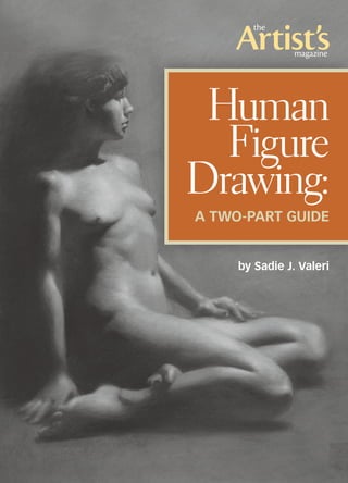
1. by Sadie J. Valeri
Human
Figure
Drawing:
A Two-Part Guide
2. 2 www.artistsmagazine.com
drawing board By Sadie J. Valeri
FINDING CORRECT PROPORTIONS
is the most important part of creat-
ing a convincing figure drawing.
Humans have an infinite variety of
proportions, but that variety falls
within a very narrow range. It’s very
easy to make your figure drawing
look distorted or even alien if the
proportions fall outside the range of
human possibility.
The best way I’ve found to avoid
potential proportion problems is to
use the straight-line block-in tech-
nique to create accurate angles in
the figure. If all of the angles in your
drawing are correct, the proportions
will be correct and the drawing will
fall into place. One way to illustrate
the importance of accurate angles
is to picture a capital “A”. We can
imagine a wide “A” or a narrow “A”
or a normal, well-proportioned “A.”
The only aspects of the letter “A” that
change in these three scenarios are
the tilts of the two sides.
In this article I’ll demonstrate
how I complete a straight-line block-
in for the human figure—with accu-
rate angles—which will prepare you
to later complete a precise draw- ing
of the figure.
1. Draw the Envelope
First I construct an “envelope”—a
multisided box constructed out of
long, straight lines. The lines are like
beams leaning against the outside
points of the model. Depending on
the pose, I’m referring to the most
exterior points of a shoulder, a knee
or a forehead, for example. This enve-
lope places the figure on the page
and establishes general proportions.
Using my whole arm, moving
from the shoulder, I draw long, soft
Human Figure Drawing, Part 1
Use the classical, straight-line block-in method to create accurate angles and proportions for
contour drawings of the human figure.
Above: Valeri uses a straight-line block-in method to begin her classical figure drawings. In
Study of Torrey (charcoal and white chalk, 18x14), she’s left the lower portion in its simple
contour drawing stage and built up values and modeled form in the upper portion of the drawing.
3. drawing board
3www.artistsmagazine.com
lines that are easily erased. If you’re
a beginner, you can use a knitting
needle to hold up to the model for
checking the angles. You can do this
by measuring the degree of tilt each
line has from the vertical or hori-
zontal axis, which you establish with
the knitting needle. However, do try
to match the angles using only your
eyes. The less you rely on tools, the
more sensitive your eye will become.
(When you measure angles using a
knitting needle, be certain to use
a straight arm to keep a consistent
distance from the model.)
The envelope I drew for this
demo corresponds to the model pose
in step 5 (page 5).
2. Build a Web
When I can clearly imagine the
entire figure fitting comfort- ably
inside the envelope, I start
constructing interior lines with a
“web.” I look for the longest, straight-
est relationships I can find, cutting
across the form from side to side.
This step shows a line (AB) from
the model’s forehead to the tip of
her nose, down her left shoulder to
her rib cage and abdomen. Another
long line (AC) travels from the top of
her forehead down the front of her
neck to the outside of her right hip
to the tips of her right toes. A long
horizontal line (CD) runs from her
toes along the front edge of her right
shin to just under her knee.Another
horizontal line (BE) runs along the
top of her left thigh.
Finding these long, straight
lines in the figure trains the eye to
scan all across the form instead of
focusing on small details. I use each
step in the drawing process to go
back and correct the earlier steps.
When I’m really struggling, I often
go all the way back to the envelope
stage to solve a problem. If I find a
problem with a small section, it usu-
ally means there’s a problem with
the larger shapes.
3. Establish Midpoints
I try to rely on measurements as
little as possible but, early on in the
process, I do establish midpoints.
First, looking only at my paper and
not at the model, I measure and
make a short mark on my paper at
1 2 A
B
C
D
E
Materials
Surface: Daler-Rowney Murano
Textured Fine Art Papers, the color
Storm
(I love this paper for charcoal. It’s
toothy enough to hold the charcoal,
but smooth enough so I’m not fighting
against a texture. And the paper holds
up to a lot of erasing. Tape three or
four sheets to a hard drawing board
for an ideal surface.
Charcoal: Winsor & Newton vine
charcoal, medium
Other: chamois cloth, kneaded
eraser, Sanford Paper Mate Tuff Stuff
retractable eraser
4. drawing board
4 www.artistsmagazine.com
the halfway point (A) from the top
of the head to the bottom of the low-
est point, the tips of the right toes,
in this case. If the pose is also wide,
like this one, I mark the horizontal
midpoint (B) as well—along the line
from the tips of the fingers to the tip
of the left knee in this drawing.
Holding up a knitting needle
vertically in front of the model, I
then find the vertical halfway point
between the top and the bottom,
mark that point on the needle with
my thumb and make a mental note
of a visual landmark on the model. I
do the same for the horizontal half-
way point. I hold my arm straight,
elbow locked, so the needle is always
the same distance from my eye.
Throughout the life of the draw-
ing process, I can recheck that the
midpoint marks on the paper are
hitting the correct landmarks on the
model so that the major proportions
will fall into place.
At this stage, as I’m drawing in
the lines for the contour of the figure,
using the straight-arm method with
my needle to measure the angles cor-
rectly, I’m creating the major angles
in the figure: the angles created by
the head, neck and shoulders, by the
bent knees and respective shins;
the angle between the two thighs,
the one between the body and the
right arm, and so on. I’m careful to
remeasure and recheck the angles
before and after drawing them on
my paper.
4. Draw the Terminator
When the figure has started to take
shape, I start to block in the shadow
mass. The line between light and
shadow is called the “terminator”
because this line is the termina- tion,
or the ending, of the light and repre-
sents the precise line beyond which
the light can no longer touch the
model. We only see the termi- nator
as soft and fuzzy because the light
grows slowly darker as the form
turns away from the light. In fact,
this line is the “horizon” of the form
(as it would be seen from the point of
view of the light source)—a contour
line, just as important as the exterior
contours of the form.
Sometimes it’s difficult to see
the terminator, especially in diffused
light. One trick is to approach the
model (with his or her permission)
and hold up a knitting needle to cast
a shadow across the skin. Where the
cast shadow of the needle disappears
into the shadow on the model is the
specific point where the light ends
and the true shadow begins.
5. Finish the Contour Drawing
The drawing can look geometric and
blockish for quite a while with this
method. I only start to refine the con-
tour when I’m sure my major shapes
are as correct in proportion as pos-
sible. I never use curved lines; I just
keep segmenting the straight lines
until they are smaller and smaller. If
a knee, elbow or shoulder feels too
sharp, I resist the urge to round it off.
Instead, I use a straight line to “slice”
4
terminator
3
A
B
5. drawing board
5www.artistsmagazine.com
off a corner. This method requires a
careful, drawn-out process (no pun
intended) with small, incremental
adjustments and refinements.
As I use smaller segments, and
add detail, often errors appear—a
leg or a head or a foot won’t fit in
the space I’ve made for it. As soon
as I feel the the urge to “stretch” or
“squish” body parts to make them
fit, I stop, put down my charcoal
and just look. The only way to fix
the error is to go back and correct
the larger shapes. I always tell my
students, “If you find a problem with
an arm, don’t look for the solution in
the arm: Go back to the beginning
and check your envelope and your
midpoints.” The most grievous errors
in figure drawing are often made
due to an unwillingness to go back
and to correct previous decisions. In
order to progress, we must always be
willing to go back to previous steps,
sometimes to the beginning, and do
what I call “major surgery.”
The Next Step
For successful contour drawing
you need to repeatedly recheck
midpoints and go back to readjust
portions of the drawing, but with
practice this straight-line block-in
method really pays off in accurately
proportioned figures. Once my con-
tour drawing is completed, I move
into shading with black and white
General Pencil charcoal pencils.
Special Note
In the next section, I’ll complete
this piece and share my techniques
for build- ing up values, modeling
form and creating dramatic lighting
effects in a classical drawing. n
SADIE J. VALERI has taught graduate stu-
dents at the Academy of Art University in
San Francisco and is co-founder of the blog
womenpaintingwomen.blogspot.com. She
currently teaches workshops and classes at
Sadie Valeri Atelier in San Francisco. Visit her
website at www.sadievaleri.com.
5
6. 6 www.artistsmagazine.com
drawing board By Sadie J. Valeri
To create an image that’s an
accurate depiction of light falling on
form, we must have a very organized
approach to analyzing light and
shadow. Otherwise we tend to exag-
gerate and distort, destroying the
feel of the light and the structure of
the form.
The human eye can see a huge
range of values, much darker shad-
ows and much brighter highlights
than any art material can capture.
Even with the broad value range of
charcoal pencil and white chalk on
toned paper, we still must interpret
what we see—not just copy it—to
capture a true feeling of the light.
The untrained approach to shad-
ing is to compare two patches that
are right next to each other and eval-
uate how similar or different they are
to each other. However, because our
eyes see such a huge range of value,
we see a big difference between any
two adjacent areas. As a result, we
tend to make the differences too
great, with huge jumps of value.
The more accurate way to evalu-
ate how light or dark an area is, is to
compare it to the lightest light in the
whole composition, and to the dark-
est dark, scanning our eyes across
the whole scene.
In the previous article about
drawing the contour of a figure,
I used the straight-line block-in
method to create accurate angles and
proportions for contour drawings of
the human figure. I emphasized how
important it is to move the eyes so
they scan the whole figure, instead of
zooming in on small details too soon.
In like manner, we see more accurate
value relationships when we scan our
eyes across the whole image.
5. Finish the Contour Drawing
This is the last step (see page 7) in
our contour drawing from the previ-
ous article. The drawing can look
geometric and blockish for quite a
while with the straight-line block-in
method. I only start to refine the
contour when I’m sure my major
shapes are as correct in proportion
as possible. I never use curved lines;
I just keep segmenting the straight
lines until they’re smaller and smaller.
Human Figure Drawing, Part 2
Learn to mass in values and model three-dimensional form
to create convincing, light-enhanced nudes.
Above: To depict accurate value relation-
ships and shapes in a figure, as in Study
of Christina (charcoal and white chalk on
toned paper, 24x18), Valeri scans her eyes
across the entire image.
7. drawing board
7www.artistsmagazine.com
If a knee, elbow or shoulder feels too
sharp, I resist the urge to round it off.
Instead, I use a straight line to “slice”
off a corner. This method requires
a careful, slow investigation of the
shapes, with small, incremental
adjustments and refinements.
6. Fill in Shadow Masses
To keep my shadows and lights orga-
nized, I repeat one mantra to myself
over and over: Keep the shadows
simple! To remember to do this, I
first use soft vine charcoal to fill in
all the shadow areas with one flat,
even tone of value, as rich and dark
as I can make it. This will make a
very flat, graphical image with a
sharp, clear delineation between the
shadow and the light, which I think
of as separate countries.
In my previous article, I spoke
about the edge of the shadow mass
or the ending of the light, which we
can call the “terminator.” This line
separates light and shadow, so for
now it appears as a sharp, hard edge.
It can be disconcerting to see the
area on one side of this line filled in
with shadow on what should be a soft,
rounded form! But we’ll find the form
gets soft and rounded easily later on.
7. Mass in All Values
To start creating the feel of the light
in the whole image, I mass in values
across the whole composition. I use
a chamois, paper towels, blending
stumps and anything I can find to
blend and rub the charcoal. I was
captivated by the brilliant light on
my model Christina, so I darkened
the entire background a bit so that
later on the lights would really pop.
I make my shadows nice
and dark by building up a layer of
medium or soft charcoal and rubbing
it gently into the surface with a stiff,
inexpensive paper towel. Then I build
up more layers of vine charcoal and
rub again. I do this over and over
until the surface is velvety and dark.
When I’m shading, I mix and layer
5 6
terminator
7
8. drawing board
8 www.artistsmagazine.com
all different hardnesses of charcoal.
A harder charcoal over a softer layer
can sometimes work like a blending
stump. Notice that I keep my shad-
ows simple, even allowing the back
contour of the model’s arm to melt
into the shadow cast on the wall
behind her.
8. Model Form With White
The fun begins! I always start with the
area that has the most interest; in this
case, the light falling on her upper
chest is brightest and also captures
the drama of the whole picture. Using
a very sharp white charcoal pencil
(actually a chalk), I work to build up
the lightest light and then shade
gently down toward the shadow.
When I’ve used the white chalk
for a while, I switch to the black
charcoal and work in the opposite
direction. I work from the shadow
up toward the light with a very hard
charcoal and a light touch. With this
technique, the white chalk and black
charcoal never touch or mix. The
cool midtone of the paper acts as the
value between them.
I always model across the form,
moving perpendicular to the termi-
nator, the line separating light from
shadow on the figure (see step 5,
page 7), imagining each plane turn-
ing toward or away from the light.
Often problems arise when we work
along the form, or parallel to the
terminator. We might see a ridge of
light falling across a rib and draw a
bright crescent shape in white. This
makes a rib look garish and harsh, as
if the model has been injured. I see
this often when inexperienced artists
draw the neck and clavicle area of a
model. Sometimes the clavicles look
like straight, harsh rods jammed
under the model’s skin!
When we work across the form,
we notice some edges are harder and
some are softer, and sometimes the
rib or clavicle disappears completely
before re-emerging. We observe all
the subtle nuances that make organic
form look soft and alive, instead of
dead, damaged or mechanical.
I think about the light coming
down in beams from the source, hit-
ting the surface of the model’s skin
at the highlight, and then undulat-
ing across the surface until the light
8Keep Drawing
Tools Sharp
Work with only very sharp pencils
because a sharp point gets the pig-
ment deep into the crevices of the
paper and creates a smooth, even
surface. A blunt tool leaves too
much texture because it skims over
the the tooth of the paper.
Sharpen your charcoal pencil first
with a knife to cut away the wood,
and then rub the point on sandpa-
per, turning it constantly, to create a
needle-sharp point.
Be careful not to break the pen-
cil while sharpening; this can take
some practice! Sometimes pencil
leads are broken every inch or so
inside the pencil. These pencils
were probably dropped and are
impossible to sharpen, so it’s better
to start with a new pencil.
To sharpen vine charcoal, just rub
it on sandpaper to create a point.
9. drawing board
9www.artistsmagazine.com
fades and dims toward shadow. Then
I go back to an adjacent highlight
and make the journey to the shadow
again. I think of modeling as a series
of expeditions, traveling across a
changing terrain.
Slowly, the sharp, hard edge
of the terminator melts away, and
the form becomes rounded. In fact,
sometimes we find that we have to
darken the shadows significantly once
we’re deep into the process. That’s
because the shadow, which is blocked
in with hard edges, looks very
dark and severe, but as the form is
rounded, we realize the shadows can
afford to be much richer and darker.
9. Refine the Shading
To complete the image (see larger
image, page 6), I continue to shade
across the whole composition by
working in small areas, bringing one
area to a high finish before moving
on. I work with a soft touch, building
up layer after layer to achieve values,
instead of pressing into the paper and
potentially damaging the surface.
The tooth of the paper is very impor-
tant to protect because it grabs the
charcoal and chalk. If you press too
hard, the tooth is pushed down and
you can’t build up more value range.
Capturing the feel of the light
requires knowing when to edit—
when to “collapse” values. Collapsing
values means making the lights group
together and the shadows group
together. So when working with the
chalk, I keep all the values in my
light areas very close to each other.
If we notice a big jump between
the highlight and the general light
area, we shouldn’t be alarmed. We
need to scan our eyes across the
whole scene, and we’ll find that,
in comparison to the deep, dark
shadows, the highlight and the light
are very similar. The highlights
will actually look brighter if they’re
supported by almost-as-light areas
surrounding them.
If we just copy values and hope
for a facsimile of three-dimensional
form, our drawings will look empty
and disorganized, but if we internal-
ize a deep and sensitive understand-
ing of the three-dimensional shapes
of the forms, and of the direction of
the light, that understanding will
show up in our drawings. We want
our drawings to evince the intelli-
gence of a highly functioning, think-
ing and feeling human mind, both in
the model and in the artist. n
Sadie J. Valeri has taught graduate stu-
dents at the Academy of Art University in San
Francisco and is co-founder of the blog www.
womenpaintingwomen.com. She currently
teaches workshops and classes at Sadie
Valeri Atelier in San Francisco. Visit her web-
site at www.sadievaleri.com.
9
Materials
Surface: Daler-Rowney Murano
Textured Fine Art Papers, the color
“Storm” (This paper is toothy enough
to hold the charcoal, but smooth
enough so I’m not fighting against a
texture. Also, the paper holds up to
a lot of erasing. Tape three or four
sheets to a hard drawing board for an
ideal surface.)
Charcoal: Winsor & Newton vine
charcoal—soft, medium and hard
Charcoal pencils: General Pencil’s
medium, hard and extra-hard (Soft
breaks too easily.)
Chalk: General Pencil’s “white char-
coal” pencil (This is actually a chalk,
not a charcoal.)
Other: Retractable box cutter or
X-Acto knife for sharpening char-
coal pencils, 120-grit sandpaper for
sharpening charcoal, blending stumps
(reserve some just for charcoal and
some just for chalk), chamois cloth,
kneaded eraser, Sanford Paper Mate
Tuff Stuff retractable eraser, paper
towels (the scratchy, inexpensive kind)
10. Get the best
art instruction all year long!
Celebrate & live a creative life
with your year-long subscription
to The Artist’s Magazine, one of the
country’s top art magazines featur-
ing work from artists in all media
& styles. Discover your new favorite
painting or drawing technique with
your subscription to The Artist’s
Magazine.
Subscribe today at
subscribe.artistsmagazine.com.
Did you enjoy
this article?
Don’t miss a single drawing lesson when you
subscribe to The Artist’s Magazine today!
2012 Annual CD of art 2001-2010 CD of art
Also available: