Strategize a Smooth Tenant-to-tenant Migration and Copilot Takeoff
Busb 301 june 2013 power point do don't
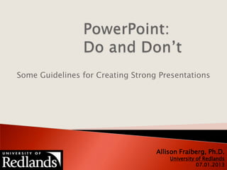
1. Some Guidelines for Creating Strong Presentations
Allison Fraiberg, Ph.D.
University of Redlands
07.01.2013
2. 1. General Considerations
2. Do This; Don’t Do That
Design, Format, and Organization
Creating Text
Graphics and Animation
3. Questions About Your Slides
3. Slides should enhance your talk, not replace it
Limit slides to essential info
Don’t read your slides
You are the star, not your slides
4. Design a template
Include title & agenda slide
Include “Questions?” slide
Use bland background with
contrasting text colors
Standardize positions,
colors, and styles
Create balanced slides
DO
5. Use multiple backgrounds
Use very dark backgrounds
Use very bright text colors
Create endless variety
DON’T
6. Use 18-48 point easy-to-
read fonts
Use bulleted sentence
fragments
Spell and punctuate
correctly
Use colors that contrast
with background
Be consistent with
capitalization
DO
7. Have more than 6-7 lines
on a slide
Have more than 6-7 words
on a line
Use complete sentences
Use
abbreviations, acronyms, or
all caps
Use unusual fonts
DON’T
8. Enhance point with graphics
Use graphics to convey
emotion
Balance slides with graphics
Animate to reveal points
when relevant
Synthesize and highlight
info from tables and graphs
Simplify!
DO
9. Use more than two graphics
per slide
Include graphics with
incorrect tone
Let graphics overwhelm
Overanimate
Leave audience to figure
out table & graph info
DON’T