SlideShare uma empresa Scribd logo
1 de 10
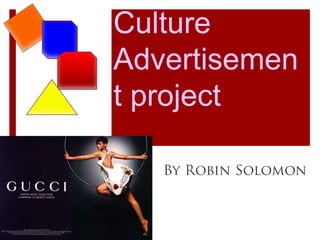
Media & CultureAdvertisement project By Robin Solomon
Transfer
1) The product being advertise is tourism in Norway and the brand is “Explore” which is a travel agency. 2) a.  the predominant type of technique is transfer b. The positive connotations are used to show transfer in the ad are thepeacefulatmosphere in Norway such as clean snow, air, beautiful sceneries, blue skies and no engine sailing boat.  The ad is also showing tranquility because you can feel it is free from disturbance.  The locations are away from the busy cities showing that Norway is very peaceful. 3) The ad is trying to convince us to escape our busy life and go on a refreshing holiday to Norway. 4)  “Wake  Up! Start Living! Sail and Ski in Norway” is capitalized and this is saying just get up and start living! It is actively inviting you start living and maybe make a change.  The ad also uses the color blue and it is strongly associated with calmness and tranquility because of the peaceful setting in the mountains and the snow is very clean and fresh.  It also says Start living at “explore” which is a tactic to grab the viewers attention.  They want the viewer to be involve in booking reservations.
5) a. What I thought was well done is that the text has a echo in the back the contrast with the light blue color.  The echo is to show as if someone is yelling or saying to you to wake up!  I thought it was a clever idea to motivate people to go on a holiday.    b. I thought that the ad only focused on one destination in the country which is the mountains. Since the ad is advertising Norway, I thought that there should be a variety of activities that people can do in Norway not just sailing and mountain hiking.
Bandwagon
1)  The product being advertised is a smart phone and the brand is called blackberry. 2 a.  The predominant technique used is bandwagon. b. This is Bandwagon because the ad obviously suggests that you should not wait any longer to join the big group who is already using the product.  The ad’s states “WAIT NO MORE, The Blackberry curve has been waiting for you 3) The ad is trying to convince you that you will be part of a elite group or a popular group that also has a blackberry. 4) The black color definitely shows the power of the product.  When you see the black color you also immediately say the name of the product “Blackberry”.  It is clever for the ad makers to use the black background color.  The ad also announces the date that it is going to be released in stores so therefore they really want you to get one.  The ad also states Verizon and this is a advanced telecommunications service which was not on previous blackberry phones so therefore this could be a push for current customers to purchase a new one.
5) a. The ad is kept very simple and direct.  The letter type is simple and using the capitalization makes it even easier to read.  On top of that, using the white and black makes it stand out more. b. I think the ad didn’t explain what Verizon is and they assume that everyone knows what it is but that is not necessarily true for the new comers to the product.
Hidden Fears
1) A medication agent used to reduce hairloss and promote hair regrowth and the brand is called Rogaine 2) a. Predominant technique used in the ad is “Hidden Fears” b. This is hidden fears because it shows that many hair strands on the comb and the man is surprised with the amount of hair on the comb.  Also the area on the head seems like the hair came off very easily, which shows a very large amount of hair that is just pulled off by a comb. 3) The ad is trying to convince you to avoid hair loss and you can have a embarrassing bald area that is visible on your head.
4)  The ad is mainly focused on the person’s reaction to the amount of hair loss and the subject is seen on the mirror and the comb and everything else is blurred.  The text that says “YOU DON’T HAVE TO LOSE IT” is capitalized, persuading to the viewer to not take the risk of losing hair.  The ad also uses the color black and it is associated with fear and evil.  The black in this ad is trying to convince the viewers to not risk on having a lot of hair pulled off.      5) a.  What is well done in the ad blurred out the unimportant bits so that the viewer will focus more on the guys face and the comb with the many hair strands. b.  Something that is not well done is the text for Rogain which is the brand of the product.  People may not recognize what is because the brand is in normal text and the size is small.  If the logo was present, then the viewer's know that it is a anti hair loss agent is being advertised.

Mais conteúdo relacionado

Semelhante a Discover Norway's Peaceful Scenery

Market launch presentation
Market launch presentationMarket launch presentation
Market launch presentationmarie_kamara
 
GCSE Lesson 1 Representation in the Media
GCSE Lesson 1 Representation in the MediaGCSE Lesson 1 Representation in the Media
GCSE Lesson 1 Representation in the MediaRafaelPerezOlivan
 
NDU Term Paper | Creativity In Advvertising
NDU Term Paper | Creativity In AdvvertisingNDU Term Paper | Creativity In Advvertising
NDU Term Paper | Creativity In AdvvertisingNaja Faysal
 
Media Unit 1 Presentation
Media Unit 1 PresentationMedia Unit 1 Presentation
Media Unit 1 PresentationRo0kie
 
John west case study presentation
John west case study presentationJohn west case study presentation
John west case study presentationItsjustrory
 
John west case study presentation
John west case study presentationJohn west case study presentation
John west case study presentationItsjustrory
 
Media and Culture
Media and CultureMedia and Culture
Media and CultureNutchawin
 
Nick Hughes DT Folder
Nick Hughes DT FolderNick Hughes DT Folder
Nick Hughes DT FolderNickHughesRWS
 
Different kind of advertisements
Different kind of advertisements  Different kind of advertisements
Different kind of advertisements Muhammad Fahad Khan
 
Analysing the style of adverts
Analysing the style of advertsAnalysing the style of adverts
Analysing the style of advertsLucasjwarren
 
Key note presentation Media Unit 1
Key note presentation Media Unit 1Key note presentation Media Unit 1
Key note presentation Media Unit 1Itsjustrory
 

Semelhante a Discover Norway's Peaceful Scenery (20)

Andy 5
Andy 5Andy 5
Andy 5
 
Ad Project
Ad ProjectAd Project
Ad Project
 
Advertisements
AdvertisementsAdvertisements
Advertisements
 
Market launch presentation
Market launch presentationMarket launch presentation
Market launch presentation
 
GCSE Lesson 1 Representation in the Media
GCSE Lesson 1 Representation in the MediaGCSE Lesson 1 Representation in the Media
GCSE Lesson 1 Representation in the Media
 
Unit 20 p1 m1
Unit 20 p1 m1Unit 20 p1 m1
Unit 20 p1 m1
 
NDU Term Paper | Creativity In Advvertising
NDU Term Paper | Creativity In AdvvertisingNDU Term Paper | Creativity In Advvertising
NDU Term Paper | Creativity In Advvertising
 
Media Unit 1 Presentation
Media Unit 1 PresentationMedia Unit 1 Presentation
Media Unit 1 Presentation
 
advert analysis
advert analysisadvert analysis
advert analysis
 
John west case study presentation
John west case study presentationJohn west case study presentation
John west case study presentation
 
John west case study presentation
John west case study presentationJohn west case study presentation
John west case study presentation
 
Presentation2
Presentation2Presentation2
Presentation2
 
Media and Culture
Media and CultureMedia and Culture
Media and Culture
 
Nick Hughes DT Folder
Nick Hughes DT FolderNick Hughes DT Folder
Nick Hughes DT Folder
 
Irn bru pro forma
Irn bru pro formaIrn bru pro forma
Irn bru pro forma
 
Different kind of advertisements
Different kind of advertisements  Different kind of advertisements
Different kind of advertisements
 
Analysing the style of adverts
Analysing the style of advertsAnalysing the style of adverts
Analysing the style of adverts
 
Eng adv
Eng advEng adv
Eng adv
 
Eng adv
Eng advEng adv
Eng adv
 
Key note presentation Media Unit 1
Key note presentation Media Unit 1Key note presentation Media Unit 1
Key note presentation Media Unit 1
 

Discover Norway's Peaceful Scenery

  • 1. Media & CultureAdvertisement project By Robin Solomon
  • 3. 1) The product being advertise is tourism in Norway and the brand is “Explore” which is a travel agency. 2) a. the predominant type of technique is transfer b. The positive connotations are used to show transfer in the ad are thepeacefulatmosphere in Norway such as clean snow, air, beautiful sceneries, blue skies and no engine sailing boat. The ad is also showing tranquility because you can feel it is free from disturbance. The locations are away from the busy cities showing that Norway is very peaceful. 3) The ad is trying to convince us to escape our busy life and go on a refreshing holiday to Norway. 4) “Wake Up! Start Living! Sail and Ski in Norway” is capitalized and this is saying just get up and start living! It is actively inviting you start living and maybe make a change. The ad also uses the color blue and it is strongly associated with calmness and tranquility because of the peaceful setting in the mountains and the snow is very clean and fresh. It also says Start living at “explore” which is a tactic to grab the viewers attention. They want the viewer to be involve in booking reservations.
  • 4. 5) a. What I thought was well done is that the text has a echo in the back the contrast with the light blue color. The echo is to show as if someone is yelling or saying to you to wake up! I thought it was a clever idea to motivate people to go on a holiday. b. I thought that the ad only focused on one destination in the country which is the mountains. Since the ad is advertising Norway, I thought that there should be a variety of activities that people can do in Norway not just sailing and mountain hiking.
  • 6. 1) The product being advertised is a smart phone and the brand is called blackberry. 2 a. The predominant technique used is bandwagon. b. This is Bandwagon because the ad obviously suggests that you should not wait any longer to join the big group who is already using the product. The ad’s states “WAIT NO MORE, The Blackberry curve has been waiting for you 3) The ad is trying to convince you that you will be part of a elite group or a popular group that also has a blackberry. 4) The black color definitely shows the power of the product. When you see the black color you also immediately say the name of the product “Blackberry”. It is clever for the ad makers to use the black background color. The ad also announces the date that it is going to be released in stores so therefore they really want you to get one. The ad also states Verizon and this is a advanced telecommunications service which was not on previous blackberry phones so therefore this could be a push for current customers to purchase a new one.
  • 7. 5) a. The ad is kept very simple and direct. The letter type is simple and using the capitalization makes it even easier to read. On top of that, using the white and black makes it stand out more. b. I think the ad didn’t explain what Verizon is and they assume that everyone knows what it is but that is not necessarily true for the new comers to the product.
  • 9. 1) A medication agent used to reduce hairloss and promote hair regrowth and the brand is called Rogaine 2) a. Predominant technique used in the ad is “Hidden Fears” b. This is hidden fears because it shows that many hair strands on the comb and the man is surprised with the amount of hair on the comb. Also the area on the head seems like the hair came off very easily, which shows a very large amount of hair that is just pulled off by a comb. 3) The ad is trying to convince you to avoid hair loss and you can have a embarrassing bald area that is visible on your head.
  • 10. 4) The ad is mainly focused on the person’s reaction to the amount of hair loss and the subject is seen on the mirror and the comb and everything else is blurred. The text that says “YOU DON’T HAVE TO LOSE IT” is capitalized, persuading to the viewer to not take the risk of losing hair. The ad also uses the color black and it is associated with fear and evil. The black in this ad is trying to convince the viewers to not risk on having a lot of hair pulled off. 5) a. What is well done in the ad blurred out the unimportant bits so that the viewer will focus more on the guys face and the comb with the many hair strands. b. Something that is not well done is the text for Rogain which is the brand of the product. People may not recognize what is because the brand is in normal text and the size is small. If the logo was present, then the viewer's know that it is a anti hair loss agent is being advertised.