
Recomendados
Mais conteúdo relacionado
Semelhante a RHoK brand guidelines version april 2012
Semelhante a RHoK brand guidelines version april 2012 (20)
Último
Último (20)
RHoK brand guidelines version april 2012
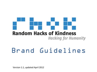
- 1. Brand Guidelines Version 1.1, updated April 2012
- 2. Table of Contents • Purpose • Background of Brand • Brand Guidelines – Brand Look & Feel – Branding Examples – Event Naming • Approvals & Legal
- 3. How to use this document The RHoK brand is a shorthand representation of everything the community stands for -- from our purpose and mission to the community values and personality. As we strive to expand our impact and global community, it is extremely important that we build a coherent global brand. A RHoK event in Bangalore should have the same look and feel as an event in Moscow. All members of our community – from our hackers to our sponsors – become part of the same global community. These guidelines are designed to provide the parameters necessary so that we keep a consistent global identity. The more we can build a coherent global community, the more potential impact we can have.
- 4. Why RHoK? Random Acts of Kindness: spontaneous, selfless actions done for the benefit of others whenever an opportunity presents itself Hacks: use of minimal resources and maximum brainpower to quickly and efficiently create solutions to interesting problems Random Hacks of Kindness: a global volunteer community of innovators building practical open technology to make the world a better place
- 5. Why RHoK? What began as a small initiative between Google, Microsoft, Yahoo!, HP, NASA and the World Bank is now a global movement with over 4000 participants in 50 cities and 180 partners across government, academic, corporate and NGO partners world-wide.
- 7. The RHoK Logo The RHoK logo consists of three elements: (1) the graphic symbol (2) the wordmark (3) the tagline. The graphic symbol and wordmark must always appear together. The tagline can only be removed from the logo when it appears elsewhere on the printed material (such as on the back of a T-shirt). The approved electronic art files are available from _______________. No modifications are permitted. (1) Graphic Twenty individual pixels form the RHoK logo, symbol represenIng the very foundaIon of technology in its simplest form (2) Wordmark The full name always accompanies the symbol (3) Tagline The tagline states our mission and always falls offset under the logo
- 8. The RHoK Logo Clearance The RHoK logo should always have a minimum clearance where no other logos or graphic treatments are to appear. This is defined as the length and width of the pixelized “r” in the graphic symbol. This minimum space should be kept proporIonally to the size of the logo. Minimum Size When printed too small, the logo is not legible. The smallest size that the logo can be printed is 2.5” 2.5” Color Palate Color Pantone C M Y K R G B Web # The RHoK logo should always appear in blue on a Blue Pantone xxx 0 0 0 0 0 0 0 000000 background that allows the logo color to appear Gray clearly. Express permission is required to print the RHoK logo in colors other than blue. The only Gold excepIon is the winner T-‐shirts where RHoK Silver appears in gold. That design is available to all event organizers or upon request. Bronze
- 9. Brand Guidelines: Branding Examples T-‐Shirt Water BoZle SIcker
- 10. Brand Guidelines: Incorrect Usage Graphic device without wordmark
- 11. Brand Guidelines: Event Naming Only approved event names and logos may be used. Events are named using the convention of RHoK [City Name] (e.g. “RHoK Bangalore”). A location-specific RHoK logo will be provided for each event, which should be used in promoting the event. These should not be created locally. This is the only instance where the RHoK graphic device may be used without the RHoK wordmark.
- 12. Approvals & Legal Use of the RHoK logo: • The RHoK logo can only be used for events that have received a license. • No one is permitted to use the RHoK brand in any way for an event without a license issued by RHoK. A license is good for a specific event on a specific date. Use of partner names & logos • The names and logos of the RHoK Core Partners (Microsoft, Google, Yahoo!, HP, NASA, The World Bank) CAN NOT be used in any way unless otherwise specified.