SlideShare uma empresa Scribd logo
1 de 121
Baixar para ler offline
Color


Image	
  from	
  Flickr	
  user	
  	
  
     nsaplayer.
                                                  Understand, to better use
Agenda
1 What is?
2 How do we perceive?
3 Guidelines...
4 Did you know...


                  CO       L   OR
1   What is color?
From the sun to our eyes

 1   The	
  sun	
  emits	
  light	
  composed	
  of	
  several	
  electromagne:c	
  wavelengths.

 2   Some	
  wavelengths	
  are	
  absorbed	
  by	
  apple´s	
  color	
  pigments	
  and	
  some	
  are	
  reflected.

 3   Our	
  eye	
  receives	
  the	
  reflected	
  wavelengths	
  and	
  process	
  it	
  into	
  red	
  color.


                                       images	
  from	
  Flickr	
  users	
  pren:sc	
  (eye),	
  Oceano	
  Mare	
  (landscape)	
  and	
  Dykstra	
  (apples).
Color is a sensation and,
in	
  Apple	
  Developer	
  Documenta:on,	
  Color	
  Management	
  Overview,	
  2009.
                                                                                         therefore a subjective experience.
                                                                                                                                             ”
                                                                                                                    image	
  from	
  Flickr	
  user	
  
                                                                                                                        chandudesai.
Emotional...
     Research on prison discovered that
     red and yellow wings increased
     violence rather than blue and green.


                                            Image	
  from	
  Flickr	
  
                                              user	
  wwarby.
Color impairments...
Some people cannot distinguish
between red and green.


                                 Image	
  from	
  Flickr	
  user	
  an	
  
                                     untrained	
  eye.
Cultural...
While in the western culture white is
used for marriages, in the Eastern
Asia, it’s often used in funerals.


                                        Image	
  from	
  Flickr	
  
                                          user	
  an	
  Extra	
  
                                            Medium.
Color is a sensation and,
in	
  Apple	
  Developer	
  Documenta:on,	
  Color	
  Management	
  Overview,	
  2009.
                                                                                         therefore a subjective experience.
                                                                                                                                            ”
                                                                                                                    image	
  from	
  Flickr	
  user	
  
                                                                                                                        chandudesai.

      This content aims at better
      understanding color,


      nevertheless


      these are not
      rigid rules to follow.
But, what are really the colors we feel
everyday, all the time, at least most of us,
that give us all the emotions and kind of
talk to us, giving even different meanings to
the same aspects, depending on which part
of the globe we live in, but, really, what is
color, tell me please, that’s the reason, I am
reading this damn presentation, to know
and understand what is color....
By the way, nice color, the one used in this slide :)
CO   L OR   IS
Color is the visual effect that is
caused by the spectral composition
of the light emitted, transmitted, or


                                                                       ”
reflected by objects. in	
  Color	
  Logic	
  for	
  Web	
  Site	
  Design
Color is the visual effect that is
                                                                                             caused by the spectral composition
                                                                                             of the light emitted, transmitted, or


    Visual	
  effect:
                                                                                                                                                                     ”
                                                                                             reflected by objects. in	
  Color	
  Logic	
  for	
  Web	
  Site	
  Design


                 400                 450                   500                      550                 600            650               700               750 units:	
  nm


    Spectral	
  composi:on:

GAMMA	
  RAYS          X-­‐RAYS      ULTRAVIOLET	
  RAYS         VISIBLE	
  LIGHT         INFRARED	
  RAYS     RADAR         FM           TV         SHORTWAVE            AM


    Light:                  emi^ed                                     transmi^ed                                 reflected


    Objects:
Color can be created by two means

                    Our eyes either receive:
  reflected light                              direct light
Color can be created by two means

                    Our eyes either receive:
  reflected light


                           Subtractive color
                           Color	
  is	
  made	
  from	
  subtrac2ng	
  wavelengths	
  of	
  light.

                           Examples:	
  fruits,	
  clothes,	
  human	
  skin,	
  etc.
Color can be created by two means

                    Our eyes either receive:
  reflected light                        Primary colors


                                       Cyan, yellow and magenta.
                                          Color model: CYMK.
Color can be created by two means

            Our eyes either receive:
                                                                                 direct light


            Additive color
            Color	
  is	
  made	
  from	
  mixing	
  wavelengths	
  of	
  light.

            Examples:	
  TV,	
  computer	
  displays,	
  sun	
  light,	
  etc.
Color can be created by two means

                     Our eyes either receive:
      Primary colors                            direct light


       Red, green, blue.
      Color model: RBG.
Color properties, in a more scientific way


                                       Fundamentally, color is the perception
                                       of light rays wavelengths in the
                                       electromagnetic visible spectrum.


           Hue is the most dominant light wavelength:


                                                              data	
  and	
  images	
  from	
  CambridgeinColour.com.
Color properties, in a more scientific way


                                          Fundamentally, color is the perception
                                          of light rays wavelengths in the
                                          electromagnetic visible spectrum.


Saturation measures the purity of the most dominant wavelengths:


                                                                   data	
  and	
  images	
  from	
  CambridgeinColour.com.
Color properties, in a more scientific way

Hue


Saturation


                                             data	
  and	
  images	
  from	
  CambridgeinColour.com.
Color properties, in a more practical way

                 Hue


                  Color itself in electromagnetic spectrum.
                  >>	
  blue,	
  green,	
  yellow,	
  etc.
Color properties, in a more practical way

              Saturation

     +                                                      —


                                                                 pure	
  vs	
  muted


                The purity of hue (more or less of a color).
                >>	
  blood	
  red,	
  pure	
  yellow,	
  etc.
Color properties, in a more practical way

               Brightness (value)

     +                                              —


                                                        dark	
  vs	
  light


         Differences in intensity of light (darker vs lighter).
         >>	
  bright	
  red	
  vs	
  dim	
  red.
Color properties, in a more practical way

                                 Hue


           Saturation

  +                          —
                                            pure	
  vs	
  muted


        Brightness (value)

  +                          —
                                              dark	
  vs	
  light
Color movement

                 Do colors appear to move?
Color movement

                 Do colors appear to move?
                 Yes.


                        +               +


             BACKWARD          INWARD       STOPPED
Color movement
                                                   Why colors appear to move?


   Because different light wavelengths are focused differently by the eye lens.


                     light	
  wavelengths        lens       re:na


     400nm (blue)                           600nm (green)           750nm (red)
       IN	
  FRONT                             PERFECTLY              BEHIND
Color temperature

        Warm colors


                      Red, oranges, yellows and green-yellows.


                             Color movement: outward


                                 data	
  and	
  images	
  from	
  ColorLab,	
  h^p://colorlab.webespacios.com.
Color temperature

                                             Cool colors


    Purples, blues, aquas, and greens.


        Color movement: inward


                                         data	
  and	
  images	
  from	
  ColorLab,	
  h^p://colorlab.webespacios.com.
Color temperature

       Warm colors             Cool colors


                     data	
  and	
  images	
  from	
  ColorLab,	
  h^p://colorlab.webespacios.com.
Color temperature

                Neutral colors

                   Saturation: 0%


   Brightness


                  Black, white and gray are not saturated and are called neutral colors.
2   How do we perceive color?
1 Light passes through the cornea.

                      Cornea


                                    Human	
  eye	
  structure.


Cornea: focus and refracts light rays.
                                                                 data	
  from	
  Sensa:on	
  and	
  Percep:on.
2 The iris open / closes the pupil to regulate the light that enters the eye.

                                                                    Iris


                                                                   Pupil


                          Human	
  eye	
  structure.


Dilated pupils: at night the pupils open more to get more light.
3 The lens focus light into the retina.
                                                                         Accommodation


                                                               The	
  lens	
  gets	
  fa9er	
  to	
  focus	
  on	
  
                                                               close	
  objects	
  and	
  returns	
  to	
  its	
  
                                                               normal,	
  thinner,	
  shape	
  when	
  
                                                               viewing	
  objects	
  farther	
  away.

                            Human	
  eye	
  structure.


Lens: to obtain a sharp clear image in the retina, the lens refracts and focus the light rays.
3.1 Different wavelengths require different focusing.


              light	
  wavelengths                lens                   re:na


   shorter	
  wavelengths	
  (blue)   medium	
  wavelengths	
  (green)           long	
  wavelengths	
  (red)
             IN	
  FRONT                        PERFECTLY                                 BEHIND
3.1 Different wavelengths require different focusing.


                                   Repercussions
   3.1.1	
  	
  Blues	
  appear	
  to	
  be	
  distant,	
  reds	
  appear	
  to	
  be	
  closer.

   3.1.2	
  	
  Simultaneous	
  saturated	
  colors	
  may	
  cause	
  visual	
  fa:gue.

   3.1.3	
  	
  Difficult	
  to	
  obtain	
  a	
  sharp	
  image	
  in	
  re:na	
  with	
  pure	
  blue.

   3.1.4	
  	
  Green	
  is	
  the	
  most	
  reshul	
  color	
  for	
  the	
  human	
  eye.
                                             data	
  from	
  The	
  essen:al	
  guide	
  to	
  user	
  interface	
  design.
3.1.1 Blues appear to be distant, reds appear to be closer.

MOVEMENT

Inward: colors appear to move backward (blue).
Outward: colors appear to move forward (red).
Just right: colors appear to be stopped (green).


                                                    +            +


                                         BACKWARD       INWARD       STOPPED
3.1.2 Simultaneous saturated colors may cause visual fatigue.

REFOCUSING

Refocusing different wavelengths
simultaneously, make the muscles tired.
>>	
  The	
  worst	
  case	
  is	
  blue	
  vs	
  red.


                                                         look	
  carefully...
3.1.3 Difficult to obtain a sharp image in retina with pure blue.

FOCUSING

Short wavelengths (blue) focus behind retina, creating
less sharper images.
>>	
  Small	
  objects,	
  text	
  and	
  edges	
  should	
  be	
  avoided	
  with	
  pure	
  blue.


                                                                                        look carefully...   look carefully...
3.1.4 Green is the most restful color for the human eye.


            PERFECT FOCUS

            Green light wavelengths focus perfectly in
            the retina, creating sharper images.
            >>	
  Why	
  is	
  so	
  relaxing	
  to	
  go	
  out	
  and	
  enjoy	
  nature?


image	
  from	
  Flickr	
  user	
  ichiro	
  kishimi
3.2 Some wavelengths are absorbed by the lens.


                                 Repercussions
  3.2.1	
  	
  The	
  lens	
  absorbs	
  more	
  wavelengths	
  in	
  the	
  blue	
  spectrum.

  3.2.2	
  	
  As	
  people	
  get	
  older,	
  sensi:vity	
  to	
  blue	
  decreases.

  3.2.3	
  	
  Older	
  people	
  need	
  brighter,	
  saturated	
  colors.

                                           data	
  from	
  The	
  essen:al	
  guide	
  to	
  user	
  interface	
  design.
3.2.1 The lens absorbs more wavelengths in the blue spectrum.
3.2.2 As people get older, sensitivity to blue decreases.


                    As we get older, our lens yellows.


                           older	
  people	
  may	
  see


                                                           color	
  examples	
  from	
  Color	
  Logic	
  for	
  Web	
  Site	
  Design.
3.2.3 Older people need brighter, saturated colors.


                                                                      Image	
  from	
  Flickr	
  user	
  SundeepGoel.
                                         data	
  from	
  The	
  essen:al	
  guide	
  to	
  user	
  interface	
  design.
3.3 The lens also refocus with brightness differences.
3.3.1 High contrast variations may cause visual fatigue.

BRIGHTNESS VARIATION

If the lens has to continuously refocus for bright
and dark objects, it may cause visual fatigue.


                                                     Image	
  from	
  Flickr	
  user	
  masontrullinger.
4 Retina light receptors receive light wavelengths and fire accordingly.


                                                                  Fovea


                                                      Re6na


                                     Human	
  eye	
  structure.
4 Retina light receptors receive light wavelengths and fire accordingly.


                                                                  Fovea


                                                      Re6na


                                     Human	
  eye	
  structure.
Retina light receptors:           rods      cones


                                    Fovea


                          Re6na
rods


Operate mostly in dim light,
concentrated outside of fovea.
>>	
  Sensi2vity	
  with	
  periphery	
  vision


                                                                 Fovea


                                                         Re6na
cones


Color vision, concentrated on fovea,
give sharper vision.
>>	
  Acuity	
  with	
  central	
  vision


                                                    Fovea


                                            Re6na
4.1 Color is perceived by the response ratio from 3 types of cones.
                     cone cells peak response to light


                                                         Image	
  from	
  CambridgeinColour.com.
4.1 Color is perceived by the response ratio from 3 types of cones.
                                         Short wavelength (S) - 440 nm.
                                         >>	
  2%	
  “blue”	
  	
  on	
  periphery	
  of	
  fovea.


                                         Medium wavelength (M) - 535 nm.
                                         >>	
  32%	
  “green”	
  on	
  middle	
  of	
  fovea.


                                         Long wavelength (L) - 565 nm.
                                         >>	
  64%	
  “red”	
  on	
  middle	
  of	
  fovea.


                                                                Image	
  from	
  CambridgeinColour.com.
4.2 Color sensitivity in the periphery.
                                          Center of fovea:
                                          our eyes work with trichromatic color.


                            Fovea


                    Re6na
4.2 Color sensitivity in the periphery.
                                     Around fovea: we are red-green blind.
                                     >>	
  Reds	
  and	
  greens	
  tends	
  to	
  look	
  yellow.

                                     >>	
  Violets	
  and	
  blues	
  tends	
  to	
  look	
  blue...


                            Fovea


                    Re6na
4.2 Color sensitivity in the periphery.
                                          Extreme periphery:
                                          we are insensible to color.


                            Fovea


                    Re6na
4.2 Color sensitivity in the periphery.


                            Fovea


                    Re6na
4.2.1 Yellow and blue are the best colors in the visual periphery.


                         data	
  from	
  Color-­‐Vision	
  Mechanisms	
  in	
  the	
  Peripheral	
  Re:nas	
  of	
  Normal	
  and	
  Dichroma:c	
  Observers	
  
5    Cones responses are translated into 3 opponent channels.

                        cone cells peak response to light


Opponent channels: brain interprets color using antagonist responses from 3 cones.
                                                            Image	
  from	
  CambridgeinColour.com.
antagonist responses

                         , means that neurons in these
     opponent channels either respond one color or the
     antagonist, never both at the same time.
antagonist responses


                                                                                                         Example:


  if	
  green	
  neurons	
  are	
  responding	
  heavily,	


  red	
  ones	
  respond	
  less	
  
  ++++                                                                                                                                                                                                                                                     ++
     +++++                                                                                                                                                                                                                                                      +
  ++++                                                                                                                                                                                                                                                     +
     +++++                                                                                                                                                                                                                                                      +
  +++++                                                                                                                                                                                                                                                    +
        ++++                                                                                                                                                                                                                                                    ++
  +++++                                                                                                                                                                                                                                                    +
Opponent channels:
                                                                                  Brightness
   green             red           blue              yellow         black                             white


  Efficiency: The long (red) and medium (green) wavelengths overlap. To be efficient the
  brain uses this overlapping info to get 2 channels of color and one of brightness.


                                                                    Image	
  from	
  CambridgeinColour.com.
Opponent channels:
  green         red


                      Image	
  from	
  CambridgeinColour.com.
Opponent channels:
                     blue   yellow


                                     Image	
  from	
  CambridgeinColour.com.
Opponent channels:
                                   Brightness
                     black                             white


                     Image	
  from	
  CambridgeinColour.com.
Opponent channels:
                                   Brightness
                     black                             white


                     Image	
  from	
  CambridgeinColour.com.
Opponent channels:
                                   Brightness
                     black                             white


                     Image	
  from	
  CambridgeinColour.com.
Brightness
                                                      black                             white


5.1   Brightness is derived from green and red waves.


            cone cells peak sensitivity to light brightness


                                                      Image	
  from	
  CambridgeinColour.com.
5.1           Brightness is derived from green and red waves.


                                 Repercussions
 5.1.1	
  	
  Brighter	
  colors	
  in	
  the	
  spectrum	
  are	
  in	
  the	
  middle.

 5.1.2	
  	
  Yellow	
  is	
  the	
  most	
  luminous	
  color	
  in	
  the	
  spectrum.


                                            data	
  from	
  The	
  essen:al	
  guide	
  to	
  user	
  interface	
  design.
5.1.1 Brighter colors in the spectrum are in the middle.


      BRIGHTNESS


400                450   500         550            600   650    700
                               WAVELENGTH	
  (nm)
5.1.2 Yellow is the most luminous color in the spectrum.


                                                                      lor.
                                                               he r co
                                                    a   n y ot
                                               an
                                       ster th
                                   n fa
                              ntio
                     e’s atte
                 opl
         gets pe
     w
Yello

                                                                             American school buses are yellow.

                                                                              Metro floor barriers are yellow.
EXPERIMENT


Instruc2ons:	
  stare	
  at	
  the	
  black	
  dot	
  in	
  the	
  blue	
  square	
  for	
  30	
  seconds,	
  then	
  move	
  your	
  eyes	
  immediately	
  to	
  the	
  white	
  
square	
  in	
  the	
  right.	
  

WHAT	
  COLOR	
  DO	
  YOU	
  SEE?

What	
  is	
  happening:	
  Each	
  opponent	
  channel	
  has	
  cells	
  firing	
  up	
  for	
  blue,	
  but	
  eventually	
  they	
  will	
  get	
  :red	
  because	
  you	
  
are	
  making	
  an	
  effort,	
  and	
  the	
  cells	
  for	
  yellow	
  that	
  are	
  already	
  firing	
  will	
  become	
  prominent	
  because	
  they	
  are	
  not	
  :red.
EXPERIMENT


WHAT	
  COLOR	
  DO	
  YOU	
  SEE?	
  YELLOW

What	
  is	
  happening:	
  Each	
  opponent	
  channel	
  has	
  cells	
  firing	
  up	
  for	
  blue,	
  but	
  eventually	
  they	
  will	
  get	
  :red	
  because	
  you	
  
are	
  making	
  an	
  effort,	
  and	
  the	
  cells	
  for	
  yellow	
  that	
  are	
  already	
  firing	
  will	
  become	
  prominent	
  because	
  they	
  are	
  not	
  :red.
EXPERIMENT


After-image effect: one of the effects from the opponent color theory.


 WHAT	
  COLOR	
  DO	
  YOU	
  SEE?	
  YELLOW

 What	
  is	
  happening:	
  Each	
  opponent	
  channel	
  has	
  cells	
  firing	
  up	
  for	
  blue,	
  but	
  eventually	
  they	
  will	
  get	
  :red	
  because	
  you	
  
 are	
  making	
  an	
  effort,	
  and	
  the	
  cells	
  for	
  yellow	
  that	
  are	
  already	
  firing	
  will	
  become	
  prominent	
  because	
  they	
  are	
  not	
  :red.

                                                                                                           Opponent channel: blue                                           yellow
Color blindness
                      , a color vision deficiency, is the
inability to perceive differences between some of the
colors that others can distinguish.
in	
  Color	
  Logic	
  for	
  Web	
  Site	
  Design

                                                                                                                                                                           ”
                                                       readable?             readable?                                       readable?


                                                                   color blinded people may see


                                                       readable?             readable?                                       readable?


                                                                        data	
  from	
  Using	
  Color	
  Effec:vely.	
  Color	
  blindness	
  example	
  from	
  Color	
  Logic	
  For	
  Web	
  Site	
  Design.
Color blindness


Some people lack one of the photopigments
used in eye’s retina to transmit color.


                          Mainly two types: Red-green & Blue-Yellow.
Saturated colors with the same brightness are hard to distinguish by
impaired people.


                                               8%         of men and


                  0.4%              of women

                                                    are color defective.
EXPERIMENT
What number do you see?


                   data	
  from	
  Ishihara	
  color	
  test	
  in	
  Wikipedia.
EXPERIMENT
                 What number do you see?


>>	
  74	
  -­‐	
  normal	
  vision.

>>	
  21	
  -­‐	
  some	
  vision	
  impairment.

>>	
  Nothing	
  -­‐	
  you´re	
  in	
  real	
  trouble.	
  	
  You	
  don’t	
  perceive	
  color	
  at	
  all.

                                                                                  data	
  from	
  Ishihara	
  color	
  test	
  in	
  Wikipedia.
3   Guidelines to use color...
Do communication mediums matter?


                                                    COKE	
  -­‐	
  image	
  from	
  Flickr	
  user	
  xiaming.


 TIME	
  -­‐	
  TIME	
  -­‐f	
  rom	
  Flickr	
  
                image	
   image	
  
   user	
  Tony	
  tlickr	
  isfit.
      from	
  F he	
  M user	
                                                                    SCREENS	
  -­‐	
  image	
  from	
  Flickr	
  user	
  nouQraz.
           Tony	
  the	
  Misfit.
YES


Other mediums
(TV, printouts, magazines, etc.)

Have a SMALLER exposition time.

                                         COKE	
  -­‐	
  image	
  from	
  Flickr	
  user	
  xiaming.


Computer
Have a LONGER exposition time.


                                                                                       SCREENS	
  -­‐	
  image	
  from	
  Flickr	
  user	
  nouQraz.
image	
  from	
  Flickr	
  user	
  heymynameispaul.


How long would you look at these
commercials?
lower exposition time,	
  because	
  you	
  can	
  stop	
  looking	
  whenever	
  you	
  want...
image	
  from	
  Flickr	
  user	
  heymynameispaul.


How long would you look at these
commercials?
lower exposition time,	
  because	
  you	
  can	
  stop	
  looking	
  whenever	
  you	
  want...
How long would use a bright
yellow background, in your PC?
longer exposition time, because	
  working	
  in	
  the	
  computer	
  is	
  part	
  of	
  many	
  people´s	
  daily	
  lives.
How long would use a bright
yellow background, in your PC?
longer exposition time, because	
  working	
  in	
  the	
  computer	
  is	
  part	
  of	
  many	
  people´s	
  daily	
  lives.
Careful when choosing highly saturated and bright colors.
                                                     COKE	
  -­‐	
  image	
  from	
  Flickr	
  user	
  xiaming.


      TIME	
  -­‐	
  image	
  from	
  Flickr	
  
        user	
  Tony	
  the	
  Misfit.
        TIME	
  -­‐	
  image	
  from	
  Flickr	
                                                          SCREENS	
  -­‐	
  image	
  from	
  Flickr	
  user	
  nouQraz.
          user	
  Tony	
  the	
  Misfit.
Guidelines
1   Always give enough contrast

2   Avoid simultaneous saturated colors

3   Avoid pure blue for small text & objects
1   Always give enough contrast

              News                       News

       DO NOT SEARCH AT ALL       DO NOT SEARCH AT ALL


         SEARCH NEARBY              SEARCH NEARBY


           Bugs Bunny                 Bugs Bunny


             Chiwawa                    Chiwawa


      ENROLL IN PROGRAM        ENROLL IN PROGRAM


          HOME PAGE                  HOME PAGE


        SECOND PAGE                SECOND PAGE


         10 de Abril de 2009        10 de Abril de 2009


         4 de Maio de 2009           4 de Maio de 2009
Why        always give enough contrast


Contrast
                 difference in perceived brightness of two objects

 The sharper the object stands out against its background,
 the quicker and better the lens accommodation.


                                   Accommodation


    Lens


                                                             Image	
  from	
  Flickr	
  user	
  WTL	
  photos.
Why        always give enough contrast


                 Contrast effects


                                                                                Image	
  from	
  Flickr	
  user	
  Shadab.


Bad contrast makes harder for the eyes to focus (excess of accommodation) causing visual fatigue.
Why     always give enough contrast


 Differences in brightness


                                                                                      Image	
  from	
  Flickr	
  user	
  Grant	
  MacDonald.


       The eye focuses most sharply on objects with different colors and brightnesses.


Text	
  size	
  also	
  ma^ers.	
  The                	
  smaller	
  the	
  text,	
  higher	
  needs	
  to	
  be	
  the	
  contrast.
How to       always give enough contrast


1.1 Using dark colors vs bright colors.
                                 ask	
  yourselves:

                 Is this color bright or dark?
How to        always give enough contrast


 1.1 Using dark colors vs bright colors.
                                  When	
  in	
  doubt:

Use a color space that includes the brightness property


                                                         HSB	
  color	
  space	
  tool,	
  HSB	
  is	
  
                                                         also	
  available...
How to       always give enough contrast


1.2 Using natural opponent channels colors.
                             Opponent channels colors

             red	
  &	
  green                               blue	
  &	
  yellow                               black	
  &	
  white


                                 can	
  you	
  read	
  me?                         can	
  you	
  read	
  me?


                                 can	
  you	
  read	
  me?                         can	
  you	
  read	
  me?


                                                    Avoid	
  using	
  both	
  colors	
  with	
  maximum	
  satura:on	
               difficult to look?
How to       always give enough contrast


1.2 Using natural opponent channels colors.
                   Opponent channels colors


                                              image	
  from	
  Flickr	
  user	
  kuyman.
How to        always give enough contrast


1.3 Using brighter colors vs darker colors in the visible spectrum.
                                             can	
  you	
  read	
  me?            can	
  you	
  read	
  me?


                                             can	
  you	
  read	
  me?            can	
  you	
  read	
  me?


                                                         Avoid	
  using	
  both	
  colors	
  with	
  
                                                         maximum	
  satura:on	
                 difficult to look?
How to       always give enough contrast


1.4 Using a compliant tool with WCAG 2.0's luminosity contrast algorithm.


  Available	
  at	
  h^p://juicystudio.com/services/luminositycontrastra:o.php
How to                      always give enough contrast


1.5 Smoothing used contrast on screens.


Lorem ipsum dolor sit amet, consectetur adipisicing elit, sed do
eiusmod tempor incididunt ut labore et dolore magna aliqua. Ut enim       Lorem ipsum dolor sit amet, consectetur adipisicing
ad minim veniam, quis nostrud exercitation ullamco laboris nisi ut        elit, sed do eiusmod tempor incididunt ut labore et
aliquip ex ea commodo consequat. Duis aute irure dolor in                 dolore magna aliqua. Ut enim ad minim veniam,
reprehenderit in voluptate velit esse cillum dolore eu fugiat nulla       quis nostrud exercitation ullamco laboris nisi ut
pariatur. Excepteur sint occaecat cupidatat non proident, sunt in culpa   aliquip ex ea commodo consequat.
qui officia deserunt mollit anim id est laborum.

                          vs                                                                    vs
Lorem ipsum dolor sit amet, consectetur adipisicing elit, sed do
eiusmod tempor incididunt ut labore et dolore magna aliqua. Ut enim       Lorem ipsum dolor sit amet, consectetur adipisicing
ad minim veniam, quis nostrud exercitation ullamco laboris nisi ut        elit, sed do eiusmod tempor incididunt ut labore et
aliquip ex ea commodo consequat. Duis aute irure dolor in                 dolore magna aliqua. Ut enim ad minim veniam,
reprehenderit in voluptate velit esse cillum dolore eu fugiat nulla       quis nostrud exercitation ullamco laboris nisi ut
pariatur. Excepteur sint occaecat cupidatat non proident, sunt in culpa   aliquip ex ea commodo consequat.
qui officia deserunt mollit anim id est laborum.
How to                 always give enough contrast


   1.5 Smoothing used contrast on screens.


   Color contrasts are
   more intense and
   sharp on screens


Because the screens emit light instead of reflecting it, the resulting colors are brighter and more intense.

                                 data	
  from	
  Logoorange	
  in	
  h^p://www.logoorange.com/text-­‐color-­‐contrasts.php,	
  Image	
  from	
  Flickr	
  user	
  Ben	
  Dodson.
2 Avoid simultaneous saturated colors


       Beware of colors in images. Do not compare solely big saturated colored areas.
Note   >>	
  look	
  around	
  for	
  images	
  that	
  may	
  have	
  saturated	
  colors	
  (tennis	
  ball),	
  because	
  they	
  influence	
  the	
  final	
  result.
2 Avoid simultaneous saturated colors
Why    avoid simultaneous saturated colors


                             Do you remember?


 1 - Excessive eyes refocusing causing visual fatigue
                                                                look with careful...


                                                          look	
  carefully...


 2 - False perception of depth

         Inward: colors appear to move backward (blue).
         Outward: colors appear to move forward (red).
Why   avoid simultaneous saturated colors


                                                     Do you remember?


 3 - Communication mediums.
      Some mediums use saturated colors to catch attention (TV, printed advertising,
      street billboards, etc.)
      >>	
  on	
  a	
  website	
  do	
  you	
  always	
  need	
  to	
  catch	
  a^en:on?

      >>	
  how	
  long	
  will	
  people	
  look	
  at	
  the	
  saturated	
  colors?


 4 - Saturated colors with same brightness hard to distinguish by
     impaired people                                                                       read?          read?           read?


                                                                                           color	
  blinded	
  people	
  may	
  see

                                                                                           read?          read?           read?
How to        avoid simultaneous saturated colors


1   Using gradients.


             I am very saturated!                   I have a gradient instead!


2 Desaturating your colors.


                                                                 image	
  from	
  Flickr	
  user	
  shianghan27.
3 Avoid pure blue for small text & objects
  Lorem ipsum dolor sit amet, consectetur adipisicing elit, sed do eiusmod tempor
  incididunt ut labore et dolore magna aliqua. Ut enim ad minim veniam, quis nostrud
  exercitation ullamco laboris nisi ut aliquip ex ea commodo consequat. Duis aute irure
  dolor in reprehenderit in voluptate velit esse cillum dolore eu fugiat nulla pariatur.
  Excepteur sint occaecat cupidatat non proident, sunt in culpa qui officia deserunt mollit
  anim id est laborum.

  Sed ut perspiciatis unde omnis iste natus error sit voluptatem accusantium doloremque
  laudantium, totam rem aperiam, eaque ipsa quae ab illo inventore veritatis et quasi
  architecto beatae vitae dicta sunt explicabo. Nemo enim ipsam voluptatem quia voluptas
  sit aspernatur aut odit aut fugit, sed quia consequuntur magni dolores eos qui ratione
  voluptatem sequi nesciunt. Neque porro quisquam est, qui dolorem ipsum quia dolor sit
  amet, consectetur, adipisci velit, sed quia non numquam eius modi tempora incidunt ut
  labore et dolore magnam aliquam quaerat voluptatem. Ut enim ad minima veniam, quis
  nostrum exercitationem ullam corporis suscipit laboriosam, nisi ut aliquid ex ea commodi
  consequatur? Quis autem vel eum iure reprehenderit qui in ea voluptate velit esse quam
  nihil molestiae consequatur, vel illum qui dolorem eum fugiat quo voluptas nulla
  pariatur?

  At vero eos et accusamus et iusto odio dignissimos ducimus qui blanditiis praesentium
  voluptatum deleniti atque corrupti quos dolores et quas molestias excepturi sint
  occaecati cupiditate non provident, similique sunt in culpa qui officia deserunt mollitia
  animi, id est laborum et dolorum fuga. Et harum quidem rerum facilis est et expedita
  distinctio. Nam libero tempore, cum soluta nobis est eligendi optio cumque nihil impedit
  quo minus id quod maxime placeat facere possimus, omnis voluptas assumenda est,
  omnis dolor repellendus. Temporibus autem quibusdam et aut officiis debitis aut rerum
  necessitatibus saepe eveniet ut et voluptates repudiandae sint et molestiae non
  recusandae. Itaque earum rerum hic tenetur a sapiente delectus, ut aut reiciendis
  voluptatibus maiores alias consequatur aut perferendis doloribus asperiores repellat.
3 Avoid pure blue for small text & objects
   Lorem ipsum dolor sit amet, consectetur adipisicing elit, sed do eiusmod tempor
   incididunt ut labore et dolore magna aliqua. Ut enim ad minim veniam, quis nostrud
   exercitation ullamco laboris nisi ut aliquip ex ea commodo consequat. Duis aute irure
   dolor in reprehenderit in voluptate velit esse cillum dolore eu fugiat nulla pariatur.
   Excepteur sint occaecat cupidatat non proident, sunt in culpa qui officia deserunt mollit
   anim id est laborum.

   Sed ut perspiciatis unde omnis iste natus error sit voluptatem accusantium doloremque
   laudantium, totam rem aperiam, eaque ipsa quae ab illo inventore veritatis et quasi
   architecto beatae vitae dicta sunt explicabo. Nemo enim ipsam voluptatem quia voluptas
   sit aspernatur aut odit aut fugit, sed quia consequuntur magni dolores eos qui ratione
   voluptatem sequi nesciunt. Neque porro quisquam est, qui dolorem ipsum quia dolor sit
   amet, consectetur, adipisci velit, sed quia non numquam eius modi tempora incidunt ut
   labore et dolore magnam aliquam quaerat voluptatem. Ut enim ad minima veniam, quis
   nostrum exercitationem ullam corporis suscipit laboriosam, nisi ut aliquid ex ea commodi
   consequatur? Quis autem vel eum iure reprehenderit qui in ea voluptate velit esse quam
   nihil molestiae consequatur, vel illum qui dolorem eum fugiat quo voluptas nulla
   pariatur?


             Some people say that this guideline is not so relevant when applied to
Alert        computer displays. Because these displays already deal with blurred pixels, the
             influence of blue text in our visual system will be irrelevant.
                                                     Ar:cle	
  from	
  SBFAQ	
  Part	
  6:	
  Color	
  for	
  Text	
  and	
  Graph	
  Legibility,	
  Is	
  blue	
  bad?	
  from	
  Visual	
  Expert,	
  
                                                                 Human	
  Factors.	
  In	
  h^p://www.visualexpert.com/FAQ/Part6/cfaqPart6.html
Why    avoid pure blue for small text & objects


                              Do you remember?


 1 - Difficult to obtain a sharp image in retina with pure blue color.


                                                                                 look with         look with
                                                                                 careful...        careful...


 2 - The blue photopigments in the retina are very few.
                                                  >>	
  2%	
  “blue”	
  	
  on	
  periphery	
  of	
  fovea.


                                        Fovea     >>	
  32%	
  “green”	
  on	
  middle	
  of	
  fovea.

                                Re6na
                                                  >>	
  64%	
  “red”	
  on	
  middle	
  of	
  fovea.
Why    avoid pure blue for small text & objects


                              Do you remember?


 3 - The lens absorbs more wavelengths in the blue spectrum than
     other regions.


 4 - As people get older, sensitivity to blue spectrum decreases.


                                  older	
  people	
  may	
  see


                                                                  data	
  from	
  The	
  essen:al	
  guide	
  to	
  user	
  interface	
  design.
                                                                  Color	
  examples	
  from	
  Color	
  Logic	
  for	
  Web	
  Site	
  Design.
How to            avoid pure blue for small text & objects


1   Desaturating your blues or using another colors.

      Lorem ipsum dolor sit amet,                                       Lorem ipsum dolor sit amet,
      consectetur adipisicing elit, sed do                              consectetur adipisicing elit, sed do
      eiusmod tempor incididunt ut.                                     eiusmod tempor incididunt ut.


2 Increasing size of letters or thickness of objects
    Fine Print in blue
                                      Fine Print in blue


                                                           image	
  from	
  Flickr	
  user	
  AHMED.
4   Did you know...
“ The daytime sky looks blue because short ligh wavelengths,
Why the sky looks blue?     which fall at the blue end of the spectrum, are scattered
                            more than long wavelengths.”
                                            data	
  from	
  Sensa:on	
  and	
  Percep:on,	
  Wolfe.	
  Image	
  from	
  Flickr	
  user	
  
                                                                                                 .
“The fact that all the properties of particles are
determined by principles closely related to the methods
of observation would mean that the basic structures of
the material world are determined, ultimately, by the
way we look at this world”
physicist Fritjof Capra 
Document	
  version   Revision	
  date         Author	
  (s)                           Changes

       2.0             9	
  nov	
  2009    Emanuel	
  Fernandes   Complete	
  redesign	
  of	
  document	
  to	
  
                                                                  simplify	
  content.

       1.0             30	
  jun	
  2009   Emanuel	
  Fernandes   Ini:al	
  document.
Slides	
  designed	
  by:

  emanuel.m.fernandes@gmail.com


November	
  9,	
  2009

Mais conteúdo relacionado

Mais procurados (20)

Colour Theory
Colour TheoryColour Theory
Colour Theory
 
Color
ColorColor
Color
 
Color theory part 2
Color theory part 2Color theory part 2
Color theory part 2
 
PechaKucha: Expresividad del color. Relatividad. Códigos e interpretaciones. ...
PechaKucha: Expresividad del color. Relatividad. Códigos e interpretaciones. ...PechaKucha: Expresividad del color. Relatividad. Códigos e interpretaciones. ...
PechaKucha: Expresividad del color. Relatividad. Códigos e interpretaciones. ...
 
Color Theory
Color TheoryColor Theory
Color Theory
 
El Color 1
El Color 1El Color 1
El Color 1
 
Color in design
Color in designColor in design
Color in design
 
Colour theory
Colour theoryColour theory
Colour theory
 
Understanding Color
Understanding ColorUnderstanding Color
Understanding Color
 
Color Chapter 2 Powerpoint 2
Color Chapter 2 Powerpoint 2Color Chapter 2 Powerpoint 2
Color Chapter 2 Powerpoint 2
 
The Color Wheel #1
The Color Wheel #1The Color Wheel #1
The Color Wheel #1
 
Light and shadow
Light and shadowLight and shadow
Light and shadow
 
Colour 1st ESO
Colour 1st ESOColour 1st ESO
Colour 1st ESO
 
Colour theory II
Colour theory IIColour theory II
Colour theory II
 
Color Mixing
Color MixingColor Mixing
Color Mixing
 
Color Theory
Color TheoryColor Theory
Color Theory
 
Color
ColorColor
Color
 
COLOR FUNDAMENTALS
COLOR FUNDAMENTALSCOLOR FUNDAMENTALS
COLOR FUNDAMENTALS
 
Color Psychology Presentation
Color Psychology PresentationColor Psychology Presentation
Color Psychology Presentation
 
Color theory
Color theoryColor theory
Color theory
 

Destaque

Color vision
Color visionColor vision
Color visionguisbond
 
Mod 14 Basic Concepts and Vision
Mod 14   Basic Concepts and VisionMod 14   Basic Concepts and Vision
Mod 14 Basic Concepts and VisionTina Medley
 
UX by the numbers: The meaning and value of numbers in UX
UX by the numbers: The meaning and value of numbers in UXUX by the numbers: The meaning and value of numbers in UX
UX by the numbers: The meaning and value of numbers in UXUXPA UK
 
Our country in numbers
Our country in numbersOur country in numbers
Our country in numbersmariajoaocosta
 
Meaning Of The Colors Of The Rainbow
Meaning Of The Colors Of The  RainbowMeaning Of The Colors Of The  Rainbow
Meaning Of The Colors Of The RainbowSister T.A.
 
Save mother earth
Save mother earthSave mother earth
Save mother earthvinayvasi
 
Save The Earth Presentation
Save The Earth PresentationSave The Earth Presentation
Save The Earth PresentationRohini Arumugam
 
Save Our Planet Earth
Save Our Planet EarthSave Our Planet Earth
Save Our Planet EarthKarthik D
 
SAVE Environment AND MOTHER EARTH
SAVE Environment AND MOTHER EARTHSAVE Environment AND MOTHER EARTH
SAVE Environment AND MOTHER EARTHAFRA
 
Critical thinking and logic powerpoint
Critical thinking and logic powerpointCritical thinking and logic powerpoint
Critical thinking and logic powerpointannvillanueva
 
Top 10 tourist destinations in india
Top 10 tourist destinations in indiaTop 10 tourist destinations in india
Top 10 tourist destinations in indiaRahul Singh
 
什麼是貧窮
什麼是貧窮  什麼是貧窮
什麼是貧窮 Birgit Lin
 
English astronomie
English astronomieEnglish astronomie
English astronomiebymafe
 
Creativecontentuclan
CreativecontentuclanCreativecontentuclan
CreativecontentuclanDina El-sofy
 
Prism March 2011
Prism March 2011Prism March 2011
Prism March 2011afpizzitola
 

Destaque (20)

Color vision
Color visionColor vision
Color vision
 
Mod 14 Basic Concepts and Vision
Mod 14   Basic Concepts and VisionMod 14   Basic Concepts and Vision
Mod 14 Basic Concepts and Vision
 
UX by the numbers: The meaning and value of numbers in UX
UX by the numbers: The meaning and value of numbers in UXUX by the numbers: The meaning and value of numbers in UX
UX by the numbers: The meaning and value of numbers in UX
 
Our country in numbers
Our country in numbersOur country in numbers
Our country in numbers
 
The World of Colors Part 4 of 4
The World of Colors Part 4 of 4The World of Colors Part 4 of 4
The World of Colors Part 4 of 4
 
The World of Colors Part 3 of 4
The World of Colors Part 3 of 4The World of Colors Part 3 of 4
The World of Colors Part 3 of 4
 
Meaning Of The Colors Of The Rainbow
Meaning Of The Colors Of The  RainbowMeaning Of The Colors Of The  Rainbow
Meaning Of The Colors Of The Rainbow
 
Colour
ColourColour
Colour
 
Scientific method
Scientific methodScientific method
Scientific method
 
Save mother earth
Save mother earthSave mother earth
Save mother earth
 
Save The Earth Presentation
Save The Earth PresentationSave The Earth Presentation
Save The Earth Presentation
 
Positive health through Yoga
Positive health through YogaPositive health through Yoga
Positive health through Yoga
 
Save Our Planet Earth
Save Our Planet EarthSave Our Planet Earth
Save Our Planet Earth
 
SAVE Environment AND MOTHER EARTH
SAVE Environment AND MOTHER EARTHSAVE Environment AND MOTHER EARTH
SAVE Environment AND MOTHER EARTH
 
Critical thinking and logic powerpoint
Critical thinking and logic powerpointCritical thinking and logic powerpoint
Critical thinking and logic powerpoint
 
Top 10 tourist destinations in india
Top 10 tourist destinations in indiaTop 10 tourist destinations in india
Top 10 tourist destinations in india
 
什麼是貧窮
什麼是貧窮  什麼是貧窮
什麼是貧窮
 
English astronomie
English astronomieEnglish astronomie
English astronomie
 
Creativecontentuclan
CreativecontentuclanCreativecontentuclan
Creativecontentuclan
 
Prism March 2011
Prism March 2011Prism March 2011
Prism March 2011
 

Último

Case Study of Hotel Taj Vivanta, Pune
Case Study of Hotel Taj Vivanta, PuneCase Study of Hotel Taj Vivanta, Pune
Case Study of Hotel Taj Vivanta, PuneLukeKholes
 
The history of music videos a level presentation
The history of music videos a level presentationThe history of music videos a level presentation
The history of music videos a level presentationamedia6
 
Brookefield Call Girls: 🍓 7737669865 🍓 High Profile Model Escorts | Bangalore...
Brookefield Call Girls: 🍓 7737669865 🍓 High Profile Model Escorts | Bangalore...Brookefield Call Girls: 🍓 7737669865 🍓 High Profile Model Escorts | Bangalore...
Brookefield Call Girls: 🍓 7737669865 🍓 High Profile Model Escorts | Bangalore...amitlee9823
 
Pooja 9892124323, Call girls Services and Mumbai Escort Service Near Hotel Hy...
Pooja 9892124323, Call girls Services and Mumbai Escort Service Near Hotel Hy...Pooja 9892124323, Call girls Services and Mumbai Escort Service Near Hotel Hy...
Pooja 9892124323, Call girls Services and Mumbai Escort Service Near Hotel Hy...Pooja Nehwal
 
VVIP Pune Call Girls Dange Chowk (8250192130) Pune Escorts Nearby with Comple...
VVIP Pune Call Girls Dange Chowk (8250192130) Pune Escorts Nearby with Comple...VVIP Pune Call Girls Dange Chowk (8250192130) Pune Escorts Nearby with Comple...
VVIP Pune Call Girls Dange Chowk (8250192130) Pune Escorts Nearby with Comple...Call Girls in Nagpur High Profile
 
SD_The MATATAG Curriculum Training Design.pptx
SD_The MATATAG Curriculum Training Design.pptxSD_The MATATAG Curriculum Training Design.pptx
SD_The MATATAG Curriculum Training Design.pptxjanettecruzeiro1
 
Top Rated Pune Call Girls Koregaon Park ⟟ 6297143586 ⟟ Call Me For Genuine S...
Top Rated  Pune Call Girls Koregaon Park ⟟ 6297143586 ⟟ Call Me For Genuine S...Top Rated  Pune Call Girls Koregaon Park ⟟ 6297143586 ⟟ Call Me For Genuine S...
Top Rated Pune Call Girls Koregaon Park ⟟ 6297143586 ⟟ Call Me For Genuine S...Call Girls in Nagpur High Profile
 
CALL ON ➥8923113531 🔝Call Girls Kalyanpur Lucknow best Female service 🧵
CALL ON ➥8923113531 🔝Call Girls Kalyanpur Lucknow best Female service  🧵CALL ON ➥8923113531 🔝Call Girls Kalyanpur Lucknow best Female service  🧵
CALL ON ➥8923113531 🔝Call Girls Kalyanpur Lucknow best Female service 🧵anilsa9823
 
AMBER GRAIN EMBROIDERY | Growing folklore elements | Root-based materials, w...
AMBER GRAIN EMBROIDERY | Growing folklore elements |  Root-based materials, w...AMBER GRAIN EMBROIDERY | Growing folklore elements |  Root-based materials, w...
AMBER GRAIN EMBROIDERY | Growing folklore elements | Root-based materials, w...BarusRa
 
CALL ON ➥8923113531 🔝Call Girls Aminabad Lucknow best Night Fun service
CALL ON ➥8923113531 🔝Call Girls Aminabad Lucknow best Night Fun serviceCALL ON ➥8923113531 🔝Call Girls Aminabad Lucknow best Night Fun service
CALL ON ➥8923113531 🔝Call Girls Aminabad Lucknow best Night Fun serviceanilsa9823
 
Pooja 9892124323, Call girls Services and Mumbai Escort Service Near Hotel Gi...
Pooja 9892124323, Call girls Services and Mumbai Escort Service Near Hotel Gi...Pooja 9892124323, Call girls Services and Mumbai Escort Service Near Hotel Gi...
Pooja 9892124323, Call girls Services and Mumbai Escort Service Near Hotel Gi...Pooja Nehwal
 
Stark Industries Marketing Plan (1).pptx
Stark Industries Marketing Plan (1).pptxStark Industries Marketing Plan (1).pptx
Stark Industries Marketing Plan (1).pptxjeswinjees
 
Booking open Available Pune Call Girls Nanded City 6297143586 Call Hot India...
Booking open Available Pune Call Girls Nanded City  6297143586 Call Hot India...Booking open Available Pune Call Girls Nanded City  6297143586 Call Hot India...
Booking open Available Pune Call Girls Nanded City 6297143586 Call Hot India...Call Girls in Nagpur High Profile
 
Delhi Call Girls Paharganj 9711199171 ☎✔👌✔ Whatsapp Hard And Sexy Vip Call
Delhi Call Girls Paharganj 9711199171 ☎✔👌✔ Whatsapp Hard And Sexy Vip CallDelhi Call Girls Paharganj 9711199171 ☎✔👌✔ Whatsapp Hard And Sexy Vip Call
Delhi Call Girls Paharganj 9711199171 ☎✔👌✔ Whatsapp Hard And Sexy Vip Callshivangimorya083
 
VIP Call Girls Service Mehdipatnam Hyderabad Call +91-8250192130
VIP Call Girls Service Mehdipatnam Hyderabad Call +91-8250192130VIP Call Girls Service Mehdipatnam Hyderabad Call +91-8250192130
VIP Call Girls Service Mehdipatnam Hyderabad Call +91-8250192130Suhani Kapoor
 
Escorts Service Nagavara ☎ 7737669865☎ Book Your One night Stand (Bangalore)
Escorts Service Nagavara ☎ 7737669865☎ Book Your One night Stand (Bangalore)Escorts Service Nagavara ☎ 7737669865☎ Book Your One night Stand (Bangalore)
Escorts Service Nagavara ☎ 7737669865☎ Book Your One night Stand (Bangalore)amitlee9823
 
DragonBall PowerPoint Template for demo.pptx
DragonBall PowerPoint Template for demo.pptxDragonBall PowerPoint Template for demo.pptx
DragonBall PowerPoint Template for demo.pptxmirandajeremy200221
 

Último (20)

B. Smith. (Architectural Portfolio.).pdf
B. Smith. (Architectural Portfolio.).pdfB. Smith. (Architectural Portfolio.).pdf
B. Smith. (Architectural Portfolio.).pdf
 
Case Study of Hotel Taj Vivanta, Pune
Case Study of Hotel Taj Vivanta, PuneCase Study of Hotel Taj Vivanta, Pune
Case Study of Hotel Taj Vivanta, Pune
 
The history of music videos a level presentation
The history of music videos a level presentationThe history of music videos a level presentation
The history of music videos a level presentation
 
Brookefield Call Girls: 🍓 7737669865 🍓 High Profile Model Escorts | Bangalore...
Brookefield Call Girls: 🍓 7737669865 🍓 High Profile Model Escorts | Bangalore...Brookefield Call Girls: 🍓 7737669865 🍓 High Profile Model Escorts | Bangalore...
Brookefield Call Girls: 🍓 7737669865 🍓 High Profile Model Escorts | Bangalore...
 
Pooja 9892124323, Call girls Services and Mumbai Escort Service Near Hotel Hy...
Pooja 9892124323, Call girls Services and Mumbai Escort Service Near Hotel Hy...Pooja 9892124323, Call girls Services and Mumbai Escort Service Near Hotel Hy...
Pooja 9892124323, Call girls Services and Mumbai Escort Service Near Hotel Hy...
 
VVIP Pune Call Girls Dange Chowk (8250192130) Pune Escorts Nearby with Comple...
VVIP Pune Call Girls Dange Chowk (8250192130) Pune Escorts Nearby with Comple...VVIP Pune Call Girls Dange Chowk (8250192130) Pune Escorts Nearby with Comple...
VVIP Pune Call Girls Dange Chowk (8250192130) Pune Escorts Nearby with Comple...
 
SD_The MATATAG Curriculum Training Design.pptx
SD_The MATATAG Curriculum Training Design.pptxSD_The MATATAG Curriculum Training Design.pptx
SD_The MATATAG Curriculum Training Design.pptx
 
young call girls in Pandav nagar 🔝 9953056974 🔝 Delhi escort Service
young call girls in Pandav nagar 🔝 9953056974 🔝 Delhi escort Serviceyoung call girls in Pandav nagar 🔝 9953056974 🔝 Delhi escort Service
young call girls in Pandav nagar 🔝 9953056974 🔝 Delhi escort Service
 
Top Rated Pune Call Girls Koregaon Park ⟟ 6297143586 ⟟ Call Me For Genuine S...
Top Rated  Pune Call Girls Koregaon Park ⟟ 6297143586 ⟟ Call Me For Genuine S...Top Rated  Pune Call Girls Koregaon Park ⟟ 6297143586 ⟟ Call Me For Genuine S...
Top Rated Pune Call Girls Koregaon Park ⟟ 6297143586 ⟟ Call Me For Genuine S...
 
CALL ON ➥8923113531 🔝Call Girls Kalyanpur Lucknow best Female service 🧵
CALL ON ➥8923113531 🔝Call Girls Kalyanpur Lucknow best Female service  🧵CALL ON ➥8923113531 🔝Call Girls Kalyanpur Lucknow best Female service  🧵
CALL ON ➥8923113531 🔝Call Girls Kalyanpur Lucknow best Female service 🧵
 
AMBER GRAIN EMBROIDERY | Growing folklore elements | Root-based materials, w...
AMBER GRAIN EMBROIDERY | Growing folklore elements |  Root-based materials, w...AMBER GRAIN EMBROIDERY | Growing folklore elements |  Root-based materials, w...
AMBER GRAIN EMBROIDERY | Growing folklore elements | Root-based materials, w...
 
Call Girls Service Mukherjee Nagar @9999965857 Delhi 🫦 No Advance VVIP 🍎 SER...
Call Girls Service Mukherjee Nagar @9999965857 Delhi 🫦 No Advance  VVIP 🍎 SER...Call Girls Service Mukherjee Nagar @9999965857 Delhi 🫦 No Advance  VVIP 🍎 SER...
Call Girls Service Mukherjee Nagar @9999965857 Delhi 🫦 No Advance VVIP 🍎 SER...
 
CALL ON ➥8923113531 🔝Call Girls Aminabad Lucknow best Night Fun service
CALL ON ➥8923113531 🔝Call Girls Aminabad Lucknow best Night Fun serviceCALL ON ➥8923113531 🔝Call Girls Aminabad Lucknow best Night Fun service
CALL ON ➥8923113531 🔝Call Girls Aminabad Lucknow best Night Fun service
 
Pooja 9892124323, Call girls Services and Mumbai Escort Service Near Hotel Gi...
Pooja 9892124323, Call girls Services and Mumbai Escort Service Near Hotel Gi...Pooja 9892124323, Call girls Services and Mumbai Escort Service Near Hotel Gi...
Pooja 9892124323, Call girls Services and Mumbai Escort Service Near Hotel Gi...
 
Stark Industries Marketing Plan (1).pptx
Stark Industries Marketing Plan (1).pptxStark Industries Marketing Plan (1).pptx
Stark Industries Marketing Plan (1).pptx
 
Booking open Available Pune Call Girls Nanded City 6297143586 Call Hot India...
Booking open Available Pune Call Girls Nanded City  6297143586 Call Hot India...Booking open Available Pune Call Girls Nanded City  6297143586 Call Hot India...
Booking open Available Pune Call Girls Nanded City 6297143586 Call Hot India...
 
Delhi Call Girls Paharganj 9711199171 ☎✔👌✔ Whatsapp Hard And Sexy Vip Call
Delhi Call Girls Paharganj 9711199171 ☎✔👌✔ Whatsapp Hard And Sexy Vip CallDelhi Call Girls Paharganj 9711199171 ☎✔👌✔ Whatsapp Hard And Sexy Vip Call
Delhi Call Girls Paharganj 9711199171 ☎✔👌✔ Whatsapp Hard And Sexy Vip Call
 
VIP Call Girls Service Mehdipatnam Hyderabad Call +91-8250192130
VIP Call Girls Service Mehdipatnam Hyderabad Call +91-8250192130VIP Call Girls Service Mehdipatnam Hyderabad Call +91-8250192130
VIP Call Girls Service Mehdipatnam Hyderabad Call +91-8250192130
 
Escorts Service Nagavara ☎ 7737669865☎ Book Your One night Stand (Bangalore)
Escorts Service Nagavara ☎ 7737669865☎ Book Your One night Stand (Bangalore)Escorts Service Nagavara ☎ 7737669865☎ Book Your One night Stand (Bangalore)
Escorts Service Nagavara ☎ 7737669865☎ Book Your One night Stand (Bangalore)
 
DragonBall PowerPoint Template for demo.pptx
DragonBall PowerPoint Template for demo.pptxDragonBall PowerPoint Template for demo.pptx
DragonBall PowerPoint Template for demo.pptx
 

Color - understand to better use

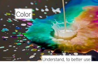
  • 1. Color Image  from  Flickr  user     nsaplayer. Understand, to better use
  • 2. Agenda 1 What is? 2 How do we perceive? 3 Guidelines... 4 Did you know... CO L OR
  • 3. 1 What is color?
  • 4. From the sun to our eyes 1 The  sun  emits  light  composed  of  several  electromagne:c  wavelengths. 2 Some  wavelengths  are  absorbed  by  apple´s  color  pigments  and  some  are  reflected. 3 Our  eye  receives  the  reflected  wavelengths  and  process  it  into  red  color. images  from  Flickr  users  pren:sc  (eye),  Oceano  Mare  (landscape)  and  Dykstra  (apples).
  • 5. Color is a sensation and, in  Apple  Developer  Documenta:on,  Color  Management  Overview,  2009. therefore a subjective experience. ” image  from  Flickr  user   chandudesai.
  • 6. Emotional... Research on prison discovered that red and yellow wings increased violence rather than blue and green. Image  from  Flickr   user  wwarby.
  • 7. Color impairments... Some people cannot distinguish between red and green. Image  from  Flickr  user  an   untrained  eye.
  • 8. Cultural... While in the western culture white is used for marriages, in the Eastern Asia, it’s often used in funerals. Image  from  Flickr   user  an  Extra   Medium.
  • 9. Color is a sensation and, in  Apple  Developer  Documenta:on,  Color  Management  Overview,  2009. therefore a subjective experience. ” image  from  Flickr  user   chandudesai. This content aims at better understanding color, nevertheless these are not rigid rules to follow.
  • 10. But, what are really the colors we feel everyday, all the time, at least most of us, that give us all the emotions and kind of talk to us, giving even different meanings to the same aspects, depending on which part of the globe we live in, but, really, what is color, tell me please, that’s the reason, I am reading this damn presentation, to know and understand what is color.... By the way, nice color, the one used in this slide :)
  • 11. CO L OR IS
  • 12. Color is the visual effect that is caused by the spectral composition of the light emitted, transmitted, or ” reflected by objects. in  Color  Logic  for  Web  Site  Design
  • 13. Color is the visual effect that is caused by the spectral composition of the light emitted, transmitted, or Visual  effect: ” reflected by objects. in  Color  Logic  for  Web  Site  Design 400 450 500 550 600 650 700 750 units:  nm Spectral  composi:on: GAMMA  RAYS X-­‐RAYS ULTRAVIOLET  RAYS VISIBLE  LIGHT INFRARED  RAYS RADAR FM TV SHORTWAVE AM Light: emi^ed transmi^ed reflected Objects:
  • 14. Color can be created by two means Our eyes either receive: reflected light direct light
  • 15. Color can be created by two means Our eyes either receive: reflected light Subtractive color Color  is  made  from  subtrac2ng  wavelengths  of  light. Examples:  fruits,  clothes,  human  skin,  etc.
  • 16. Color can be created by two means Our eyes either receive: reflected light Primary colors Cyan, yellow and magenta. Color model: CYMK.
  • 17. Color can be created by two means Our eyes either receive: direct light Additive color Color  is  made  from  mixing  wavelengths  of  light. Examples:  TV,  computer  displays,  sun  light,  etc.
  • 18. Color can be created by two means Our eyes either receive: Primary colors direct light Red, green, blue. Color model: RBG.
  • 19. Color properties, in a more scientific way Fundamentally, color is the perception of light rays wavelengths in the electromagnetic visible spectrum. Hue is the most dominant light wavelength: data  and  images  from  CambridgeinColour.com.
  • 20. Color properties, in a more scientific way Fundamentally, color is the perception of light rays wavelengths in the electromagnetic visible spectrum. Saturation measures the purity of the most dominant wavelengths: data  and  images  from  CambridgeinColour.com.
  • 21. Color properties, in a more scientific way Hue Saturation data  and  images  from  CambridgeinColour.com.
  • 22. Color properties, in a more practical way Hue Color itself in electromagnetic spectrum. >>  blue,  green,  yellow,  etc.
  • 23. Color properties, in a more practical way Saturation + — pure  vs  muted The purity of hue (more or less of a color). >>  blood  red,  pure  yellow,  etc.
  • 24. Color properties, in a more practical way Brightness (value) + — dark  vs  light Differences in intensity of light (darker vs lighter). >>  bright  red  vs  dim  red.
  • 25. Color properties, in a more practical way Hue Saturation + — pure  vs  muted Brightness (value) + — dark  vs  light
  • 26. Color movement Do colors appear to move?
  • 27. Color movement Do colors appear to move? Yes. + + BACKWARD INWARD STOPPED
  • 28. Color movement Why colors appear to move? Because different light wavelengths are focused differently by the eye lens. light  wavelengths lens re:na 400nm (blue) 600nm (green) 750nm (red) IN  FRONT PERFECTLY BEHIND
  • 29. Color temperature Warm colors Red, oranges, yellows and green-yellows. Color movement: outward data  and  images  from  ColorLab,  h^p://colorlab.webespacios.com.
  • 30. Color temperature Cool colors Purples, blues, aquas, and greens. Color movement: inward data  and  images  from  ColorLab,  h^p://colorlab.webespacios.com.
  • 31. Color temperature Warm colors Cool colors data  and  images  from  ColorLab,  h^p://colorlab.webespacios.com.
  • 32. Color temperature Neutral colors Saturation: 0% Brightness Black, white and gray are not saturated and are called neutral colors.
  • 33. 2 How do we perceive color?
  • 34. 1 Light passes through the cornea. Cornea Human  eye  structure. Cornea: focus and refracts light rays. data  from  Sensa:on  and  Percep:on.
  • 35. 2 The iris open / closes the pupil to regulate the light that enters the eye. Iris Pupil Human  eye  structure. Dilated pupils: at night the pupils open more to get more light.
  • 36. 3 The lens focus light into the retina. Accommodation The  lens  gets  fa9er  to  focus  on   close  objects  and  returns  to  its   normal,  thinner,  shape  when   viewing  objects  farther  away. Human  eye  structure. Lens: to obtain a sharp clear image in the retina, the lens refracts and focus the light rays.
  • 37. 3.1 Different wavelengths require different focusing. light  wavelengths lens re:na shorter  wavelengths  (blue) medium  wavelengths  (green) long  wavelengths  (red) IN  FRONT PERFECTLY BEHIND
  • 38. 3.1 Different wavelengths require different focusing. Repercussions 3.1.1    Blues  appear  to  be  distant,  reds  appear  to  be  closer. 3.1.2    Simultaneous  saturated  colors  may  cause  visual  fa:gue. 3.1.3    Difficult  to  obtain  a  sharp  image  in  re:na  with  pure  blue. 3.1.4    Green  is  the  most  reshul  color  for  the  human  eye. data  from  The  essen:al  guide  to  user  interface  design.
  • 39. 3.1.1 Blues appear to be distant, reds appear to be closer. MOVEMENT Inward: colors appear to move backward (blue). Outward: colors appear to move forward (red). Just right: colors appear to be stopped (green). + + BACKWARD INWARD STOPPED
  • 40. 3.1.2 Simultaneous saturated colors may cause visual fatigue. REFOCUSING Refocusing different wavelengths simultaneously, make the muscles tired. >>  The  worst  case  is  blue  vs  red. look  carefully...
  • 41. 3.1.3 Difficult to obtain a sharp image in retina with pure blue. FOCUSING Short wavelengths (blue) focus behind retina, creating less sharper images. >>  Small  objects,  text  and  edges  should  be  avoided  with  pure  blue. look carefully... look carefully...
  • 42. 3.1.4 Green is the most restful color for the human eye. PERFECT FOCUS Green light wavelengths focus perfectly in the retina, creating sharper images. >>  Why  is  so  relaxing  to  go  out  and  enjoy  nature? image  from  Flickr  user  ichiro  kishimi
  • 43. 3.2 Some wavelengths are absorbed by the lens.
  • 44. 3.2 Some wavelengths are absorbed by the lens. Repercussions 3.2.1    The  lens  absorbs  more  wavelengths  in  the  blue  spectrum. 3.2.2    As  people  get  older,  sensi:vity  to  blue  decreases. 3.2.3    Older  people  need  brighter,  saturated  colors. data  from  The  essen:al  guide  to  user  interface  design.
  • 45. 3.2.1 The lens absorbs more wavelengths in the blue spectrum.
  • 46. 3.2.2 As people get older, sensitivity to blue decreases. As we get older, our lens yellows. older  people  may  see color  examples  from  Color  Logic  for  Web  Site  Design.
  • 47. 3.2.3 Older people need brighter, saturated colors. Image  from  Flickr  user  SundeepGoel. data  from  The  essen:al  guide  to  user  interface  design.
  • 48. 3.3 The lens also refocus with brightness differences.
  • 49. 3.3.1 High contrast variations may cause visual fatigue. BRIGHTNESS VARIATION If the lens has to continuously refocus for bright and dark objects, it may cause visual fatigue. Image  from  Flickr  user  masontrullinger.
  • 50. 4 Retina light receptors receive light wavelengths and fire accordingly. Fovea Re6na Human  eye  structure.
  • 51. 4 Retina light receptors receive light wavelengths and fire accordingly. Fovea Re6na Human  eye  structure.
  • 52. Retina light receptors: rods cones Fovea Re6na
  • 53. rods Operate mostly in dim light, concentrated outside of fovea. >>  Sensi2vity  with  periphery  vision Fovea Re6na
  • 54. cones Color vision, concentrated on fovea, give sharper vision. >>  Acuity  with  central  vision Fovea Re6na
  • 55. 4.1 Color is perceived by the response ratio from 3 types of cones. cone cells peak response to light Image  from  CambridgeinColour.com.
  • 56. 4.1 Color is perceived by the response ratio from 3 types of cones. Short wavelength (S) - 440 nm. >>  2%  “blue”    on  periphery  of  fovea. Medium wavelength (M) - 535 nm. >>  32%  “green”  on  middle  of  fovea. Long wavelength (L) - 565 nm. >>  64%  “red”  on  middle  of  fovea. Image  from  CambridgeinColour.com.
  • 57. 4.2 Color sensitivity in the periphery. Center of fovea: our eyes work with trichromatic color. Fovea Re6na
  • 58. 4.2 Color sensitivity in the periphery. Around fovea: we are red-green blind. >>  Reds  and  greens  tends  to  look  yellow. >>  Violets  and  blues  tends  to  look  blue... Fovea Re6na
  • 59. 4.2 Color sensitivity in the periphery. Extreme periphery: we are insensible to color. Fovea Re6na
  • 60. 4.2 Color sensitivity in the periphery. Fovea Re6na
  • 61. 4.2.1 Yellow and blue are the best colors in the visual periphery. data  from  Color-­‐Vision  Mechanisms  in  the  Peripheral  Re:nas  of  Normal  and  Dichroma:c  Observers  
  • 62. 5 Cones responses are translated into 3 opponent channels. cone cells peak response to light Opponent channels: brain interprets color using antagonist responses from 3 cones. Image  from  CambridgeinColour.com.
  • 63. antagonist responses , means that neurons in these opponent channels either respond one color or the antagonist, never both at the same time.
  • 64. antagonist responses Example:  if  green  neurons  are  responding  heavily,                                                                      red  ones  respond  less   ++++ ++ +++++ + ++++ + +++++ + +++++ + ++++ ++ +++++ +
  • 65. Opponent channels: Brightness green red blue yellow black white Efficiency: The long (red) and medium (green) wavelengths overlap. To be efficient the brain uses this overlapping info to get 2 channels of color and one of brightness. Image  from  CambridgeinColour.com.
  • 66. Opponent channels: green red Image  from  CambridgeinColour.com.
  • 67. Opponent channels: blue yellow Image  from  CambridgeinColour.com.
  • 68. Opponent channels: Brightness black white Image  from  CambridgeinColour.com.
  • 69. Opponent channels: Brightness black white Image  from  CambridgeinColour.com.
  • 70. Opponent channels: Brightness black white Image  from  CambridgeinColour.com.
  • 71. Brightness black white 5.1 Brightness is derived from green and red waves. cone cells peak sensitivity to light brightness Image  from  CambridgeinColour.com.
  • 72. 5.1 Brightness is derived from green and red waves. Repercussions 5.1.1    Brighter  colors  in  the  spectrum  are  in  the  middle. 5.1.2    Yellow  is  the  most  luminous  color  in  the  spectrum. data  from  The  essen:al  guide  to  user  interface  design.
  • 73. 5.1.1 Brighter colors in the spectrum are in the middle. BRIGHTNESS 400 450 500 550 600 650 700 WAVELENGTH  (nm)
  • 74. 5.1.2 Yellow is the most luminous color in the spectrum. lor. he r co a n y ot an ster th n fa ntio e’s atte opl gets pe w Yello American school buses are yellow. Metro floor barriers are yellow.
  • 75. EXPERIMENT Instruc2ons:  stare  at  the  black  dot  in  the  blue  square  for  30  seconds,  then  move  your  eyes  immediately  to  the  white   square  in  the  right.   WHAT  COLOR  DO  YOU  SEE? What  is  happening:  Each  opponent  channel  has  cells  firing  up  for  blue,  but  eventually  they  will  get  :red  because  you   are  making  an  effort,  and  the  cells  for  yellow  that  are  already  firing  will  become  prominent  because  they  are  not  :red.
  • 76. EXPERIMENT   WHAT  COLOR  DO  YOU  SEE?  YELLOW What  is  happening:  Each  opponent  channel  has  cells  firing  up  for  blue,  but  eventually  they  will  get  :red  because  you   are  making  an  effort,  and  the  cells  for  yellow  that  are  already  firing  will  become  prominent  because  they  are  not  :red.
  • 77. EXPERIMENT After-image effect: one of the effects from the opponent color theory.   WHAT  COLOR  DO  YOU  SEE?  YELLOW What  is  happening:  Each  opponent  channel  has  cells  firing  up  for  blue,  but  eventually  they  will  get  :red  because  you   are  making  an  effort,  and  the  cells  for  yellow  that  are  already  firing  will  become  prominent  because  they  are  not  :red. Opponent channel: blue yellow
  • 78. Color blindness , a color vision deficiency, is the inability to perceive differences between some of the colors that others can distinguish. in  Color  Logic  for  Web  Site  Design ” readable? readable? readable? color blinded people may see readable? readable? readable? data  from  Using  Color  Effec:vely.  Color  blindness  example  from  Color  Logic  For  Web  Site  Design.
  • 79. Color blindness Some people lack one of the photopigments used in eye’s retina to transmit color. Mainly two types: Red-green & Blue-Yellow.
  • 80. Saturated colors with the same brightness are hard to distinguish by impaired people. 8% of men and 0.4% of women are color defective.
  • 81. EXPERIMENT What number do you see? data  from  Ishihara  color  test  in  Wikipedia.
  • 82. EXPERIMENT What number do you see? >>  74  -­‐  normal  vision. >>  21  -­‐  some  vision  impairment. >>  Nothing  -­‐  you´re  in  real  trouble.    You  don’t  perceive  color  at  all. data  from  Ishihara  color  test  in  Wikipedia.
  • 83. 3 Guidelines to use color...
  • 84. Do communication mediums matter? COKE  -­‐  image  from  Flickr  user  xiaming. TIME  -­‐  TIME  -­‐f  rom  Flickr   image   image   user  Tony  tlickr  isfit. from  F he  M user   SCREENS  -­‐  image  from  Flickr  user  nouQraz. Tony  the  Misfit.
  • 85. YES Other mediums (TV, printouts, magazines, etc.) Have a SMALLER exposition time. COKE  -­‐  image  from  Flickr  user  xiaming. Computer Have a LONGER exposition time. SCREENS  -­‐  image  from  Flickr  user  nouQraz.
  • 86. image  from  Flickr  user  heymynameispaul. How long would you look at these commercials? lower exposition time,  because  you  can  stop  looking  whenever  you  want...
  • 87. image  from  Flickr  user  heymynameispaul. How long would you look at these commercials? lower exposition time,  because  you  can  stop  looking  whenever  you  want...
  • 88. How long would use a bright yellow background, in your PC? longer exposition time, because  working  in  the  computer  is  part  of  many  people´s  daily  lives.
  • 89. How long would use a bright yellow background, in your PC? longer exposition time, because  working  in  the  computer  is  part  of  many  people´s  daily  lives.
  • 90. Careful when choosing highly saturated and bright colors. COKE  -­‐  image  from  Flickr  user  xiaming. TIME  -­‐  image  from  Flickr   user  Tony  the  Misfit. TIME  -­‐  image  from  Flickr   SCREENS  -­‐  image  from  Flickr  user  nouQraz. user  Tony  the  Misfit.
  • 91. Guidelines 1 Always give enough contrast 2 Avoid simultaneous saturated colors 3 Avoid pure blue for small text & objects
  • 92. 1 Always give enough contrast News News DO NOT SEARCH AT ALL DO NOT SEARCH AT ALL SEARCH NEARBY SEARCH NEARBY Bugs Bunny Bugs Bunny Chiwawa Chiwawa ENROLL IN PROGRAM ENROLL IN PROGRAM HOME PAGE HOME PAGE SECOND PAGE SECOND PAGE 10 de Abril de 2009 10 de Abril de 2009 4 de Maio de 2009 4 de Maio de 2009
  • 93. 1 Always give enough contrast News News DO NOT SEARCH AT ALL DO NOT SEARCH AT ALL SEARCH NEARBY SEARCH NEARBY Bugs Bunny Bugs Bunny Chiwawa Chiwawa ENROLL IN PROGRAM ENROLL IN PROGRAM HOME PAGE HOME PAGE SECOND PAGE SECOND PAGE 10 de Abril de 2009 10 de Abril de 2009 4 de Maio de 2009 4 de Maio de 2009
  • 94. Why always give enough contrast Contrast difference in perceived brightness of two objects The sharper the object stands out against its background, the quicker and better the lens accommodation. Accommodation Lens Image  from  Flickr  user  WTL  photos.
  • 95. Why always give enough contrast Contrast effects Image  from  Flickr  user  Shadab. Bad contrast makes harder for the eyes to focus (excess of accommodation) causing visual fatigue.
  • 96. Why always give enough contrast Differences in brightness Image  from  Flickr  user  Grant  MacDonald. The eye focuses most sharply on objects with different colors and brightnesses. Text  size  also  ma^ers.  The  smaller  the  text,  higher  needs  to  be  the  contrast.
  • 97. How to always give enough contrast 1.1 Using dark colors vs bright colors. ask  yourselves: Is this color bright or dark?
  • 98. How to always give enough contrast 1.1 Using dark colors vs bright colors. When  in  doubt: Use a color space that includes the brightness property HSB  color  space  tool,  HSB  is   also  available...
  • 99. How to always give enough contrast 1.2 Using natural opponent channels colors. Opponent channels colors red  &  green blue  &  yellow black  &  white can  you  read  me? can  you  read  me? can  you  read  me? can  you  read  me? Avoid  using  both  colors  with  maximum  satura:on   difficult to look?
  • 100. How to always give enough contrast 1.2 Using natural opponent channels colors. Opponent channels colors image  from  Flickr  user  kuyman.
  • 101. How to always give enough contrast 1.3 Using brighter colors vs darker colors in the visible spectrum. can  you  read  me? can  you  read  me? can  you  read  me? can  you  read  me? Avoid  using  both  colors  with   maximum  satura:on   difficult to look?
  • 102. How to always give enough contrast 1.4 Using a compliant tool with WCAG 2.0's luminosity contrast algorithm.  Available  at  h^p://juicystudio.com/services/luminositycontrastra:o.php
  • 103. How to always give enough contrast 1.5 Smoothing used contrast on screens. Lorem ipsum dolor sit amet, consectetur adipisicing elit, sed do eiusmod tempor incididunt ut labore et dolore magna aliqua. Ut enim Lorem ipsum dolor sit amet, consectetur adipisicing ad minim veniam, quis nostrud exercitation ullamco laboris nisi ut elit, sed do eiusmod tempor incididunt ut labore et aliquip ex ea commodo consequat. Duis aute irure dolor in dolore magna aliqua. Ut enim ad minim veniam, reprehenderit in voluptate velit esse cillum dolore eu fugiat nulla quis nostrud exercitation ullamco laboris nisi ut pariatur. Excepteur sint occaecat cupidatat non proident, sunt in culpa aliquip ex ea commodo consequat. qui officia deserunt mollit anim id est laborum. vs vs Lorem ipsum dolor sit amet, consectetur adipisicing elit, sed do eiusmod tempor incididunt ut labore et dolore magna aliqua. Ut enim Lorem ipsum dolor sit amet, consectetur adipisicing ad minim veniam, quis nostrud exercitation ullamco laboris nisi ut elit, sed do eiusmod tempor incididunt ut labore et aliquip ex ea commodo consequat. Duis aute irure dolor in dolore magna aliqua. Ut enim ad minim veniam, reprehenderit in voluptate velit esse cillum dolore eu fugiat nulla quis nostrud exercitation ullamco laboris nisi ut pariatur. Excepteur sint occaecat cupidatat non proident, sunt in culpa aliquip ex ea commodo consequat. qui officia deserunt mollit anim id est laborum.
  • 104. How to always give enough contrast 1.5 Smoothing used contrast on screens. Color contrasts are more intense and sharp on screens Because the screens emit light instead of reflecting it, the resulting colors are brighter and more intense. data  from  Logoorange  in  h^p://www.logoorange.com/text-­‐color-­‐contrasts.php,  Image  from  Flickr  user  Ben  Dodson.
  • 105. 2 Avoid simultaneous saturated colors
  • 106. 2 Avoid simultaneous saturated colors Beware of colors in images. Do not compare solely big saturated colored areas. Note >>  look  around  for  images  that  may  have  saturated  colors  (tennis  ball),  because  they  influence  the  final  result.
  • 107. 2 Avoid simultaneous saturated colors
  • 108. Why avoid simultaneous saturated colors Do you remember? 1 - Excessive eyes refocusing causing visual fatigue look with careful... look  carefully... 2 - False perception of depth Inward: colors appear to move backward (blue). Outward: colors appear to move forward (red).
  • 109. Why avoid simultaneous saturated colors Do you remember? 3 - Communication mediums. Some mediums use saturated colors to catch attention (TV, printed advertising, street billboards, etc.) >>  on  a  website  do  you  always  need  to  catch  a^en:on? >>  how  long  will  people  look  at  the  saturated  colors? 4 - Saturated colors with same brightness hard to distinguish by impaired people read? read? read? color  blinded  people  may  see read? read? read?
  • 110. How to avoid simultaneous saturated colors 1 Using gradients. I am very saturated! I have a gradient instead! 2 Desaturating your colors. image  from  Flickr  user  shianghan27.
  • 111. 3 Avoid pure blue for small text & objects Lorem ipsum dolor sit amet, consectetur adipisicing elit, sed do eiusmod tempor incididunt ut labore et dolore magna aliqua. Ut enim ad minim veniam, quis nostrud exercitation ullamco laboris nisi ut aliquip ex ea commodo consequat. Duis aute irure dolor in reprehenderit in voluptate velit esse cillum dolore eu fugiat nulla pariatur. Excepteur sint occaecat cupidatat non proident, sunt in culpa qui officia deserunt mollit anim id est laborum. Sed ut perspiciatis unde omnis iste natus error sit voluptatem accusantium doloremque laudantium, totam rem aperiam, eaque ipsa quae ab illo inventore veritatis et quasi architecto beatae vitae dicta sunt explicabo. Nemo enim ipsam voluptatem quia voluptas sit aspernatur aut odit aut fugit, sed quia consequuntur magni dolores eos qui ratione voluptatem sequi nesciunt. Neque porro quisquam est, qui dolorem ipsum quia dolor sit amet, consectetur, adipisci velit, sed quia non numquam eius modi tempora incidunt ut labore et dolore magnam aliquam quaerat voluptatem. Ut enim ad minima veniam, quis nostrum exercitationem ullam corporis suscipit laboriosam, nisi ut aliquid ex ea commodi consequatur? Quis autem vel eum iure reprehenderit qui in ea voluptate velit esse quam nihil molestiae consequatur, vel illum qui dolorem eum fugiat quo voluptas nulla pariatur? At vero eos et accusamus et iusto odio dignissimos ducimus qui blanditiis praesentium voluptatum deleniti atque corrupti quos dolores et quas molestias excepturi sint occaecati cupiditate non provident, similique sunt in culpa qui officia deserunt mollitia animi, id est laborum et dolorum fuga. Et harum quidem rerum facilis est et expedita distinctio. Nam libero tempore, cum soluta nobis est eligendi optio cumque nihil impedit quo minus id quod maxime placeat facere possimus, omnis voluptas assumenda est, omnis dolor repellendus. Temporibus autem quibusdam et aut officiis debitis aut rerum necessitatibus saepe eveniet ut et voluptates repudiandae sint et molestiae non recusandae. Itaque earum rerum hic tenetur a sapiente delectus, ut aut reiciendis voluptatibus maiores alias consequatur aut perferendis doloribus asperiores repellat.
  • 112. 3 Avoid pure blue for small text & objects Lorem ipsum dolor sit amet, consectetur adipisicing elit, sed do eiusmod tempor incididunt ut labore et dolore magna aliqua. Ut enim ad minim veniam, quis nostrud exercitation ullamco laboris nisi ut aliquip ex ea commodo consequat. Duis aute irure dolor in reprehenderit in voluptate velit esse cillum dolore eu fugiat nulla pariatur. Excepteur sint occaecat cupidatat non proident, sunt in culpa qui officia deserunt mollit anim id est laborum. Sed ut perspiciatis unde omnis iste natus error sit voluptatem accusantium doloremque laudantium, totam rem aperiam, eaque ipsa quae ab illo inventore veritatis et quasi architecto beatae vitae dicta sunt explicabo. Nemo enim ipsam voluptatem quia voluptas sit aspernatur aut odit aut fugit, sed quia consequuntur magni dolores eos qui ratione voluptatem sequi nesciunt. Neque porro quisquam est, qui dolorem ipsum quia dolor sit amet, consectetur, adipisci velit, sed quia non numquam eius modi tempora incidunt ut labore et dolore magnam aliquam quaerat voluptatem. Ut enim ad minima veniam, quis nostrum exercitationem ullam corporis suscipit laboriosam, nisi ut aliquid ex ea commodi consequatur? Quis autem vel eum iure reprehenderit qui in ea voluptate velit esse quam nihil molestiae consequatur, vel illum qui dolorem eum fugiat quo voluptas nulla pariatur? At vero eos et accusamus et iusto odio dignissimos ducimus qui blanditiis praesentium voluptatum deleniti atque corrupti quos dolores et quas molestias excepturi sint occaecati cupiditate non provident, similique sunt in culpa qui officia deserunt mollitia animi, id est laborum et dolorum fuga. Et harum quidem rerum facilis est et expedita distinctio. Nam libero tempore, cum soluta nobis est eligendi optio cumque nihil impedit quo minus id quod maxime placeat facere possimus, omnis voluptas assumenda est, omnis dolor repellendus. Temporibus autem quibusdam et aut officiis debitis aut rerum necessitatibus saepe eveniet ut et voluptates repudiandae sint et molestiae non recusandae. Itaque earum rerum hic tenetur a sapiente delectus, ut aut reiciendis voluptatibus maiores alias consequatur aut perferendis doloribus asperiores repellat.
  • 113. 3 Avoid pure blue for small text & objects Lorem ipsum dolor sit amet, consectetur adipisicing elit, sed do eiusmod tempor incididunt ut labore et dolore magna aliqua. Ut enim ad minim veniam, quis nostrud exercitation ullamco laboris nisi ut aliquip ex ea commodo consequat. Duis aute irure dolor in reprehenderit in voluptate velit esse cillum dolore eu fugiat nulla pariatur. Excepteur sint occaecat cupidatat non proident, sunt in culpa qui officia deserunt mollit anim id est laborum. Sed ut perspiciatis unde omnis iste natus error sit voluptatem accusantium doloremque laudantium, totam rem aperiam, eaque ipsa quae ab illo inventore veritatis et quasi architecto beatae vitae dicta sunt explicabo. Nemo enim ipsam voluptatem quia voluptas sit aspernatur aut odit aut fugit, sed quia consequuntur magni dolores eos qui ratione voluptatem sequi nesciunt. Neque porro quisquam est, qui dolorem ipsum quia dolor sit amet, consectetur, adipisci velit, sed quia non numquam eius modi tempora incidunt ut labore et dolore magnam aliquam quaerat voluptatem. Ut enim ad minima veniam, quis nostrum exercitationem ullam corporis suscipit laboriosam, nisi ut aliquid ex ea commodi consequatur? Quis autem vel eum iure reprehenderit qui in ea voluptate velit esse quam nihil molestiae consequatur, vel illum qui dolorem eum fugiat quo voluptas nulla pariatur? Some people say that this guideline is not so relevant when applied to Alert computer displays. Because these displays already deal with blurred pixels, the influence of blue text in our visual system will be irrelevant. Ar:cle  from  SBFAQ  Part  6:  Color  for  Text  and  Graph  Legibility,  Is  blue  bad?  from  Visual  Expert,   Human  Factors.  In  h^p://www.visualexpert.com/FAQ/Part6/cfaqPart6.html
  • 114. Why avoid pure blue for small text & objects Do you remember? 1 - Difficult to obtain a sharp image in retina with pure blue color. look with look with careful... careful... 2 - The blue photopigments in the retina are very few. >>  2%  “blue”    on  periphery  of  fovea. Fovea >>  32%  “green”  on  middle  of  fovea. Re6na >>  64%  “red”  on  middle  of  fovea.
  • 115. Why avoid pure blue for small text & objects Do you remember? 3 - The lens absorbs more wavelengths in the blue spectrum than other regions. 4 - As people get older, sensitivity to blue spectrum decreases. older  people  may  see data  from  The  essen:al  guide  to  user  interface  design. Color  examples  from  Color  Logic  for  Web  Site  Design.
  • 116. How to avoid pure blue for small text & objects 1 Desaturating your blues or using another colors. Lorem ipsum dolor sit amet, Lorem ipsum dolor sit amet, consectetur adipisicing elit, sed do consectetur adipisicing elit, sed do eiusmod tempor incididunt ut. eiusmod tempor incididunt ut. 2 Increasing size of letters or thickness of objects Fine Print in blue Fine Print in blue image  from  Flickr  user  AHMED.
  • 117. 4 Did you know...
  • 118. “ The daytime sky looks blue because short ligh wavelengths, Why the sky looks blue? which fall at the blue end of the spectrum, are scattered more than long wavelengths.” data  from  Sensa:on  and  Percep:on,  Wolfe.  Image  from  Flickr  user   .
  • 119. “The fact that all the properties of particles are determined by principles closely related to the methods of observation would mean that the basic structures of the material world are determined, ultimately, by the way we look at this world” physicist Fritjof Capra 
  • 120. Document  version Revision  date Author  (s) Changes 2.0 9  nov  2009 Emanuel  Fernandes Complete  redesign  of  document  to   simplify  content. 1.0 30  jun  2009 Emanuel  Fernandes Ini:al  document.
  • 121. Slides  designed  by: emanuel.m.fernandes@gmail.com November  9,  2009