
Recomendados
Mais conteúdo relacionado
Mais procurados
Mais procurados (18)
Destaque
Destaque (17)
Semelhante a Contents page analysis
Semelhante a Contents page analysis (20)
Mais de ellisabethfrier
Mais de ellisabethfrier (6)
Contents page analysis
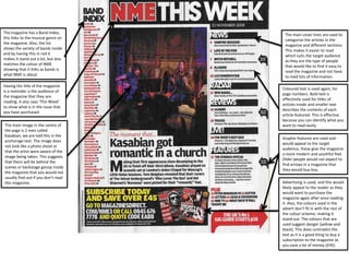
- 1. The magazine has a Band Index, this links to the musical genre on the magazine. Also, the list shows the variety of bands inside and by having this in red it makes it stand out a lot, but also matches the colour of NME showing that it links as bands is what NME is about. Having the title of the magazine is a reminder o the audience of the magazine that they are reading. It also says ‘This Week’ to show what is in the issue that you have purchased. The main image in the centre of the page is 2 men called Kasabian, we are told this in the anchorage text. The image does not look like a photo shoot or that the artist were aware of the image being taken. This suggests that there will be behind the scenes or backstage gossip inside the magazine that you would not usually find out if you don’t read this magazine. The main cover lines are used to categorise the articles in the magazine and different sections. This makes it easier to read which suits the target audience as they are the type of people that would like to find it easy to read the magazine and not have to read lots of information. Coloured text is used again, for page numbers. Bold text is effectively used for titles of articles inside and smaller text describes the contents of each article featured. This is effective because you can identify what you want to read easily. Graphic features are used and would appeal to the target audience, these give the magazine a more modern and youthful feel. Older people would not expect to find arrows in a magazine that they would buy buy. Advertising is used, and this would likely appeal to the reader as they would want to purchase the magazine again after once reading it. Also, the colours used in the advert don’t fit in with the rest of the colour scheme, making it stand out. The colours that are used suggest danger (yellow and black). This does contradict the text as it is a good thing to buy a subscription to the magazine as you save a lot of money (£45).