
Recomendados
Mais conteúdo relacionado
Mais procurados
Mais procurados (18)
Destaque
Destaque (20)
Semelhante a Florence double page spread
Semelhante a Florence double page spread (20)
Mais de domhayes03
Mais de domhayes03 (20)
Florence double page spread
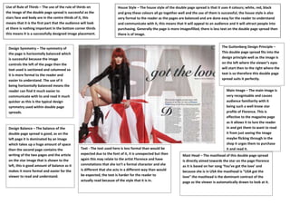
- 1. Use of Rule of Thirds – The use of the rule of thirds on House Style – The house style of the double page spread is that it uses 4 colours; white, red, black the image of the double page spread is successful as the and grey these colours all go together well and the use of them is successful, the house style is also stars face and body are in the centre thirds of it, this very formal to the reader as the pages are balanced and are done easy for the reader to understand means that it is the first part that the audience will look and communicate with it, this means that it will appeal to an audience and it will attract people into at there is nothing important in the bottom corner thirds purchasing. Generally the page is more imagesfilled, there is less text on the double page spread then this means It is a successfully designed image placement. there is of image. Design Symmetry – The symmetry of The Guttenberg Design Principle – the page is horizontally balanced which This double page spread fits into the is successful because the image design principle well as the image is controls the left of the page then the on the left where the viewer’s eyes text used is sectioned and columned so will start then to the right where the it is more formal to the reader and text is so therefore this double page easier to understand. The use of it spread suits it perfectly. being horizontally balanced means the reader can find it much easier to Main Image – The main image is communicate with to and read it much very recognisable and causes quicker as this is the typical design audience familiarity with it symmetry used within double page being such a well know star spreads. profile of Florence. This is effective to the magazine page as it allows it to lure the reader Design Balance – The balance of the in and get them to want to read double page spread is good, as on the it from just seeing the image left page it is dominated by an image maybe flicking through in the which takes up a huge amount of space shop it urges them to purchase then the second page contains the Text - The text used here is less formal than would be it and read it. writing of the two pages and the article expected due to the font of it, it is unexpected but then Mast Head – The masthead of this double page spread on the star image that is shown to the again this may relate to the artist Florence and have is directly aimed towards the star on the page Florence left, this is good amount of balance as it connotations that she isn’t a formal character and she as it is based on her song ‘You’ve got the love’ and makes it more formal and easier for the is different that she acts in a different way than would because she is in USA the masthead is “USA got the viewer to read and understand. be expected, the text is harder for the reader to love” the masthead is the dominant contrast of the actually read because of the style that it is in. page as the viewer is automatically drawn to look at it.