
Recommended
More Related Content
What's hot
What's hot (15)
Viewers also liked
Similar to Responsive Web Design
Similar to Responsive Web Design (20)
Recently uploaded
Recently uploaded (20)
Responsive Web Design
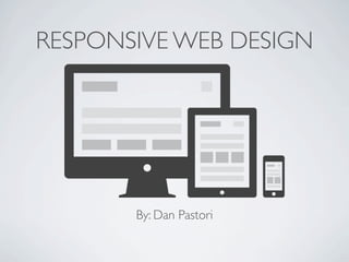
- 1. RESPONSIVE WEB DESIGN By: Dan Pastori
- 2. WHAT IT IS? A design that displays all of your content clearly and effectively on all devices regardless of screen sizes, while maintaining a central theme. This used to be called Fluid design. Design for all screen sizes!
- 3. BENEFITS Your content is clearly available on ALL devices SEO Streamlined look If done correctly, you can design once
- 4. TECHNOLOGIES USED *
- 5. PROCESS/PRACTICE Design for mobile first, scale up! Never have 2 scroll bars..EVER! Keep a consistent look. Design for content
- 7. MEDIA QUERIES <link href="styles.css" type="text/css" media="screen" rel="stylesheet"/> It gets even more awesome! Can use separate style @media (max-width:830px) { } You can morph your design as the size changes!
- 8. IMPLEMENTATION Single Stylesheet (if not many styles) @media (min-width : 320px){ /* Styles */ } Multiple Stylesheets <link rel="stylesheet" href="smartphone.css" media="min-width : 320px">
- 10. BEST TOOL
- 11. OTHER TOOLS A variety of devices. http://mattkersley.com/responsive/ ~ Allows you to type in a URL and see the result at different screen sizes.
- 14. IMAGE SOURCES • Front Page Image: http://johnpolacek.github.com/scrolldeck.js/decks/responsive/ • CSS 3: http://people.rit.edu/rag7482/320/Project3/images/css3.png • HTML 5: http://www.w3.org/html/logo/downloads/ HTML5_Logo_512.png • JQuery Mobile: http://jquerymobile.com/wp-content/uploads/2012/09/jquery- mobile-logo_positive.png
- 15. CONTENT SOURCES • http://www.techrepublic.com/blog/webmaster/how-to-create- media-queries-in-responsive-web-design/1789 • http://www.stuffandnonsense.co.uk/blog/about/ hardboiled_css3_media_queries/ • http://css-tricks.com/snippets/css/media-queries-for-standard- devices/ • http://www.onextrapixel.com/2012/04/23/responsive-web- design-layouts-and-media-queries/
Editor's Notes
- \n
- \n
- \n
- \n
- \n
- \n
- \n
- \n
- \n
- \n
- \n
- \n
- \n
- \n
- \n