SlideShare a Scribd company logo
1 of 11
1. In what ways does your media product use, develop or challenge forms and conventions of
                                               real media products?
My magazine has been based and laid out in similar way of big selling magazines such as Hip pop connection,
RWD, VIBE and The Rap Up. I have ensured to mimic these magazines as much as a I possibly can whilst still
being individual and creative. I ensured that the layout of my magazine resembled the magazines that I had
looked at to ensure that my target audience are aware that it is a music genre magazine .
In the finalising of my magazine I have tried to ensure that I followed the layout and design of music magazine's
as closely as possible,. On the front cover I used a typeface for the mast head similar to that of an American
magazine ‘The Rap Up’, I did this because I felt their uniqueness and individuality being imitated would appeal
to my target audience the best. The eyebrow is also a similar style as this makes it look professional that I
used form ‘Hip pop connection’.
The image I have used on my front cover portrays the images I have seen used in other music magazines such
as ‘RWD’, and ‘Hip pop Connection’.. The shot I took was a medium shot, with eye contact with the audience,
to entice them further. The fact that I have placed the model with a microphone in her hand reinforces the
genre , I got this idea from an ‘RWD’ magazine. I also edited the photo to make certain aspects brighter, I added
light to the left side of her .This was an attempt to make the front cover image looks as focused as possible ,
therefore enhancing that professional look of a magazine.
When looking at other music magazines. The use of consistent fonts where important, as it grasps and keeps
the audiences attention, it also makes the magazine look collective. I applied this t my own magazine by only
having four main colours. I chose to use red and blue for the title as I felt this stood out against the background
of the magazine.
Whilst carrying out my research it became apparent to me that some of the magazines were using promotional
offers such as freebies. These promotional offers furthered the audience's enticement in buying the product.
By using this same idea with my media product I thought that it would be an ideal convention to use as it
would maximize sales.
I ensured that the name of my magazine could easily relate to that of its chosen genre. The chosen name ‘Beat
Drop’, was used as the ‘drop’ adds emphases on the ‘beat’ therefore expressing immediately it is a hip pop and
R&B genre magazine.
The idea od including artists name
                                       at the top was used as it makes the
                                       magazine look more professional


                                                      The ‘U’ has an arrow
                                                      pointing up , I
                                                      similarly used this
                                                      idea to create a
                                                      unique masthead.


                                                                             A list of the artists
                                                                             included within the
                                                                             magazine have been         I imitated the idea
                Headlines were                                               placed here , I did this   of the artist holding
                placed at the side ,                                         as well
                                                                                                        a microphone ,
                I similarly did this
                                                                                                        which expresses
                                                                                                        which genre the
A quote that The                                                                                        magazine is as well
Game said was                                                                                           as attracts
placed underneath                                                                                       attention
his name. I too
copied a quote that
Sloozie said.


                                                                             This is what gave
              The main cover                                                 me the idea of
              artists name is bold                                           including a free mix
              which attracts                                                 tape cd and fixating
              attention similar I                                            it here.
              did this
An advertisement
                                                             was placed next to
                                                             the contents page I
                                                             similarly did this


I placed the date next to
the contents line as well


                            I used four different boxes
                            which give an insight as too
                            what the reader will read into
                            as well .
The contents page is the page that directs the reader around each part of the magazine. The creation of the contents page
for me was an easy task , as I based my design on a simple layout form RWD. This layout configured of four pictures giving
the readers insight of what to expect to read into with text at the bottom , it is clear layout for my target audience to
understand and not to overwhelming. There is a picture to the right of the contents page advertising VioJens , this was
done to keep the readers interested.
The four images I used for the main contents page were electronics, a female , a male , and one of both a male and female.
.All of RWD contents pages have been laid out like this. I edited some of the pictures clearing the backgrounds. The image
of the male is to show that the magazine appeals to males , and the image of the girl is to show that the magazine appeals
to females just as well as males , the image of 2 people represents music artist that are in a group , and the image of a
phone and headsets show that as well as music other interest of the target audience are cover to an extent. The image on
the right of male advertising Vio jeans , is a technique used to keep the reader interested.
I used the same font that was used on the front cover ‘sloozie’ to write the content page up as well , so that the magazine
looks collective and professional. I ensured through out the contents page pink and blue was used. Both these pages
along with the front cover page have a black background. I have done this so that it is easily noticeable that the pages
are form the same magazine,.
2.    How does your media product represent particular social groups?

My media product represent a youthful age group of teenager to late 20’s.Through my magazine I have
represent this group to be very independent and dominant. i ensured that both males and females can identify
themselves within the magazine. I have ensured that I have kept to the genres of my magazine and have not
gone off topic to keep the target audiences interest going. The models used have been positioned in such a way
that my target audience can identify themselves carrying out those poses. The language used is some what
informal making my target audience feel more comfortable with the magazine. I have represented a magazine
that portrays a calm youth culture of hip pop and R&B.
3.                                    T3
           What kind of media institution might distribute your media product and why?

The Distribution of my magazine is one of the most important aspects of the media institution.
In order to give my magazine a chance of selling I would have to get help from other big media
institutions. I have decided to use Bauer . As there is space in there institution for a Hip pop and
R&B genre magazine. As Bauer do not have already have a genre of this magazine , I do feel that
at first may not sell however in the long term with effective publishing and advertising it will .It is
noticeable that all the magazines that are published by Bauer all the same colours that relate to
one another , however my magazine does not have this as I was trying to make it stand out from
the rest of the magazines as it is a new product which has not got any loyalties form customers
just yet. This is a massive publishing. The conclusion so deciding to sue Bauer instead of IPC
was because I believe that it is generally a better and more thoughtful idea to team up with
leading magazines such as ‘Kerrang!’ and ‘Q’ rather than compete with them. This also means
the funds advertise my magazine would be more cost effective , rather than to the idea of being
an independent magazine. The result of not being independent would mean a maximised profit.
As I have created a music magazine it can be distributed in wide range of places. Such as news
agents and music shops. By selling my magazine in these locations it will reach the a lot of its
target audience , as newsagents are located often amount schools , colleges and universities. I
will also enable subscriptions of my magazine to be made online which will also increase the
interest within the magazine.
•   The audience for my magazine are 18-34 year olds who have an interest in urban music, entertainment, culture and
    lifestyle. In terms of the ‘SOCS’ my target audience are between the B-D band. Overall I think it would be targeted more
    toward the C-D band however for the older end of my target audience, from the ages of 25 and upwards they may
    possibly be well fitted into the B band of the social grade .As the price of the magazine is £3.99p this fits in well with
    band B, C and D. People in the C-D band would be young adults, who have just left education or are still in education
    which means that this magazine should be an easy option for them to buy. However people that are not within my
    target audience may be able to afford the price of my magazine, therefore expanding the range of customers who buy
    my product.
     The gender of my targeted audience will be both male and females as I intend to reach the maximum amount of
    profits by appealing to both genders. .Although the front cover image is of a female artist, who has been represented
    as a strong individual and not as a stereotypical object which relates to sex as how most for the females within the
    industry are portrayed. which means other females would feel more obliged to buy the magazine. However in order to
    make sure it relates to males as swell I have included information about other male artists e.g. K.Koke, Johnny Gunz
    etc. Also the colours used are a mixture of red ,blue, pink, light blue and yellow ,which ideally is not for a specific
    gender. The language used could arguably be said to reach out more to males however I feel that the main
    background image of a female will make up for the lost customers amongst the female spectrum ,who feel put off due
    to the language used. I have tried to make it appeal to both male and females , however I fell that it relates more to
    males., which was not the intention.
5.   How did you attract/address your audience?
When it came to me having to target my audience this was not hard, because it is very simple to indentify and understan
the basic appeals of ‘Hip pop, R&B and Grime’ cultures and to present them in my magazine. The first main opportunity y
are given to sell your product is the front cover as this is the first thing that the target audience will see and will determine
whether they possibly buy the magazine or not .I had to ensure that my colour scheme complimented my main cover ima
and at the same time not being more over powering than the main cover image . I used bold colours, such as red and blu
as the magazines main colours, as I feel these colours have more of an affect on memory. The font of the masthead is bold
and the fixation of the typography is unique, the font for the rest of the cover lines are simple. This is so that it looks as re
as possible.


On the front cover I tried to dress the main image model in bright clothing that matches the colour scheme of the magazin
and at the same time stood out, to make it seem more professional. I ensured that my female artist was wearing a t shirt
,which shows more of an unfeminine side which is what females are usually not seen as, due to the fact that they are mai
stereotyped and portrayed as less important sexual objects within the music industry., the colour of the top she is wearin
is yellow which stands out against the background colour. My artist is holding a microphone in her hand., which is coming
directly as the focal point of the magazine, this effect was created by asking her to bend her hand at a 45 degree and , and
focusing the camera on the microphone on her hand. This is very appealing and draws attention to the magazine..
Attracting the audience on the front cover is key in order for them to view the rest of the front cover. The importance of e
contact was key for me, so I felt that it was very important to keep it throughout the magazine. This is why on the content
page all of the images of people have eye contact with the camera as well.
I also used a promotional technique of giving a freebie with the magazine, in tis case it was a free mix tape CD.I did this
because i thought this would be an ideal way to generate a loyal audience which is key for now products.. this is
mentioned on the bottom right hand corner of the magazine as a finishing focal point as the reader finishing looking at
the front cover, it can not be missed due to costs the CD is on the back of the front cover in a plastic wallet.
The title of the magazine attracts and addresses the audience it is intended for. The way in which the title has been layout
, automatically relates to the genre of the magazine, as the drop has been placed underneath beat , in order to add
emphasis on the beat. An arrow has also been placed under the P on drop, as well as the o having a red fill which gives
somewhat of an extra effect on the drop. The name beat drop relates to the genre effectively. The price of my magazine is
3.99, as the price is a big factor on whether a product is bought or not .i have priced the magazine at a reasonable price
that both ends of my target audience will be able to reach.
6.    What have you learnt about technologies from the process of
                                          constructing this product?

I have used a wide range of various technologies to create my project. Through out the completing of my project I came
across different types of technologies , some of them which i was used to and some of them which i needed to further my
knowledge and practice.
When researching up information on the genre of my magazine , i used the search ending ‘Google’, this helped me to find
images , data information and also compare genres.’ I used many different sites but the there were three sites that helped
me gain a detailed understating of how my project should look.

http://www.vibe.com/music
This website gave me a deeper understanding of what my target audience should be and how i can market my project to
appeal to that chosen group.
http://www.rap-up.com/, http://www.rwdmag.com/ - These sites showed me similar and different conventions of different
magazines.

For the practical side of the project a camera was required , I decided to use a college camera along with my cousins came
as he too had a professional camera. I had three lessons by a friend who is a professional. When taking these pictures i had
to put what i had learnt into perspective , things such as lighting , make up ,costume , i had to consider I intended to make
the photographs look as professional as possible. I took a range of photos, most of people.

The two design software i used ,were Photoshop and InDesign , i found InDesign a lot easier to use than Photoshop as i
have done a course using InDesign .As are teachers told us we could only use these two software's , i had no other choice
than to learn how to use Photoshop , i had to go through tutorials on the Photoshop website which gave me a better
understanding the more I used it, the better I got, and soon I became sufficient in using it.
Slide share was used to upload PowerPoint presentations , at first there was the start up issue of singing up and knowing
how to navigate myself around the program .However with time it became more common to me on how to upload pictures
and PowerPoint presentations. By using all of these programs and software's I was able to create a profession finalised
media product.
7.    what do you feel you have learnt in the progression from it to the full product?          ?
From the begging of the project starting off with my preliminary task I do feel within myself that I have learnt and
achieved a great amount of both knowledge and skill. Evidence of this is that I have completed a project that shows
my understanding and analysis of how and what a media magazine should look like and what contents it should
comprise.

At first I was unsure of how to use many of the programs and soft wares we had been instructed to use. It was a
struggle to come to terms with the navigation of these programs. It is evident that in my preliminary task the layout
of my magazine does not follow the conventions of a front cover at all . Font , colour and typography do not fall into
place as they should do. Compared to my final magazine which follows the codes and conventions of a magazine. The
user of the blogs was alien to me , at first I was very unsure of how to use it and how to navigate myself around.
Posting my work up was a very hard task for me but as I progressed further with my project it became more frequent
to my knowledge.
Overall I have gained an understanding of creation and anaylis.I n the sense that , I now understand that the planning
process is key before the core content of a project can be started , therefore much research is needed to be carried
out .When creating the magazine I learnt that conventions such as typography , colour , backgrounds , the posting of
the model , the background of the image, all do come together as one to create a final image , as this is what creates
professional magazine.

More Related Content

What's hot

Media Evaluation - 1.
Media Evaluation - 1. Media Evaluation - 1.
Media Evaluation - 1. smullett3
 
Evaluation claire walsh
Evaluation claire walshEvaluation claire walsh
Evaluation claire walshclairewa
 
Evaluation finale
Evaluation finaleEvaluation finale
Evaluation finalegordon17
 
Evaluation of my music magazine
Evaluation of my music magazineEvaluation of my music magazine
Evaluation of my music magazineRosieDaly1
 
Evaluatio ndlwd
Evaluatio ndlwdEvaluatio ndlwd
Evaluatio ndlwdjodie95
 
Evaluation presentation
Evaluation presentationEvaluation presentation
Evaluation presentationOliSearle
 
Evaluation of my media product
Evaluation of my media productEvaluation of my media product
Evaluation of my media product2006115
 
Annotation of two magazines front cover’s
Annotation of two magazines front cover’sAnnotation of two magazines front cover’s
Annotation of two magazines front cover’sJessieGee14
 
Evaluation of my music magazine
Evaluation of my music magazineEvaluation of my music magazine
Evaluation of my music magazinefrancescacummins
 
Media Coursework Evaluation
Media Coursework EvaluationMedia Coursework Evaluation
Media Coursework Evaluationlizzieseffer
 
Finished evaluation
Finished evaluation Finished evaluation
Finished evaluation MimWood
 

What's hot (18)

Media Evaluation - 1.
Media Evaluation - 1. Media Evaluation - 1.
Media Evaluation - 1.
 
Evaluation claire walsh
Evaluation claire walshEvaluation claire walsh
Evaluation claire walsh
 
Media evaluation final
Media evaluation finalMedia evaluation final
Media evaluation final
 
Evaluation
EvaluationEvaluation
Evaluation
 
Task 1
Task 1Task 1
Task 1
 
Evaluation finale
Evaluation finaleEvaluation finale
Evaluation finale
 
My final-evaluation1
My final-evaluation1My final-evaluation1
My final-evaluation1
 
Evaluation of my music magazine
Evaluation of my music magazineEvaluation of my music magazine
Evaluation of my music magazine
 
Evaluatio ndlwd
Evaluatio ndlwdEvaluatio ndlwd
Evaluatio ndlwd
 
Evaluation presentation
Evaluation presentationEvaluation presentation
Evaluation presentation
 
Evaluation of my media product
Evaluation of my media productEvaluation of my media product
Evaluation of my media product
 
Evaluation
EvaluationEvaluation
Evaluation
 
Annotation of two magazines front cover’s
Annotation of two magazines front cover’sAnnotation of two magazines front cover’s
Annotation of two magazines front cover’s
 
Media evaluation
Media evaluationMedia evaluation
Media evaluation
 
Evaluation of my music magazine
Evaluation of my music magazineEvaluation of my music magazine
Evaluation of my music magazine
 
Evaluation[1]
Evaluation[1]Evaluation[1]
Evaluation[1]
 
Media Coursework Evaluation
Media Coursework EvaluationMedia Coursework Evaluation
Media Coursework Evaluation
 
Finished evaluation
Finished evaluation Finished evaluation
Finished evaluation
 

Viewers also liked

Power station 1(vauxhall) new
Power station 1(vauxhall) newPower station 1(vauxhall) new
Power station 1(vauxhall) newdami11
 
Raspberry falls dangers of water wells in limestone karst geology-final
Raspberry falls dangers of water wells in limestone karst geology-finalRaspberry falls dangers of water wells in limestone karst geology-final
Raspberry falls dangers of water wells in limestone karst geology-finalbrillmrtk
 
Presentation1 eval (2)
Presentation1 eval (2)Presentation1 eval (2)
Presentation1 eval (2)dami11
 
Presentation2
Presentation2Presentation2
Presentation2dami11
 
Power station 1(vauxhall)
Power station 1(vauxhall)Power station 1(vauxhall)
Power station 1(vauxhall)dami11
 
Home work: Multiple Bifurcations of Sample Dynamical Systems
Home work: Multiple Bifurcations of Sample Dynamical SystemsHome work: Multiple Bifurcations of Sample Dynamical Systems
Home work: Multiple Bifurcations of Sample Dynamical Systemsyuejia2001
 
Pbe 11'
Pbe 11'Pbe 11'
Pbe 11'caipor
 
Unit 6 keynote
Unit 6 keynoteUnit 6 keynote
Unit 6 keynotecaipor
 
My project: Multiple Bifurcations of Sample Dynamical Systems
My project: Multiple Bifurcations of Sample Dynamical SystemsMy project: Multiple Bifurcations of Sample Dynamical Systems
My project: Multiple Bifurcations of Sample Dynamical Systemsyuejia2001
 
CD COVER MOCK UPS FRONT AND BACK
CD COVER MOCK UPS FRONT AND BACKCD COVER MOCK UPS FRONT AND BACK
CD COVER MOCK UPS FRONT AND BACKdami11
 
Power station 1(vauxhall)]
Power station 1(vauxhall)]Power station 1(vauxhall)]
Power station 1(vauxhall)]dami11
 
final result : Multiple Bifurcations of Sample Dynamical Systems
final result : Multiple Bifurcations of Sample Dynamical Systemsfinal result : Multiple Bifurcations of Sample Dynamical Systems
final result : Multiple Bifurcations of Sample Dynamical Systemsyuejia2001
 
Multiple Bifurcations of Sample Dynamical Systems
Multiple Bifurcations of Sample Dynamical SystemsMultiple Bifurcations of Sample Dynamical Systems
Multiple Bifurcations of Sample Dynamical Systemsyuejia2001
 
Hirsch s.w., smale s. differential equations, dynamical systems and linear ...
Hirsch s.w., smale s.   differential equations, dynamical systems and linear ...Hirsch s.w., smale s.   differential equations, dynamical systems and linear ...
Hirsch s.w., smale s. differential equations, dynamical systems and linear ...yuejia2001
 

Viewers also liked (16)

Power station 1(vauxhall) new
Power station 1(vauxhall) newPower station 1(vauxhall) new
Power station 1(vauxhall) new
 
Raspberry falls dangers of water wells in limestone karst geology-final
Raspberry falls dangers of water wells in limestone karst geology-finalRaspberry falls dangers of water wells in limestone karst geology-final
Raspberry falls dangers of water wells in limestone karst geology-final
 
Presentation1 eval (2)
Presentation1 eval (2)Presentation1 eval (2)
Presentation1 eval (2)
 
Presentation2
Presentation2Presentation2
Presentation2
 
Power station 1(vauxhall)
Power station 1(vauxhall)Power station 1(vauxhall)
Power station 1(vauxhall)
 
Home work: Multiple Bifurcations of Sample Dynamical Systems
Home work: Multiple Bifurcations of Sample Dynamical SystemsHome work: Multiple Bifurcations of Sample Dynamical Systems
Home work: Multiple Bifurcations of Sample Dynamical Systems
 
El arte
El arteEl arte
El arte
 
Pbe 11'
Pbe 11'Pbe 11'
Pbe 11'
 
Unit 6 keynote
Unit 6 keynoteUnit 6 keynote
Unit 6 keynote
 
My project: Multiple Bifurcations of Sample Dynamical Systems
My project: Multiple Bifurcations of Sample Dynamical SystemsMy project: Multiple Bifurcations of Sample Dynamical Systems
My project: Multiple Bifurcations of Sample Dynamical Systems
 
CD COVER MOCK UPS FRONT AND BACK
CD COVER MOCK UPS FRONT AND BACKCD COVER MOCK UPS FRONT AND BACK
CD COVER MOCK UPS FRONT AND BACK
 
Power station 1(vauxhall)]
Power station 1(vauxhall)]Power station 1(vauxhall)]
Power station 1(vauxhall)]
 
final result : Multiple Bifurcations of Sample Dynamical Systems
final result : Multiple Bifurcations of Sample Dynamical Systemsfinal result : Multiple Bifurcations of Sample Dynamical Systems
final result : Multiple Bifurcations of Sample Dynamical Systems
 
Multiple Bifurcations of Sample Dynamical Systems
Multiple Bifurcations of Sample Dynamical SystemsMultiple Bifurcations of Sample Dynamical Systems
Multiple Bifurcations of Sample Dynamical Systems
 
Hirsch s.w., smale s. differential equations, dynamical systems and linear ...
Hirsch s.w., smale s.   differential equations, dynamical systems and linear ...Hirsch s.w., smale s.   differential equations, dynamical systems and linear ...
Hirsch s.w., smale s. differential equations, dynamical systems and linear ...
 
Management 2011-12
Management 2011-12Management 2011-12
Management 2011-12
 

Similar to Presentation1 Eval (2)

Evaluation question 1
Evaluation question 1Evaluation question 1
Evaluation question 1suhayl786
 
As media evaluation – asmaa tanveer
As media evaluation – asmaa tanveerAs media evaluation – asmaa tanveer
As media evaluation – asmaa tanveerasmaa786
 
(Final evalution)
(Final evalution)(Final evalution)
(Final evalution)Benita29
 
As media presentation
As media presentationAs media presentation
As media presentationKorrinaalbert
 
Media question 1
Media question 1Media question 1
Media question 1kyleblogger
 
Music Magazine Evaluation Task11
Music Magazine Evaluation Task11Music Magazine Evaluation Task11
Music Magazine Evaluation Task11LuceTshibangu
 
Evaluation pdf
Evaluation pdfEvaluation pdf
Evaluation pdfbhavzz03
 
Evaluation new
Evaluation newEvaluation new
Evaluation newbhavzz03
 
Media evaluation
Media evaluationMedia evaluation
Media evaluationOllySnowxx
 
Evaluation - Part 1 (Improved)
Evaluation - Part 1 (Improved) Evaluation - Part 1 (Improved)
Evaluation - Part 1 (Improved) BHollis95
 
Evaluation 1 - Renegade Magazine
Evaluation 1 - Renegade MagazineEvaluation 1 - Renegade Magazine
Evaluation 1 - Renegade MagazineMaxSunnar
 
Evaluation
EvaluationEvaluation
Evaluations9142
 
Evaluation 1
Evaluation 1Evaluation 1
Evaluation 1MaxSunnar
 
EVALUATION // QUESTION 1
EVALUATION // QUESTION 1 EVALUATION // QUESTION 1
EVALUATION // QUESTION 1 msharrattmedia
 
Media Evaluation
Media EvaluationMedia Evaluation
Media Evaluationemmacleary
 
Media music magazine evaluation
Media music magazine evaluationMedia music magazine evaluation
Media music magazine evaluationsharonbachra
 

Similar to Presentation1 Eval (2) (20)

Evaluation question 1
Evaluation question 1Evaluation question 1
Evaluation question 1
 
As media evaluation – asmaa tanveer
As media evaluation – asmaa tanveerAs media evaluation – asmaa tanveer
As media evaluation – asmaa tanveer
 
(Final evalution)
(Final evalution)(Final evalution)
(Final evalution)
 
As media presentation
As media presentationAs media presentation
As media presentation
 
Media question 1
Media question 1Media question 1
Media question 1
 
Music Magazine Evaluation Task11
Music Magazine Evaluation Task11Music Magazine Evaluation Task11
Music Magazine Evaluation Task11
 
Evaluation pdf
Evaluation pdfEvaluation pdf
Evaluation pdf
 
The Evalution
The EvalutionThe Evalution
The Evalution
 
The evalution
The evalutionThe evalution
The evalution
 
Evaluation new
Evaluation newEvaluation new
Evaluation new
 
Media evaluation
Media evaluationMedia evaluation
Media evaluation
 
Evaluation - Part 1 (Improved)
Evaluation - Part 1 (Improved) Evaluation - Part 1 (Improved)
Evaluation - Part 1 (Improved)
 
Evaluation 1 - Renegade Magazine
Evaluation 1 - Renegade MagazineEvaluation 1 - Renegade Magazine
Evaluation 1 - Renegade Magazine
 
Magazine evaluation
Magazine evaluationMagazine evaluation
Magazine evaluation
 
Question 1
Question 1Question 1
Question 1
 
Evaluation
EvaluationEvaluation
Evaluation
 
Evaluation 1
Evaluation 1Evaluation 1
Evaluation 1
 
EVALUATION // QUESTION 1
EVALUATION // QUESTION 1 EVALUATION // QUESTION 1
EVALUATION // QUESTION 1
 
Media Evaluation
Media EvaluationMedia Evaluation
Media Evaluation
 
Media music magazine evaluation
Media music magazine evaluationMedia music magazine evaluation
Media music magazine evaluation
 

More from dami11

Rain falls down
Rain falls downRain falls down
Rain falls downdami11
 
Rain falls down
Rain falls downRain falls down
Rain falls downdami11
 
Artists song
Artists songArtists song
Artists songdami11
 
Artists song new
Artists song newArtists song new
Artists song newdami11
 
Artists song new
Artists song newArtists song new
Artists song newdami11
 
Artists song new
Artists song newArtists song new
Artists song newdami11
 
Artists song new
Artists song newArtists song new
Artists song newdami11
 
Artists song
Artists songArtists song
Artists songdami11
 

More from dami11 (8)

Rain falls down
Rain falls downRain falls down
Rain falls down
 
Rain falls down
Rain falls downRain falls down
Rain falls down
 
Artists song
Artists songArtists song
Artists song
 
Artists song new
Artists song newArtists song new
Artists song new
 
Artists song new
Artists song newArtists song new
Artists song new
 
Artists song new
Artists song newArtists song new
Artists song new
 
Artists song new
Artists song newArtists song new
Artists song new
 
Artists song
Artists songArtists song
Artists song
 

Presentation1 Eval (2)

  • 1. 1. In what ways does your media product use, develop or challenge forms and conventions of real media products? My magazine has been based and laid out in similar way of big selling magazines such as Hip pop connection, RWD, VIBE and The Rap Up. I have ensured to mimic these magazines as much as a I possibly can whilst still being individual and creative. I ensured that the layout of my magazine resembled the magazines that I had looked at to ensure that my target audience are aware that it is a music genre magazine . In the finalising of my magazine I have tried to ensure that I followed the layout and design of music magazine's as closely as possible,. On the front cover I used a typeface for the mast head similar to that of an American magazine ‘The Rap Up’, I did this because I felt their uniqueness and individuality being imitated would appeal to my target audience the best. The eyebrow is also a similar style as this makes it look professional that I used form ‘Hip pop connection’. The image I have used on my front cover portrays the images I have seen used in other music magazines such as ‘RWD’, and ‘Hip pop Connection’.. The shot I took was a medium shot, with eye contact with the audience, to entice them further. The fact that I have placed the model with a microphone in her hand reinforces the genre , I got this idea from an ‘RWD’ magazine. I also edited the photo to make certain aspects brighter, I added light to the left side of her .This was an attempt to make the front cover image looks as focused as possible , therefore enhancing that professional look of a magazine. When looking at other music magazines. The use of consistent fonts where important, as it grasps and keeps the audiences attention, it also makes the magazine look collective. I applied this t my own magazine by only having four main colours. I chose to use red and blue for the title as I felt this stood out against the background of the magazine. Whilst carrying out my research it became apparent to me that some of the magazines were using promotional offers such as freebies. These promotional offers furthered the audience's enticement in buying the product. By using this same idea with my media product I thought that it would be an ideal convention to use as it would maximize sales. I ensured that the name of my magazine could easily relate to that of its chosen genre. The chosen name ‘Beat Drop’, was used as the ‘drop’ adds emphases on the ‘beat’ therefore expressing immediately it is a hip pop and R&B genre magazine.
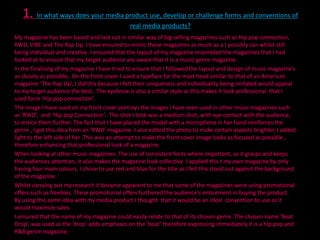
  • 2. The idea od including artists name at the top was used as it makes the magazine look more professional The ‘U’ has an arrow pointing up , I similarly used this idea to create a unique masthead. A list of the artists included within the magazine have been I imitated the idea Headlines were placed here , I did this of the artist holding placed at the side , as well a microphone , I similarly did this which expresses which genre the A quote that The magazine is as well Game said was as attracts placed underneath attention his name. I too copied a quote that Sloozie said. This is what gave The main cover me the idea of artists name is bold including a free mix which attracts tape cd and fixating attention similar I it here. did this
  • 3. An advertisement was placed next to the contents page I similarly did this I placed the date next to the contents line as well I used four different boxes which give an insight as too what the reader will read into as well .
  • 4. The contents page is the page that directs the reader around each part of the magazine. The creation of the contents page for me was an easy task , as I based my design on a simple layout form RWD. This layout configured of four pictures giving the readers insight of what to expect to read into with text at the bottom , it is clear layout for my target audience to understand and not to overwhelming. There is a picture to the right of the contents page advertising VioJens , this was done to keep the readers interested. The four images I used for the main contents page were electronics, a female , a male , and one of both a male and female. .All of RWD contents pages have been laid out like this. I edited some of the pictures clearing the backgrounds. The image of the male is to show that the magazine appeals to males , and the image of the girl is to show that the magazine appeals to females just as well as males , the image of 2 people represents music artist that are in a group , and the image of a phone and headsets show that as well as music other interest of the target audience are cover to an extent. The image on the right of male advertising Vio jeans , is a technique used to keep the reader interested. I used the same font that was used on the front cover ‘sloozie’ to write the content page up as well , so that the magazine looks collective and professional. I ensured through out the contents page pink and blue was used. Both these pages along with the front cover page have a black background. I have done this so that it is easily noticeable that the pages are form the same magazine,.
  • 5. 2. How does your media product represent particular social groups? My media product represent a youthful age group of teenager to late 20’s.Through my magazine I have represent this group to be very independent and dominant. i ensured that both males and females can identify themselves within the magazine. I have ensured that I have kept to the genres of my magazine and have not gone off topic to keep the target audiences interest going. The models used have been positioned in such a way that my target audience can identify themselves carrying out those poses. The language used is some what informal making my target audience feel more comfortable with the magazine. I have represented a magazine that portrays a calm youth culture of hip pop and R&B.
  • 6. 3. T3 What kind of media institution might distribute your media product and why? The Distribution of my magazine is one of the most important aspects of the media institution. In order to give my magazine a chance of selling I would have to get help from other big media institutions. I have decided to use Bauer . As there is space in there institution for a Hip pop and R&B genre magazine. As Bauer do not have already have a genre of this magazine , I do feel that at first may not sell however in the long term with effective publishing and advertising it will .It is noticeable that all the magazines that are published by Bauer all the same colours that relate to one another , however my magazine does not have this as I was trying to make it stand out from the rest of the magazines as it is a new product which has not got any loyalties form customers just yet. This is a massive publishing. The conclusion so deciding to sue Bauer instead of IPC was because I believe that it is generally a better and more thoughtful idea to team up with leading magazines such as ‘Kerrang!’ and ‘Q’ rather than compete with them. This also means the funds advertise my magazine would be more cost effective , rather than to the idea of being an independent magazine. The result of not being independent would mean a maximised profit. As I have created a music magazine it can be distributed in wide range of places. Such as news agents and music shops. By selling my magazine in these locations it will reach the a lot of its target audience , as newsagents are located often amount schools , colleges and universities. I will also enable subscriptions of my magazine to be made online which will also increase the interest within the magazine.
  • 7. The audience for my magazine are 18-34 year olds who have an interest in urban music, entertainment, culture and lifestyle. In terms of the ‘SOCS’ my target audience are between the B-D band. Overall I think it would be targeted more toward the C-D band however for the older end of my target audience, from the ages of 25 and upwards they may possibly be well fitted into the B band of the social grade .As the price of the magazine is £3.99p this fits in well with band B, C and D. People in the C-D band would be young adults, who have just left education or are still in education which means that this magazine should be an easy option for them to buy. However people that are not within my target audience may be able to afford the price of my magazine, therefore expanding the range of customers who buy my product. The gender of my targeted audience will be both male and females as I intend to reach the maximum amount of profits by appealing to both genders. .Although the front cover image is of a female artist, who has been represented as a strong individual and not as a stereotypical object which relates to sex as how most for the females within the industry are portrayed. which means other females would feel more obliged to buy the magazine. However in order to make sure it relates to males as swell I have included information about other male artists e.g. K.Koke, Johnny Gunz etc. Also the colours used are a mixture of red ,blue, pink, light blue and yellow ,which ideally is not for a specific gender. The language used could arguably be said to reach out more to males however I feel that the main background image of a female will make up for the lost customers amongst the female spectrum ,who feel put off due to the language used. I have tried to make it appeal to both male and females , however I fell that it relates more to males., which was not the intention.
  • 8. 5. How did you attract/address your audience? When it came to me having to target my audience this was not hard, because it is very simple to indentify and understan the basic appeals of ‘Hip pop, R&B and Grime’ cultures and to present them in my magazine. The first main opportunity y are given to sell your product is the front cover as this is the first thing that the target audience will see and will determine whether they possibly buy the magazine or not .I had to ensure that my colour scheme complimented my main cover ima and at the same time not being more over powering than the main cover image . I used bold colours, such as red and blu as the magazines main colours, as I feel these colours have more of an affect on memory. The font of the masthead is bold and the fixation of the typography is unique, the font for the rest of the cover lines are simple. This is so that it looks as re as possible. On the front cover I tried to dress the main image model in bright clothing that matches the colour scheme of the magazin and at the same time stood out, to make it seem more professional. I ensured that my female artist was wearing a t shirt ,which shows more of an unfeminine side which is what females are usually not seen as, due to the fact that they are mai stereotyped and portrayed as less important sexual objects within the music industry., the colour of the top she is wearin is yellow which stands out against the background colour. My artist is holding a microphone in her hand., which is coming directly as the focal point of the magazine, this effect was created by asking her to bend her hand at a 45 degree and , and focusing the camera on the microphone on her hand. This is very appealing and draws attention to the magazine.. Attracting the audience on the front cover is key in order for them to view the rest of the front cover. The importance of e contact was key for me, so I felt that it was very important to keep it throughout the magazine. This is why on the content page all of the images of people have eye contact with the camera as well.
  • 9. I also used a promotional technique of giving a freebie with the magazine, in tis case it was a free mix tape CD.I did this because i thought this would be an ideal way to generate a loyal audience which is key for now products.. this is mentioned on the bottom right hand corner of the magazine as a finishing focal point as the reader finishing looking at the front cover, it can not be missed due to costs the CD is on the back of the front cover in a plastic wallet. The title of the magazine attracts and addresses the audience it is intended for. The way in which the title has been layout , automatically relates to the genre of the magazine, as the drop has been placed underneath beat , in order to add emphasis on the beat. An arrow has also been placed under the P on drop, as well as the o having a red fill which gives somewhat of an extra effect on the drop. The name beat drop relates to the genre effectively. The price of my magazine is 3.99, as the price is a big factor on whether a product is bought or not .i have priced the magazine at a reasonable price that both ends of my target audience will be able to reach.
  • 10. 6. What have you learnt about technologies from the process of constructing this product? I have used a wide range of various technologies to create my project. Through out the completing of my project I came across different types of technologies , some of them which i was used to and some of them which i needed to further my knowledge and practice. When researching up information on the genre of my magazine , i used the search ending ‘Google’, this helped me to find images , data information and also compare genres.’ I used many different sites but the there were three sites that helped me gain a detailed understating of how my project should look. http://www.vibe.com/music This website gave me a deeper understanding of what my target audience should be and how i can market my project to appeal to that chosen group. http://www.rap-up.com/, http://www.rwdmag.com/ - These sites showed me similar and different conventions of different magazines. For the practical side of the project a camera was required , I decided to use a college camera along with my cousins came as he too had a professional camera. I had three lessons by a friend who is a professional. When taking these pictures i had to put what i had learnt into perspective , things such as lighting , make up ,costume , i had to consider I intended to make the photographs look as professional as possible. I took a range of photos, most of people. The two design software i used ,were Photoshop and InDesign , i found InDesign a lot easier to use than Photoshop as i have done a course using InDesign .As are teachers told us we could only use these two software's , i had no other choice than to learn how to use Photoshop , i had to go through tutorials on the Photoshop website which gave me a better understanding the more I used it, the better I got, and soon I became sufficient in using it. Slide share was used to upload PowerPoint presentations , at first there was the start up issue of singing up and knowing how to navigate myself around the program .However with time it became more common to me on how to upload pictures and PowerPoint presentations. By using all of these programs and software's I was able to create a profession finalised media product.
  • 11. 7. what do you feel you have learnt in the progression from it to the full product? ? From the begging of the project starting off with my preliminary task I do feel within myself that I have learnt and achieved a great amount of both knowledge and skill. Evidence of this is that I have completed a project that shows my understanding and analysis of how and what a media magazine should look like and what contents it should comprise. At first I was unsure of how to use many of the programs and soft wares we had been instructed to use. It was a struggle to come to terms with the navigation of these programs. It is evident that in my preliminary task the layout of my magazine does not follow the conventions of a front cover at all . Font , colour and typography do not fall into place as they should do. Compared to my final magazine which follows the codes and conventions of a magazine. The user of the blogs was alien to me , at first I was very unsure of how to use it and how to navigate myself around. Posting my work up was a very hard task for me but as I progressed further with my project it became more frequent to my knowledge. Overall I have gained an understanding of creation and anaylis.I n the sense that , I now understand that the planning process is key before the core content of a project can be started , therefore much research is needed to be carried out .When creating the magazine I learnt that conventions such as typography , colour , backgrounds , the posting of the model , the background of the image, all do come together as one to create a final image , as this is what creates professional magazine.