Proofreading & editing course student produces outstanding coursework
•
1 gostou•509 visualizações

CTJT proofreading and editing course student, Guanjun Kwok, has produced an outstanding piece of coursework.

Recomendados
Mais conteúdo relacionado
Mais de Cleland Thom
Mais de Cleland Thom (20)
Último
Último (20)
Proofreading & editing course student produces outstanding coursework
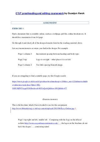
- 1. CTJT proofreading and editing coursework by Guanjun Kwok ASSIGNMENT EXERCISE 1 Find a document that is available online, such as a webpage, pdf file, online brochure etc. It should be a maximum of one A4 page. Go through it and check all of the design elements listed in the teaching material above. List any inconsistencies or errors you find in the design. For example: Page 1 column 3: Inconsistent spacing between heading and body type. Page 2 top: Logo is set right – other places it is set left. Page 4 column 2: Too little spacing beneath image. If you are struggling to find a suitable page, try this Google search: https://www.google.co.uk/search?q=online+brochure&espv=210&es_sm=122&tbm=isch&tb o=u&source=univ&sa=X&ei=X0j- UtHUKfP07AagnYG4Bw&ved=0CGoQsAQ&biw=1092&bih=477 (Exercise answers) This is the brochure which I have decided to use for this assignment: http://www.bbmarketing.co.uk/wp-content/uploads/2013/06/Easy-Online.jpg Page 1 top right and left, middle left: Comparing with the logo on the official website http://www.easyonlinerecruitment.co.uk/ , the logos on the brochure do not have the slogan '.......connecting talent'.
- 2. Page 1 top right and left, middle left: The logo on the top right has a different font size comparing with the same logos on the top left and middle left. Page 1 top right and left, middle left: There are three logos on the brochure; the format is strange as usually only one logo is needed on one page. Page 1 middle: The 'Statistics source' 's font size is too small to be read with ease. Page 1 top right and left, middle left: Comparing with the logo on the official website, the logos on the brochure have more spacing beneath the images/words. Page 1 bottom: The contact and website information's font colour should be consistant in blue like the one at the middle right of the brochure. Moreover, the colour play at the bottom makes it a bit hard to read the information. The use of the colour blue is also to be consistant with its official website, where there is no transluscent white usage for wordings. Page 1 top: The two square images should be properly aligned side by side. Page 1 middle: The message on the post-it note has a different theme font compared with the rest on the brochure and with its official website. Page 1 middle left: The space between the upper portion and lower portion is slightly apart as compared with the middle right side. Page 1 lower left: 'you could be wasting over 20 hours - that's nearly 3 days work!' should not be in bold and hence not consistant with the rest of the sentence. Page 1 top right. left middle and bottom left: Comparing with the contact number on the official website, the contact numbers on the brochure are different. Page 1 top left and bottom right: In order to be consistent with the official website, all the wordings within the orange background should be in white colour. Page 1 left bottom: The heading at 'do you hate wasting your time' has a different colour font of blue as compared to other wordings' colour in the brochure. Page 1 right middle: 'www.easyonlinerecruitment' does not align properly to the lower part as compared with the left side of the brochure.
- 3. Page 1 left middle: Only for the twitter part the full name of 'twitter' is written fully. However, for the call, enquiry and website, they all written in short forms of 't', 'e,' and 'w' instead. Page 1 left lower: The first paragraph has a different font size and colour as compared with the rest of the paragraphs below it. CTJT proofreading and editing coursework by Guanjun Kwok