
Recomendados
Mais conteúdo relacionado
Mais procurados
Mais procurados (20)
Destaque
Semelhante a Magazine Front Cover Development Diary
Semelhante a Magazine Front Cover Development Diary (20)
Mais de charlottepage94
Mais de charlottepage94 (20)
Magazine Front Cover Development Diary
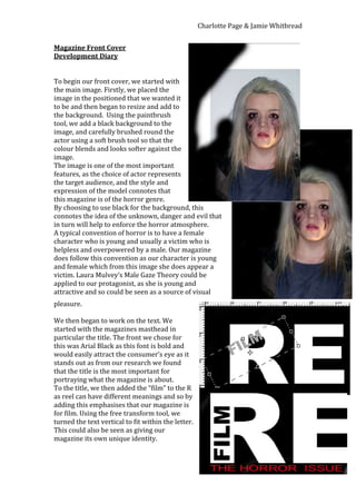
- 1. Charlotte Page & Jamie Whitbread Magazine Front Cover Development Diary To begin our front cover, we started with the main image. Firstly, we placed the image in the positioned that we wanted it to be and then began to resize and add to the background. Using the paintbrush tool, we add a black background to the image, and carefully brushed round the actor using a soft brush tool so that the colour blends and looks softer against the image. The image is one of the most important features, as the choice of actor represents the target audience, and the style and expression of the model connotes that this magazine is of the horror genre. By choosing to use black for the background, this connotes the idea of the unknown, danger and evil that in turn will help to enforce the horror atmosphere. A typical convention of horror is to have a female character who is young and usually a victim who is helpless and overpowered by a male. Our magazine does follow this convention as our character is young and female which from this image she does appear a victim. Laura Mulvey’s Male Gaze Theory could be applied to our protagonist, as she is young and attractive and so could be seen as a source of visual pleasure. We then began to work on the text. We started with the magazines masthead in particular the title. The front we chose for this was Arial Black as this font is bold and would easily attract the consumer’s eye as it stands out as from our research we found that the title is the most important for portraying what the magazine is about. To the title, we then added the “film” to the R as reel can have different meanings and so by adding this emphasises that our magazine is for film. Using the free transform tool, we turned the text vertical to fit within the letter. This could also be seen as giving our magazine its own unique identity.
- 2. Charlotte Page & Jamie Whitbread We have added a 3D effect to the main title to add some depth and attract audiences, as it will stand out more against other competing magazines when on display. Underneath the title, we have included a slogan, “The Horror Issue,” as this coincides with the release of the issue being Halloween and also the release of the film featured on the front cover, Ancestors. The decision to write this in red text connotes danger and blood making it the magazine easy to identify this genre of this particular issue of the film magazine. We have put the picture over the magazine title slightly as we have found this to be a convention of many magazine front covers. For the main coverline, we have taken the film title from our poster so that the style is consistent across both platforms. Also, by doing this our house style can be recognised and the title with the red ‘O’ in the title almost becomes like a brand identity for Ancestors. Using the shape tool, we added a black box to the background so that the text becomes more readable.
- 3. Charlotte Page & Jamie Whitbread Underneath the main headline, we have added a strapline with a description of what the main article is about. By using words such as ‘exclusive,’ this will hopefully entice consumers as this article is unique to our magazine and so will be their only chance to read it as it cannot be found anywhere else. Words such as ‘behind the scenes’ also gives consumers and exclusive insight into the production of a film and makes them feel involved with this process. Also, using words such as ‘chilling’ emphasises the horror theme. Inserts are another convention of magazines, which usually show something that will reward the reader for buying the magazine. In our secondary research, an theory proposed by Tina Zennand suggests that to entice readers you should always offer something extra. We have decided to add one of these and offer consumers a free poster inside. We did this by selecting the shape tool and drawing a red circle. We chose to use red because this stands out against the black, white and grey colours. Also, the red could be symbolic of the ‘O’ in the title and the doll’s eye that can be seen in the background. We chose to make this more eye-catching by turning this insert into a label that appears to be peeling off in the corner of the magazine. We did this by using the select tool to take off the bottom part of the sticker that we then layered over the top. We changed this section to a darker red so that it appeared 3D like and added some depth to the magazine. We think that this has help to make our magazine look more appealing as it stands out and look interesting.
- 4. Charlotte Page & Jamie Whitbread Inspired by The Woman in Black products where the supernatural figure is visible slightly in the background, we have decided to add this to our own magazine by placing the doll behind the character. This is an example of dramatic irony as the consumers are aware that this figure is here and could potentially be dangerous yet the character is unaware of this, creating an enigma. We have created an extra element of mystery by changing the opacity of the paint brush that which used to colour over the doll as this adds a see-through, shadow effect which made the figure look darker and evil. We have chose to only show the red eye of the doll behind the character to highlight the sense of evil and anger. These are both emotions associated with horror and so remind consumers that this is part of the horror genre. From our secondary research, advice given by Rebecca Loveridge was to spark curiosity in the readers. We have taken this advice and have tried to create an enigma in various ways including with the image of the main protagonist, as consumers are likely to want to know why she is in this state. Also, with the doll in the background, there is an element of mystery as to how this is connected to the protagonist and what the dolls history is. There is also curiosity created with the coverlines as consumers interested in horror may want to know what our top 10 horrors films are and which is in first place. Readers are also invited to see behind the scenes of the film featured on the front cover and so there is an element of mystery to find out how the film was made. We have also added a barcode to the bottom right hand corner and positioned the date and price above it as this is not something that people necessarily look for until they pick up the magazine and therefore this is why we have placed this in an area, which is not as eye-catching. For the coverlines, we have includes ones which are horror related to enforce that this issue is of the horror genre. For instance, as the magazine would be released at Halloween, we have included the ‘Top 10 Horror Films” to help consumers prepare for the latest horror films as this is the time when horror films are most popular. Also, we have included the Woman in Black as another strapline where our magazine will have exclusive interviews with cast from the sequel. After the success of the first film, audiences are likely to be keen to find out information about the sequel and so more inclined to pick our magazine up.
- 5. Charlotte Page & Jamie Whitbread We have considered the layout of the text and carefully positioned the ‘P’ to fit in the curve of the of the number one as careful details like these will help to make our front cover more visually appealing and professional. With the ‘Horror,’ we have downloaded a font style from the Internet to reflect a horror style as shown below. This adds something different that stands out on our front cover so that all the text is not exactly the same. To help with the overall layout of the magazine cover, we added a rule of thirds grid to help us ensure that the consumer’s eye is directed towards the most attractive features. With the rule of thirds here, the consumer’s attention is drawn towards the doll’s eye as this crosses across the intersection points and the main character.