User Interface Design Principles
•Transferir como PPTX, PDF•
8 gostaram•2,169 visualizações


Recomendados
Mais conteúdo relacionado
Semelhante a User Interface Design Principles
Semelhante a User Interface Design Principles (20)
Mais de Charles Herchelroath
Último
Último (20)
User Interface Design Principles
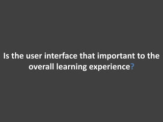
- 1. Is the user interface that important to the overall learning experience?
- 2. If you have a bad interface, your program will fail.
- 3. Learner complaints are often directed at the program’s interface.
- 4. This face is an indication that your user interface is confusing to your learner.
- 5. A confused learner might have some questions.
- 6. "Did I finish everything there is?" The user interface lacks a clear structure. "How do I get out of this thing?" The user interface lacks a clear and accessible exit point. "What am I supposed to do now?" The user interface lacks clear instruction. “What is this thing doing?" The user interface lacks clear information.
- 7. Learning stops when learner frustration outweighs learner motivation.
- 8. Your learners have reasonable expectations of your interface.
- 9. “I want to know how to complete the program." “I want to learn the content, not your user interface." “I want to know what I need to do next." “I want the program to operate how I think it should."
- 10. User interface myth vs. reality.
- 11. Reality Myth The user is progressing through the program, therefore the program is a success. Usability alone does not indicate that the program has been successful.
- 12. Reality Usability alone does not indicate that the program has been successful.
- 13. Reality Myth The designer and the developer play different roles in the construction of a user interface. In order to design a user interface I need to be an expert in…
- 14. Reality The designer and the developer play different roles in the construction of a user interface.
- 15. Reality Myth Your learners want to do more than only navigate your interface. The primary focus of interface design is navigation.
- 16. Reality Your learners want to do more than only navigate your interface.
- 17. Your user interface encompasses more than navigation.
- 18. BUT
- 19. Navigation is a large part of user interface design.
- 20. The leaner needs to know how to enter.
- 21. This is a clear entry point.
- 22. The leaner needs to know where they are.
- 23. The leaner needs to know where they are going.
- 24. This navigation panel or “sequence map” shows where you have been, where you are, and where you are going.
- 25. The leaner needs to find help if they need it.
- 26. These are all examples of help features.
- 27. The leaner needs to know how to leave the program.
- 28. This “safety net” prevents me from accidently leaving the program without saving my work.
- 29. When the user re-enters the program, give them a chance to continue where they left off.
- 30. Your user interface will have a unique layout.
- 31. Visual Hierarchy The most important content should stand out the most.
- 32. No visual hierarchy…. You are invited to Charles’ 31st Birthday Party! Kids are welcome. Dinner will be served. Bring your favorite dessert to share with the group. Please RSVP to Heidi by November 1st at 555-4460. When: November 13th, at 7:00 PM. Where : Charles’ house. Ask Heidi for directions when you RSVP if you need them. See you there!
- 33. Some visual hierarchy…. You are invited to Charles’ 31st Birthday Party! Kids are welcome. Dinner will be served. Bring your favorite dessert to share with the group. Please RSVP to Heidi by November 1st at 555-4460. When: November 13th, at 7:00 PM. Where : Charles’ house. Ask Heidi for directions when you RSVP if you need them. See you there!
- 34. But we can do better…
- 35. You are invited to Charles’ 31st Birthday Party! Kids are welcome. Dinner will be served. Bring your favorite dessert to share with the group. Please RSVP to Heidi by November 1st at 555-4460. When: November 13th, at 7:00 PM. Where : Charles’ house. Ask Heidi for directions when you RSVP if you need them. See you there!
- 36. Visual Flow Tells the learner what they should look at next.
- 37. Grouping/Alignment Group and align things together to show that they are related.
- 38. Proximity Similarity The closer objects are to one another, the more likely they are to be perceived as a group. Object s of the same shape, size, color or orientation will be associated with one another
- 39. Continuity Closure Our eyes want to see continuous lines and curves formed by smaller shapes. Our eyes want to see closed forms that aren’t explicitly drawn for us.
- 40. Putting it all together…
- 41. Your user interface will have a unique look and feel.
- 42. Designing a color scheme.
- 43. Put dark foregrounds against light backgrounds Put light foregrounds against dark backgrounds You want your text to contrast…not compliment
- 44. Don’t use red versus green as a critical color distinction Click the green button to continue. Click the red button to quit.
- 45. Those who are color blind cannot distinguish between them Click the green button to continue. Click the red button to quit. They’re both green to me…
- 46. vs. Warm Cool Colors evoke strong emotions Colors are more relaxing vs. Dark Light Colors create a somber or edgy tone Colors are less claustrophobic vs. High Low Contrast evokes harmony Contrast evokes tension and strength vs. Bright Muted Colors are easier on they eyes of your learners Colors evoke energy, brightness and warmth
- 47. Use a combination of colors and hues to create a visually rich presentation
- 48. Choose a typeface that matches the “voice” of your interface.
- 49. Don’t use serifed fonts. Don’t use italicized, cursive, orornamental fonts. Avoid font styles that will impact the readability of the text. Don’t use highly geometric fonts. DON’T USE ALL CAPS.
- 50. Here are some important factors that impact the quality of text.
- 51. Leanness Say just enough and no more.
- 52. Transitions Use clear transition statements that alert the learner when we are changing gears.
- 53. Clarity Avoid ambiguous language and use consistent terminology.
- 54. Reading Level Keep the reading level of your audience in mind when writing your text.
- 55. Mechanics Poor mechanics will impact the credibility of your course.
- 56. Use graphics in your course to increase learner motivation and engagement.
Notas do Editor
- Skillfully designed screens for interactive multimedia are recognized to draw learners' attention, to motivate learners toward interaction with the software, and to help learners accomplish learning goals without confusion and fatigue as well as to contribute to the quality and usability of interactive programsNow what’s the impact of a bad interface?
- Kind of a bold statement, but a poor interface confuses the learner, impact their motivation, and distracts them from what they need to be doing which is learning.
- Think about complaints that you receive about an elearning course that you deploy. Most times you are not troubleshooting issues with the content, you are troubleshooting issues with the interface. When you walk into an unfamiliar room, you begin to look around and take in the shape and general features of the room. This all happens in a fraction of a second and then you transition to doing what you came in to do. This is the same thing that happens with user interfaces. The user is attending your interface with a specific goal in mind, but upon entry, they take a moment to adjust to their new surroundings. This is a process that takes time and takes away from their original goal, so when designing our interfaces, we want to make sure that we make as many features as intuitive and user friendly as possible.
- Here are some typical questions or complaints that you may hear about an interface.
- Kind of a bold statement, but a poor interface confuses the learner, impact their motivation, and distracts them from what they need to be doing which is learning.
- There are too many hyper-links to various locations in the program and offer too many layers of content. Without a recommended path of navigation or an excellent tracking system, students find themselves "lost ". Without a clear and easy and safeexit path, students can feel "stuck" inside the program and might be reluctant to use it as a just-in-time resource in the future.This frustration often is the result of poor instructions or a lack of visual cues. Sometimes the title screen is programmed to remain on-screen until the student presses a key to continue. But without a prompt, the student waits and waits. Without adequate information, students are likely to assume the worst, and may shut off the computer thinking that it isn't working properly.
- Unless they are an interface design architect, they shouldn’t really even notice your interface. Another bold statement, a well designed interface is one that the user doesn’t notice.
- An unusable product will prevent the goal from being achieved, yes but usability is not the sole goal of a learning program.
- An unusable product will prevent the goal from being achieved, yes but usability is not the sole goal of a learning program.
- Graphic design, flash, xml, authorware, powerpoint, the list goes on and on but the truth is. The designer is responsbile for desiging the expereince the developer is responsible fro creating the tangible product.
- Graphic design, flash, xml, authorware, powerpoint, the list goes on and on but the truth is. The designer is responsbile for desiging the expereince the developer is responsible fro creating the tangible product.
- The designer’s focus needs to be on creating an interface that supports the actions the learner can take and support the learner in their learning.Not one that is only useable.
- The designer’s focus needs to be on creating an interface that supports the actions the learner can take and support the learner in their learning.Not one that is only useable.
- In terms of navigation you users want a few things.Safe Exploration“Let me explore without getting lost or getting in trouble” Midstream Changes“I changed my mind about what I was doing.” Deferred Choices“I don’t want to answer that right now” Habituation“That gesture works everywhere else; why doesn’t it work here, too?”Spatial Memory“I swear that button was here a minute ago. Where did it go?”Let’s talk about some navigation needs.
- Provide clear entry points into your interface and make them descriptive and action oriented. Your entry point is the door to your main content.You should only have few entry points and you should use language that first time users will understand. Visually, the entry point should stand out on the screen and should be a focal point for the learner.
- It is especially helpful, especially in elearning interfaces, to include some sort of cue to the learner so they know where they are in instruction. This helps the user to stay found, let’s them know there progress and helps them plan their next steps.
- The user needs to know how to get to where they want to go. This is when global navigation controls come in. Use a small section of every page and show a consistent set of links or buttons that take the user to key section of the application.
- This is an example of a sequence map in a presentation created in Articulate presenter.This outline shows the lesson sequence and includes visual cues that let’s the learner what they have completed, where they are currently, and what lessons are coming up. An additional features of the sequence map is it allows users to click on the lesson titles and jump to that part of the program. Safe exploration.
- The learner should always be able to get help if they get stuck. This includes procedural help with the interface and information help with the content. I recommend using a mixture of lightweight and heavyweight help techniques to support users with varying needs.
- When exiting the program, whether they are doing it permantly or temporarily there needs to be a message that makes it clear that they are leaving the program. Just like you have a clear entry point, have a clear, safe exit point. What do I mean about safe exit? You want to offer your user what is called a safety net to ensure they don’t accidently exit the program while in the middle of a time consuming task.Tie back to safe exploration.
- Here is an example of a safety net in Microsoft Office PowerPoint. This safety net prevents me from accidently leaving the program without saving my work.I cannot move forward with anything else until I answer this dialogue.This example also illustrates and escape hatch which allows me to cancel this action without any risk or consequence. Sometime a user reaches a page, or encounters a dialogue box by accident. Also, sometimes a user starts an action, but does not want to continue with it. An escape hatch is included to get the user out of a certain page and back to a more familiar place. Changes midstream; deferred choices
- When the user exits the program, you want your interface to remember where they left off in their training and retain their progress. Here’s another example in articulate. I can choose to start the presentation from where I left off meaning that I don’t have to go and re-do anything. All of my progress is saved.
- Page layout is the art of manipulation the user’s attention on a page to convey meaning, sequence and points of interaction. We are going to discuss three major elements of page layout; visual hiearchy, visual flow, grouping and alignment.
- Title should look like titles and stand out, secondary content should be in the background.The reader should be able to deduce from your visual hierarchy the informational structure of your layout.Let’s look at some examples.
- On first glance, what’s the most important information in this paragraph? You can deduce the first sentence but otherwise it is hard to tell because this is a block of text with no indication that any information is more or less important.In this next example, we separated the content out a little bit by including whitespace. Now you can at least see distinct groups of information the headline about my birthday party stands out a bit more. But this layout still focuses your attention on text that is not the most important. Because we are all left to right readers, our eyes most likely focused first on You are invited to.Let’s adjust this further.
- On first glance, what’s the most important information in this paragraph? You can deduce the first sentence but otherwise it is hard to tell because this is a block of text with no indication that any information is more or less important.In this next example, we separated the content out a little bit by including whitespace. Now you can at least see distinct groups of information the headline about my birthday party stands out a bit more. But this layout still focuses your attention on text that is not the most important. Because we are all left to right readers, our eyes most likely focused first on You are invited to.Let’s adjust this further.
- Page layout is the art of manipulation the user’s attention on a page to convey meaning, sequence and points of interaction. We are going to discuss three major elements of page layout; visual hiearchy, visual flow, grouping and alignment.
- So now we not only have used whitespace to separate the information but we have also used typography and positioning to denote hiearchy.The big bold fonts tell us what the important information is and draw our attention immediately. The size of the fonts give us an idea of the hierarchy as well. The biggest font being the most important and then next sized font being the next most important and so on. Spatial positioning of the smaller enhances the importance of the text on the left margin. Mechanisms that help you lay out visual hiearchyUpper-left corner preference (why?)WhitespaceContrasting fontsContrasting foregrounds and backgroundsPositioning, alignment and indenting (subordinate)Graphics
- Visual hiearchy is connected with visual flow. Whatever standards you set when desiging your visual hiearchy will ultimately affect the visual flow of your page.Top to bottom, left to right is the default visual flowStrong focal points will draw our eyes first, followed by the weaker ones. The perceived meaning of the page content will change where the user chooses to look. Let’s take a look at an example.Be sure to note that the most important information is located in the center of the stage.
- Like focal points grouping and aligning help create a visual hiearchy. They also help with visual flow as our eyes tend to go from group to group.The theory behind grouping was developed early in the 20th century by Gestalt psychologists. They described several layout properties that are hardwired in our system.Let’s look at a few of them now.
- Proximity – Put things close together and your user will associate them with on another. Similarity – If two things are the same shape, size, color or orientation, then viewers will also associate those together.
- Continuity – Our eyes want to see continuous lines and curves formed by the alignment of smaller shapes. Closure – Our eyes also want to see simple closed forms. Even when those forms aren’t necessarily closed for us.
- They are important alone, but they are best used in combination with one another. Let’s look at that website one more time to see if we can pick out the different layout properties.
- Now we are talking about making the interface look pretty with color schemes and typography and graphic selection. How important are these graphic design elements to your interface?Creating a professional polished look and feel instills a sense of trust in your learners which means they find your elearning more credible. Also, pretty interfaces are more enjoyable and, when a user is enjoying your interface, they are a little more forgiving when it comes to usability issues. Also, pretty interfaces are more motivating for the learner.
- Let’s first talk about designig your color scheme. You color scheme for your program should be one of the first look and feel elements that you create.All of design elements will follow the boundaries set by this color scheme. Let’s first look at some basic guidelines to ensure readability of text when it comes to color.
- Okay, so we’ve talked about readability, but lets take a look at some other general guidelines of color use in powerpoint design.
- Okay, so we’ve talked about readability, but lets take a look at some other general guidelines of color use in powerpoint design.
- Red, orange yellow, brown and beige are considered warm colors. Use warm colors to create strong emotions such as excitement, anger or optimism. Blue, green, purple, grey are considered cool colors. Cool colors tend to be more relaxing. Pages with dark backgrounds feel edgier, more somber. Light backgrounds tend to feel much less clausterphobic. More open. Strong contrast evokes tension, strenght and boldness.Low contrast is more soothing and relaxing. Highly staturated or pure colors evoke energy, vividness brightness and warmth. They have character. Do not overuse them though as they can tire the eyes. For this reason Muted colors make up the bulk of most color palettes.
- Like the color, the font you select will set the tone for your interface. For example bolder fonts denote a louder voice with more urgency and energy.Some fonts speak with a more formal voice while other speaking with playful tones such as Comic Sans.The main point is that you select a font that matches to tone of your course. Realize you are creating a voice and you want to ensure that it is consistent throughout your course, so if you select one type of font, try to stick with fontst that are similar.
- As with color readability is also an issue with body text. Especially smaller body text. Keep the following in consideration when selecting your fonts. Sans-serif fonts are more readable on computer monitors and tend to look better at small point sizes. Italicized, cursive or ornamental fonts are unreadable at smaller sizes so avoid them.As do geometric fonts that have circular letters. All caps is hard to read for body text but is okay for headers or short bits of text.
- In support of leaner text it has been found that we learn and retain the gist of the content better than we do the detail.
- It is difficult for a learner to identify a change is display that represent a continuation of the current versus one that denotes a change in topic, so use transition statements that help the learner know where they are at all times.Make sure they are clear, do not say click here to continue, instead say click here to be taken to the next section: Clarity.
- Be specific with your language.Don’t tell users to click it, or click there. Say click the Next button to be take to “Blank.Also avoid using pronouns when referring to people. Instead, refer to people by their name. Also use consistent terminology throughout. Don’t use beaker for the first half of the program and then transition to using container for the rest.
- Here we are talking about grammar, spelling, syntax, etc.Standards for mechanics are established and it is up to you to follow them.
- Here’s a table representing some of the graphics that you will most likely include as a part of your interface or program.Representational – Example: Art course, showing a picture of a painting. Mnemonic – Example: Language course, showing a picture of a fork that accompanies the work fork in spanishOrganziational – Example: Providing a graphical overview of the course material, basically a course mapRelational – Example: A line graph or a pie chart that compares sets of dataTransformational – Example: An animation that depicts changes in weather patternsInterpretive – Example: A line drawing of a car engine.Note: When using interpretive graphics, be sure to avoid excessive detail or realism. Too much detail can overload the leaner and confuse them because they don’t know what they should be focusing on. Simple line drawings tend to illustrate the point more clearly for noivce learners.