SlideShare uma empresa Scribd logo
1 de 5
Baixar para ler offline
Go Mobile
                                             Mobile sites drive growth for small businesses
                                             Learn three ways mobile-friendly websites are moving businesses
Three reasons why mobile-friendly
                                             forward and 10 best practices for building a mobile site.
sites matter
1.  obile-friendly websites benefit your
   M                                         The mobile web is rapidly expanding. More and more, consumers visit
   customer, and in turn your business.
                                             websites via their mobile devices. And it’s projected that more than half of
   These sites produce an average 75%
   higher rate of engagement (revenue,
                                             Americans will own a smartphone by the end of 2011.1 Given the changing
   page views, etc.) per visit for           consumer behavior, it’s critical that businesses meet this demand and
   mobile users.2                            invest in a mobile website.
2.  obile web use is exploding. By 2015,
   M
                                             What is a mobile website? It’s a site built specifically for the mobile
   more Americans will access the web
   via mobile than desktop.1 Building
                                             experience. It takes advantage of mobile features, including click-to-call and
   a mobile-friendly site essential for      click-to-map, so it’s easy for users to fine to your businesses – immediately.
   businesses to prepare and realize         It’s a simpler version of your regular website that’s designed specifically for
   the opportunity.                          on-the-go users visiting your site via a smartphone. In fact, mobile- friendly
3.  sers take action on mobile-friendly
   U                                         web experiences have produced an average 75% higher rate of engagement
   sites. 1 in 5 website visits lead to an   (revenue, page views, etc.) per visit for mobile users.2
   immediate call to the business.10
                                             Just because a website can be viewed on a smartphone does not mean
Ready to build a mobile site?                it is mobile-friendly. Let’s take a closer look at how a customized site can
Here are 10 best practices                   enhance your mobile customers’ experience.
1. Keep it quick
2. Simplify navigation
3. Be thumb-friendly
4. Design for visibility
5. Make it accessible
6. Make it easy to convert
7. Make it local
8. Make it seamless
9. Use mobile site redirects
10. Listen, learn and iterate


                                             Not mobile-friendly	                     Mobile-friendly
                                             •	  ide-to-side scrolling required
                                                S                                     •	  ormatted so entire site fits
                                                                                         F
                                                to view entire site                      on phone screen
                                             •	  ext is too small to read
                                                T                                     •	  ext is large and east to read
                                                                                         T
                                             •	  uttons are small and close
                                                B                                     •	  arge buttons are thumb-friendly
                                                                                         L
                                                together, often resulting in             and make it easy for users to
                                                accidental clicks                        take action
Here are the three reasons why mobile sites
are important
1. Mobile-friendly sites positively impact consumer attitudes
Mobile consumers use their devices frequently and purposefully, with high expectations of
the mobile sites they visit. A positive mobile experience can drive significant revenue for a
business. 51% of consumers are more likely to purchase from retailers that have a mobile-
friendly website.3
On the other hand, a negative mobile website experience can be quite costly. 19% of mobile
users will form a negative overall perception of a company if they are dissatisfied with the
mobile experience.4 Consumers don’t like pinching and zooming their way through a mobile
site, trying to locate business information. It’s a frustrating experience that drives customers
away. In fact, nearly 2 in 3 users are unlikely to return to a mobile site with which they had
trouble and 40% of consumers said they’d visit a competitor’s mobile site instead.5
By building a mobile-friendly website, businesses will not only increase revenue with current
customers, but also capture customers who are dissatisfied with competitor websites.

2. Mobile usage is exploding, it’s time to prepare
For the past decade, we’ve heard about mobile: how it is changing the way we interact with one
another and with our customers. In reality, usage of the mobile web had not fully materialized –
until now. Consider this: 30% of all Google search queries for restaurants come from mobile.6
Mobile growth isn’t expected to stop. By 2015, more Americans will access the web via mobile
than desktop.7 Smartphones have become an extension of people’s daily lives. They are
omnipresent in pockets and purses, and consumers use them everywhere and at anytime.
Google comissioned data shows, 87% of smartphone consumers use their smartphone while
on-the-go, or while commuting and walking.8
But mobile phones are no longer just for
folks on the go – 93% of consumers use
their smartphones at home.9 With a mobile-
friendly site businesses can take advantage
of these new consumer habits, reaching
potential customers wherever they are
throughout the day. Just as consumers use
their devices in a number of places, they
also use them while engaged in a number
of activities. Why? Smartphone users are
also multi-taskers.
For those who don’t want to waste a
minute of their day, smartphones enable                          Source: The Mobile Movement Study, Google/Ipsos
them to be productive and connected at
all times. While shopping, for instance,
customers can read product reviews and locate nearby stores. As consumers evolve, it’s
important for businesses to effectively use the mobile web to engage customers – wherever
they are, whatever they’re doing.
3. Consumers take immediate action on mobile-friendly sites
With the click-to-call feature, a “clickable” phone number enables customers to quickly reach
a business with just one touch. For mobile-friendly websites powered by DudaMobile, nearly
1 in 5 visits to a small business site leads to an immediate call to the business, with some
industries seeing very high click-to-call rates – pizzerias (32%), car services (27.8%) and auto
repair services (22.3%).10
By including DudaMobile’s mobile-specific features such as click-to-call, maps and directions,
businesses can drive immediate in-store sales from consumers ready to purchase.
Providing customers with a mobile-friendly website makes it very easy for consumers to
contact you and get to your business – fast. Consumers are hungry for this information. In
fact, DudaMobile data shows the average click rate that consumers access maps and
directions on mobile optimized sites is very high.
Now ask yourself: how can I use mobile’s unique features to drive customers to my business?
Start thinking and begin building.


                                                                            Source: DudaMobile Internal Data 2011


                         Source: DudaMobile Internal Data 2011


Ready to build a mobile site? Here are 10 best practices
1. Keep it quick
Mobile users are often short on time, squeezing in online tasks as they go about their day.
To help them, design your site to load fast and make copy easy to scan.
•	
  Prioritize the content and features that mobile users need most. Use your desktop site
  analytics to see what mobile users are doing.
•	
  Reduce large blocks of text and use bullet points for easy reading.
•	
  Compress images to keep them small for faster site loading.
2. Simplify navigation
No one likes to be confused. Clear navigation and, on large or complex sites, search
functionality will help your customers easily find what they need.
•	
  Minimize scrolling and keep it vertical only.
•	
  Use a clear hierarchy in menus and avoid rollovers.
•	
  Help users navigate between levels with clear back and home buttons.
•	
  Use seven links or fewer per page of navigation.
•	
  Have a search box prominently available on complex sites.

3. Be Thumb-friendly
People use their fingers to operate mobile devices – especially their thumbs. Design your
site so even large hands can easily interact with it.
•	
  Use large, centered buttons and give them breathing room to reduce accidental clicks.
•	
  Pad smaller buttons to increase the clickable area.
•	
  Pad check boxes by making the text clickable.

4. Design for visibility
A mobile-friendly site gets its message across without causing eyestrain. Make it easy for
your customers to read – remember, they may be in a place with low light.
•	
  Create contrast between background and text.
•	
  Make sure content fits onscreen and can be read without pinching and zooming.
•	
  Use plenty of negative space.
•	
  Use size and color to indicate link/button priority.
•	
  Use 3D effects and shadowing for buttons.

5. Make it accessible
Ideally, your mobile site should work across all mobile devices and all handset orientations.
•	
  Find alternatives to Flash – it does not work on some devices.
•	
  Use HTML5 for interactivity and animation.
•	
  Adapt your site for both vertical and horizontal orientations.
•	
  Keep users in the same place when they change orientation.

6. Make it easy to convert
No matter what your site’s objective is, your customers need to be able to do it with a
virtual keyboard and no mouse. Make it easy to buy something or contact you!
•	
  Focus on information that will aid conversion (i.e., product details).
•	
  Reduce the number of steps needed to complete a transaction.
•	
  Keep forms short and use the fewest number of fields possible.
•	
  Use check boxes, lists and scroll menus to make data entry easier.
•	
  Use Click-To-Call functionality for all phone numbers.
7. Make it local
Consumers look for local info on their phones all the time – from locating the nearest gas station
to finding an open pizza place. Include functionality that helps people find and get to you.
•	
  Have your address or store locator on the landing page.
•	
  Include maps and directions. Use GPS to personalize when possible.
•	
  Allow users to check stock at nearby stores.

8. Make it seamless
People now use multiple screens throughout the day. Convert as much of the functionality of
your desktop site to mobile as you can to create a seamless experience.
•	
  Allow users to save popular searches and shopping cart contents.
•	
  Maintain key features of site across all channels as much as possible.
•	
  Display the same information for products/services.

9. Use mobile site redirects
A mobile site redirect is code that can automatically tell if visitors are using a mobile device and
send them to the mobile-friendly version of your site. Have your site developer implement this
redirect code so your customers get the best version of your site for their needs.
•	
  Give users a choice to go back to the desktop site, but make it easy to return to the mobile site.
•	 users choose which version they prefer to see for later visits.
  Let
•	
  Include key information, such as your address or a store locator, on the redirect page.

10. Listen, learn and iterate
Good mobile sites are user-centric, which means they’re built with input from your audience.
Ask your desktop site users what they want in a mobile website and make testing and
optimization an ongoing process.
•	
  Use analytics to understand how people use your site.
•	 possible, especially for complex sites, do user testing before implementation and collect
  If
  user feedback after launch.
•	
  Iterate often and continuously improve your site based on your research.


About GoMo
GoMo is a Google-led initiative dedicated to helping businesses ‘Go Mobile’ by providing them with the tools and resources they need to make their websites
more mobile-friendly. On the GoMo website, businesses can see how their sites look on a mobile device using the GoMoMeter tool and get personalized
recommendations for creating a more mobile-friendly experience. The site also has information on current mobile trends and mobile site best practices,
as well as a list of developers ready to help companies build their mobile sites.
For more information visit http://howtogomo.com


About DudaMobile
DudaMobile is a mobile website creation platform that makes it easy to turn existing websites into mobile optimized sites. On the DudaMobile website,
businesses can build and host mobile-friendly websites that sync with a regular website, and add mobile specific features like Click-to-Call and Maps 
Directions. With more than 500,000 mobile websites on it’s platform, Duda is on mission to helping businesses go mobile.
For more information visit http://www.dudamobile.com


Nielsen, 2010. 2Omniture, April 2010. 3Brand Anywhere and Luth Research, November 2010. 4Compuware, March 2011. 5 Compuware Inc. March 2010.
1


Google Internal Data January 2011. 7IDC. 8The Mobile Movement Study, Google/Ipsos OTX MediaCT April 2011. 9The Mobile Movement Study,
6


Google/Ipsos OTX MediaCT April 2011. 10Duda Mobile Internal Data August 2011


© 2011 Google Inc. All rights reserved. Google and the Google logo are trademarks of Google Inc.
All other company and product names may be trademarks of the respective companies with which they are associated.

Mais conteúdo relacionado

Destaque

How Race, Age and Gender Shape Attitudes Towards Mental Health
How Race, Age and Gender Shape Attitudes Towards Mental HealthHow Race, Age and Gender Shape Attitudes Towards Mental Health
How Race, Age and Gender Shape Attitudes Towards Mental HealthThinkNow
 
AI Trends in Creative Operations 2024 by Artwork Flow.pdf
AI Trends in Creative Operations 2024 by Artwork Flow.pdfAI Trends in Creative Operations 2024 by Artwork Flow.pdf
AI Trends in Creative Operations 2024 by Artwork Flow.pdfmarketingartwork
 
PEPSICO Presentation to CAGNY Conference Feb 2024
PEPSICO Presentation to CAGNY Conference Feb 2024PEPSICO Presentation to CAGNY Conference Feb 2024
PEPSICO Presentation to CAGNY Conference Feb 2024Neil Kimberley
 
Content Methodology: A Best Practices Report (Webinar)
Content Methodology: A Best Practices Report (Webinar)Content Methodology: A Best Practices Report (Webinar)
Content Methodology: A Best Practices Report (Webinar)contently
 
How to Prepare For a Successful Job Search for 2024
How to Prepare For a Successful Job Search for 2024How to Prepare For a Successful Job Search for 2024
How to Prepare For a Successful Job Search for 2024Albert Qian
 
Social Media Marketing Trends 2024 // The Global Indie Insights
Social Media Marketing Trends 2024 // The Global Indie InsightsSocial Media Marketing Trends 2024 // The Global Indie Insights
Social Media Marketing Trends 2024 // The Global Indie InsightsKurio // The Social Media Age(ncy)
 
Trends In Paid Search: Navigating The Digital Landscape In 2024
Trends In Paid Search: Navigating The Digital Landscape In 2024Trends In Paid Search: Navigating The Digital Landscape In 2024
Trends In Paid Search: Navigating The Digital Landscape In 2024Search Engine Journal
 
5 Public speaking tips from TED - Visualized summary
5 Public speaking tips from TED - Visualized summary5 Public speaking tips from TED - Visualized summary
5 Public speaking tips from TED - Visualized summarySpeakerHub
 
ChatGPT and the Future of Work - Clark Boyd
ChatGPT and the Future of Work - Clark Boyd ChatGPT and the Future of Work - Clark Boyd
ChatGPT and the Future of Work - Clark Boyd Clark Boyd
 
Getting into the tech field. what next
Getting into the tech field. what next Getting into the tech field. what next
Getting into the tech field. what next Tessa Mero
 
Google's Just Not That Into You: Understanding Core Updates & Search Intent
Google's Just Not That Into You: Understanding Core Updates & Search IntentGoogle's Just Not That Into You: Understanding Core Updates & Search Intent
Google's Just Not That Into You: Understanding Core Updates & Search IntentLily Ray
 
Time Management & Productivity - Best Practices
Time Management & Productivity -  Best PracticesTime Management & Productivity -  Best Practices
Time Management & Productivity - Best PracticesVit Horky
 
The six step guide to practical project management
The six step guide to practical project managementThe six step guide to practical project management
The six step guide to practical project managementMindGenius
 
Beginners Guide to TikTok for Search - Rachel Pearson - We are Tilt __ Bright...
Beginners Guide to TikTok for Search - Rachel Pearson - We are Tilt __ Bright...Beginners Guide to TikTok for Search - Rachel Pearson - We are Tilt __ Bright...
Beginners Guide to TikTok for Search - Rachel Pearson - We are Tilt __ Bright...RachelPearson36
 
Unlocking the Power of ChatGPT and AI in Testing - A Real-World Look, present...
Unlocking the Power of ChatGPT and AI in Testing - A Real-World Look, present...Unlocking the Power of ChatGPT and AI in Testing - A Real-World Look, present...
Unlocking the Power of ChatGPT and AI in Testing - A Real-World Look, present...Applitools
 
12 Ways to Increase Your Influence at Work
12 Ways to Increase Your Influence at Work12 Ways to Increase Your Influence at Work
12 Ways to Increase Your Influence at WorkGetSmarter
 

Destaque (20)

How Race, Age and Gender Shape Attitudes Towards Mental Health
How Race, Age and Gender Shape Attitudes Towards Mental HealthHow Race, Age and Gender Shape Attitudes Towards Mental Health
How Race, Age and Gender Shape Attitudes Towards Mental Health
 
AI Trends in Creative Operations 2024 by Artwork Flow.pdf
AI Trends in Creative Operations 2024 by Artwork Flow.pdfAI Trends in Creative Operations 2024 by Artwork Flow.pdf
AI Trends in Creative Operations 2024 by Artwork Flow.pdf
 
Skeleton Culture Code
Skeleton Culture CodeSkeleton Culture Code
Skeleton Culture Code
 
PEPSICO Presentation to CAGNY Conference Feb 2024
PEPSICO Presentation to CAGNY Conference Feb 2024PEPSICO Presentation to CAGNY Conference Feb 2024
PEPSICO Presentation to CAGNY Conference Feb 2024
 
Content Methodology: A Best Practices Report (Webinar)
Content Methodology: A Best Practices Report (Webinar)Content Methodology: A Best Practices Report (Webinar)
Content Methodology: A Best Practices Report (Webinar)
 
How to Prepare For a Successful Job Search for 2024
How to Prepare For a Successful Job Search for 2024How to Prepare For a Successful Job Search for 2024
How to Prepare For a Successful Job Search for 2024
 
Social Media Marketing Trends 2024 // The Global Indie Insights
Social Media Marketing Trends 2024 // The Global Indie InsightsSocial Media Marketing Trends 2024 // The Global Indie Insights
Social Media Marketing Trends 2024 // The Global Indie Insights
 
Trends In Paid Search: Navigating The Digital Landscape In 2024
Trends In Paid Search: Navigating The Digital Landscape In 2024Trends In Paid Search: Navigating The Digital Landscape In 2024
Trends In Paid Search: Navigating The Digital Landscape In 2024
 
5 Public speaking tips from TED - Visualized summary
5 Public speaking tips from TED - Visualized summary5 Public speaking tips from TED - Visualized summary
5 Public speaking tips from TED - Visualized summary
 
ChatGPT and the Future of Work - Clark Boyd
ChatGPT and the Future of Work - Clark Boyd ChatGPT and the Future of Work - Clark Boyd
ChatGPT and the Future of Work - Clark Boyd
 
Getting into the tech field. what next
Getting into the tech field. what next Getting into the tech field. what next
Getting into the tech field. what next
 
Google's Just Not That Into You: Understanding Core Updates & Search Intent
Google's Just Not That Into You: Understanding Core Updates & Search IntentGoogle's Just Not That Into You: Understanding Core Updates & Search Intent
Google's Just Not That Into You: Understanding Core Updates & Search Intent
 
How to have difficult conversations
How to have difficult conversations How to have difficult conversations
How to have difficult conversations
 
Introduction to Data Science
Introduction to Data ScienceIntroduction to Data Science
Introduction to Data Science
 
Time Management & Productivity - Best Practices
Time Management & Productivity -  Best PracticesTime Management & Productivity -  Best Practices
Time Management & Productivity - Best Practices
 
The six step guide to practical project management
The six step guide to practical project managementThe six step guide to practical project management
The six step guide to practical project management
 
Beginners Guide to TikTok for Search - Rachel Pearson - We are Tilt __ Bright...
Beginners Guide to TikTok for Search - Rachel Pearson - We are Tilt __ Bright...Beginners Guide to TikTok for Search - Rachel Pearson - We are Tilt __ Bright...
Beginners Guide to TikTok for Search - Rachel Pearson - We are Tilt __ Bright...
 
Unlocking the Power of ChatGPT and AI in Testing - A Real-World Look, present...
Unlocking the Power of ChatGPT and AI in Testing - A Real-World Look, present...Unlocking the Power of ChatGPT and AI in Testing - A Real-World Look, present...
Unlocking the Power of ChatGPT and AI in Testing - A Real-World Look, present...
 
12 Ways to Increase Your Influence at Work
12 Ways to Increase Your Influence at Work12 Ways to Increase Your Influence at Work
12 Ways to Increase Your Influence at Work
 
ChatGPT webinar slides
ChatGPT webinar slidesChatGPT webinar slides
ChatGPT webinar slides
 

Google_Go Mobile_Small Business white paper_August 2011

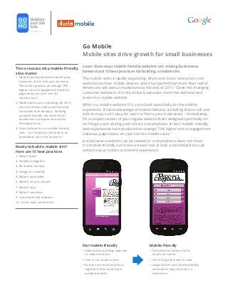
  • 1. Go Mobile Mobile sites drive growth for small businesses Learn three ways mobile-friendly websites are moving businesses Three reasons why mobile-friendly forward and 10 best practices for building a mobile site. sites matter 1. obile-friendly websites benefit your M The mobile web is rapidly expanding. More and more, consumers visit customer, and in turn your business. websites via their mobile devices. And it’s projected that more than half of These sites produce an average 75% higher rate of engagement (revenue, Americans will own a smartphone by the end of 2011.1 Given the changing page views, etc.) per visit for consumer behavior, it’s critical that businesses meet this demand and mobile users.2 invest in a mobile website. 2. obile web use is exploding. By 2015, M What is a mobile website? It’s a site built specifically for the mobile more Americans will access the web via mobile than desktop.1 Building experience. It takes advantage of mobile features, including click-to-call and a mobile-friendly site essential for click-to-map, so it’s easy for users to fine to your businesses – immediately. businesses to prepare and realize It’s a simpler version of your regular website that’s designed specifically for the opportunity. on-the-go users visiting your site via a smartphone. In fact, mobile- friendly 3. sers take action on mobile-friendly U web experiences have produced an average 75% higher rate of engagement sites. 1 in 5 website visits lead to an (revenue, page views, etc.) per visit for mobile users.2 immediate call to the business.10 Just because a website can be viewed on a smartphone does not mean Ready to build a mobile site? it is mobile-friendly. Let’s take a closer look at how a customized site can Here are 10 best practices enhance your mobile customers’ experience. 1. Keep it quick 2. Simplify navigation 3. Be thumb-friendly 4. Design for visibility 5. Make it accessible 6. Make it easy to convert 7. Make it local 8. Make it seamless 9. Use mobile site redirects 10. Listen, learn and iterate Not mobile-friendly Mobile-friendly • ide-to-side scrolling required S • ormatted so entire site fits F to view entire site on phone screen • ext is too small to read T • ext is large and east to read T • uttons are small and close B • arge buttons are thumb-friendly L together, often resulting in and make it easy for users to accidental clicks take action
  • 2. Here are the three reasons why mobile sites are important 1. Mobile-friendly sites positively impact consumer attitudes Mobile consumers use their devices frequently and purposefully, with high expectations of the mobile sites they visit. A positive mobile experience can drive significant revenue for a business. 51% of consumers are more likely to purchase from retailers that have a mobile- friendly website.3 On the other hand, a negative mobile website experience can be quite costly. 19% of mobile users will form a negative overall perception of a company if they are dissatisfied with the mobile experience.4 Consumers don’t like pinching and zooming their way through a mobile site, trying to locate business information. It’s a frustrating experience that drives customers away. In fact, nearly 2 in 3 users are unlikely to return to a mobile site with which they had trouble and 40% of consumers said they’d visit a competitor’s mobile site instead.5 By building a mobile-friendly website, businesses will not only increase revenue with current customers, but also capture customers who are dissatisfied with competitor websites. 2. Mobile usage is exploding, it’s time to prepare For the past decade, we’ve heard about mobile: how it is changing the way we interact with one another and with our customers. In reality, usage of the mobile web had not fully materialized – until now. Consider this: 30% of all Google search queries for restaurants come from mobile.6 Mobile growth isn’t expected to stop. By 2015, more Americans will access the web via mobile than desktop.7 Smartphones have become an extension of people’s daily lives. They are omnipresent in pockets and purses, and consumers use them everywhere and at anytime. Google comissioned data shows, 87% of smartphone consumers use their smartphone while on-the-go, or while commuting and walking.8 But mobile phones are no longer just for folks on the go – 93% of consumers use their smartphones at home.9 With a mobile- friendly site businesses can take advantage of these new consumer habits, reaching potential customers wherever they are throughout the day. Just as consumers use their devices in a number of places, they also use them while engaged in a number of activities. Why? Smartphone users are also multi-taskers. For those who don’t want to waste a minute of their day, smartphones enable Source: The Mobile Movement Study, Google/Ipsos them to be productive and connected at all times. While shopping, for instance, customers can read product reviews and locate nearby stores. As consumers evolve, it’s important for businesses to effectively use the mobile web to engage customers – wherever they are, whatever they’re doing.
  • 3. 3. Consumers take immediate action on mobile-friendly sites With the click-to-call feature, a “clickable” phone number enables customers to quickly reach a business with just one touch. For mobile-friendly websites powered by DudaMobile, nearly 1 in 5 visits to a small business site leads to an immediate call to the business, with some industries seeing very high click-to-call rates – pizzerias (32%), car services (27.8%) and auto repair services (22.3%).10 By including DudaMobile’s mobile-specific features such as click-to-call, maps and directions, businesses can drive immediate in-store sales from consumers ready to purchase. Providing customers with a mobile-friendly website makes it very easy for consumers to contact you and get to your business – fast. Consumers are hungry for this information. In fact, DudaMobile data shows the average click rate that consumers access maps and directions on mobile optimized sites is very high. Now ask yourself: how can I use mobile’s unique features to drive customers to my business? Start thinking and begin building. Source: DudaMobile Internal Data 2011 Source: DudaMobile Internal Data 2011 Ready to build a mobile site? Here are 10 best practices 1. Keep it quick Mobile users are often short on time, squeezing in online tasks as they go about their day. To help them, design your site to load fast and make copy easy to scan. • Prioritize the content and features that mobile users need most. Use your desktop site analytics to see what mobile users are doing. • Reduce large blocks of text and use bullet points for easy reading. • Compress images to keep them small for faster site loading.
  • 4. 2. Simplify navigation No one likes to be confused. Clear navigation and, on large or complex sites, search functionality will help your customers easily find what they need. • Minimize scrolling and keep it vertical only. • Use a clear hierarchy in menus and avoid rollovers. • Help users navigate between levels with clear back and home buttons. • Use seven links or fewer per page of navigation. • Have a search box prominently available on complex sites. 3. Be Thumb-friendly People use their fingers to operate mobile devices – especially their thumbs. Design your site so even large hands can easily interact with it. • Use large, centered buttons and give them breathing room to reduce accidental clicks. • Pad smaller buttons to increase the clickable area. • Pad check boxes by making the text clickable. 4. Design for visibility A mobile-friendly site gets its message across without causing eyestrain. Make it easy for your customers to read – remember, they may be in a place with low light. • Create contrast between background and text. • Make sure content fits onscreen and can be read without pinching and zooming. • Use plenty of negative space. • Use size and color to indicate link/button priority. • Use 3D effects and shadowing for buttons. 5. Make it accessible Ideally, your mobile site should work across all mobile devices and all handset orientations. • Find alternatives to Flash – it does not work on some devices. • Use HTML5 for interactivity and animation. • Adapt your site for both vertical and horizontal orientations. • Keep users in the same place when they change orientation. 6. Make it easy to convert No matter what your site’s objective is, your customers need to be able to do it with a virtual keyboard and no mouse. Make it easy to buy something or contact you! • Focus on information that will aid conversion (i.e., product details). • Reduce the number of steps needed to complete a transaction. • Keep forms short and use the fewest number of fields possible. • Use check boxes, lists and scroll menus to make data entry easier. • Use Click-To-Call functionality for all phone numbers.
  • 5. 7. Make it local Consumers look for local info on their phones all the time – from locating the nearest gas station to finding an open pizza place. Include functionality that helps people find and get to you. • Have your address or store locator on the landing page. • Include maps and directions. Use GPS to personalize when possible. • Allow users to check stock at nearby stores. 8. Make it seamless People now use multiple screens throughout the day. Convert as much of the functionality of your desktop site to mobile as you can to create a seamless experience. • Allow users to save popular searches and shopping cart contents. • Maintain key features of site across all channels as much as possible. • Display the same information for products/services. 9. Use mobile site redirects A mobile site redirect is code that can automatically tell if visitors are using a mobile device and send them to the mobile-friendly version of your site. Have your site developer implement this redirect code so your customers get the best version of your site for their needs. • Give users a choice to go back to the desktop site, but make it easy to return to the mobile site. • users choose which version they prefer to see for later visits. Let • Include key information, such as your address or a store locator, on the redirect page. 10. Listen, learn and iterate Good mobile sites are user-centric, which means they’re built with input from your audience. Ask your desktop site users what they want in a mobile website and make testing and optimization an ongoing process. • Use analytics to understand how people use your site. • possible, especially for complex sites, do user testing before implementation and collect If user feedback after launch. • Iterate often and continuously improve your site based on your research. About GoMo GoMo is a Google-led initiative dedicated to helping businesses ‘Go Mobile’ by providing them with the tools and resources they need to make their websites more mobile-friendly. On the GoMo website, businesses can see how their sites look on a mobile device using the GoMoMeter tool and get personalized recommendations for creating a more mobile-friendly experience. The site also has information on current mobile trends and mobile site best practices, as well as a list of developers ready to help companies build their mobile sites. For more information visit http://howtogomo.com About DudaMobile DudaMobile is a mobile website creation platform that makes it easy to turn existing websites into mobile optimized sites. On the DudaMobile website, businesses can build and host mobile-friendly websites that sync with a regular website, and add mobile specific features like Click-to-Call and Maps Directions. With more than 500,000 mobile websites on it’s platform, Duda is on mission to helping businesses go mobile. For more information visit http://www.dudamobile.com Nielsen, 2010. 2Omniture, April 2010. 3Brand Anywhere and Luth Research, November 2010. 4Compuware, March 2011. 5 Compuware Inc. March 2010. 1 Google Internal Data January 2011. 7IDC. 8The Mobile Movement Study, Google/Ipsos OTX MediaCT April 2011. 9The Mobile Movement Study, 6 Google/Ipsos OTX MediaCT April 2011. 10Duda Mobile Internal Data August 2011 © 2011 Google Inc. All rights reserved. Google and the Google logo are trademarks of Google Inc. All other company and product names may be trademarks of the respective companies with which they are associated.