
Recomendados
Mais conteúdo relacionado
Mais procurados
Mais procurados (20)
Semelhante a White Noise Presentation
Semelhante a White Noise Presentation (20)
Último
Último (20)
White Noise Presentation
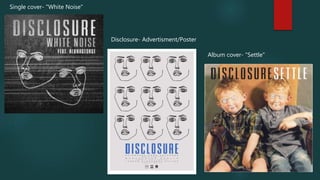
- 1. Single cover- "White Noise" Album cover- "Settle" Disclosure- Advertisment/Poster
- 2. Alike on the album cover, the ghostly face logos are also present here on the single cover as a recurring theme. The faces become the central focus and remind the audience to associate it with the artists. The faces themselves represent the audience and connect with the single title well "White Noise". Then Disclosure plays they become these strange memorable faces that people can relate and connect to. The idea that there are two represent the idea of a group of people connecting through this music. Cleverly the background image staying within the color scheme is the visual depiction of the title "white noise" and displays the static, grainy white noise that looks quite rustic and raw. This makes the single look quite alternative and unusual. The literal meaning brings to life the message in the song- this also means people will remember the cover art for "white noise" as they can just visualize the literal thing. This also suggests that the music may also be jumpy and pumped like the visual static. It also offers the idea of 'electro' house through the symbolism of mechanics, electricity and power. The same sort of color scheme from the album titles is translated into this single cover. A mixture of black, whites and a range of gray values are explored within the realistic 'white noise'. This deepens the message and creates a dark mystery that draws the audience in. The white in the title and from the masks make sure that negative connotations are not carried through; and the static lines symbolize energy breaking through- and therefore the genre of music.
- 3. The grey background of the poster creates quite a still, neutral tone which goes well in combination to the font. The big, bold, blue font draws attention to the lower part of the image to then read the information underneath about touring; this is why it is positioned here. The repeated print of the faces follow the typical style and recognizable theme for Disclosure which is present in almost all their prints. The outlined faces creates the idea of deconstructing the persons identity, and the music from Disclosure becomes us. The idea of recurring faces creates a disconnected bond towards the audience; one face would have more a direct approach. Also, the fact that this is an advertisement with the use of multiple faces may be a representation of people at a concert or fans of Disclosure
- 4. Disclosures album art features a baby picture of the two artists representing everything as "settled". The white, tedious and spooky Disclosure faces trace over the heads- representing the transformation of one's self when they listen to Disclosure. This is represented through the baby pictures as their identity is changed as they listen to the music. The outlined faces represent them, but they become whole when the music plays. The name "settle" contrasts against the lively, jumpy, pumped music genre that really doesn’t "settle" anyone down. The typographics use the same boxy font that may hold meaning of structure and order. It being quite small represents the idea of the ability to overcome order and break free of containment. There is a lot of appeal in not abiding by rules, and this music genre promotes alternativeness. The black for "Disclosure" represents darkness and mystery that the artists bring with their exciting music. And "settle" in white represents purity and order which goes well with the picture theme of childhood. These colors contrast and may represent the "good" and "evil" contrast when you listen to the music. Disclosures iconic logo of the masks are cleverly placed in the center of the album so the audience recognizes it and remembers what the album looks like or at least the representation of the artists. The titles are placed at the top so they do not interfere with the album art or logo but are still in a visible place. The high positioning may represent authority and goes well with the theme of their music taking you over. There are a variation of other colors within from the baby photo- this may connote that the album has a mixture of emotions or messages within it.