
Recomendados
Mais conteúdo relacionado
Mais procurados
Mais procurados (20)
Semelhante a Analysis of Double Page Spread-Radio Times
Semelhante a Analysis of Double Page Spread-Radio Times (20)
Mais de asmediaf12
Mais de asmediaf12 (20)
Último
Último (20)
Analysis of Double Page Spread-Radio Times
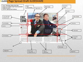
- 1. Double Page Spread-Draft-SLIDESHARE Colour= Red, Black, White, Grey, Blue Background= Mainly image focused upon/plain background colour Columns= Split up into 4 columns Main Title/heading Main Image Page Anchor Secondary Images By-Line Font styles Big, blocked, serif Rule of thirds Sub Heading Drop Cap By-Line Text wrap Sub Heading Secondary Images Text wrap Pagination Main Copyshaped like a ‘U’ Date of publication Pagination
- 2. Double Page Spread Main Image-This double page spread is very image based with only the two people (Eric& Ernie) being in the foreground. The fact that this is very image manipulated is to attract maybe a target audience who do not prefer to read large amounts of text, even though there is text not so much, which could give a stereotypical point in the readership of Radio Times magazine are uneducated and are only interested in purely images. Main Heading- ‘ERIC, ERNIE & ME’ is main typography here which illustrates the two men in this photograph likely to be in the documentary itself by placing this here beside it gives new audiences indication of who this they are. Colours-The use of colour schemes on this page is very simple with low key lighting that is used, which gives of an impression that they are corporate and professional documentary, the use of the positioning of the image is quirky to alternate there images allowing them to fit the taste of the audience. The dominate colour is white and black with blue which is bold and represents a business feel from what they are wearing too. and the image itself. Text wrap-Is used on this double page spread to allow the image to be in front rather than the text first this enables the audience to focus again on the image, but also so it is easier to see. The way ‘secondary image’ is on a slant to and wrapped around the text suggests that Radio Times wants us to see the image on the left as well as reading. Eric & Ernie are the core focus here as they are exposed to be in more colour which does not blend in with the background in comparison to the rest of the double page spread. Radio Times may have chosen to do this as the target audience is predominantly males and this would suggest that they want to entice audiences who replicate them. Sub Heading-Gives the a heading to a subsection of a particular piece of text which provides a short brief overview in what is involved. Here the sub heading is in a different font underneath the main heading to separate and highlight the fact that what you about to read is linked with the main copy. Page Number- is one of the main key conventions usually on a magazine which helps the viewers find out the title name and what page number it is. The double page spread has been split up into 4 columns with fully justified lines which allows all the words to be in portion and displays it better on the screen. Background-The background is very neutral, and plain with a white backdrop not being able to see the surrounding of the location which suggests that that Eric & Ernie are meant to be the foreground image the white/ grey backdrop allows the audience not to focus on the background By-Line- A by-line has been in this magazine to show who the photographer of this specific publication is and where the photograph was taken. Copy-The copy is very basic and easily eligible to read with minimal formal language which suggests this magazine is colloquial and not hard to interpret which is suitable for people who lack in education. Drop cap-a drop cap has been used in the colour ‘red’ to emphasise the importance of this paragraph/ article which again draws readers in. Page Anchor- ‘In semiology any caption or key elements that fixes the meaning of an image and directs the viewer toward a preferred reading.’ For example the main heading of the two men in the middle of the page is placed just below the two terminal (dead) areas where most people wouldn’t look allowing audiences to relate to the main image and the copy together, by leaving the terminal areas blank allows the double page spread to look uncluttered. Rule of thirds-Radio Times have followed the emblematic convention of a documentary magazine to allow the attraction of the audiences gaze to fall on to these hotspots of the magazine especially when this double page spread is dominantly image lead. For example the centre focus is entirely on Eric & Ernie as they are the attraction to the viewers of this magazine, the attention is automatically draw to the photograph and it’s intersection points.
- 3. Audience & Institutions Target Audience: The magazine appeals to a mass audience between the age range from 15-29, however are to focus more on young listeners. Social Class: The social class of Radio Times readers are moderately lower with the magazine only costing £1.60, also targeting younger teenagers who are still in education would not be able to afford a higher magazine price. Cost of magazine: This magazine would cost £1.60.
- 4. House Style/Ethos ‘A company's preferred manner of presentation and layout of written material’ The ethos & house style of Radio Times is represented through the use of bold colour, image lead magazine and layout for instance; Black: Which is bold and attracts attention, is corporate & professional. White: Which helps connote an image of purity and new programmes and ideas, also placed as a backdrop allows us to focus on the images & copy. Red: Which is attractive, stands out and gives importance. The colours throughout the double page spread portrays the overall image of Radio Times and what they want to reveal throughout the design, composition and images.
- 5. Double Page Spread-Draft-SLIDESHARE Colour= Black, Blue, White, Red Background= Mainly black, plain background Columns= Split up into 2 columns, text on one side, image on another. Font styles Big, blocked and thin, serif Main Title/heading Main Image- Long shot Rule of thirds By-Line Sub Heading Drop Cap Secondary Images Pagination Pagination Main Copy
- 6. Double Page Spread Main Image-The main image on this double page spread is a Olympic athlete with a long shot camera shot looking head on, his body language suggests that he is determined and ready to go, this illustrates and creates a meaning for the audience of his persona and his ambition. The use of the board prop suggests that he is interested in skiing which allows the readers of this magazine to target audiences who are image based as there is not too much copy for them to read. Sub Heading-Gives the a heading to a subsection of a particular piece of text which provides a short brief overview in what is involved. Background-The background is very simple, the page is almost split up into 2 sections the main image and then the copy, the left hand is illustrating the article with the masthead and the right shows the main image with sub sections. The foreground image is been seen by the audiences however the background is very out of focused and not easily distinguishable. 4 Columns-The double page spread overall is broken up into 4 columns which gives clarity as the page is equally proportional and clearly visible to reduce the cluttered effect. This allows readers not to be confused or distracted by too much text. Font Styles-The use of font/typography in this page is very plain however big and bold to emphasise the fact that the athlete is serious and confident. The standard Ariel sans serif font for the article helps differentiate the article and the heading. Main Heading- The use of the main heading with the typography being heavy and bold ‘Hurtling Headlong to glory’, almost is giving a hidden signified message to what it is denoting- ambition and facing it head on the use of the alteration allows audiences to immediately look at the masthead. Drop cap-has been used 4lines in to show the emphasise of the first word ‘it’ starting off with a statement drawing the readers into the article. The use of the white drop cap also coherent with the rest of the magazine too. Page Number-are the key conventions usually on a magazine which helps the audiences find out the title name and what page number it is. Copy-The copy is very basic and easily eligible to read with minimal formal language which suggests this magazine is suitable for everyone to read and is not a hard readership. Colours-The use of colour schemes on this page is very dull and mysterious which gives of an impression that Radio Times is very selective in choosing colours. The vibrant red that the athlete's board and helmet is placed provides a significant meaning for his desire and passion for what he is doing in comparison to the dark black/ blue background. The use of white typography helps the reader to read the article and not struggle Second Images-The secondary images on the page are in little extracts of what the athlete does to keep fit- this breaks up the article alone to help audiences navigate through the page. Rule of thirds-Radio Times have followed the representative convention of a music magazine to allow the attraction of the audiences be attracted to the hotspots of the magazine. For example the first spot draws attention to the masthead and what the article is about.
- 7. Audience & Institutions Target Audience: The magazine appeals to a mass audience between the age range from 15-29, however are to focus more on young listeners. Social Class: The social class of Radio Times readers are moderately lower with the magazine only costing £1.60, also targeting younger teenagers who are still in education would not be able to afford a higher magazine price. Cost of magazine: This magazine would cost £1.60.
- 8. House Style/Ethos ‘A company's preferred manner of presentation and layout of written material’ The ethos & house style of Radio Times is represented through the use of bold colour, image lead magazine and layout for instance; Black: Which is bold and attracts attention, is corporate & professional. White: Which helps connote an image of purity and new programmes and ideas, also helps stand out with the black backdrop allowing focus on the images & copy. Red: Which is attractive, stands out and gives importance. The colours throughout the double page spread portrays the overall image of Radio Times and what they want to reveal throughout the design, composition and images.