Question 2
•Transferir como PPTX, PDF•
0 gostou•238 visualizações

The document discusses linking ancillary products like album artwork and advertisements to music videos to establish an artist's brand identity. It provides examples from Riley's planned video, magazine ad, and album cover, showing consistency in settings, costumes, and aesthetics between the pieces. Censor strips and rural settings seen in the ad and cover will also appear in the video. Examples from Joey Bada$$ further illustrate how setting, props, and style can connect ancillary works to videos and reinforce a cohesive vision that engages and grows the artist's audience.

Recomendados
Mais conteúdo relacionado
Mais procurados
Mais procurados (20)
Destaque
Destaque (14)
Semelhante a Question 2
Semelhante a Question 2 (20)
Mais de Ashley Riley
Último
Último (20)
Question 2
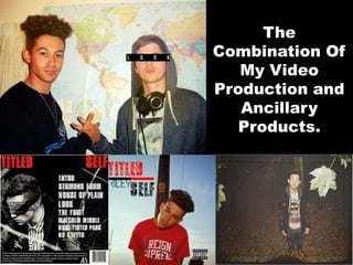
- 1. The Combination Of My Video Production and Ancillary Products.
- 2. BRAND IDENTITY Riley is a conscious Hip Hop artist who’s music explores the normalities, pressures and reasoning behind modern societal and personal behaviour. His ethos is to subvert genre and culture conventions by becoming a part ,and making a spectacle of, everything he wishes to change within the industry. He does this through his musical alter ego, “Black Chalk”, who is an incarnation of everything Riley finds stale, uninspiring, wrong and negatively influential in the Hip Hop genre. Riley himself, raps using extremely advanced techniques within the Hip Hop scene, constantly trying to innovate with flow, wordplay, relatable topics and complex and memorable instrumentals. Overall, he wants to put the art form and focus on music, back into the UK rap industry. This idea has been developed largely in Riley listening to influential artists before him, such as Outkast, MF DOOM, Kendrick Lamar and Kanye West. Each of these artists have gained success and legendary (or near legendary) status within the genre for breaking genre boundaries and conventions with their music and identity. For instance, Outkast’s duality allows them to manipulate their music, and thus the size of their audience. Not only can they appeal to the average rap listener through making music about crime and violence, but also offer thought provoking reasoning as to why the black youth feel pressured to commit these acts, and why we should change. This formula worked, and allowed Outkast to the increase their audience substantially, even impressing critics.
- 3. Ancillary Products X Video Production X Brand Identity
- 4. Links within the ancillary product and video production help establish and promote Riley’s brand identity. Aesthetic coherency is key in establishing a consistent idea to a target audience, and I have used many techniques to achieve this. An example of such consistency would be my use of editing in both the ancillary product and video production. The use of the censor strip is a stylised symbol that Riley wishes to use as a recurring aesthetic in his material. It signifies crime, the taboo and enigma, relevant themes and concepts within Hip Hop music. In blanking out how others look around Riley, it diverts attention to him, potentially helping him attract members of his target audience. It adds to Riley’s brand identity through exaggerating conventions of the genre, with notions of danger and crime suggested by the simple inclusion of a black strip.
- 5. Links in setting and costume also play a integral role in establishing consistent aesthetic brand identity. Making sure the audience actually visualises in motion what they saw on paper helps them see the vision the artist is trying to create. In doing this, they will appreciate the artist more, as it makes the artist’s work more memorable. Again censor strips are used on the magazine advert to further the aesthetic style Riley aims to achieve. Riley is wearing the same costume on the magazine advertisement as he wears within the dilapidated car park and hazy rooms scenes within the video. Every link generated between media helps keep a constant image of the artist and his product in the minds of the audience. Using the same costume in both the music video and the magazine advert for the album reminds the audience of the album itself, potentially boosting sales and helping it hold it’s relevance in the eyes of the consumer. Crew necks jumpers are a common costume choice for rappers, as they are comfortable, casual and notably urban looking. Through these qualities, they connote masculinity, a theme exploited in most rap music. This appeals to Hip Hop’s core target audience of working class males. The magazine advert shares the same setting as that of the slow zoom on the X during the music video for Malcolm Middle. The X is directly correlated to the chorus of the track “leaving you cross like Malcolm X”. The visual representation of this line helps make the video more memorable, and it’s use on the album advert will remind the audience of the ancillary product. The consistency and links in these products can potentially be a powerful tool for marketing, as the audience will be constantly reminded of all three products.
- 6. Part of Riley’s identity is his association and ties with where he grew up. The rural backdrop he features on his album cover is explored in the music video for Malcolm Middle. Though the bandana font, masculine red hue of his T-shirt and the crucifix chain all connote attributes of Hip Hop and it’s urban roots, the tree, radio mast, and power lines signify a country landscape. In the music video, he performs on a country road. The high angle shot directly contrasts the low angle shot of the album cover, adding a different perspective of the environment. Where as on the cover Riley seems like the main focus, within the video, the high angle shot portrays Riley as almost lonely in the breadth and span of the rural setting. The setting subverting genre conventions anyway, the inclusion of it’s symbolic meaning also subverts conventions by becoming attuned with the artist’s feelings. This will reach out to a larger audience who care less about genre conventions and more about what the artist is trying to convey, and what they can relate to. I believe it is a good idea to establish the setting and character through the use of artwork and advertisement, so as to draw an audience in. Once your ancillary products have interested people with the artist’s aesthetic, the music and visuals will flesh out and explore the setting and character they were reeled in by. Essentially, the ancillary product is there to gain the audience; the music and video elements of the project will keep them hooked. I believe my product does this well, with many settings and themes that are conveyed on the ancillary product being explored in the music video, such as Riley’s conflict in growing up in a rural setting, but loving a genre that is indubitably urban.
- 7. A brief overview of how other artist’s within the industry link their ancillary products to their music video productions. This analysis will show that the route I’ve taken will be successful in establishing and maintaining a fan base for Riley.
- 8. BRAND IDENTITY The ethos of Joey Bada$$ and his Pro Era crew is to bring modern Hip Hop back to it’s roots. A large majority of his tracks, along with his image, visuals and style, are all influenced by the Boom Bap and Golden Age eras of Hip Hop music. Thus, his products will always have an authentic, vintage and gritty aesthetic. Being such a young rapper, the decision to market music before his time was a bold but clever one, as it appeals to the older generation of Hip Hop listeners and the younger listeners, due to his age. As such, Joey’s audience and fan base is very large for an underground rapper.
- 9. The album cover for “Summer Knights” by Joey Bada$$ clearly presents links to it’s lead music video. The setting and props are the main focus, and their relevancy is portrayed in key, memorable scenes of the video. Joey’s old school Hip Hop aesthetic is supplemented by the black and white visuals, prop bicycle, afro-centric fashion sense and graffiti font. The bicycle shared by the front cover and music video, connotes a rebellious teenage attitude and an urban lifestyle, which are both major conventions of the Hip Hop genre, along with being tied in to Joey’s own life as a young rapper. The film grain effect on the front cover is also similar to the black and white filter within the music video, signifying that Joey was taught by a time preceding his years, fitting in with the old school ethos he is trying to present. The graffiti font ties in with Joey’s afrocentricity within fashion and style, with each of these elements falling under the bracket of Hip Hop. The setting of the American Football Stadium also links to the album cover, with Joey walking around inside the setting on the video, whereas on the album cover, the audience’s perspective is outside of it. This isn’t dissimilar to my decision to have a low angle shot on my album cover of Riley in a rural setting, coupled with a low angle of the country road setting within the video. Joey builds upon genre conventions and staples in nearly every way, linking the most prevalent elements within his artwork of the ancillary product and video to create a cohesive vision and product that will appeal to the core audience of Hip Hop in nearly everyway, while also leaving his target audience with room to grow by exploiting his youth.