Graphic Design Lectures 2014
•Transferir como PPTX, PDF•
0 gostou•398 visualizações

This document discusses various techniques for developing successful ideas and communicating messages effectively through graphic design. It covers phases involved in idea development like insight, goals and preparation. Methods for escaping mental blocks like brainstorming and sketching are presented. The document also discusses typography fundamentals like serif vs sans serif fonts and using typeface, size and line length to ensure readability. Symmetry, asymmetry and contrast are explored for conveying messages visually. Strategies for writing clearly for an audience like starting with headlines and removing unnecessary words are also outlined.

Recomendados
Recomendados
Mais conteúdo relacionado
Mais procurados
Mais procurados (20)
Destaque
Destaque (20)
Semelhante a Graphic Design Lectures 2014
Semelhante a Graphic Design Lectures 2014 (20)
Último
Último (20)
Graphic Design Lectures 2014
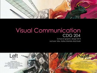
- 1. School of graphic design 2014 Lecturer: Miss. Hafiza Wahida Abd Kadir
- 2. Chapter 7 ‘But out there is where the fruit is’
- 3. A successful idea is characterized by the fact that it captures attention and invokes emotions (joy, desire, sympathy). The idea should be simple and have the capacity for further development.
- 4. This involve a number of phases which have to be passed through; › Insight › Goal › Situation › Preparation › Openness › Priorities › Pauses › Tricks of the trade › Censorship › Respect and lack of respect › The idea itself
- 5. The following method can be used to escape a mental block; › Association; Brainstorming (where all the suggestions are welcome). › Sketching; Drawing triggers completely new ideas. › Opposites; Trying to come up with ideas using opposites and conflicts. › Start at the end; Starting with the idea and working backwards towards the necessary prerequisites.
- 6. It’s important to identify and break force of habit with a message in an innovative form with unpredictable content.
- 8. Visible typography: › The letters take on a personal design, which reinforces the message. For instance in a newspaper header or in a logotype. Invisible typography › Form a silent link between author & reader. › Form a silent link between send & receiver. As in a work of literature.
- 9. Romans: › Characterized by the difference between thick strokes & fine hairlines & the fact that they have serifs. The letters’ heels or feet. Sans serif: › Characterized by their even design and the lack of serifs.
- 10. The typeface must suit the context & be readable. › Readability; how easy it is for the receiver to read a text. › Factors crucial to readability include the typeface itself, type size & line length.
- 11. Reinforcement; › The need to highlight more clearly various part of a text. › The most common are use if headings & subheadings & the marking of new paragraphs.
- 12. The whole also conveys a message. The symmetrical approach is experienced by the receiver as being organized, harmonious & elegant. The asymmetrical approach is dynamic & attractive. The contrasting approach is experienced in an intense fashion through contrasting sizes, strengths, shapes & colours.
- 13. Chapter 9 ‘But that was much later’
- 14. Need to be formulated at every stage of communicative work, & that goes for visual as well as verbal communication. What does the text have to achieve? › Influencing & changing someone’s emotions or attitudes? › Teaching something?
- 15. Have to know who they write for. › Writers have to put themselves in their reader’s shoes & think about the reader’s needs.
- 16. Have the reader in your mind’s eye Start with the headline Follow-up the headline in the text immediately Be concrete and not too witty Write in the active voice and remove most of the adjectives
- 17. Cross out everything you can Remove your favorite bits without crying Don’t be ingratiating, but do be quite personal Check the text against your strategy and creative goals Have someone read what you have written › Proof reading.
- 18. Use your creativity by using typography and visual. Create a visual that can communicate. Use software adobe illustrator and adobe Photoshop. › Set up as portrait or landscape. › Use A3 size. Date line: 20th of March 2014.