Webpage Design Basics for Non-Designers
•Transferir como KEY, PDF•
6 gostaram•1,413 visualizações


Recomendados
Recomendados
Mais conteúdo relacionado
Semelhante a Webpage Design Basics for Non-Designers
Semelhante a Webpage Design Basics for Non-Designers (20)
Mais de Mike Wilcox
Mais de Mike Wilcox (20)
Último
Último (20)
Webpage Design Basics for Non-Designers
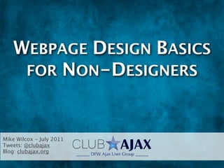
- 1. WEBPAGE DESIGN BASICS FOR NON-DESIGNERS Mike Wilcox - July 2011 Tweets: @clubajax Blog: clubajax.org
- 3. OMG! GARY IS HERE!!!
- 5. THE LOGO
- 6. The Logo The Logo should be done first. It determines what the website will look like.
- 7. The Logo The Logo should be done first. It determines what the website will look like. If a client asks for a site before the logo is done... run away!!
- 8. The Logo The Logo should be done first. It determines what the website will look like. If a client asks for a site before the logo is done... run away!! Logo is the face of the company
- 9. The Logo The Logo should be done first. It determines what the website will look like. If a client asks for a site before the logo is done... run away!! Logo is the face of the company Should convey either what the company does or its message
- 10. The Logo The Logo should be done first. It determines what the website will look like. If a client asks for a site before the logo is done... run away!! Logo is the face of the company Should convey either what the company does or its message Ideally, you should interview founders to get the personality of the company
- 11. The Logo The Logo should be done first. It determines what the website will look like. If a client asks for a site before the logo is done... run away!! Logo is the face of the company Should convey either what the company does or its message Ideally, you should interview founders to get the personality of the company What mood does it invoke?
- 12. The Logo The Logo should be done first. It determines what the website will look like. If a client asks for a site before the logo is done... run away!! Logo is the face of the company Should convey either what the company does or its message Ideally, you should interview founders to get the personality of the company What mood does it invoke? Professional, whimsical, emotional, corporate, edgy, artistic
- 13. Color Colors are meaningful. You’ll need at least a primary and secondary. Red PROS: fire, power, passion, importance, energy, excitement CONS: rage, emergency, anger, (and death in China, we know) Orange PROS: happiness, joy, sunshine, cheerfulness, childlike exuberance CONS: ignorance, deceit Yellow PROS: joy, intelligence, brightness, energy, optimism, happiness CONS: caution, criticism, laziness, jealousy Green PROS: nature, healing, growth, harmony, safety CONS: money, greed, jealousy, beginner Blue PROS: peaceful, calming, stability, trust, dependability CONS: depression, coldness, passiveness Purple PROS: royalty, sophistication, wealth, luxury, spirituality, creativity, magic CONS: gloominess, sadness Black PROS: power, elegance, sophistication, depth CONS: death, mystery, the unknown, grief, mourning, sorrow White PROS: purity, innocence, cleanliness, safety CONS: cold, distant, winter http://sixrevisions.com/web_design/a-look-into-color-theory-in-web-design/
- 14. Color - cont’d Use Kuler, or another color-selection app http://www.techiemania.com/5-awesome-free-tools-to-help-you-choose-your-website-color-scheme.html http://kuler.adobe.com/#create/fromacolor
- 15. Thumbnails You must use a pencil and paper. Ideas for logos cannot be done directly in Photoshop (I know - I've tried)
- 16. Logo Design Tips
- 17. Logo Design Tips Needs to read well and purposefully
- 18. Logo Design Tips Needs to read well and purposefully Needs to hold up to being very small
- 19. Logo Design Tips Needs to read well and purposefully Needs to hold up to being very small Should have a version in back and white
- 20. Logo Design Tips Needs to read well and purposefully Needs to hold up to being very small Should have a version in back and white Should have a CMYK version for printing
- 22. LOGO EXAMPLES
- 23. Logo Examples
- 24. Logo Redesign
- 25. Logo Redesign
- 26. Logo Redesign
- 30. Website Galleries This is where those webpage galleries come in handy
- 31. Website Galleries This is where those webpage galleries come in handy Whenever you see a good one, bookmark it!
- 32. Website Galleries This is where those webpage galleries come in handy Whenever you see a good one, bookmark it! A quick way to learn what is the current trend in design
- 33. Website Galleries This is where those webpage galleries come in handy
- 34. Website Galleries This is where those webpage galleries come in handy Whenever you see a good one, bookmark it!
- 35. Website Galleries This is where those webpage galleries come in handy Whenever you see a good one, bookmark it! A quick way to learn what is the current trend in design
- 36. Le’ Bad While not a necessary step, it’s fun to see some bad designs and what you shouldn’t do.
- 37. Le’ Bad While not a necessary step, it’s fun to see some bad designs and what you shouldn’t do. http://www.rhythmband.com/
- 38. Le’ Bad While not a necessary step, it’s fun to see some bad designs and what you shouldn’t do. http://www.rhythmband.com/ http://www.disabilityresources.org/
- 39. Le’ Bad While not a necessary step, it’s fun to see some bad designs and what you shouldn’t do. http://www.rhythmband.com/ http://www.disabilityresources.org/ http://art.yale.edu/
- 40. Le’ Bad While not a necessary step, it’s fun to see some bad designs and what you shouldn’t do. http://www.rhythmband.com/ http://www.disabilityresources.org/ http://art.yale.edu/ http://www.yvettesbridalformal.com/
- 41. Le’ Bad While not a necessary step, it’s fun to see some bad designs and what you shouldn’t do. http://www.rhythmband.com/ http://www.disabilityresources.org/ http://art.yale.edu/ http://www.yvettesbridalformal.com/ http://richardwiseman.wordpress.com/2011/01/06/the-worst-websites- ever/
- 43. DESIGN BASICS
- 44. Layout There are many layout variations, but here are the most common: http://skyje.com/2011/01/web-layouts/
- 45. Layout There are many layout variations, but here are the most common: One column http://skyje.com/2011/01/web-layouts/
- 46. Layout There are many layout variations, but here are the most common: One column Two column http://skyje.com/2011/01/web-layouts/
- 47. Layout There are many layout variations, but here are the most common: One column Two column Three column http://skyje.com/2011/01/web-layouts/
- 48. Layout There are many layout variations, but here are the most common: One column Two column Three column Fixed width (centered) http://skyje.com/2011/01/web-layouts/
- 49. Layout There are many layout variations, but here are the most common: One column Two column Three column Fixed width (centered) Fluid / Stretchy http://skyje.com/2011/01/web-layouts/
- 50. Color
- 51. Color Same rules as the logo applies
- 52. Color Same rules as the logo applies Don’t use simple, saturated colors. Looks like your kid did it!
- 53. Color Same rules as the logo applies Don’t use simple, saturated colors. Looks like your kid did it! Also be careful of overly muted designs. They may
- 54. Design Tips
- 55. Design Tips Don't be afraid of whitespace
- 56. Design Tips Don't be afraid of whitespace Vary sizes and colors, break up monotony
- 57. Design Tips Don't be afraid of whitespace Vary sizes and colors, break up monotony Make the eye "dance" on the page from one element to another
- 59. TYPOGRAPHY
- 60. Serif vs Sans Serif http://www.alistapart.com/articles/on-web-typography/
- 61. Serif vs Sans Serif A serif is a structural detail on the elements of the font. http://www.alistapart.com/articles/on-web-typography/
- 62. Serif vs Sans Serif A serif is a structural detail on the elements of the font. The purpose is to give the font and word more of a horizontal flow, and therefore make a block of text easier to read. http://www.alistapart.com/articles/on-web-typography/
- 63. Serif vs Sans Serif A serif is a structural detail on the elements of the font. The purpose is to give the font and word more of a horizontal flow, and therefore make a block of text easier to read. Some studies show that a sans serif is easier to read on monitors, possibly because of the lack of resolution. http://www.alistapart.com/articles/on-web-typography/
- 64. Serif vs Sans Serif A serif is a structural detail on the elements of the font. The purpose is to give the font and word more of a horizontal flow, and therefore make a block of text easier to read. Some studies show that a sans serif is easier to read on monitors, possibly because of the lack of resolution. A recent study suggested that neither serif nor sans serif matter as much as the familiarity of the http://www.alistapart.com/articles/on-web-typography/
- 65. Font Weight http://www.alistapart.com/articles/on-web-typography/
- 66. Font Weight Bolder text is considered “heavier” or “darker” because it allows less white space to show. http://www.alistapart.com/articles/on-web-typography/
- 67. Font Weight Bolder text is considered “heavier” or “darker” because it allows less white space to show. Bold text is harder to read in copy, but easier to read in headlines. http://www.alistapart.com/articles/on-web-typography/
- 68. Font Weight Bolder text is considered “heavier” or “darker” because it allows less white space to show. Bold text is harder to read in copy, but easier to read in headlines. Use different weights to draw attention to different areas of interest. http://www.alistapart.com/articles/on-web-typography/
- 69. Headlines http://ilovetypography.com/2008/02/28/a-guide-to-web-typography/
- 70. Headlines Go bold, go heavy http://ilovetypography.com/2008/02/28/a-guide-to-web-typography/
- 71. Headlines Go bold, go heavy Grab attention http://ilovetypography.com/2008/02/28/a-guide-to-web-typography/
- 72. Headlines Go bold, go heavy Grab attention Use fancy, unordinary fonts http://ilovetypography.com/2008/02/28/a-guide-to-web-typography/
- 73. Type - Content http://www.alistapart.com/articles/on-web-typography/
- 74. Type - Content Must be lighter http://www.alistapart.com/articles/on-web-typography/
- 75. Type - Content Must be lighter Avoid “reversed”colors, like white on black http://www.alistapart.com/articles/on-web-typography/
- 76. Type - Content Must be lighter Avoid “reversed”colors, like white on black Must be standard font faces http://www.alistapart.com/articles/on-web-typography/
- 77. Type - Content Must be lighter Avoid “reversed”colors, like white on black Must be standard font faces Times, Arial and Helvetica are the most common font not because of their design, but because people are used to reading them http://www.alistapart.com/articles/on-web-typography/
- 78. Web Fonts List
- 79. Web Fonts List It’s more than just Arial and Times now.
- 80. Web Fonts List It’s more than just Arial and Times now. HTML5 fonts take a while to load, but helps differentiate the site.
- 81. Web Fonts List It’s more than just Arial and Times now. HTML5 fonts take a while to load, but helps differentiate the site. Recommended that a non-expert stick with the standard fonts list.
Notas do Editor
- \n
- \n
- \n
- \n
- \n
- \n
- \n
- \n
- \n
- \n
- \n
- \n
- \n
- \n
- \n
- \n
- \n
- \n
- \n
- \n
- \n
- \n
- \n
- \n
- \n
- \n
- \n
- \n
- \n
- \n
- \n
- \n
- \n
- \n
- \n
- \n
- \n
- \n
- \n
- \n
- \n
- \n
- \n
- \n
- \n
- \n
- \n
- \n
- \n
- \n
- \n
- \n
- \n
- \n
- \n
- \n
- \n
- \n
- \n
- \n
- \n
- \n
- \n
- \n
- \n
- \n
- \n
- \n