
Recomendados
Mais conteúdo relacionado
Mais procurados
Mais procurados (18)
Semelhante a Contents page deconstructions
Semelhante a Contents page deconstructions (20)
Último
Último (20)
Contents page deconstructions
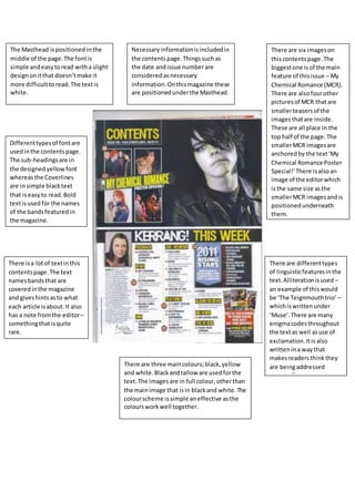
- 1. Necessaryinformationisincludedin the contentspage.Thingssuchas the date andissue numberare consideredasnecessary information.Onthismagazine these are positionedunderthe Masthead. The Masthead ispositioned inthe middle of the page.The fontis simple andeasytoread witha slight designonitthat doesn’tmake it more difficulttoread.The textis white. There isa lotof textinthis contentspage.The text namesbandsthat are coveredinthe magazine and giveshintsasto what each article isabout.It also has a note fromthe editor– somethingthatisquite rare. Differenttypesof fontare usedinthe contentspage. The sub-headingsare in the designed yellow font whereasthe Coverlines are insimple blacktext that iseasyto read.Bold textisusedfor the names of the bandsfeaturedin the magazine. There are six imageson thiscontentspage.The biggestone isof the main feature of thisissue – My Chemical Romance (MCR). There are alsofourother picturesof MCR thatare smallerteasersof the imagesthatare inside. These are all place in the top half of the page.The smallerMCR imagesare anchoredby the text‘My Chemical Romance Poster Special!’There isalsoan image of the editorwhich isthe same size asthe smallerMCR imagesandis positionedunderneath them. There are differenttypes of linguisticfeaturesinthe text.Alliterationisused – an example of thiswould be ‘The Teignmouthtrio’ – whichiswrittenunder ‘Muse’.There are many enigmacodesthroughout the textas well asuse of exclamation.Itisalso writtenina waythat makesreadersthinkthey are beingaddressed personally. There are three maincolours;black,yellow and white.Blackandtallow are usedforthe text.The imagesare in full colour,otherthan the mainimage that isin blackand white.The colourscheme issimple aneffective asthe coloursworkwell together.
- 2. The Masthead ispositionedinthe top leftcornerof the page.The font issimple andbecause of the wide spacingbetweenthe letters,itis alsoveryeasyto read.Theyhave use the colour white forthistext. Theyhave includedsome necessary information,suchasthe issue number,but overall thiscontentspage doesn’thave the necessaryinformationmostmagazines have (e.g.date).The issue numberispositionedat the top of the rightpage,inthe centre. There are differenttypesof fontusedonthe contents page.The Coverlinesare inaboldblacktextthat’s easy to read.The enigmacodesare ina smallerblackfont that issimple andalsoeasyto read.The Masthead and Sub-headingare ina differentfontthatissimple yet stylishandreadable.Thenthere isthe small redtext that standsout andlooksattractive yetit,too, issimple and easyto read(slightlymore difficultbecauseof the distractingcolour). There are several differentimages,positionedinvarious placesacross the twopages.The biggestimage (and therefore the one thatgetsthe mostattention) isa cartoon/anime type picture thatthe Gorillazuse intheir musicvideos.Thisindicatesthatthe Gorillazare the (or one of) mainfeature/sinthismagazine. The other imagesare relatedtothe other thingsfeaturedinthe magazine andare sub-images. The main colourscheme for thismagazine isred,white and black.Thisis simple yet effectiveandshows thatthe magazine isformature audiencesratherthan children,whoprefercolourful things There isquite a lotof textinthiscover page.The texttellsyouthe namesof the bands/singersthatwill be featured inthe magazine andeachhave teasing hintsunderthemto attract and draw youin. The linguisticfeaturesuse inthiscontentspage are; use of rhetorical questions –underthe coverline ‘Q Hero’ – thismake the readerthinkwantto findout more about itso theycan answerthat question. Thisis justone example,thereare sure tobe many otherdifferentlinguisticfeaturesinthe text.
- 3. The magazine hasnecessary informationsuchasthe date and issue number.These are positionedinthe top rightcorner of the page.This includesthe page numberalso. The Masthead is positionedatthe top leftcorner.It iseasyto see and readbecause the fontis simple, withoutany designoreffects. The font colouris white. The colour scheme isred,white and black.It issimple yeteffective.Itis for mature audiencesasitdoesn’t have loadsof differentcoloursthat are on magazinesaimedatchildren. There are three differenttypesof fontsusedinthis contentspage.They are all simple and easyto read. There islittle textinthisfeature.The small amountof textthatis on thispage will be the namesof otherbandsor singersthatare featuredinthe magazine andenigmacodes givinghintsasto whateach feature isabout. There are twoimagesonthiscontentspage – the mainimages,and a sub-image.The mainimage takesupmostof the page to bring attentiontothisfeature inthe magazine.The smaller image isto bringattentiontothe nextfeature oris placedthere because itis one of the more popularartistin the magazine.