
Recomendados
Mais conteúdo relacionado
Destaque
Mais de amydedman1
Mais de amydedman1 (20)
Último
Último (20)
Progression
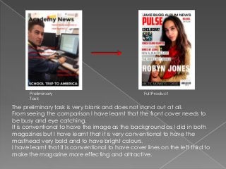
- 1. Preliminary Task Full Product The preliminary task is very blank and does not stand out at all. From seeing the comparison I have learnt that the front cover needs to be busy and eye catching. It is conventional to have the image as the background as I did in both magazines but I have learnt that it is very conventional to have the masthead very bold and to have bright colours. I have learnt that it is conventional to have cover lines on the left third to make the magazine more effecting and attractive.
- 2. My preliminary task has covered some conventions. It does have a masthead and a few cover lines. Also there are a range of colours. However it does not have any other images and the font is very plain and doesn’t change. My finished front cover also has a bold masthead as well as a range of fonts and colours. Also I have used more than one image on the front cover and it is of a band/artist which is conventional for a music magazine.
- 3. My photography and images have improved because the shot type used in my preliminary task is not very effective and doesn’t look very conventional. Also it is not eye catching and the colours are very dull. This has been improved greatly in my finished product because I have used a mid shot which allows you to see the image easier and the features are conventional for the magazine. The mise-en-scene has also been improved because the clothes and person in the image doesn’t really suit the genre of the magazine. It was a school magazine and the clothes are not related to school. My finished front cover looks better because the setting, props, costume and lighting has improved a lot to make it conventional.
- 4. The image editing has improved greatly because on my preliminary task I didn’t edit it at all so it didn’t stand out. On my front cover I edited it correctly to make the brightness and contrast effective and for the image to stand out.
- 5. The layout in my preliminary task was conventional because I have a masthead, cover lines and the use of left third. However, my front cover now uses route of the eye and looks more conventional for a music magazine.
- 6. My fonts on my preliminary task are conventional for the student/teacher/parent audience because it’s a simple font. However, the fact that I stuck to the same font on the front cover is very unconventional. My finished front cover uses a lot of improved fonts because I have varied the font styles and even though they are all sans serif which is conventional, I have chosen different types of fonts. The colours are not conventional on my preliminary task because some colours make the writing hard to read. Also red isn’t conventional for school magazine so it doesn’t appeal to the audience. The colours have improved on my front cover because I have kept to a house style to make it conventional. I chose the colours I knew would be appealing from the knowledge of colours and their connotations I gained since the preliminary task.
- 7. My preliminary task doesn’t‘ really have a mode of address because there isn’t a tone given from my preliminary front cover because it is just basic. Although, from the knowledge I have gained from the research and planning I found that the images, fonts, colours helped towards making the mode of address quite weird and different.