Model Call Girl in Tilak Nagar Delhi reach out to us at 🔝9953056974🔝
Coldplay Digipack Case Study
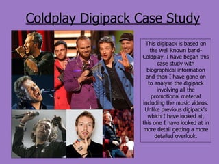
1. Coldplay Digipack Case Study This digipack is based on the well known band- Coldplay. I have began this case study with biographical information and then I have gone on to analyse the digipack involving all the promotional material including the music videos. Unlike previous digipack’s which I have looked at, this one I have looked at in more detail getting a more detailed overlook.
2.
3.
4. Magazine Shoots Coldplay clearly advertises itself without just focusing on CD covers and the typical promotional goods e.g. a poster and music video; they allow themselves to be under the public eye when working with mainstream magazines such as Rolling Stone. This allows them to become even more popular depicting their musical talent and dedication to their fans and also in allowing others to listen to their music by promoting it through various mediums. After analysing Coldplay in terms of biographical information, it is clear that they are not as conventional as other music bands where drugs are a part of their lives and arguments lead to band break ups e.g. the recent oasis break up. Coldplay seem more stable and throughout the covers they are all pictured as a group showing how they are working together well producing music for their fans and by refusing hard drugs they are showing their professional perception on their work and passion. There are mainly long shots which are shown in the music videos often again showing them as a band but due to their CD covers being very abstract it allows the audience to relate these magazine cover shoots to the CD covers, magazine covers can be a part of the digipack as they are a promotional item.
5.
6.
7. Merchandise This merchandise varied in price but remained reasonable, there is clearly a wide variety of products for Coldplay fans to choose from, they include clothing and accessories for everyday life such as a bag and keying. These products are simple and can be bought elsewhere but with the Coldplay decorations: it creates individual products that are eye catching. After listening to their music and looking through their fascinating website, the audience will also look through this selection of merchandise. They all are a part of the promotional products and digipack clearly conveying intertextuality within as fonts, images and designs from the CD covers and from other events such as tours are on these products allowing people to immediately refer to their own recollections of the band.
8.
9. Single CD Covers These single covers link to the album covers, for example, the single ‘violet hill’ from the Viva la Vida album is a different image but gives the same impression of religious traditional art, which ironically is modern when using it in a contemporary fashion as Coldplay does. Each single is more individually selected to suit the song yet interlinks with the album, its as though the main album cover illustrates the atmosphere and the overall portrayal from the songs yet the singles are more distinct to each song. The single CD cover for the song ‘yellow’ has a yellow/ orange coloured background whilst having the abstract photography remain, the single for the track ‘trouble’ links to the image of fire which appears as though it is spreading but at the same time it is beautiful, as the photograph manipulation shows each detail of flames which could also be argued as artistic. The other single which has caught my attention is ‘shiver’: the cover for this song is more negative with unusual line structures and lengths including which directions they are going which links to the uncontrollable behaviour of shivering, this catches the audiences attention in a different way from the other singles as it could be metaphorical for emotions.
10. Coldplay Poster Analysis This poster is unique and simple, it advertises Coldplay as a band, which they are, it conveys how they are modern with the use of contemporary photography. The name ‘Coldplay’ is in block capitals stating how they are important, against the white background it allows the band name to become more emphasised. The background of the poster appears to be a realistic environment showing how they can easily be related to and also how their songs are honest. This poster differs greatly from the previous one in many ways, it also shows how a band can change from their first album until their last showing development and the change in their confidence to express themselves more personally or through a more eccentric sense. The font for this poster gives the impression of classical music, this interlinks with the art which is very traditional but also shocking with the violence showing how its unique and fascinating.
11. This poster contradicts the title of the song in which is was designed for, it is abstract and creative showing how simple can still be professional. The characteristics show blurriness in the imagery showing how you cannot focus and therefore do not know your own place or on the other hand it is your place in terms of metaphorically. I am discussing this poster despite it not being designed to advertise a single but instead to advertise a tour. There however are still some similar characteristics to the poster in comparison to others, such as the sketching which is a unique selling point showing how Coldplay as a band are individual turning to talent and not always the conventional photograph of the band. This poster is extremely similar to the album cover of ‘a rush of blood to the head’, as discussed before the head is slowly disappearing like sand- this is eccentric allowing the audience to easily recognise it and relate the poster and Album cover together.
![Biographical Information.. ,[object Object],[object Object],[object Object],[object Object],[object Object],[object Object]](data:image/gif;base64,R0lGODlhAQABAIAAAAAAAP///yH5BAEAAAAALAAAAAABAAEAAAIBRAA7)