SlideShare a Scribd company logo
1 of 6
Text advertising 3 free posters. This is used to encourage people to buy the magazine and suggests they are getting something given back to them. The copy ‘Free posters’ is written in bold capital letters to make it easy to read. It is written in a white font, this stands out on the black background and attracts attention. The magazine name ‘NME’ is the largest font on the page which enables it to stand out and clearly be seen. A bright, red font has been used to engage the audiences attention. The logo is located in the top right hand corner and is aesthetically pleasing. The background of the magazine is taken up by a single image of a black CD. This is effective as the CD has strong connotations of music, albums and singers. It is closely linked with the story it is representing ‘The 100 greatest albums..’ The text is written in the centre of the CD in a black font which clearly stands out on the pale background. The text ‘You’ve never heard’ is written in bold. This signifies importance. It is used to engage and interest the reader. It will make them feel they’re missing out and encourage them to read the story to discover the unknown. The magazine uses various famous artist names such as ‘Kasabian’ and ‘MGMT’ As they are well known and popular they will attract readers and fans. They are music professionals which clearly shows they know what they’re talking about, therefore the album list will be accurate and of a good quality. The black background suggests both class and professionalism which shows the magazine is good quality and worth buying. It also gives connotations of mystery suggesting the article will reveal new artists and music for the audience.
The title takes up the majority of the masthead. It is written in a bold, capital lettered font. Its rugged edges give connotations of excitement and suggest the magazine is unique, like no other music magazine.  The slipknot logo has been used as it is recognised by the majority of the target audience. This will attract the wide fan base of the band and encourage them to read the magazine. As the logo takes up a large portion of the page it clearly shows the magazine will have a big story on the band.  The image used is of a member of slipknot wearing a mask. This has been used as the readers are familiar with the bands trademark masks. The grey coloured mask give connotations of a serious band, which suggests they are devoted to their music and the article will be both interesting and informative. The magazine offers five free posters  to attract attention and persuade people to buy the magazine. This is similar to NME magazine, they are giving the reader something back for buying the magazine. They have chosen popular music artists that are well known by the target audience. Bright red and white fonts have been used as they clearly stand out on the dark coloured background. It attracts attention to them and makes them easy to read.
A white background has been used for the contents page. This colour scheme has been chosen to enable the bright coloured text and numbers to stand out and clearly be read.  This issue of the magazine was a special  on Bruce Springsteen. An image of his band has been used, this is to advertise the article and encourage people to read that page. The photograph is in black and white, this will appeal to the audience as it clearly shows they have been around for a long time and built up a good reputation and fan base. Page numbers have been written in a bold, red font. This is so it clearly stands out and the reader can easily access the pages they want to read. The heading ‘Contents’ has been written in a large, simple font to clearly inform the reader what the page is about. The pale orange colour compliments the red and orange colours used around the page making the colour scheme look both effective and professional. A small black font has been used to give the page name and a short summary of what the page includes. The colour black gives connotations of a smart, professional magazine with powerful articles.
An image of Lowell George has been used, it takes up the majority of the page. This clearly shows he is of importance and an article on him will be in the magazine. A quote underneath suggests he was an intelligent and interesting man who was popular amongst many. This portrays him in a positive way making the reader automatically feel fond of the figure and interested in reading more about him. The black and white image suggests sorrow, death and mourning. It also gives connotations of mystery. This is used to intrigue the reader and encourage them to read about him. The black background suggests the magazine will prefer darker genres, such as metal and rock. The colour scheme also enables the white font to clearly stand out and be easily visible for the reader. The black background also compliments the image used and enables it to clearly stand out.  The issue number and month of the magazines release is clearly displayed near the top of the page. This enables the reader to clearly see which is the most recent of issues if they are a regular buyer. White and red fonts have been used so that they stand out on the black background and can clearly be read. Heading are written in a bigger, bolder font to attract the readers attention. It has been used to highlight the most important articles in the magazine.
Half of the double page spread is taken up by an image of the band. A medium shot is used to clearly show the bands surroundings. The mise-en-scene of the image shows them in an old fashioned location which suggests their music is retro. The band are wearing unusual clothes which clearly shows their music is individual and they like to be different. The bubbles on the floor suggest the band are mischievous and like to have fun. This portrays them in a positive way showing they are down to earth and even though famous are actually normal. A dog has been used in the picture to reflect their softer, more caring sides. A bright yellow background has been used. The colour yellow gives strong connotations of warmth and happiness. It suggests that like the colour the band have bold, bright personalities and music to match their personalities. The colour is attracts attention to the article and enables the black and white font to clearly stand out on the background. The mise-en-page of the article shows that it is written in two symmetrical ‘L’ shapes. This is aesthetically pleasing to the eye of the reader. A short summary of the band is placed in the middle of the shapes. The shapes are used to frame the summary and highlight it. This suggests it is of importance. The heading of the article has been written in an unusual black and white font. The font gives connotations of a mad and wacky band. As the font is interesting it suggests the article will be too and encourages the customer to read the article.
The letter ‘O’ has been replaced by a symbol that represents a target. This clearly suggests the man has targets and goals he is determined to reach. This is used to draw in the reader and encourage them to find out what he hopes to achieve. Half of the double page spread is an image of Paul Weller, the character featured in the article. The large image suggests he is of importance. The low angle shot portrays him as superior to the reader and shows he is a powerful and rich man. His black coat and low light surroundings suggest he is mysterious and edgy. The dark colours show nobody knows much about him and in the article he is willing to open up. A quote by Paul Weller is written in large capital letters. This is used to highlight the text and show it is of importance. It shows he is optimistic and still has faith in his career. It clearly shows he is hopeful for the future and has faith in himself. The font used is small and formal suggesting the topic of the interview is important and serious. The dark, grey font used compliments the black background and white font used. The colour scheme is pleasing to the eye.

More Related Content

Featured

2024 State of Marketing Report – by Hubspot
2024 State of Marketing Report – by Hubspot2024 State of Marketing Report – by Hubspot
2024 State of Marketing Report – by HubspotMarius Sescu
 
Everything You Need To Know About ChatGPT
Everything You Need To Know About ChatGPTEverything You Need To Know About ChatGPT
Everything You Need To Know About ChatGPTExpeed Software
 
Product Design Trends in 2024 | Teenage Engineerings
Product Design Trends in 2024 | Teenage EngineeringsProduct Design Trends in 2024 | Teenage Engineerings
Product Design Trends in 2024 | Teenage EngineeringsPixeldarts
 
How Race, Age and Gender Shape Attitudes Towards Mental Health
How Race, Age and Gender Shape Attitudes Towards Mental HealthHow Race, Age and Gender Shape Attitudes Towards Mental Health
How Race, Age and Gender Shape Attitudes Towards Mental HealthThinkNow
 
AI Trends in Creative Operations 2024 by Artwork Flow.pdf
AI Trends in Creative Operations 2024 by Artwork Flow.pdfAI Trends in Creative Operations 2024 by Artwork Flow.pdf
AI Trends in Creative Operations 2024 by Artwork Flow.pdfmarketingartwork
 
PEPSICO Presentation to CAGNY Conference Feb 2024
PEPSICO Presentation to CAGNY Conference Feb 2024PEPSICO Presentation to CAGNY Conference Feb 2024
PEPSICO Presentation to CAGNY Conference Feb 2024Neil Kimberley
 
Content Methodology: A Best Practices Report (Webinar)
Content Methodology: A Best Practices Report (Webinar)Content Methodology: A Best Practices Report (Webinar)
Content Methodology: A Best Practices Report (Webinar)contently
 
How to Prepare For a Successful Job Search for 2024
How to Prepare For a Successful Job Search for 2024How to Prepare For a Successful Job Search for 2024
How to Prepare For a Successful Job Search for 2024Albert Qian
 
Social Media Marketing Trends 2024 // The Global Indie Insights
Social Media Marketing Trends 2024 // The Global Indie InsightsSocial Media Marketing Trends 2024 // The Global Indie Insights
Social Media Marketing Trends 2024 // The Global Indie InsightsKurio // The Social Media Age(ncy)
 
Trends In Paid Search: Navigating The Digital Landscape In 2024
Trends In Paid Search: Navigating The Digital Landscape In 2024Trends In Paid Search: Navigating The Digital Landscape In 2024
Trends In Paid Search: Navigating The Digital Landscape In 2024Search Engine Journal
 
5 Public speaking tips from TED - Visualized summary
5 Public speaking tips from TED - Visualized summary5 Public speaking tips from TED - Visualized summary
5 Public speaking tips from TED - Visualized summarySpeakerHub
 
ChatGPT and the Future of Work - Clark Boyd
ChatGPT and the Future of Work - Clark Boyd ChatGPT and the Future of Work - Clark Boyd
ChatGPT and the Future of Work - Clark Boyd Clark Boyd
 
Getting into the tech field. what next
Getting into the tech field. what next Getting into the tech field. what next
Getting into the tech field. what next Tessa Mero
 
Google's Just Not That Into You: Understanding Core Updates & Search Intent
Google's Just Not That Into You: Understanding Core Updates & Search IntentGoogle's Just Not That Into You: Understanding Core Updates & Search Intent
Google's Just Not That Into You: Understanding Core Updates & Search IntentLily Ray
 
Time Management & Productivity - Best Practices
Time Management & Productivity -  Best PracticesTime Management & Productivity -  Best Practices
Time Management & Productivity - Best PracticesVit Horky
 
The six step guide to practical project management
The six step guide to practical project managementThe six step guide to practical project management
The six step guide to practical project managementMindGenius
 
Beginners Guide to TikTok for Search - Rachel Pearson - We are Tilt __ Bright...
Beginners Guide to TikTok for Search - Rachel Pearson - We are Tilt __ Bright...Beginners Guide to TikTok for Search - Rachel Pearson - We are Tilt __ Bright...
Beginners Guide to TikTok for Search - Rachel Pearson - We are Tilt __ Bright...RachelPearson36
 

Featured (20)

2024 State of Marketing Report – by Hubspot
2024 State of Marketing Report – by Hubspot2024 State of Marketing Report – by Hubspot
2024 State of Marketing Report – by Hubspot
 
Everything You Need To Know About ChatGPT
Everything You Need To Know About ChatGPTEverything You Need To Know About ChatGPT
Everything You Need To Know About ChatGPT
 
Product Design Trends in 2024 | Teenage Engineerings
Product Design Trends in 2024 | Teenage EngineeringsProduct Design Trends in 2024 | Teenage Engineerings
Product Design Trends in 2024 | Teenage Engineerings
 
How Race, Age and Gender Shape Attitudes Towards Mental Health
How Race, Age and Gender Shape Attitudes Towards Mental HealthHow Race, Age and Gender Shape Attitudes Towards Mental Health
How Race, Age and Gender Shape Attitudes Towards Mental Health
 
AI Trends in Creative Operations 2024 by Artwork Flow.pdf
AI Trends in Creative Operations 2024 by Artwork Flow.pdfAI Trends in Creative Operations 2024 by Artwork Flow.pdf
AI Trends in Creative Operations 2024 by Artwork Flow.pdf
 
Skeleton Culture Code
Skeleton Culture CodeSkeleton Culture Code
Skeleton Culture Code
 
PEPSICO Presentation to CAGNY Conference Feb 2024
PEPSICO Presentation to CAGNY Conference Feb 2024PEPSICO Presentation to CAGNY Conference Feb 2024
PEPSICO Presentation to CAGNY Conference Feb 2024
 
Content Methodology: A Best Practices Report (Webinar)
Content Methodology: A Best Practices Report (Webinar)Content Methodology: A Best Practices Report (Webinar)
Content Methodology: A Best Practices Report (Webinar)
 
How to Prepare For a Successful Job Search for 2024
How to Prepare For a Successful Job Search for 2024How to Prepare For a Successful Job Search for 2024
How to Prepare For a Successful Job Search for 2024
 
Social Media Marketing Trends 2024 // The Global Indie Insights
Social Media Marketing Trends 2024 // The Global Indie InsightsSocial Media Marketing Trends 2024 // The Global Indie Insights
Social Media Marketing Trends 2024 // The Global Indie Insights
 
Trends In Paid Search: Navigating The Digital Landscape In 2024
Trends In Paid Search: Navigating The Digital Landscape In 2024Trends In Paid Search: Navigating The Digital Landscape In 2024
Trends In Paid Search: Navigating The Digital Landscape In 2024
 
5 Public speaking tips from TED - Visualized summary
5 Public speaking tips from TED - Visualized summary5 Public speaking tips from TED - Visualized summary
5 Public speaking tips from TED - Visualized summary
 
ChatGPT and the Future of Work - Clark Boyd
ChatGPT and the Future of Work - Clark Boyd ChatGPT and the Future of Work - Clark Boyd
ChatGPT and the Future of Work - Clark Boyd
 
Getting into the tech field. what next
Getting into the tech field. what next Getting into the tech field. what next
Getting into the tech field. what next
 
Google's Just Not That Into You: Understanding Core Updates & Search Intent
Google's Just Not That Into You: Understanding Core Updates & Search IntentGoogle's Just Not That Into You: Understanding Core Updates & Search Intent
Google's Just Not That Into You: Understanding Core Updates & Search Intent
 
How to have difficult conversations
How to have difficult conversations How to have difficult conversations
How to have difficult conversations
 
Introduction to Data Science
Introduction to Data ScienceIntroduction to Data Science
Introduction to Data Science
 
Time Management & Productivity - Best Practices
Time Management & Productivity -  Best PracticesTime Management & Productivity -  Best Practices
Time Management & Productivity - Best Practices
 
The six step guide to practical project management
The six step guide to practical project managementThe six step guide to practical project management
The six step guide to practical project management
 
Beginners Guide to TikTok for Search - Rachel Pearson - We are Tilt __ Bright...
Beginners Guide to TikTok for Search - Rachel Pearson - We are Tilt __ Bright...Beginners Guide to TikTok for Search - Rachel Pearson - We are Tilt __ Bright...
Beginners Guide to TikTok for Search - Rachel Pearson - We are Tilt __ Bright...
 

Analysing music magazines

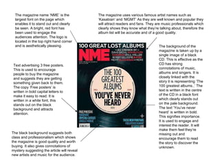
  • 1. Text advertising 3 free posters. This is used to encourage people to buy the magazine and suggests they are getting something given back to them. The copy ‘Free posters’ is written in bold capital letters to make it easy to read. It is written in a white font, this stands out on the black background and attracts attention. The magazine name ‘NME’ is the largest font on the page which enables it to stand out and clearly be seen. A bright, red font has been used to engage the audiences attention. The logo is located in the top right hand corner and is aesthetically pleasing. The background of the magazine is taken up by a single image of a black CD. This is effective as the CD has strong connotations of music, albums and singers. It is closely linked with the story it is representing ‘The 100 greatest albums..’ The text is written in the centre of the CD in a black font which clearly stands out on the pale background. The text ‘You’ve never heard’ is written in bold. This signifies importance. It is used to engage and interest the reader. It will make them feel they’re missing out and encourage them to read the story to discover the unknown. The magazine uses various famous artist names such as ‘Kasabian’ and ‘MGMT’ As they are well known and popular they will attract readers and fans. They are music professionals which clearly shows they know what they’re talking about, therefore the album list will be accurate and of a good quality. The black background suggests both class and professionalism which shows the magazine is good quality and worth buying. It also gives connotations of mystery suggesting the article will reveal new artists and music for the audience.
  • 2. The title takes up the majority of the masthead. It is written in a bold, capital lettered font. Its rugged edges give connotations of excitement and suggest the magazine is unique, like no other music magazine. The slipknot logo has been used as it is recognised by the majority of the target audience. This will attract the wide fan base of the band and encourage them to read the magazine. As the logo takes up a large portion of the page it clearly shows the magazine will have a big story on the band. The image used is of a member of slipknot wearing a mask. This has been used as the readers are familiar with the bands trademark masks. The grey coloured mask give connotations of a serious band, which suggests they are devoted to their music and the article will be both interesting and informative. The magazine offers five free posters to attract attention and persuade people to buy the magazine. This is similar to NME magazine, they are giving the reader something back for buying the magazine. They have chosen popular music artists that are well known by the target audience. Bright red and white fonts have been used as they clearly stand out on the dark coloured background. It attracts attention to them and makes them easy to read.
  • 3. A white background has been used for the contents page. This colour scheme has been chosen to enable the bright coloured text and numbers to stand out and clearly be read. This issue of the magazine was a special on Bruce Springsteen. An image of his band has been used, this is to advertise the article and encourage people to read that page. The photograph is in black and white, this will appeal to the audience as it clearly shows they have been around for a long time and built up a good reputation and fan base. Page numbers have been written in a bold, red font. This is so it clearly stands out and the reader can easily access the pages they want to read. The heading ‘Contents’ has been written in a large, simple font to clearly inform the reader what the page is about. The pale orange colour compliments the red and orange colours used around the page making the colour scheme look both effective and professional. A small black font has been used to give the page name and a short summary of what the page includes. The colour black gives connotations of a smart, professional magazine with powerful articles.
  • 4. An image of Lowell George has been used, it takes up the majority of the page. This clearly shows he is of importance and an article on him will be in the magazine. A quote underneath suggests he was an intelligent and interesting man who was popular amongst many. This portrays him in a positive way making the reader automatically feel fond of the figure and interested in reading more about him. The black and white image suggests sorrow, death and mourning. It also gives connotations of mystery. This is used to intrigue the reader and encourage them to read about him. The black background suggests the magazine will prefer darker genres, such as metal and rock. The colour scheme also enables the white font to clearly stand out and be easily visible for the reader. The black background also compliments the image used and enables it to clearly stand out. The issue number and month of the magazines release is clearly displayed near the top of the page. This enables the reader to clearly see which is the most recent of issues if they are a regular buyer. White and red fonts have been used so that they stand out on the black background and can clearly be read. Heading are written in a bigger, bolder font to attract the readers attention. It has been used to highlight the most important articles in the magazine.
  • 5. Half of the double page spread is taken up by an image of the band. A medium shot is used to clearly show the bands surroundings. The mise-en-scene of the image shows them in an old fashioned location which suggests their music is retro. The band are wearing unusual clothes which clearly shows their music is individual and they like to be different. The bubbles on the floor suggest the band are mischievous and like to have fun. This portrays them in a positive way showing they are down to earth and even though famous are actually normal. A dog has been used in the picture to reflect their softer, more caring sides. A bright yellow background has been used. The colour yellow gives strong connotations of warmth and happiness. It suggests that like the colour the band have bold, bright personalities and music to match their personalities. The colour is attracts attention to the article and enables the black and white font to clearly stand out on the background. The mise-en-page of the article shows that it is written in two symmetrical ‘L’ shapes. This is aesthetically pleasing to the eye of the reader. A short summary of the band is placed in the middle of the shapes. The shapes are used to frame the summary and highlight it. This suggests it is of importance. The heading of the article has been written in an unusual black and white font. The font gives connotations of a mad and wacky band. As the font is interesting it suggests the article will be too and encourages the customer to read the article.
  • 6. The letter ‘O’ has been replaced by a symbol that represents a target. This clearly suggests the man has targets and goals he is determined to reach. This is used to draw in the reader and encourage them to find out what he hopes to achieve. Half of the double page spread is an image of Paul Weller, the character featured in the article. The large image suggests he is of importance. The low angle shot portrays him as superior to the reader and shows he is a powerful and rich man. His black coat and low light surroundings suggest he is mysterious and edgy. The dark colours show nobody knows much about him and in the article he is willing to open up. A quote by Paul Weller is written in large capital letters. This is used to highlight the text and show it is of importance. It shows he is optimistic and still has faith in his career. It clearly shows he is hopeful for the future and has faith in himself. The font used is small and formal suggesting the topic of the interview is important and serious. The dark, grey font used compliments the black background and white font used. The colour scheme is pleasing to the eye.