
Recomendados
Mais conteúdo relacionado
Mais procurados
Mais procurados (20)
Semelhante a Double page spread overview
Semelhante a Double page spread overview (20)
Mais de amberjeancathykhamou
Double page spread overview
- 1. Double Page Spread Overview
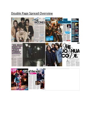
- 2. When it comes to their double page spreads NME keep a consistency through their layout and style of the images and text, however when it comes to the design of the double page spread NME makes sure that it suits the article they are featuring. Main conventions that are featured on double page spreads of music magazines will be the headlines, every double page spread needs a headline to introduce the article, such as an artist would have a headlining band at a concert that gets the crowd warmed up for their performance. Main images are always needed as well as it gives the magazine a chance to present the artist however way it wants to, to the audience which sets them up for the article they are about to read On the above double page spreads you can see that the text has been placed on more than likely the bottom right hand side of the page and written in the same fonts with black colouring. With this simplistic design of the text it makes it easier for the reader to enjoy what their reading without having to focus hard due to the mix of crazy colours or the page being too packed with irrelevant information, NME know what their readers like. Keeping the text in a column style
- 3. keeps a sophisticated edge to the magazine to show that it’s not all about the main image, but what the article holds. Whenever there is text on the page is focused on a white background making it stand out more and have the reader be easily drawn towards it, as well as this it also makes the double page spreads look a lot more professional and legit rather than a more spaced out article. NME tend to make every single double page different when it comes to the design as you can see above, each colouring of the headline and the style and positioning its created in suits the band or artist that is featured on the page. Though different they all are, they are all extremely eye catching and ooze interest, making it hard for a reader to ignore the interview/article. Without the interesting and relevant headlines the reader may not have been as interested in the spread, by seeing something you enjoy looking at with relevant colours and images it makes it more likely that as a reader you would continue to read the rest of the spread. However they can never be considered “too much” as even though they are interesting they are simplistic and sophisticated, and of
- 4. course the target audience are males so this would work in NME’s favour. What unites every single one of these double page spreads are the large and direct images that are displayed, they cover more than half of the page on most of them. This is a clever technique, as a reader would study the image first of all then become hooked, drawing them in to read the spread. By having such large images that the audience can relate too, allows the readers to connect with the spread as they will more than likely know who they are reading about, instantly making them more intrigued. NME doesn’t always use smaller related images, from above you can see three do, and three don’t. This shows NME knows how to “mix things up” and create a change rather than having the same features every single issue. An article that has more writing and information is more likely to not have related images as it may distract the audience from what they are reading, however with articles that aren’t featuring much text the maximum of four images could be presented to keep the reader interested and allowing them to enjoy what they are reading more by allowing them to see “exclusive pictures”.
- 5. All of these points reinforces NME’s “rock n roll” look as well as creating a brand identity which allows any reader to point out a copy of NME at any magazine stall.