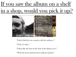
1. If you saw the album on a shelf
in a shop, would you pick it up?
“I don’t think the star connects with the audience.”
“Yeah, it’s okay.”
“I don’t like the font on the front of the album cover.”
“Well, the front and back don’t really go together”
2. If you saw this advert in a
magazine would you be
interested?
“There’s no link between the advert and album cover”
“It feels dark and gloomy, I wouldn’t be interested”
“There’s no running theme, two different fonts are never a
good look.”
“It just doesn’t seem right”
3. If you saw the album on a shelf
in a shop, would you pick it up?
“Yes defiantly, it looks really good!”
“It looks like something I’d be interested in”
“Yeah, I love the colours and the picture”
“Yeah, the star looks really good!”
4. If you saw this advert in a
magazine would you be
interested?
“Yeah, I love the colours”
“After seeing the album too, they both look really good and
work so well together”
“Yeah, the pictures are good, love it!”
“That actually looks like an advert!”